I put together an easy to follow explanation of temperature data abuse, which is simple enough that even an academic might be able to comprehend.
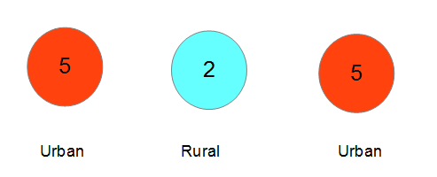
The normal UHI situation. Average temperature = 4.0
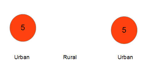
Rural station disappears. Average temperature = 5.0
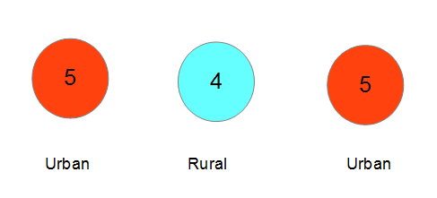
Mosher and Zeke infill and homogenize. Average temperature = 4.7. Announce that they have adjusted down from 5.0.
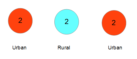
This is what a legitimate adjustment would look like. Average temperature = 2.0.


Excellent simplistic explanation, Tony. A very concise explanation that cannot be argued. I deal with natural gas wells on a regular basis, and in so doing use pressure, temperature, and flow to understand how the reservoir is behaving and what the inventory of the field is. Our methodologies do allow some in-fill of bad data by using adjacent wells and trends, but just like this explanation, we do in-fill data without at least considering the effects of the overall trend of the field and the what effect it would have on the average. If I were to use the same tricks as “climate scientists” to constantly alter both the past and present data I guarantee you that I would A) be fired and B) likely prosecuted for fraud.
Makes clear what is happening but won’t be adopted.
The settled science demands increased temps.
Yup! They know what they’re doing. This explanation is the first I’ve seen actually attempt to explain what is going on. The problem is liberals will just deny it is happening.
Hey Tony! Great example! Simple. Concise.
I’m not certain, but I think journalists may be able to understand that, too.
This is not a fair test, you did not offer them any square pegs.
… or a hammer to use them with.
I believe the correct term is ‘homogenizer’.
I agree with your analysis, except you forgot to raise some of those 5’s to 6’s due to the al gore rhythm.
Fantastic! 😀
OMG I love this. It’s brilliantly simple. Even the dumbest Climate Liars and their brainless adherents can understand it. And then they’ll ignore it, because the truth is the last thing they want. Still, . . excellent work Mr. Goddard !!
I don’t understand the last diagram with the average temperature being 2.0. What is this?
This article shows that it is not theoretical:
A Pending American Temperaturegate
Ed Long looked at pairs of rural and urban sites in 48 US states. The adjustments of the trends were of the rural sites upwards, not of the urban sites downwards.
As an example of the “big lie” strategy it is a doozy. I might add that Ken Stewart who is a blogger here in Australia has caught GISS cooling the past for our own rural sites many times.
HMMmmm — Watts get a mention but not Tony who has dragged him kicking and screaming into the realization that there was a problem. Typical
Amen sister, amen.
Outstanding explanation. Now, can it be filled in with a real-world example?
That is where this discussion began.
Bruce of Newcastle says@ February 11, 2015 at 9:44 am
So someone else besides Tony has shown the adjustments are bogus.