
After a couple of years of non-stop global warming scare stories and massively faked temperature data – the next phase of the plan has begun.
President Obama is planning to take credit for saving the planet, which simply requires making a fake deal in Paris, funding good news climate research instead of bad news climate research, and telling Gavin and Tom to start reversing their cheating with the climate data.
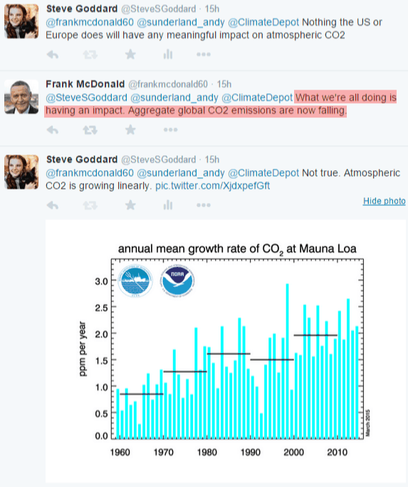
The first evidence of this appeared a few days ago, when Mikey Mann changed his BS from bad news to good news. He started pimping the patently false idea that CO2 emissions were declining due to the good work of President Obama. This has had immediate benefits, suckering clueless journalists like Frank McDonald at The Irish Times
Similarly, the New York Times just ran a big story about “The Hopeful Al Gore”
The switch from negativity to positivism is an essential part of the plan. Look for more of this as we head to Paris.
We didn’t listen to the climate deniers, did the right thing and saved the planet. All hail Emperor Obama and patron saint Al Gore.
But where does this leave the climate scientists who have been milking the scam? We can be quite certain that Hayhoe, Mann, Hansen et al have been quite well compensated for their efforts. They will be awarded medals of Freedom by the President.
Bookmark this post.

And still atmospheric CO2 will rise annually.
Surely you’re wrong here, Steve? If the Mauna Loa data are typical, the rate of CO2 increase is itself increasing (roughly) linearly, and the increase in concentration must be superlinear.
I seem to remember reading a blog post about that recently – something to do with sea level.
The plot of atmospheric CO2 over time looks very banana.
Put a few plots together.
Total Emissions
http://www.epa.gov/climatechange/images/ghgemissions/TrendsGlobalEmissions.png
Try: dCO2/dt = ?T
i.e. relate the rate of change of CO2 concentration to temperature. Like this.
http://postimg.org/image/a153d8xan/full/
Emissions rising slope vs flat to falling Concentration slope. Mama Nature loves to chow down on CO2 and the more there is the more she eats.
Yet models and reality will still diverge.
This was the original plan for the 2009 Copenhagen Summit, which would have dovetailed nicely into the cyclic cooling if it wasn’t for those meddling kids… I mean, if not for the emails being released and various world leaders dropping out in a very public way. Now they figure they have nothing left to lose, so they will adjust history to set things back on the rails again.
Anyhow, seems to me that your graph of growth rate is pretty close to growing linearly (left hand side looks significantly lower than right hand side). Atmospheric CO2 growth would then be parabolic… gonna be difficult hide that. There were zero years where the CO2 measurement has actually been falling, so if that clown is correct and emissions are falling (unlikely) it would suggest that atmospheric CO2 is not tightly coupled with emissions. As I’ve pointed out earlier, we don’t see any years where atmospheric CO2 measurement went backwards during the 1970’s oil crisis either (oil prices went through the roof), and that has to make you wonder.
CO2 is subjected to the same type of fraud as the temperature record is.
Well, there are millions of Americans who now sit at home instead of commuting to work daily.
Indeed, and the private sector increase in fracking etc, as well as a non growing Europe However, if this is true about emissions leveling off, it is a likely indicator that China is no longer growing.
http://globaleconomicanalysis.blogspot.com/2015/03/chinas-deflationary-bust-and-beyond.html
US is also not really growing either…
http://globaleconomicanalysis.blogspot.com/2015/03/yield-curve-futures-suggest-no-rate.html
As the climate cools, CO2 drops.
The claims that the last two years are the ‘warmest years EVAH’ is a lie and so when cold eats up CO2, they can claim this is happening while it is hottest ever so it is still CO2 running things instead of the other way around.
CO2 has, like the temperatures, leveled off and will soon begin dropping again as Ice Age conditions spread from Antarctica and Canada more and more and winters grow longer and ice takes longer to melt just like in previous down cycles.
The Republicans should cut Gavin’s budget.
I suspect it’s more to do with the inability of NOAA to keep up with the “Hottest year evaaaah!” adjustment scam in the face of what might be the start of a descending temperature trend.
http://www.esrl.noaa.gov/gmd/webdata/ccgg/trends/co2_trend_gl.png
The assumption is made that there is NO VARIABILITY and the data is adjusted to reflect that.
Second WHY are the results from various sites so in close to each other:
In the paper by Tom Quirk “ Sources and Sinks of Carbon Dioxide” The isotopic balance in the atmosphere is far more complex and there are many more variables than most think. Consider 94% of all anthropogenic CO2 is released into the northern hemisphere. Next the CO2 is not as well mixed as the IPCC state. From the nuclear tests in the 60’s the mixing north to south is very slow, like several years ( another rhetorical question) so why is the average northern hemisphere CO2 not higher than the south?
As Dr. J. A. Glassman so aptly put it in one of his replies,
In other words there is agreement between sites because they were ADJUSTED just like the temperature records.
Watch out for overshoot. Obama will cool us into the ending of the interglacial.