
Disrupting the Borg is expensive and time consuming!

Google Search
-
Recent Posts
- One Atomic Bomb Per Hour
- New Video : Analyzing Oil And Gas
- Is Antarctica Melting?
- High Speed Analysis And Visualization
- El Nino To The Rescue?
- Fake News Update
- Growth Of Antarctic Sea Ice
- 65 Years Of Progress!
- El Nino To The Rescue?
- Worst March Drought On Record
- ChartGL Process Control Demo
- The Biggest Money Laundering Scam
- Drought In The Headwaters Of Lake Powell
- Unrealistic Expectations Of Water Availability
- Did Bill Gates Do This?
- Worst March Drought On Record In The US
- The Real Hockey Stick Graph
- Analyzing The Western Water Crisis
- Gaslighting 1924
- “Why Do You Resist?”
- Climate Attribution Model
- Fact Checking NASA
- Fact Checking Grok
- Fact Checking The New York Times
- New Visitech Features
Recent Comments
- Bob G on One Atomic Bomb Per Hour
- Bob G on One Atomic Bomb Per Hour
- Bob G on One Atomic Bomb Per Hour
- Jack the Insider on One Atomic Bomb Per Hour
- arn on One Atomic Bomb Per Hour
- Bob G on One Atomic Bomb Per Hour
- Bob G on One Atomic Bomb Per Hour
- Bob G on One Atomic Bomb Per Hour
- Hank Phillips on One Atomic Bomb Per Hour
- Hank Phillips on One Atomic Bomb Per Hour
We Have An Early Leader In The Moron Of The Day Competition
This entry was posted in Uncategorized. Bookmark the permalink.
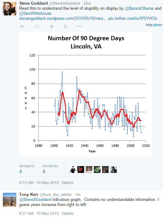
There you have it! This is the archetypical believer in man mad global warming. Unable to read a simple graph but certain in his convictions. You got it nailed!
It looks to me that you have a graph of the number of days in any particular year when the temperature was above 90degrees in Lincoln – I assume in Fahrenheit. You don’t say what the two different colours represent, but I would guess that one is the raw figure and the other is smoothed perhaps over 5 or 10 years.
The implication of the graph is that the number of days recorded as being over 90F has reduced.
Blue shows the actual data points. Red is the “smoothed” to help show trend. It is a format Tony has used over and over again here and elsewhere. He could have used a straight line to show the trend but I really am not knowledgeable enough to explain when that kind of presentation should be used and when it should not.
Also notice that the grid lines on the left scale labeled “Count” have about the same distance between them as the hash marks on the scale on the bottom labeled “Year”. IOW if the hashmarks at the bottom were extended to intersect the horizontal grid lines they would form a square.
That relationship of scale between the vertical to horizontal axis is something one always needs to be aware of because it can change ones perception of the information given when those reading it do not pay close attention to the numbers. The person that creates the graph can stretch either axis to give a false impression of what the Chart shows. It is a trick the unethical use quite often when presenting graphs to the less knowledgeable public.
Y axis count starts at zero which is most proper. If only Tony had the data to start the X axis at zero AD, it is likely CAGW would have been dead at birth..
This Kerr guy is such a fanatic believer in AGW that he cannot comprehend that the number of days above 90 has actually declined since the good old days of lower atmospheric CO2. As a result he is confused by a graph which is contradictory to what he “knows” to be the true. He assumes that the problem is with the graph.
These types of people “know” that AGW is true because it reinforces every misanthropic and/or anti-free enterprise view that they already hold dear. This Kerr guy is a good case study.
Exactly as Justa Joe said, Kerr just couldn’t fathom how a graph could show warming going backwards in time! Cognitive dissonance in action, and utterly priceless! Hahahaha!
I’m a bit slow today. It just now dawned on me from what all you guys posted that this guy’s head demands that warming increase over time so then the graph must be ‘backwards’. Sheeeeesh! What a buffoon.
Bingo!
+1
Not exactly rocket science, would believe an average 5th grader should be able to interpret it.
Perhaps the average 5th grader of some years ago might be able to interpret it. The dumbing down has continued and with things like common core, I would not be surprised if recent 10th graders might have a hard time understanding such graphs.
I agree with Neal. Also, keep in mind the new Common Core curriculum is the creation of folks who are all in with CAGW. It is possible Tony Kerr is a graduate of an early adopter of the CC train wreck.
O/t somewhat, a neighbor of mine is the Math Dept. head of a local suburban community college. I asked her once what percentage of her classes were just to get people up to speed. Was stunned to learn that 50% of the sections (classes) offered at her school were non-credit 8th, 9th and 10th grade arithmetic and algebra. Very common for high school graduates to need at least one non-credit class. Just to get into and pass Math 101.
Tony Kerr displays the same level of intelligence as Democrats who will blame a FUTURE funding cut for Amtrak on an accident which happened a few days ago. Here is my vote for him being the moron of the day.
Tim, I think you got that backwards. 😉
It’s been my observation that Democrats will trample each other to be the first, loudest and most strident to blame a train accident that happened a few days ago on FUTURE cuts in the rate of growth of spending for Amtrak.
Regarding Tony Kerr’s stupidity, it’s also been my observation that CAGW alarmists are, almost without exception, completely innumerate. Maybe that partially explains why so many Engineers (like Moi) are CAGW skeptics.
Amtrack should have been cut off and made a private concern long ago. Friend of mine rode from LA to somewhere in SC and various destinations in between and was very disappointed. Made it clear that Amtrack was the perfect example of why socialism doesn’t work. Poor service, poor food.
If Amtrak were cut off from fed funding it would either go bankrupt or cut most of its routes, no matter who was running it.
Amtrak is run by the National Railroad Passenger Corporation, a partially tax-funded public-private corporation formed in 1970 under the Nixon administration. Thanks to taxes, union rules, government regulation, and the National Highway System, running passenger trains had become unprofitable for the old private rail companies. Amtrak was a means by which the rail companies could unload the cost of running passenger trains onto the taxpayer. For most routes Amtrak must pay the private rail companies for use of their tracks.
Next he’ll be campaigning for president on the democratic ticket. I foresee a running mate for Bernie Sanders.
This graph is extremely easy to interpret. Mr. Kerr just couldn’t believe that the number of 90 degree days has actually trended downward.
Personally, I would plot such graphs as a bar chart (this is true for a lot of climate graphs). The y axis function is not a continuous variable but in fact totals for a given year. Note also how much variation there is from year to year.
To be fair, there is a large part of the population that do not understand graphs. Mr. Kerr must be one of the more high-functioning members of that community, because he apparently can string together what resembles an eight word sentence. It was nice of his helpers to turn on the computer for him on the day trip to the library.
+100
Don’t forget folks he votes. And he is representative of a vast majority of Americans.
The AVERAGE IQ is 100 that means 50% of the population has an IQ less than 100 and the majority of those with IQs above 100 went to US government mandatory Progressive Propaganda brainwashing… excuse me schools.
Australia actually in this case.
He must be affected by the down-under influence where folks “down there” have the opportunity to read everything upside-down and backwards.
You would expect that there would be an App to correct for that effect.
For which we can only apologise for letting the poor guy slip through the many cracks in the Australian education system. (I’m an Aussie and an ex-maths teacher)
That about sums up the math and science knowledge of the average global warming fruitcake. Can’t even read a simple graph. These people understand nothing if the shaman hasn’t lectured them about it. Global warming is just another religion.
I think it is the replacement for religion.
Ice shelves collapsing, seas inundating cities, coral reefs disappearing…it functions as the Hieronymus Bosch painting for the modern progressive ’cause it’s unhip to believe in God and Country.
All that education and such little self-awareness and so much fear.
Behold: the increase in cognitive dissonance, from right to left. This poor climate-fraud sycophant is so incapable of independent, critical thought that his brain is unable to process the obvious impact of the data in such a simple graph.
he’s dyslexic?? “I guess years increase from right to left”
Perhaps he’s Chinese?!?
Yes, I believe his original name is Wan.
Dyslexics of the world, UNTIE!
HEY!!!
Cut the guy from down under some slack, try turning your monitor upside down so you see what he must see while desperately clinging to the underside of the globe…
We even get the same sort of slope in California, despite what we hear about “record heatwaves, blah,blah”
https://notalotofpeopleknowthat.wordpress.com/2015/05/15/claims-that-heatwaves-will-increase-in-la-ignore-the-facts/#more-14824
Stick to the standard images of their Bible: Fire and brimstone, Noah’s flood…
Given his post, is it any wonder that so many people fall for the propaganda? It also illustrates why the alarmists quickly resort to personal attacks when questioned. People who aren’t too bright are easily intimidated.
Kerr would be the one standing on top of a house in the middle of a massive flood screaming Algore was right! This drought is proof-positive of Glow Bull Worming!”
We’ll use his kind to fuel the power plants when the glaciers start advancing across the Canadian border and scrape Detoilet, Minneapolis and Shitcago down to Kentucky. They’ll be too stupid and stubborn to believe that there’s sub-zero temperatures and we can just roll up in trucks and stack ’em up like cordwood.
There is a Tom Kerr, Lead Climate Policy Officer at the International Finance Corporation, World Bank Group.
Surely they are not the same person !! ??
Doesn’t anyone realize what happened to the unfortunate Tony Kerr?
The X axis of the graph was off the bottom of his smart phone screen and he was too dumb to check whether he was seeing the whole picture before he shot off his reply!
Yep, the first thing I did when I saw his comment was check the x-axis.
Only smart people should use a smart phone. 😉
I have a friend who is a pilot for a large airline. When presenting such graphs to him, he truly cannot understand them. Yes, he is a Progressive……
I nominate this guy.
“Dr. John O’Connor is a liar”: Leaked document reveals real reason Fort Chip’s anti-oil “whistleblower” was fired.”
http://www.therebel.media/john_is_a_liar
https://www.youtube.com/watch?t=271&v=7nOrTXEUczA
His real first name is Wayne
And now for the Anti- Moron Nomination!
Here is proof that a sane fiscally conservative approach to government and the economy will WTFPAWN leftist tax and spend “stimulus” all day long.
https://www.youtube.com/watch?v=3bMFuxDZ160