
The animation below flashes between the 1971 National Geographic Arctic ice map, and the current state of the ice reported by the US Navy.
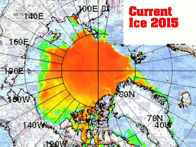
As you can see, the ice edge is nearly identical to 1971, and nothing like the wildly fraudulent map which National Geographic just published.
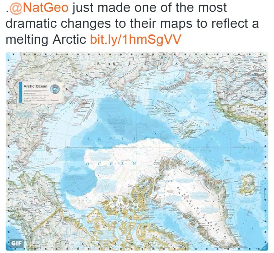

I would have to say that that new map appears calculated to induce some kind of panic, on false pretenses.
‘There is no time to think, no time to debate, no time to read or to consider options. Based on what we now know, we must act immediately, or else! You have no choice, you must accept the pre-written plan that we have tabled, immediately!‘
How many times before have we heard that line spoken within the Congress of the United States!
And then once all the flaws are discovered, by then, the dramatic tension and the adrenaline rush have receded, and the people lose interest in fixing the flawed policies, and just come to accept them as an inevitable burden.
It seems it’s always possible to excite them with another “crisis”, but never possible to excite them about correcting the long-term decline caused by the responses to all the “crises”.
RT
They are in a hurry because TRUTH is being revealed, although all the political power is trying to hide TRUTH !
TRUTH is revealed although public funds are squandered futilely trying to hide TRUTH.
Seventy years (1945-2015) of deceit are coming to an end.
http://whowhatwhy.org/2015/08/06/classic-www-hiroshimanagasaki-atomic-devastation-hidden-for-decades/
article is a fake, no sources…
When you search about the us navy maps here what you find :
http://www.navy.mil/navydata/documents/USN_artic_roadmap.pdf
As you can see the us navy know the ice is melting, and their maps and predictions are agree with natgeo…
people need to quit giving any credence to anyone associated with government at any level. If it is spoken or published by a government or government subsidized organization, it is a lie.
Gee?!? Surely you don’t mean to imply that it’s been the same since 1971? Has it not waned and waxed from 1971 to now, and that now it is back to 1971 levels, and growing? Something as dynamic as Arctic ice cannot be thought of as undergoing ‘no change’, at least to my understanding of cycles. Or am I just being picky?
I think the main point was that the actual, measured ice of the present is far greater than what’s depicted in Nat. Geo’s cartoon drawing. And that says something about Arctic temperatures, as well as about the honesty of Nat. Geo.
Tony regularly affirms that ice and temperature are highly variable. So you are not really being picky, but you are not giving him enough credit.
It is the alarmists who try to sell the catastrophist nonsense that climate is controlled by a CO2 knob and was completely stable before anthropogenic “climate change” set in. If they can’t sustain that postulate, their entire argument collapses quickly.
If it’s really back to where it was in 1971, when CO2 was far, far lower than today … then there goes the notion of CO2 as a control knob.
Amen!
Your being picky. Of course there has been lots of changes between 1971 and 2015 but I’m pretty sure you knew what is being said is that the Arctic ice extent at this time is nearly identical to what it was in 1971 and not as Nat Geo is presenting it on it’s latest map. Some “death spiral” isn’t it?
About this time in 1971 I had gotten my drivers license and was a sophomore in HS and wore my curly hair in a pretty impressive Afro. During the summers I worked at the family business welding up parts tubs and racks for GM and trash dumpsters or unloading steel trucks and putting the stock in the appropriate racks.
Ok, fair enough. Yes I know what he meant, I give Tony credit, that’s why I come here nearly daily. I’m just reminded of what a science teacher told our class once, “Say what you mean, or I’ll think you mean what you say”. btw I was also a HS Sophomore in 1971. 😉
i was one year old in 1971 🙂
I agree that the title could be changed to “Arctic ice the same now as it was in 1971”. The point of course is that there is nothing abnormal about the arctic ice today and that the current ice conditions aren’t “unprecedented” (as many in the scientific community like to state).
Reblogged this on Edonurwayup's Blog and commented:
Nat. Geo. makes me puke.
So that’s the end of the Suez and Panama canal.
Egypt launches Suez Canal expansion.
http://www.bbc.com/news/world-middle-east-33800076
Egypt’s government hopes the revenues will revive the economy – but analysts have questioned the projections.
http://fortune.com/2015/07/10/panama-canal-shipping-predictions/
Reblogged this on Daily Browse.
Truth Is Out
If GOD is the Creator, Destroyer and Sustainer of atoms and lives then the REALITY revealed by experimentation and observation bears a truly remarkable resemblance to the GOD revealed by prayer, contemplation and meditation, . . .
and TRUTH is revealed even if public funds are futilely squandered to hide TRUTH.
http://www.japantimes.co.jp/news/2015/08/08/national/history/truth-hurts-censorship-media/?utm_source=Daily+News+Updates&utm_campaign=967a302fd1-Sunday_email_updates09_08_2015&utm_medium=email&utm_term=0_c5a6080d40-967a302fd1-332818853#.VcY-ldm9Kc1
https://stevengoddard.wordpress.com/2015/08/08/spectacular-climate-fraud-from-national-geographic/
http://whowhatwhy.org/2015/08/06/classic-www-hiroshimanagasaki-atomic-devastation-hidden-for-decades/
https://notalotofpeopleknowthat.wordpress.com/2015/08/07/how-climate-scientists-cheat-and-deceive/
As I’ve said before.. Arctic sea ice is currently anomalously high compared to most of the Holocene.
Biomarkers clearly indicate that earlier in the Holocene, there was quite often no Arctic sea ice for reasonable periods each year.
All the scares about loss of Arctic sea ice doing this or doing that.. well, they didn’t happen.
No run-away methane heating from thawing permafrost etc etc…
The Earth is still here, cooled somewhat from the Holocene Optimum , the polar bears and the other marine animals are still with us.
The Arctic sea ice level is of interest only to watch… like a movie.
Loss of sea ice is not a cause of PANIC like the alarmista want to make it,
Loss of Arctic sea ice would actually take us back towards the normal for the current interglacial.
National Geo’s pushing of The World’s Greatest Fraud of All-Time was the reason for me cancelling my lifelong subscription about 10 years ago. It’s really a shame that they allowed themselves to be overtaken by Neo-Marxists and New World Order acolytes. So much for the age of science and reason.
What about thickness? Seems to me the only real way to measure sea ice would be in three dimensions.
Again thanks for the article, and for all of the wise comments from HONEST SCIENTISTS. What amazes me is HOW National GEO just blatantly can get away with any LIES that the NWO want to push. As was typically shown by George W Bush when he said on TV when president, ” The TRUTH is whatever I say it is! What damn arrogance these Elite have.
Keep up the good work and hopefully when enough people actually realize the TRUTH about our changing CLIMATE, perhaps we could we could help save the planet from the LIARS. Unfortunately I am not naïve about POLITICS, and know that ALL parties can be BOUGHT OUT, and here lies the problem as said in the famous movie the GODFATHER: “Give them a price that they can’t refuse” Alternatively threaten them to keep SILENCE or else tactics. If you want to see how dreams can be shattered by these arrogant Elite not just in the CLIMATE paradigm but in hopes for a better POLITICS.
http://www.outofthebottomlesspit.co.uk/411785131
Have a great weekend.
Though that is a good news, I cannot stop noticing that, unfortunatelly, global warming has become a business and not just any business, but one with good profit. After all those years of discussing climate change, we still don’t know what really caused global warming. I have read on http://www.arctic-warming.com about the past century and how climate evolved and I am more and more convinced that we should start paying attention to the oceans…..
Got a link to the Navy map? I have so many people I’d like to share this with, but without an original source my point is useless…
http://www.navy.mil/navydata/documents/USN_artic_roadmap.pdf
Of course the original map have nothing to see with the one in the article, as the article is simply wrong…
“The current state of the ice reported by the US Navy” would seem to be in error Steve. Where’s the big holes in the Beaufort Sea ice for example?
http://t.co/dIfoZvpMg4
depend which satellite data is used whether you see holes or very low concentration ice jim.
Do me a favour Chilly. Even MASIE shows holes in the Beaufort Sea:
http://nsidc.org/data/masie/index.html
Along with lots of ice in Hudson Bay still!
Still it must be a disappointment to you Jim. It all started out so well for you with that record low Maximum this year. Then…….. well, here we are. There is even still significant ice in Hudson bay! Greenland has gained significant ice. And it sure is looking like the melt is going to end early this year. Oh well, there is always next year to hope for some spectacular Arctic melting to portray as a disaster on your blog. perhaps even the NW passage will open up? But I wouldn’t count on it with the AMO apparently shifting to it’s cold phase.
Perhaps you would have better luck with an Atlantic Hurricane blog? It’s looking like there is a good chance that it will be a far more active season next year than the last few have been.
rah,
The Hudson Bay stuff is an in joke between Chilly and I:
http://GreatWhiteCon.info/2015/07/mail-makes-1000-arctic-mistake/#comment-211144
You seem to be neglecting the ice Greenland has been losing around the edges all year:
http://GreatWhiteCon.info/2015/02/shock-news-massive-calving-of-jakobshavn-isbrae/
Thanks for your suggestion, but I was blogging about Atlantic hurricanes long before I started on Arctic sea ice. Meanwhile the minimum is at least a month away, so don’t count your chickens just yet.
No Jim I’m not neglecting anything. Greenland has gained a lot of ice this year and melt on the coasts, especially the SW coast, is normal. Also this old mountain warrior has seen and climbed enough steep rocky crags to know that they don’t hold snow well. In fact their dropping of snow, even in below freezing conditions, is the least predictable of the different types of avalanches. The sound of that kind of avalanche as it hits bottom is like the muffled boom of far off artillery if your a safe distance from it. If you aren’t, it’s like the enemy has your range. Quite a terrifying sound at night in poor visibility.
Jim is the one who neglects… or rather CONS !!!.
Neglects to tell you all that during the first 2/3 of the Holocene there was very little ice, if any in summer.
Neglects to tell you that the reason the current Arctic sea ice is abnormally HIGH compared to most of the last 10,000 or so years is because we have only slightly warmed from the depth of the freezing LIA, the COLDEST period in known history.
Neglects.. to tell you that he has close links to the Exeter Uni climate hive and CRU climate alarmists.
rah – Another large chunk of Greenland ice just slipped into the sea:
http://neven1.typepad.com/blog/2015/08/jakobshavn-record-retreat.html
“Another large chunk of Greenland ice just slipped into the sea”
SO WHAT. !!
Maybe with a whole heap more we can get back to the beneficial norms of the Holocene, with little to no sea ice in summer.
Come on Jimbo the clown…
…. admit that the only reason there is so much Arctic sea ice is that we are only just above the COLDEST period in the last 10,000 years.
Tell me Jimbo,
How are your friends at the climate trough of Exeter Uni going.
Are they still feeding you crumbs ?
And Jimbo..
its summer up there.. sort of.
Ice melts.. get over it !!!
Jim Hunt:
So what? Glaciers advance and they receed and calf when they are doing either one sometimes. Important information for mariners in the area but in the context of an island that has gained ice mass this year in a world that others claim is warming, what does it really mean! In my judgment virtually nothing.
My problem with your outlook is that the only things that are important to you are calfing, recession or any events or measurments that could be interpreted as signs of melt you can possibly find no matter what the over all situation is. Greenland as a whole has gained gts of ice this year and that is not news for you In fact you will do all you can to deflect from that fact as per the post I’m responding to and the previous one pointing out that there is a bunch of rocky graigs essentially bare of ice along the shore. Your blog only serves to give one an insight into what the buzz is in a crowd that will go to every extent to deny any reality that does not agree with the warming meme. It is really no better sorce of unbiased information to get an honeslty presented full picture of what is going on in the arctic circle than the MSM is for getting information about what is really going on in our military or on so many other important current event matters.
Big holes.. so what !
Not like there is any chance of Arctic sea ice disappearing completely in summer like it used to for most of the first 2/3 or so of the last 10,000 years.
You know that to be the truth, even if you won’t admit it.
Reblogged this on Climatism and commented:
If National Geographic blatantly distorts climate data, to promote their agenda, imagine the other distortions of science and data the public is subjected to via other global warming sympathetic media.
While I appreciate the tone of “calm down” everyone b/c the information we are receiving cannot be trusted is right in line with my own skepticisms. I do say however that I am curious what is you sourcing for the satellite image you over layed on the mat geo image? I do believe nat geo is “in bed” with climate scientists and the info the present is often questionable. Now the real deal in m view is that only a very few people out there in “media land” have Any clue what is really going on: and that is the grand ol’ experiment of geoengineering and climate engineering. Until such time that we recognize that we are all being lied and and decepted to the FACT that large scale global geoengineering and climate engineering is happening right now and is the primary source of all this weather calamity (whAtever you wAnt to call it). Anyone reading this, including you Mr lGoddard (whom by the way I recommend being in higher level of integrity by being more forthright with your own name), go to http://www.geoengineeringwatch.org and spend the due diligence to check out this man’s research. He is in integrity and he inderstands more of what is really going on. It’s not time to panic, it’s time to wake up! You me Goddard are a fraud. And your disinformation comes from ignorance and your own personal “normalcy bias”.
Here in portland, or, I witness the geoengineering pretty much everyday now with stratospheric aerosols being sprayed like crazy. Think I’m crazy? No I am not I am awake and educated and I have had my own perceptive faculties scrubbed clean to be able to see what is the “Truth” as you all say.
http://Www.geoengineeringwatch.org
Keep this post up on your website, if you dare.
Can anyone tell me what month of 71 and 2015 these maps are from. I have a warmist quibbling over the point that the ice cover fluctuates throughout the year so they need to be same month I suppose?
Is the Nat Geo map of a particular month, or is it an idealised Atlas-type thing?
Is the Nat Geo map based on data?
If so, what month/day of the year?
IOW, are you comparing the same periods in the year here?
If the Nat Geo map represents absolute minimum for 1971, that detracts from your comparison with August values per the Navy map, as the minimum is usually nearly 2 million square km less than the coverage in early August.
I suspect the Nat Geo map is an idealized version, not based on any data, and therefore a meaningless comparison. but I’ll await your remarks to confirm or otherwise, Steve.
If your going to issue a new version of a map then why make the new one an outdated one and NOT inform your readers? The ONLY reason other than sheer incompetence, would be to deceive.
For crying out loud Barry, if the new sea ice representation is not based on any data, it’s just a cartoon fantasy!
But since it is surely not labeled “This is not based on any data” or “this is just someone’s baseless fantasy cartoon”, it is highly appropriate to compare it to real maps that are based on data, to see how close to reality it might be.
“it is highly appropriate to compare it to real maps that are based on data, to see how close to reality it might be.”
I agree. I look forward to Steve explaining whether the 1971 Nat Geo Map is simply an idealized representation (as in an Atlas) or based on any actual data. I suspect it is the former, and not based on any data.
Which would render the comparisons with “today” quite meaningless.
Surely we would not accept any graph/time series/plot which was based on no data whatsoever?
But let Steve clarify. If based on data, which month/day of the year?
I checked National Geographic for Arctic maps. The first one I found has sea ice coverage similar to 1971. Probably an idealized map, not based on data, and I’m sure they have several versions.
http://www.maps.com/map.aspx?pid=11078
What good is an “idealized” map not based on data to anyone that isn’t writing fiction?
Yeah, I’m just realizing that when he says
“whether the 1971 Nat Geo Map is simply an idealized representation (as in an Atlas) or based on any actual data. I suspect it is the former, and not based on any data”
what he is saying is that he believes the defining characteristic of an Atlas is that no map it contains is based upon any data at all. What on Earth?
Sure am glad the road maps and atlases I use in my truck and the Rand McNally trukers GPS I use are not filled with “idealized” maps not based on data.
“What good is an “idealized” map not based on data to anyone that isn’t writing fiction?”
That’s my point. Land masses are constant – sea ice is not. It fluctuates by 10 million sq/km annually. So either they just invented the boundaries of sea ice, or they based it on (less than ideal) data: there was no satellite measuring of the Arctic ice cap like we had from 1979. If the former, a pretty useless comparison. If the latter – what time of year? Is the ’71 map of the sea ice maximum area in March, or the minimum in September, or somewhere in between?
Without that information, we can’t really compare the coverage with “today” (early August 2015) as per the Navy map overlaying it.
Steve has not replied. Perhaps we’ll never know. But it would hardly be skeptical to assume that the two maps overlaid are based on the same time of year. What are we comparing EXACTLY?
and don’t forget the “us navy map” provided here is false…
When you search about the us navy maps here is what you find :
http://www.navy.mil/navydata/documents/USN_artic_roadmap.pdf
As you can see the us navy know the ice is melting, and their maps and predictions are agree with natgeo current maps…
Acc. to the Dutch news today, the Netherlands are launching a mission to the North Pole to see how much “it is warming” there.
They must be crazy?
https://stevengoddard.wordpress.com/2015/08/12/gaia-declares-the-arctic-melting-scam-dead/#comment-535610
It has clearly warmed more than the whole globe over the last 30 years. Even UAH satellite data show this – more than twice as fast as global for the satellite period.
http://vortex.nsstc.uah.edu/public/msu/t2lt/uahncdc_lt_5.6.txt
http://vortex.nsstc.uah.edu/public/msu/v6.0beta/tlt/uahncdc_lt_6.0beta3.txt
(Scroll to bottom to see the trends per decade)
As the area is not well covered by weather stations, makes sense they want to get a better fix on the surface record by examining it from the ground.
barry says
It has clearly warmed more than the whole globe over the last 30 years. Even UAH satellite data show this – more than twice as fast as global for the satellite period
henry says
your comment to me has just figures, no graph?
As for my own results from a more trustworthy website: clearly it is globally cooling
since around 199? (2014-18) =1996
you can also work it out from the formula given on the graph:
https://i0.wp.com/oi62.tinypic.com/33kd6k2.jpg
Looks like Steve was more than 2 million square kilometers wrong when he posted that 2015 sea ice melt had “essentially ended” back in August.
http://i1006.photobucket.com/albums/af185/barryschwarz/2015%20minimum_zpszhkunifs.png
The ONLY warming event in the satellite record was the 1998 El Nino and associated ocean energy release events.
These started in 1997 and ended at the start of 2001, adding about 0.26ºC to the atmospheric temperature.
Without that 0.26ºC, there has been essentially NO WARMING in the WHOLE of the 36 years of satellite temperature measurements.
The ONLY way you can show any trend is to use that step as part of the trend.
http://woodfortrees.org/plot/rss/from:1979/plot/rss/from:2001.2/trend/plot/rss/from:1979/to:1997/trend/plot/rss/from:2001.2/trend/offset:-.26
That’s the STUPIDITY of the alarmista lies. They complain that the realists use the El Nino to show a zero trend (which we don’t)*, yet invariable use it to show a warming trend. Quite bizarre.
* The El Nino is NOT the cherry-picked starting point.
The back calculation of a zero trend is actually stopped by the El Nino.
.
None of those trends are statistically significant. The only trends that are (longer-term), are warming. But your comment has nothing to do with the Arctic, which shows no step-change. The step-change itself for global temps is not statistically sound.
“The ONLY warming event in the satellite record was the 1998 El Nino and associated ocean energy release events. These started in 1997 and ended at the start of 2001, adding about 0.26ºC to the atmospheric temperature. Without that 0.26ºC, there has been essentially NO WARMING in the WHOLE of the 36 years of satellite temperature measurements.”
If you remove data for years 1997 to 2000 (Dec), there is still a warming trend.
http://i1006.photobucket.com/albums/af185/barryschwarz/rss%201997%20-%202000%20removed%20trend_zpsxr46052w.png
If you remove data from specific month in 1997 to specific month in 20012, you still get the same result.
But you DIDN’T remove the warming step. idiot !!
In fact the step is clearly evident in your graph.
So as I said.. the ONLY warming in the whole of the satellite data comes from the 1997 – 2001 El Nino step.
Thanks for the confirmation !! 🙂
Good to know that you now realise that there is absolutely NO CO2 warming signature in the whole of the satellite temperature.record.
“The only trends that are (longer-term), are warming.”
And they rely TOTALLY on that El Nino step, that you clearly show in your graphs, between 1997 and 2001.!!
Other than that step there has been NO WARMING in the whole of the satellite temperature data.
PS.. thanks for the graph..
I will use it in future, with your name cited of course…
….to show the large step at the El Nino. 🙂
pps.. could you please provide another graph with 0.26C subtracted from all readings after the step, and a linear trend line drawn as well, of course 😉
Thanks 🙂
“But you DIDN’T remove the warming step. idiot !!”
The data are left as they are, apart from removing the data you alluded to. It’s a matter of fact that anomalies in RSS (or UAH) are generally higher after 2001 than before 1997, and the warming trend is an inevitable result. Unless you want to change the post-2001 anomalies or artificially reduce the trend. The trend for the whole record (minus 1992-2001) is statistically significant, the trends you ran are not. Thus, you cannot conclude a step-change from your method. Nor any other method.
YAWN.
The ONLY warming in the satellite record comes from the El Nino step.
That is what creates the trend.
As you have just admitted…
…and as your graphs clearly show.
Your reluctance to present the graph with the step change removed from the post-step data, …
is duly noted 😉
For all to see.
For the curious, After the 0.26C step is removed from the post 2000 data…
… the trend is 0.0016ºC/year.. SCARY, hey!! Time to PANIC 🙂
Thanks El Nino for that 0.26ºC warming.. can we have a bit more please.
Unfortunately no spike at all from the current supposed El Nino, just a tiny bump.
The following La Nina could be quite deep.
“Your reluctance to present the graph with the step change removed from the post-step data..”
You want me to ‘fudge’ the data? The data is what it is, not what you’d like it to be. I believe we’re done.
@barry
instead of looking at change – which, among other things, include the errors due to poor calibration, poor instrumentation, reading (human or computer, etc
try looking at rate of change in degrees K/annum
https://i0.wp.com/oi62.tinypic.com/33kd6k2.jpg
then you can clearly see when it stopped warming and when it started cooling.
The fact that you don’t understand how to eliminate a step change from data, to see the underlying trend..
…. says everything !! 🙂
“The data is what it is, not what you’d like it to be”
Precisely..
You would like it to be a linear trend.
BUY IT ISN’T !!
Until you get out of junior high, you will not know any better.
BUT IT ISN’T
excuse my typing…. having eye problems at the moment.. unlike you.. in both eyes. !
“You want me to ‘fudge’ the data?”
No, I want you to wake up and figure out how to get the underlying trend once the effect of the 1998-2001 El Nino is removed.
I’ll leave the “fudging” up to Gavin, Phil et al. !
Too much for you.??????
“And they rely TOTALLY on that El Nino step, that you clearly show in your graphs, between 1997 and 2001.!!”
Is it your view that El Ninos add to the warming trend by ‘steps’, and that La Ninas don’t take away heat from the atmosphere? If so, we have millennia of El Ninos, and warming of the atmosphere would never go down. Runaway warming from El Ninos? I don’t think so.
OMG.. your ignorance astounds even me. !! An I knew you were an idiot !!
Yell me, why are all the alarmista so, so, so excited about an El Nino. 😉
And yes, the temperature has been dropping since the 1998 El Nino event ended in 2001.
Typo….. Tell, not Yell ..
http://www.bloomberg.com/graphics/2015-whats-warming-the-world/
And really…
Bloomberg…
Seriously ????????????????????????????????????????????
UAH satellite, data, by the way. Version 5.6. Same result for V 6.0 beta.
Here is the result for RSS – 1997 to 2000 (Dec) removed. Similar slope if you pick any of the months in 1997 and 2001.
http://i1006.photobucket.com/albums/af185/barryschwarz/rss%20trend%201997%20-%202001%20removed_zpsmxiltjc8.png
Very obvious step change..
thanks for the graph…
Who’s side are you on, because these graphs are enormously useful. 🙂
1. they illustrate the step change very well.
2. they illustrate your total lack of understanding of what you are posting.
Please keep posting 🙂
Trend for RSS with these years removed is 0.117C/decade, almost exactly the same as with those years included – which is not surprising.
You HAVE NOT REMOVED the step change form the El Nino.
You are a mathematical illiterate.
That trend relies totally and completely on the step change.
You know that, because you have produced graphs that prove it.
Thank.
To substantiate no step change around 1998 in Arctic temps, here is the plot for the region using UAH data. As you can see, the global temp spike around 1998 is not present at the same time in the Arctic region.
http://i1006.photobucket.com/albums/af185/barryschwarz/uah%20north%20pole_zpsairbkypg.png
There is a very evident step change between 1997 and 2001
but a mathematically inept idiot like you will not find it with your linear trend app.
No there isn’t. But if you are mathematically adept, feel free to demonstrate it. The data for North Pole are here.
http://vortex.nsstc.uah.edu/public/msu/t2lt/uahncdc_lt_5.6.txt
And I thought I was having eye problems.
The step change is blatant and obvious.. just like you have illustrated in RSS..
“As you can see, the global temp spike around 1998 is not present at the same time in the Arctic region”
ROFLMAO. and why not.. little child. !!
So funny watching you dig your hole deeper and deeper..
Please keep going 🙂
The UAH Arctic temps are interesting to say the least.
They didn’t “see” the 1998 El Nino.
but they did see jumps in 2005 and 2010.
And in each case these jumps were followed by a rapid cooling trend.
While the overall satellite trend in the Arctic is +0.023C/year, the cooling trend since the smaller 2010 El Nino is -0.1C per year(that’s 0.5C in 5 years !), almost exactly the same as the cooling trend after whatever caused the 2005 step.
The Arctic cooling trend between events has increased quite a lot since the sun went quiet.
You really ought to graph them as lines so the changes and the ebb and flow is more noticeable.
I’m using UAH lt 6 “NoPol” data, and I wonder what are you using, because in my data 1980 has 2 point that are obviously HIGHER than anything else in the rest of the data.
I guess people can download from Roy’s site and check for themselves 😉
I dare you to post that without your propaganda red dotted line.
Everyone will then see the step change.
So you won’t , will you. 😉
In fact, people may even pick up the cooling after the 1987 El Nino, the 2005 minor El Nino and the 2010 El Nino. And the fact that the current El Nino hasn’t provided a peak.
You wouldn’t want people to see that, now would you ! 😉
Oh wait.. where’s the 2015 data. People might also notice that it is missing.
Come on, drone.. post it without your silly red dots.
Everyone can see the OBVIOUS step change.
Any data set will provide a spurious ‘step change’ if you do as you have done. If average temps in one period are different from another, it will virtually always produce a ‘step’-like result if you split the (shorter) periods and run a linear regression. Here are results from many parts of the temperature record (HadCRU4), using roughly the same data periods as in your example.
http://i1006.photobucket.com/albums/af185/barryschwarz/step%20change%20hadcru4._zpszpgradsl.png
These aren’t step changes, they are an artefact of the different time periods/anomalies. Change the dates by 8 years or whatever and you’ll see the same pattern.
HadCrud 4 v HadCrud3 and UAH
FABRICATING the trend !! (h/t euan)
http://www.euanmearns.com/wp-content/uploads/2015/09/had34uah.png
@barry
https://stevengoddard.wordpress.com/2015/08/08/no-change-in-arctic-sea-ice-since-1971/comment-page-1/#comment-541924
An Barry, you still haven’t commented on the FACT that Arctic sea ice levels are actually anomalously HIGH compared to the first 3/4 of the Holocene.
Care to explain why there are remnants of fishing villages on the north coast of Russia.
Care to explain why Vikings were able to grow barley in Greenland.
Oh dear.. chipping away at your brain-washing is so, so tiresome !!!
You really have to take the lead and actually do some research for yourself (other than at alarmista sites), otherwise you are destined to remain a fool.
Andy,
There was also a major population center in Alaska
Doesn’t surprise me.
The world was much warmer than it is now during the early Holocene, and the Arctic region may have been quite habitable and useful for fishing etc.
Pity Neoglaciation had to happen and send us to the cold period we currently reside in.
If you consider the amount of land mass north of 45°N, opening it back up to agriculture would be great.
Wheat is most successful between the latitudes of 30° and 60°N There is a heck of a lot of Canada and Russia/China north of that.
http://www.mapsofworld.com/world-maps/world-map-with-latitude-and-longitude.html
http://www.bloomberg.com/graphics/2015-whats-warming-the-world/
Do you live in the Canada.. or do you choose somewhere else, warmer, to live?
The SLIGHT warming since the 1800’s has been TOTALLY and ABSOLUTELY BENEFICIAL to mankind.
And only a complete ignoramus idiot still falls for the level TSI argument.
Are you one of those ?
The sun is far more complex than that.. as we are unfortunately going to find out over the next few decade. (buy blankets)
No only has the warming been beneficial it occurred as a Step-Change!
Ice cores from the Freemont Glacier show it went from Little Ice Age cold to Modern Warming warm in the ten years around 1850 — Naturally.
Dr. Evans Solar Notch-Delay Theory predicts a delay of about 11 years from a change in solar conditions to a change in earth climate.
So what happened around 1840? Solar Cycle 8. It began in November 1833 with a smoothed sunspot number of 7.3 and ended in July 1843. Max sunspot number ~210. The prior Solar Cycle 7,began in May 1823 with a smoothed sunspot number of 0.1 and ended in November 1833. Max sunspot number ~105. And thus began the Grand Solar Maximum, highest in 3,000 years which has just ended.
http://www.solen.info/solar/cycles1_24.png
In the journal Astronomy and Astrophysics, Usoskin et al. “present the first fully adjustment-free physical reconstruction of solar activity” covering the past 3,000 years, which record allowed them “to study different modes of solar activity at an unprecedented level of detail.” Their reconstruction of solar activity displays several “distinct features,” including several “well-defined Grand minima of solar activity, ca. 770 BC, 350 BC, 680 AD, 1050 AD, 1310 AD, 1470 AD, and 1680 AD,” as well as “the modern Grand maximum (which occurred during solar cycles 19-23, i.e., 1950-2009),” described as “a rare or even unique event, in both magnitude and duration, in the past three millennia.”
http://www.co2science.org/articles/V17/N32/Usoskinetal2014b.jpg
PAPER: Usoskin, I.G., Hulot, G., Gallet, Y., Roth, R., Licht, A., Joos, F., Kovaltsov, G.A., Thebault, E. and Khokhlov, A. 2014. Evidence for distinct modes of solar activity Astronomy and Astrophysics 562: L10, doi: 10.1051/0004-6361/201423391.
Also SEE: A History of Solar Activity over Millennia
>>>>>>>>>>>>>>>>
And in further news from Royal Astronomical Society (RAS):
“Solar activity predicted to fall 60% in 2030s, to ‘mini ice age’ levels: Sun driven by double dynamo.” ScienceDaily. ScienceDaily, 9 July 2015.
http://www.sciencedaily.com/releases/2015/07/150709092955.htm.
You might like my graph of sunspots, here,
http://www.woodfortrees.org/plot/sidc-ssn/from:1972/to:2016/offset:10/trend/plot/sidc-ssn/from:1927/to:2016/plot/sidc-ssn/from:1927/to:1972/trend/plot/sidc-ssn/from:1927/to:2016/trend
correlated to about 7 factors, including my own 3 data sets
but I had to put an off set of 10.
{Remember that the observation of sunspots always remains a subjective measurement and probably has “improved” with time due to better techniques}.
The 87-88 Gleissberg is obvious in all the data….
we are currently in the phase where the sun is at its brightest / hottest in 88 years
but the earth is cooling
go figure..
it out
love to hear from you.
Do you not know?
1. The Sun’s pulsar core is Earth’s heat source?
2. Sunspots are magnetic fields that protrude through the photosphere from the core ?
3. These magnetic fields help transfer heat from the source to the planets, like Earth?
@omanuel
the sun holds all the keys to life on earth
it has many secrets and once we figure them out you ‘know it all’ [=Jesus=God]…..
all I have done is find relationships between what happens on the sun and what happens here
on earth and my own results confirm that Joseph was right…
http://virtualacademia.com/pdf/cli267_293.pdf
tables II and III
Thanks, Henry. Do you have contact information for the author? I probably referenced his paper in an earlier paper.
HenryP – We will never “know it all” but we already know that the AGW tale is a fable.
Again, thanks for the link. Please ask Joseph to comment on “Stalin’s Science”
https://dl.dropboxusercontent.com/u/10640850/STALINS_SCIENCE.pdf or
https://www.researchgate.net/publication/281017812_STALIN'S_SCIENCE
As the curtain is pulled on the modern Wizard of Oz, “Stalin’s Scientists” are desperately trying to frighten the public away with CERN’s pseudo-physics:
http://wchildblog.com/2015/09/20/nostradamus-warnedcern-will-be-the-destroyer/
This fantasy physics began after Stalin won WWII during a news blackout of events that changed the course of world history at Konan, Korea in Aug-Sept 1945 and then united nations on 24 Oct 1945:
https://brittius.wordpress.com/2015/08/16/dr-o-manuel-ph-d-stalins-science/