
The animation below flashes between the land portion of NOAA’s global temperature map, and their actual measured regions of temperature. Missing areas (like most of Africa, Greenland, Antarctica and Canada) are gray.
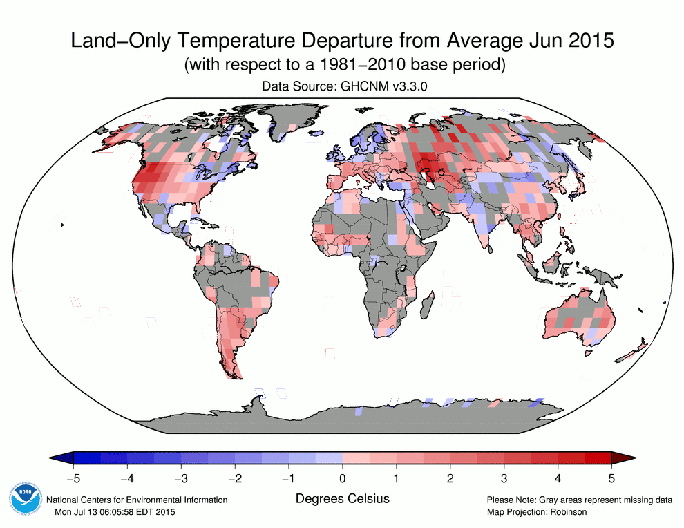
As you can see, most of their land data is fake. Then these fraudsters declare it to be the hottest month on record by a couple of hundredths of a degree.
Your tax dollars at work by climate criminals pushing propaganda for the White House.

hat does it take to be “measured?” I noticed Gabon is in grey. Yet, I know that the coastal and inland airfields had daily weather reporting whan I wa there. What gives?
This may be difficult to believe, but just because the measured temperatures are available, that does not mean that they are used. Check this old post from E.M. Smith (2009) on how the figures for cooler and mountainous regions of South America are ignored and then infilled with temperatures more, uh, favorable to CAGW.
https://chiefio.wordpress.com/2009/11/16/ghcn-south-america-andes-what-andes/
To the best of my knowledge (and someone PLEASE inform me if they know otherwise!) there has never been a clear accounting of why some temperatures are dropped and then infilled with “estimates.” This is happening with greater and greater frequency even here in the US. According to some of Tony’s other posts, even the US reports are generated from almost 50% imaginary figures.
Hey, Jason. To the best of my recollection, they have cited a supposed surplus of stations over what they say is statistically necessary, and that they supposedly don’t have enough money to maintain the numbers of stations that they have in the past. Of course, even if that were true, it still doesn’t come close to justifying adding made-up numbers into blank records that used to represent stations that have been dropped. In no other “profession” could this level of fraud be gotten away with.
But Jason, isn’t it interesting that even with all those imaginary “estimates”, they still need to falsify all the rest of the data in order to show warming?
Doesn’t that make you think that the actual global mean temperature might just be plummeting to lows not seen in decades?
Perhaps the satellite data, which also get adjusted, are also off-kilter!
With the increase in sea ice, it makes me wonder why no effort is made to incorporate into the databases the surface temperatures as measured on top of this ice. Obviously Argo cannot be used in locations covered with ice, and even if it were, its “surface temperature” measurements would be spurious because they would be taken under the ice, insulated from all that cold air!
What I would really like to see is this. 300 thermometers in the polar regions, evenly spaced over land and water. (Water stations to be on anchored buoys.) 150 north of 60N, and 150 south of 60S. Then we put together a database that includes just these stations, and no other data. No Argo, no satellites, no surface stations at other latitudes, no readings from ship engine cooling water, no nothing. Just those 300 thermometers, transmitting by encrypted radio signal with a private encryption key so that the warmists cannot interfere by forging the data transmission, or at least if they do, we might know about it. The stations to record and transmit a reading once every two hours. In those few locations where there would be a human volunteer residing, the readings can be stored up for a day or two and then transmitted manually via whatever type of telecommunications is readily available.
Once every three years or so, we make a trip to the stations that are having problems so we can repair or replace equipment as necessary.
I wonder how much that would all cost. It would be expensive, however … I just wonder if it might just be within the reach of a sufficiently large group of us. (Say, two million regular contributors.)
These are the kind of things I wonder about as I watch everyone do not much besides analyzing data that we already know to be either fabricated or, in the case of satellites, subject to adjustments that are, at best, questionable.
RT
Hey Richard! thanks for the feed back. You say, “To the best of my recollection, they have cited a supposed surplus of stations over what they say is statistically necessary, and that they supposedly don’t have enough money to maintain the numbers of stations that they have in the past.”
I am not really impressed with the clarity of their explanations. I find them unconvincing. For example, it may very well be true that they have more stations than statistically needed. But what about the second half of that explanation, that they don’t have enough money to maintain stations? To me that does not make sense. Imagine a doctor who is telling you that you desperately need a life saving operation. He tells you that the latest CAT scan shows serious anomalies, but then casually mentions that the test equipment is KNOWN to be bad and unreliable. That is roughly what the CAGW “scientists” are doing when they allow bad sites to be used. If they were really scientists, they would demand that the stations be well sited and well calibrated before making predictions that will require a response guaranteed to throw much of humanity into poverty.
Again, here is E.M. Smith re GISS cooking the books. If I recall correctly, all of the stations reporting from Bolivia (which is mostly high mountains and the altiplano) were dropped from the mix, in spite of the fact that the data was still available. Bolivia’s temperature was then infilled based on data coming from coastal South America.
https://chiefio.wordpress.com/2010/01/08/ghcn-gistemp-interactions-the-bolivia-effect/
Likewise, most of California (much of which is mountainous) was dropped until there were four stations left, mostly on the coast.
https://chiefio.wordpress.com/2009/10/24/ghcn-california-on-the-beach-who-needs-snow/
You mean we have billions of dollars for so-called climate study, but out of that we can’t afford to maintain some reliable weather stations? That notion smacks of fraud right from the beginning.
Hey Andy! “You mean we have billions of dollars for so-called climate study, but out of that we can’t afford to maintain some reliable weather stations? ”
Well, uh, YEAH! 🙂
Seriously, one of the things that pushed me decisively over the edge as a sceptic was the official response to the national site survey of stations that Watts and so many volunteers did years back. I was flabbergasted at the overwhelming number of really, really bad stations. “Holy cow! When the word gets out on this, the climatologists will demand that we get the reporting station upgraded! No way can they let this go on!” Instead, the response from the official climatologists was a yawn and a hand wave and a claim that “we can adjust those errors out, no problem…”
WHAT?! WHAT?! What kind of scientists responds to a documented corruption of data with a yawn? The answer, of course, is that NO scientist responds that way. When it comes to CAGW, what we are dealing with is not science.
What? Stalin lied?
https://dl.dropboxusercontent.com/u/10640850/STALIN'S_SCIENCE.pdf
Stalin’s climatologists obviously deserve Nobel Prizes, too!
Nothing that a bit of “Krigging” AKA “Making Stuff Up” won’t fix.
One says “Land-Only” the other says “Land & Ocean”. Land-Only seems the least pixilated. So to be clear, where the shading is grey, that means there is no data from there yet the Govt is “in-filling” with made up data? Thank you,
“The animation below flashes between the land portion of NOAA’s global temperature map, and their actual measured regions of temperature. Missing areas (like most of Africa, Greenland, Antarctica and Canada) are gray.”
Yes, I read that, but the 2 graphs are labeled differently when they flash from one to the other. Again, one graph is labeled “land only” and the other is labeled “land and ocean”?
NOAA: A bureaucratic liars club–“Making up data is what we do….”
And we are expected to believe this instead of satellites measuring the entire Lower Troposphere..
LMAO..
It doesn’t matter that the land data is fake. Most of the AGW heat is going into the oceans, because water has a higher specific heat than air. The CO2 produced by humans traps photons of infrared and sends it right into the oceans, which are all pier reviewed at Santa Monica Pier, Ocean City Maryland Pier, and the Steel Pier in AC on the Jersey shore.
Reblogged this on Climatism.
Reblogged this on 4timesayear's Blog.
Reblogged this on Climate Collections.