
In 1978, every data source showed that earth had been cooling for 30 years.
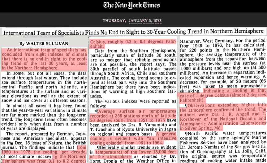
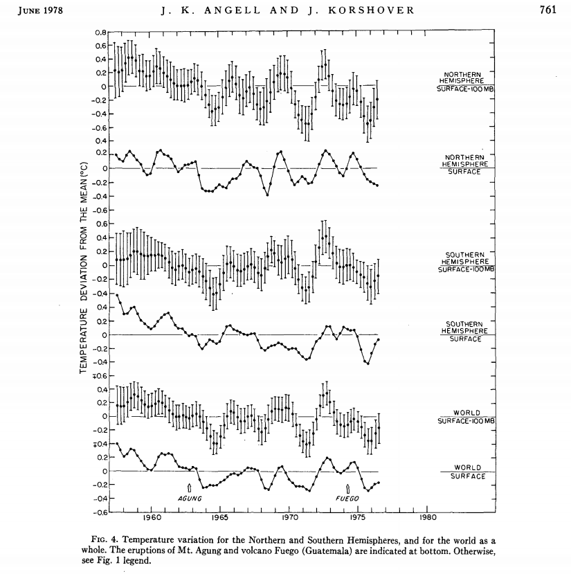
NOAA showed significant cooling at all latitudes, and all levels of the atmosphere.
journals.ametsoc.org/doi/pdf/10.1175/1520-0493(1978)106<0755%3AGTVSMA>2.0.CO%3B2
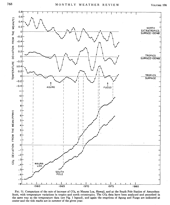
NOAA showed that temperatures were decreasing, as CO2 was increasing.
There wasn’t any doubt that Earth was cooling, but this cooling was not wanted by Al Gore and Barack Obama – so their government agencies simply made the cooling disappear.

What’s Up?
Many of us suspect something, but none of us know what.
See Jeff Condron’s blog: What’s Up? https://noconsensus.wordpress.com/2015/09/08/a-solution-to-success/
We may be witnessing an approaching battle between:
1. The selfish human forces that have historically battled each other for control of the world, and
2. The benevolent but powerful real force that created and sustains every atom, life and planet in the solar system.
Are CERN physicists being used to distract attention from the battle?
Very nice early representation of dCO2/dT. Even then it was obvious that temperature has a great impact on dCO2.
This site seems to have contracted a bad case of “VD”. On the bright side, it would seem to indicate that the information posted here bothers some people enough that they feel they have to try to discredit it. But it is tiresome. That’s ok. This too shall pass.
The blog has had 200,000 page views and 140,000 unique visitors in the last 24 hours.
Some are more unique than others. 🙂
For example a peculiar alarmist troll or a troll collective going by the name of Vending Cart or something. It may be responsible for a plurality of the difference between 200,000 and 140,000 …
You are getting under their skin.
Well done, SG
The more people that read the blog, the more people will see the moronic stupidity of VD and his paid climate cohorts, and realise just how much they have been conned by the whole “global warming/climate change/whatever” SCAM !!!
This topic especially has bought the climate scum out from under their rocks 🙂
climate scum, i like that one 🙂
I’ve had a couple of unexplained spikes in activity too. I wonder if it’s some kind of DDOS.
The September scam summit commeth and the storm troopers are out in full force.
https://www.youtube.com/watch?v=lfGZHHXiUYQ
Should have said “Brown Shirts”.
Reblogged this on WeatherAction News and commented:
Hubert Lamb said “account must be taken of psychological reactions—even in the influential research community—to the variations towards greater or less warmth as and when they occur.” I don’t think he had the goalposts being moved like this in mind though.
Have you had a chance to look at the IP addresses of your new found fans, Steven?
Alarmist propaganda denies the significant cooling that took place between and 1940 and 1979. Thanks for reminding us (and them) that the cooling did take place, even though C02 was rising during that entire time. No prettied up doctored chart will ever change that fact.
I came of age (outside of Pittsburgh) during the 1950s – 1970s period. What I experienced was my normal as there was nothing else to compare it to. We had very cold winters with great amounts of snow. We had a blast and basically lived outdoors in it as much as we were able. (The “wind chill” metric had not yet been established so we didn’t actually know how cold it really was:) But then the summers were usually also very hot. I remember more 100 degree days back then than anything I’ve seen in the last couple of decades.
In the mid 1970s things started to change. Initially I noticed we had more mixed days in winter where we would be hit with ice storms more than snow storms. Then, all at once, the winters of 76-77, 77-78, and 78-79 once again became very brutal and long. We set all-time cold records in the winter of 76-77 (where the frost line went more than two feet underground and gas lines were at risk) and then snow accumulation records in 77-78.
Just an off thought, I believe that when ever we are in the process of a phase change in the PDO (maybe also AMO) we experience much more volatile weather than when we are firmly established in one of its stable regimes.
http://link.springer.com/chapter/10.1007/978-94-010-1729-9_11
Since 1940, the effect of the rapid rise of atmospheric turbidity appears to have exceeded the effect of rising carbon dioxide, resulting in a rapid downward trend of temperature. There is no indication that these trends will be reversed, and there is some reason to believe that man-made pollution will have an increased effect in the future.
—–
http://journals.ametsoc.org/doi/abs/10.1175/1520-0469(1976)033%3C2094:ANEMOH%3E2.0.CO%3B2
By more completely accounting for those anthropogenic processes which produce both lower tropospheric aerosols and carbon dioxide, such as fossil fuel burning and agricultural burning, we calculate an expected slight decrease in surface temperature with an increase in CO2 content.
—–
http://www2.meteo.uni-bonn.de/bibliothek/Flohn_Publikationen/K227-K255/K242a.pdf
Since about 1945 [to 1974], global cooling, on a scale of -0.01°C/yr, has reversed the warming trend of the first decades of our century. The bulk of these changes is probably not man-made, but of natural origin. … A large majority of the participants of the symposium concluded that the present warm epoch has reached its final phase, and that—disregarding possible man-made variations are comparable in scale with the effects–the natural end of this interglacial epoch is “undoubtedly near.” The time – scale of this transition may be a few millenia, perhaps only centuries.
—–
http://journals.ametsoc.org/doi/pdf/10.1175/1520-0477%281970%29051%3C0403%3ALESTTL%3E2.0.CO%3B2
Evidence suggests that lake effect snowfall has significantly increased during the past several decades, particularly in Southern Michigan and Northern Indiana. While the observed changes cannot be definitively ascribed to any single factor, it seems likely that a general cooling of winter temperatures may be partially responsible for this climatic change. [M]any of the snowfall time-series curves for the lake stations show downward trends during the 1920’s and 1930’s, at the height of the recent warm period, and the more recent snowfall increase has coincided with a general world-wide cooling which has occurred in the last several decades [1940s-1970s]. Recent evidence derived from [isotope] analysis of ice core samples on the Greenland ice cap indicates a continuance of this cooling trend for another 20 or 30 years [through the 1990s].
—–
http://www.sciencemag.org/content/173/3992/138.short
It is found that, although the addition of carbon dioxide in the atmosphere does increase the surface temperature, the rate of temperature increase diminishes with increasing carbon dioxide in the atmosphere. For aerosols, however, the net effect of increase in density is to reduce the surface temperature of Earth. Because of the exponential dependence of the backscattering, the rate of temperature decrease is augmented with increasing aerosol content. An increase by only a factor of 4 in global aerosol background concentration may be sufficient to reduce the surface temperature by as much as 3.5 ° K. If sustained over a period of several years, such a temperature decrease over the whole globe is believed to be sufficient to trigger an ice age.
—–
http://onlinelibrary.wiley.com/doi/10.1111/j.1502-3885.1972.tb00145.x/abstract
A new glacial insolation regime, expected to last 8000 years, began just recently. Mean global temperatures may eventually drop about 1 °C in the next hundred years.
—–
http://www.nature.com/nature/journal/v237/n5355/abs/237385a0.html
The climatic warming trend since the 1880s, which seems to have been global in extent and was manifested by an upward trend in mean annual (and particularly mean winter) temperatures, seems to have given way since the 1940s to a cooling trend, which is most marked in higher latitudes.
—–
http://www.sciencedirect.com/science/article/pii/0033589474900027
A review of selected literature on latitudinal climatic shifts and atmosphere-ocean interaction suggests some similarities between the patterns of climate in the 1960s and the climate of the Little Ice Age
—–
http://journals.ametsoc.org/doi/abs/10.1175/1520-0477%281980%29061%3C1356%3APCCAAP%3E2.0.CO%3B2
Evidence has been presented and discussed to show a cooling trend over the Northern Hemisphere since around 1940, amounting to over 0.5°C, due primarily to cooling at mid- and high latitudes. Some regions of the middle latitudes have actually warmed while others, such as the central and eastern United States, have experienced sharp cooling. A representative station for this latter region is Lafayette, Ind., which has recorded a drop of 2.2°C in its mean annual temperature from 1940 through 1978. The cooling trend for the Northern Hemisphere has been associated with an increase of both the latitudinal gradient of temperature and the lapse rate, as predicted by climate models with decreased solar input and feedback mechanisms.
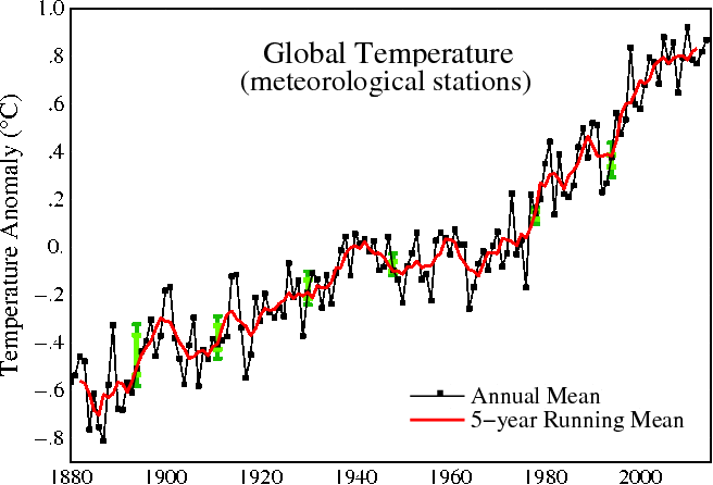
If we take GISTEMP LOTI Global mean…
You need a running mean of 60 months to transform 1957 to 1977 in a positive trend.
If you take the monthly data the negative trend you show in the first graphs is still there.
http://www.woodfortrees.org/plot/gistemp/mean:12/plot/gistemp/from:1957/to:1977/trend/plot/gistemp/mean:60/plot/gistemp/mean:60/from:1957/to:1977/trend
The top graph seems to show around 21 points per 5 years. so around 4 points per year or quarterly data…. so we could do a 3 month running means to see if the trend is still there between 1957 and 1977.
It’s still there and clear: http://www.woodfortrees.org/plot/gistemp/from:1957/to:1977/mean:3/plot/gistemp/from:1957/to:1977/mean:3/trend
So not sure this is a smoking gun… at least not with GISTEMP and this timeframe.
Yes, but an eyeball fit of the “world surface” data in the first graph of the main post shows a drop of about 0.4C to 0.5C over that period..
While your GISS graph shows a drop of about 0.04C or 0.05C
They have flatten the cooling trend by a factor of 1/10. !!!!
Thanks for bring that to our attention ! 🙂
Sorry, that was badly stated in the 2nd last sentence..
They have FLATTENED THE COOLING TREND TO 1/10 OF THE ORIGINAL !
That reads better, I think.
Also gives me a chance to reiterate the point . 🙂
Andy… here’s what I did to be more precise…
1) took figure 4 of top PDF (last graph world surface)
2) used this web site to extract data: http://arohatgi.info/WebPlotDigitizer/app/?
– Quite cool app… just found it now!
3) entered in a spreadsheet both original (1978) and GISTEMP (woodfortrees) and compared trends
I came up with a trend difference of 5.3x less today than from the 1978 data.
See: https://drive.google.com/open?id=0B7_OTN2MylIESU1LQUM0VnU5WDA
So this is how you can convince people of data manipulation…. with proper analysis… but it takes a bit of time 😉
Thanks for the comment… 😉
No problem.. I have digitisers at work.. but I try not to bring work home with me. 🙂
As SG knows, all you can do is just keep poking the data with a stick.
Shove the reality of the fraud in people’s faces.
Eventually the message slowly gets out..
….especially when the malignant trolls start trying to hound the site.
If they are here.. it means that people are getting the message ! 🙂
Tweeted with an updated graph: https://twitter.com/SimonFili/status/642285292892889088
Hope you don’t mind, I have posted links to this interchange on Notalotofpeopleknowthat, and sent a link via email to JoNova
My pleasure to be of service in the name of reason 😉 Love the work of Jo… Thanks
Jo’s cool, but sometimes gets upset with my aggressive, non-PC language towards climate twits.
I try to behave myself when I’m there. 🙂
Reblogged this on Climate Collections.