
Joe Bastardi tweeted this NCEP analysis to me, and alarm bells immediately went off in my head. The 1953 NCEP map is nonsense.
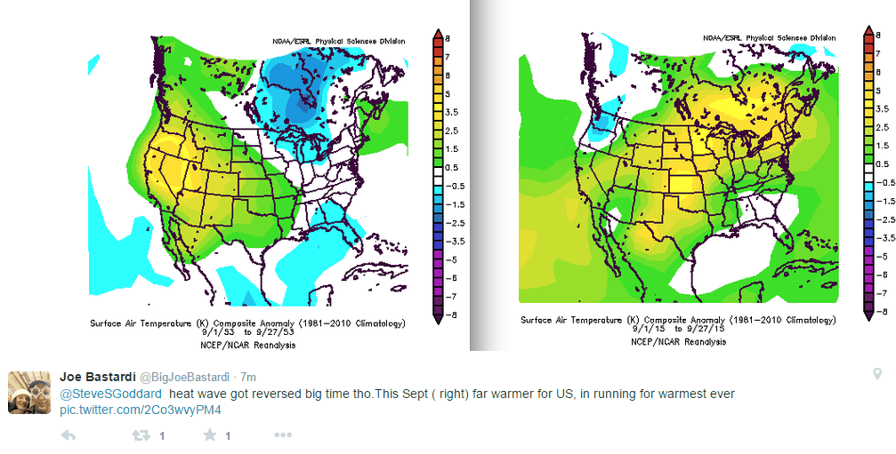
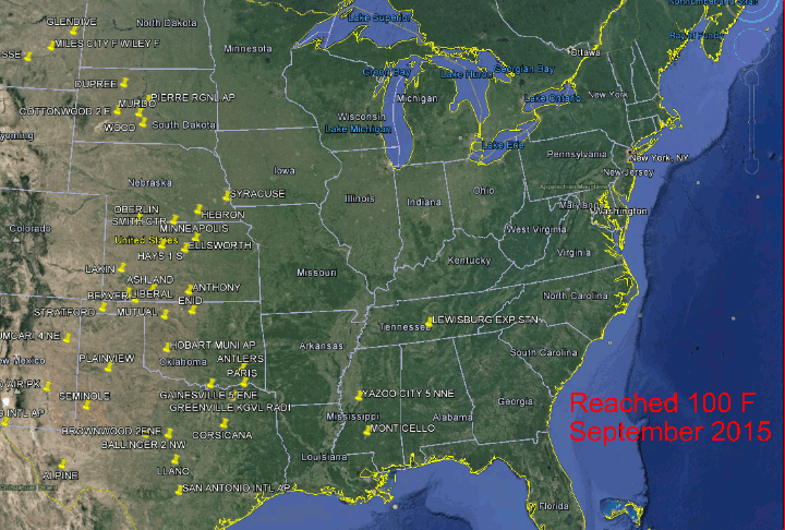
September, 1953 was an incredibly hot month in the eastern US, from start to finish. Most of Illinois and Indiana were over 100 degrees on this date in 1953.
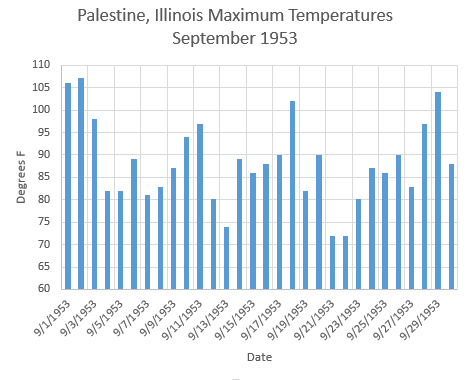
Maximum temperatures during September 1953 averaged six degrees warmer than this September. Yet NCEP says this year is hotter.

September, 1953 was much hotter than this September.
What is going on?

Yeah, that’s what happens when you adjust the past cooler and cooler and cooler. Before you know it we will discover that most of the state all time high temperature records from way back in the 1930s were set during sub-zero blizzards.
CO2 has amazing properties…its able at a moments notice, to go back in history and adjust temperatures!
It’s a real actual problem for researchers. If the “data” you are using is garbage, adjusted for political reasons, your research is garbage. Then more research is done using garbage research, and at some point, research is being done of fictional data, and something breaks.
You have that correct. The CO2, temperature and sea level data is all badly corrupted so none of the research relying on those data sets is valid.
I think the Ocean Acidification data set has also been mangled and L.S. & friends are busy revamping the solar data.
You can see the evidence in the charts from solen
It truly is frightening to see this sort of thing. Especially when the corruption is also happening in medical research
I read a LOT of scientific papers, especially ones regarding climate and changes in weather patterns, really all sorts of things. Researchers using the NCEP–NCAR reanalysis are screwed if it is changed, especially if it’s changed for political reasons. In fact, it’s not even science if the data isn’t real.
Joe HAS to be seeing more stuff like this all the time the way he and his team scour the records to help them make their wonderful forecasts. He and his colleagues sure know the weather history as far as what the records say. Demonstrated about every Saturday on his Summary video.
What is going on?
The run up to Paris where the Paris-ites screw over the Western countries. Note how they managed to oust Australia’s realist Prime Minister Just-in-time.
How many different global scandals can we get in one week?
As many as it takes to keep the Sheeple’s attention off the closed door meetings where their fates are being decided.
Joe Bastardi is saying you folks on the east coast from NC northward had better be paying close attention to Hurricane JOAQUIN. This is serious stuff. Check out his daily update video today. http://www.weatherbell.com/
If he’s right our string of no Major hurricanes hitting the US is about to end and possibly in a very big way!
Oh crap! September/October is the fair/festival are our big money makers that buys my winter hay. This is the second week of cancelations….
At least I did not get the winter rye down yesterday as I planned.
September/October is the fair/festival season our big money makers
One of these days I will learn to poof reed
Its just like the record Great Lakes ice in years NCDC insists are near average. Not plausible!
BTW, don’t know if you’ve done a post with just those stations, but it would be awesome.
*near average for the Great Lakes region, I should have specified. Also (obviously) that was for the winters, not the years.