
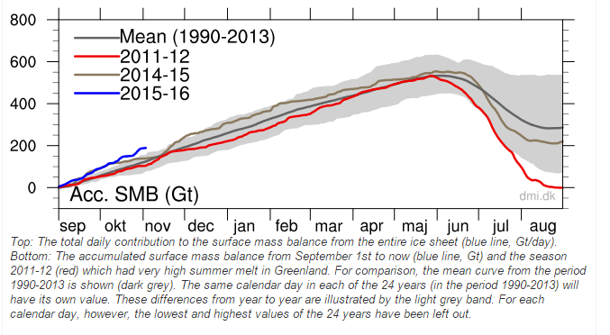
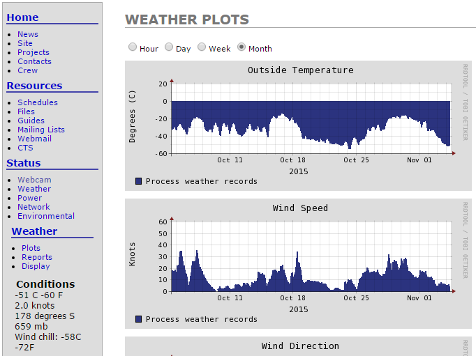
Ice growth in Greenland continues at record levels this fall. The surface of Greenland has gained 200 billion tons of snow and ice in the last eight weeks. This has been accompanied by record cold weather approaching -60C.
Arctic sea ice extent is at a ten year high for the date, after record growth.

So how does the criminals in the press report on this? They say the exact opposite of what is going on.
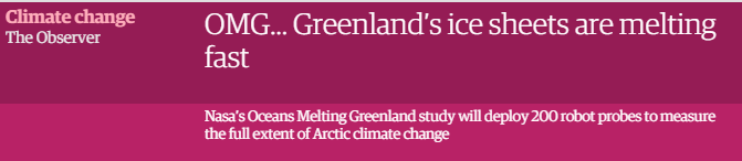
OMG… Greenland’s ice sheets are melting fast | Environment | The Guardian
Temperatures were -40C on the Greenland Ice sheet the day (October 27) that the New York Times wrote this article.

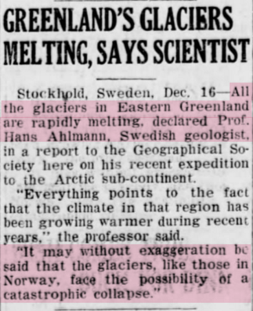
Scientists have been recycling the same stories about Greenland Glaciers collapsing, generation after generation.
It is all total nonsense, intended to get you to throw away your money and freedom. Even the most exaggerated claims of ice loss in Greenland would require 15,000 years for all the ice to melt.

have you got the third graph but superimposed with the 1990-2013 mean and standard deviations please?
These aren’t my graphs. They are taken from the DMI web site.
You are still using the wrong graph, Steven. By now you know you are misleading your readers, so please correct it. You deleted this line: “Please notice, that the sea ice extent in this plot is calculated with the coastal zones masked out. To see the absolute extent, go to this page.” You must include the coastal zones, Steven. When you do, you get a more correct graph. This is the more correct graph: http://ocean.dmi.dk/arctic/icecover.uk.php
As you can see on the more correct graph, the current sea ice extent remains 2 standard deviations below the mean. It means your title of this blog post is false. Below that graph is this statement, which you are deliberately ignoring: “The plot above replaces an earlier sea ice extent plot, that was based on data with the coastal zones masked out. This coastal mask implied that the previous sea ice extent estimates were underestimated. The new plot displays absolute sea ice extent estimates. The old plot can still be viewed here for a while.”
You are still trying to use the old plot, which the Denmark Meteorological Institute says is wrong. In fact, why not use the NSIDC graph, which uses the more common 15% base. It is found here: http://nsidc.org/arcticseaicenews/
It also show the sea ice extent to be 2 standard deviations below the mean.
What makes 1979-2000 meaningful?
It is the correct graph, which shows the more meaningful measure of 30% ice. Your FUD is disgusting.
In manufacturing, 2 Std. Dev. below the mean is called ‘normal’.
And in Climastrology, 1979 is considered “normal”. Weird Science.
“What makes 1979-2000 meaningful?”
The fact that 1979 was the bottom of the AMO cycle.
We have just gone over the top of the AMO cycle..
Arctic sea ice will now gradually start to increase year by year, and won’t it be fun watching the fraudulent claims of the AGW cultists get shriller and shriller as they do everything they can to keep twisting the reality to their agenda.
You can see the effect of the AMO in many places up north..
https://notalotofpeopleknowthat.files.wordpress.com/2012/11/image_thumb6.png?w=404&h=312
Here is another graph that very clearly illustrates why the average dullard propaganda alarmista absolutely MUST start their reference period in the late 1970’s
https://wattsupwiththat.files.wordpress.com/2015/09/clip_image004.png
Pretty uncanny match hey.
Gees, maybe there’s a NATURAL CYCLE somewhere. ;-0
http://s19.postimg.org/qzl5p322b/Rey_vs_Ross.jpg
ps.. that’s just an eyeballed red line.
AndyG, those are a pretty good match for the ~88 year Gleissberg solar cycle. The earth should be coming off peak in the next five years or so.
A few peer-reviewed papers just for Martin on the Gleissberg cycle and ‘the ~ 208 year-cyclicity, named de Vries or Suess cycle’
This has Dr Feynman’s Sister Joan Feynman as co-author.
Is solar variability reflected in the Nile River? “…We identify two characteristic timescales in the records that may be linked to solar variability: a period of about 88 years and one exceeding 200 years. We show that these timescales are present in the number of auroras reported per decade in the Northern Hemisphere at the same time….”
NASA pop sci write up of same paper:News | NASA Finds Sun-Climate Connection in Old Nile Records
Persistence of the Gleissberg 88-year solar cycle over the last ?12,000 years: Evidence from cosmogenic isotopes
This is a nice study with active links to other papers.
Strong evidence for the influence of solar cycles on a Late Miocene lake system revealed by biotic and abiotic proxies
This is a new one for me.
Possible solar origin of the 1,470-year glacial climate cycle demonstrated in a coupled model
And this one from Nature is a real goody:
Paired oxygen isotope records reveal modern North American atmospheric dynamics during the Holocene
Something I’ve noticed with scientific studies, papers and reports, is that due to the process, they are always behind the present.
You are still using the wrong graph, Steven. By now you know you are misleading your readers, so please correct it. You deleted this line: “Please notice, that the sea ice extent in this plot is calculated with the coastal zones masked out. To see the absolute extent, go to this page.” You must include the coastal zones, Steven. When you do, you get a more correct graph. This is the more correct graph: http://ocean.dmi.dk/arctic/icecover.uk.php
As you can see on the more correct graph, the current sea ice extent remains 2 standard deviations below the mean. It means your title of this blog post is false. Below that graph is this statement, which you are deliberately ignoring: “The plot above replaces an earlier sea ice extent plot, that was based on data with the coastal zones masked out. This coastal mask implied that the previous sea ice extent estimates were underestimated. The new plot displays absolute sea ice extent estimates. The old plot can still be viewed here for a while.”
You are still trying to use the old plot, which the Denmark Meteorological Institute says is wrong. In fact, why not use the NSIDC graph, which uses the more common 15% base. It is found here: http://nsidc.org/arcticseaicenews/
It also show the sea ice extent to be 2 standard deviations below the mean.
NSIDC: It is within 2 deviations, you better check more carefully next time…
DMI: The grey area is 1 standard deviation not 2…
Ok, Morgan, it is nearly two standard deviations below the mean, which means Steven’s claim is wrong. Thanks for the tip on the Danish graph. However, it still indicates the current extent to be more than 1 standard deviation below the mean, which still means there is no record sea ice comeback.
UH DUH… you know what you can do with your deviations…. your assumption he is misleading is disgusting….especially after the INCREDIBLE lies promoted by your “team”. Do you have input on the NASA study about Antarctica as well? Or the fact the shills knew the Ice shelf was nothing to do with climate? We were LIED TOO over and over and over again… the theory is now a hard shelled turd…it’s dead, give it up. And calling it theory is giving it too much credit…
A failed idea.. still born except for the massive funding used to artificially keep it squirming.
rip, I do have input on the NASA study about Antarctica, but it isn’t the subject of this thread, so I won’t fall for your troll. I will say I’m glad to see you throw in the towel so quickly.
Gator, the mean you call meaningless is the one even Steven Goddard uses. The fact that the current level is nearly 2, or more than 1, standard deviations below the mean proves that Steven Goddard’s claim (as expressed in the title of his blog post) is false.
No dummy, he uses that graph with the meaningless mean already establsihed.
What makes 1979-2000 meaningful?
Within two standard deviations of a meaningless mean.
Gator
Martin wouldn’t know a Standard Deviation if it bit him on the ass.
BYTB, Steven are you sure this isn’t David the Appalling?
Sure sounds like him.
Martin Smith says:
November 5, 2015 at 1:57 pm
Gator, the mean you call meaningless is the one even Steven Goddard uses.
I’m wondering who reads to him, and who takes his dictations. Whoever it is missed the second comment on the thread…
stevengoddard says:
November 4, 2015 at 11:30 am
These aren’t my graphs. They are taken from the DMI web site.
You cannot fix stupid.
Gator, it is even harder to fix deliberate malicious lying for gain.
We certainly have a great example of that problem siting in D.C. (District of Criminals.)
Your comments about Greenland are also deceptive. The trend for the Greenland ice sheet is ver definitely down. It is shown in this graph from NOAA: http://www.arctic.noaa.gov/reportcard/images-essays/fig3.3-tedesco.jpg
Sorry, the discussion of the Greenland trend is found here: http://www.arctic.noaa.gov/reportcard/greenland_ice_sheet.html
Why not head over to Hot Whopper and peddle your lies there, Martin?
People here are wise to your phony BS.
You and the rest of the climate liars have been do your best to deceive the whole world for years and years, but now the entire warmista scam is falling apart.
Every one in the world will know the truth soon, so you should maybe try a little CYA, instead of doubling down.
Based on the same incorrect gravity interpretations which NASA just debunked in Antarctica.
In addition, note the referenced article also relies on the MODIS data to claim record low albedo.
The MODIS data were also very recently determined to be faulty. The lowered albedo detected by MODIS was due to sensor degradation rather than a darkening of the surface due to soot, volcanic dust, flying reindeer poop, etc.
Based on these two CRITICAL flaws in the paper I do not think that this is a reference worthy of citing.
The DMI graph That SG put is correct and shows that ice mass and 30% extent which is MORE accurate than the 15% *thin ice DMI graph. Its shows HIGHEST extent for 12 years was reached yesterday. Greenland mass is increasing he is also correct and you are just pushing the fraudsters aqgenda because this site is doing irreparable damage to your criminal intents. Check Paraguay temperature adjustments Paul Homewood for irrevocable proof of massive fraud by your pals. Its only a matter of time before serious prosecutions will start against Shuckla et al
When we don’t even have accurate measurements, arguing science is futile. It’s a travesty we can’t measure everything, considering the amount of money and resources wasted on unimportant crap every single day.
Heck the USA spends Trillions on ‘Climate Change’ and cant even bother to install accurate calibrated thermometers correctly! This tells you that it is all hype or more care to do the measurements would have been taken. Then NOAA yaps about a delta 0.026C as ‘highest temp evah’
Remember the USA has the ‘best’ quality data and it sucks big time since the accuracy is only ~ 2C.
http://www.surfacestations.org/Figure1_USHCN_Pie.jpg
Climate Reference Network Rating Guide – adopted from NCDC Climate Reference Network Handbook, 2002, specifications for siting (section 2.2.1) of NOAA’s new Climate Reference Network:
Class 1 (CRN1)- Flat and horizontal ground surrounded by a clear surface with a slope below 1/3 (<19deg). Grass/low vegetation ground cover 3 degrees.
Class 2 (CRN2) – Same as Class 1 with the following differences. Surrounding Vegetation 5deg.
Class 3 (CRN3) (error >=1C) – Same as Class 2, except no artificial heating sources within 10 meters.
Class 4 (CRN4) (error >= 2C) – Artificial heating sources <10 meters.
Class 5 (CRN5) (error >= 5C) – Temperature sensor located next to/above an artificial heating source, such a building, roof top, parking lot, or concrete surface.”
Martin Smith – why don’t you try fighting for something meaningful – This man is not misleading anyone, if anything he is correcting the tampering, the flagrant and idiotic press, the government shills called “climatologist”… Your “Team” (and that’s all you care about) was WRONG – making public policy and tons of cash of an overfed and under-read people is disgusting. Go sell your snake oil and your adjustments somewhere else…. I am sure you dispute the shortest melt season too, and I am sure you can come up with a global warming “cause” for this – the “theory” you promote, is a joke, can’t be falsified, as we are constantly told “just wait” and boy it will get hot..and sea level will rise, someday…..great theory… I am sure you can become a Gore Bot and go out an preach somewhere else…may I suggest California?
I think there might be some confusion over exactly what the SMB graphic represents. This statement appears on the DMI site
For an ice sheet that neither grows or shrinks, there is at all points averaged over the year a balance between
. the amount of snow that falls and is compressed to ice
. the amount of snow and ice that melts or evaporates (sublimates) and
. the amount of ice that flows away due to the ice motion
The two first contributions make up the surface mass balance. For the ice sheet as a whole, there is a balance between the surface mass balance and the amount of ice that calves into the ocean as icebergs.
The graphs clearly don’t include ice that calves into the ocean so it’s not possible to say whether or not Greenland has gained ice this year.
The Greenland Graph as PRESENTED is perfectly clear.
the legend says:
We can read you know.
Quite – but the surface mass balance only takes into account the amount of snow which falls and is compressed as ice versus the ice and snow which melts or evaporates. It does not take into account ice which is lost through calving
Read this guest post by 2 DMI scientists
http://www.carbonbrief.org/guest-post-the-state-of-the-greenland-ice-sheet-in-2015/
which includes this
and this
It looks likely that Greenland is still losing ice.
SIGHHHhhhhh,
We understand calving. It is a function of the amount of snow, the steepness of the angle, geothermal melting from the earth (Like in Antarctica) and other geologic features.
HOWEVER Greenland is shaped like a bowl with teeth.
http://www.livescience.com/images/i/000/056/407/original/Greenland3.jpg
You are also setting up a strawman. The subject is an INCREASE IN FRESH ICE!
If the amount of FRESH ICE is increased year on year, aka ICE GROWTH, then you do not have Gore Bull Warbling and that is the point Steven is getting across.
Dance around the subject all you want Finn but fairly soon Mother Nature is going to slap everyone up side the head with the fact the earth is cooling not warming. Storms dumping 6 feet or more snow on cities like Buffalo, Boston and in the Greek Islands. (6 1/2 feet last year) Great Lakes that ice over and do not thaw completely until mid June. Rivers and shores that freeze all the way down to Washington DC and even further south. (Jordan lake in NC had a skim of Ice last year) These facts are going to wake people up ESPECIALLY when accompanied by frequent blackouts caused by idiot politicians and the likes of the EPA.
https://i0.wp.com/3.bp.blogspot.com/-7BTnRqeqVxo/Usw2ugazZ8I/AAAAAAAA2Vw/Up68eQgj6Aw/s320/mother_nature_denies_global_warming.jpg
Good – then you’ll understand it can cause loss of ice from the ice sheet. This loss is not included in the SMB graphic. It’s not just mean saying this – it’s DMI scientists, i.e. the people who present the data. Why don’t you SIGHHHHHH at them – or better still why don’t you just admit that the SMB graphic doesn’t provide a true representation of Total Mass Balance
Huh? What on earth are you on about? There’s fresh ice every year. Fresh ice is forming in the Arctic at this very moment. According to you, Steve’s main point seems to be that precipitation in Greenland was higher in 2015 than in some previous years.
So what?
And why don’t you understand this is about SNOW and ICE formed THIS YEAR!
If you don’t like the info on Greenland how about Scotland where baby glaciers are starting to form? August 24, 2014 Surprise! Glaciers appearing in Scotland
According to the BBC;
This year was even worse.
https://weatheraction.files.wordpress.com/2015/08/wpid-scottish_snow_patches_20150827t140213.jpg
or the Great Lakes which have had record ice the last two years.
https://stevengoddard.files.wordpress.com/2015/04/screenhunter_8624-apr-16-07-01.gif
or the Northern Hemisphere Snow cover that has also been at record levels.
https://i1.wp.com/realclimatescience.com/wp-content/uploads/2015/06/ScreenHunter_2301-Jun.-07-09.15.gif
Is there ice in the Arctic – yes
Is there ice in the Antarctic – yes
Climate debate over.
That is the definition of an Ice Age! OH MY GOODNESS the earth is in an ICE AGE!!!! whinge wimper sniffle…. CAGW is dead.
Reblogged this on Climatism and commented:
Antarctica ice mass rapidly growing, as confirmed by NASA, growth which would reduce the natural rate of global sea level rise.
Record ice growth and cold temperatures in the Arctic region.
And yet our Governments and the UN want to sign our freedoms and money away to stop ‘global warming’!?
We should be signing a climate treaty to forestall global cooling. It would make more sense based on observable, real-world evidence.
The USA even got rid of their strategic grain reserve so the Grain traders and Goldman Sachs can make more money off poor people.
http://articles.latimes.com/2012/sep/21/opinion/la-oe-kaufman-food-hunger-drought-20120921
http://www.cfr.org/united-states/fp-goldman-sachs-created-food-crisis/p24904
More indepth comments:
http://stevengoddard.wordpress.com/2014/03/18/bryan-walsh-hoping-to-be-the-next-paul-ehrlich/#comment-328523
https://stevengoddard.wordpress.com/2014/03/25/coldest-october-march-in-the-us-in-102-years/#comment-331925
John Finn says: “…Huh? What on earth are you on about? There’s fresh ice every year. Fresh ice is forming in the Arctic at this very moment. According to you, Steve’s main point seems to be that precipitation in Greenland was higher in 2015 than in some previous years.
So what?”
Are you really that much of a dimbulb?
The point is the AMOUNT. Snow falls every year in Scotland, Canada and northern USA but we don’t have a mile of Ice sitting on Chicago right now. GUESS WHY?
No it’s not.The point of THIS discussion was the surface mass balance on Greenland. It centred around the specific and valid point (made by me) that the surface mass balance does NOT represent the TOTAL mass balance.
DMI scientists make it clear that the surface mass balance increases most years – by an average of 290 Gt. The gain in 2015 was around 220 Gt. However, the losses from calving and melting at the edges usually mean that more ice is lost than is gained. In other words the Total Mass Balance will be lower.
Steve Goddard has consistently maintained that Greenland is gaining ice and has used the SMB to support his claim. If Steve was correct on this then Greenland would have been gaining ice in pretty much every year apart from perhaps 2012.
I think everyone obviously understands that SMB does not include calving. We also understand that calving is a result of geography, ice thickness and flow rate. Calving could even be influenced by geothermal melting of bottom layers. The important point is that even if total mass balance is negative, as long as SMB is positive then we do not have Greenland melting from radiative effects of CO2. Any melting from CO2 has to go through the surface first. If the surface is accumulating ice faster than it is melting or sublimating then we cannot blame ice loss on CO2.
As long as SMB is positive, blaming CAGW for ice loss is just a rerun of the same magical thinking that explained the pause by saying that the heat snuck through the atmosphere without warming it, and then made the oceans warm up.
Nicely said. Thanks Jason.
Also, ice lost through melting is counted against the mass balance, but much or all of this may just be refreezing underneath somewhere. In other words, it is counted as lost mass but may not be lost at all.
The article I got the ‘Bowl with Teeth’ from says Greenland, unlike Antarctica does not have lakes under the ice sheet. They think there is a drainage system (river) and that is why they do not find lakes.
Hey Gail!Interesting point you make. The density of ice is just over 90% that of water, so if the Greenland icecap is (just as an example) one kilometer thick, it would take 900 meters of water to float it and thus leave a lake at the bottom of the bowl. If the vertical distance from the bottom of the bowl to the lowest egress point out of the bowl is less than 900 meters, the ice will be permanently grounded without any major lakes. Over the long term, any melt water will either refreeze or will be drained out. Of course local or temporary lakes can still happen, but not large scale and long term.
The temp of the ice at depth is almost surely very close to the mean annual temperature for the location.
See what happens when you pour cold water onto a glass of ice fresh out of the freezer.
My freezer is set to -2 F. When I pour cold water into this ice, it quickly freezes right onto the ice.
So, several questions occur to me right off:
– What is the average annual temp on the ice sheet?
– What is the thermal conductivity of ice as compared to rock or dirt? (I suspect it is higher)
– What is the thickness of the ice where those
– What are the chances that cold water will get to the bottom of several thousand feet of ice, that is itself far below the freezing point, in the liquid state?
– Or, if it does somehow make it all the way to the bottom in a straight shot, that it will stay liquid for very long?
– Are there rivers emerging from under the ice sheet anywhere?
The NYT article states that the water pouring into the moulins emerges into the sea, but a quote form the article then states “They might even learn, Dr. Smith said, that the water is refreezing within the ice sheet and that sea levels are actually rising more slowly than models project”.
-How fast do the ice sheets deform?
– Are these moulins permanent, persisting in the same place from year to year?
– If not, how might it be known that they drain in the sea? That would be a very long tunnel through some very cold ice. The water is near freezing point to begin with.