
In 1999, NASA showed 0.6C warming from 1880 to 1997.
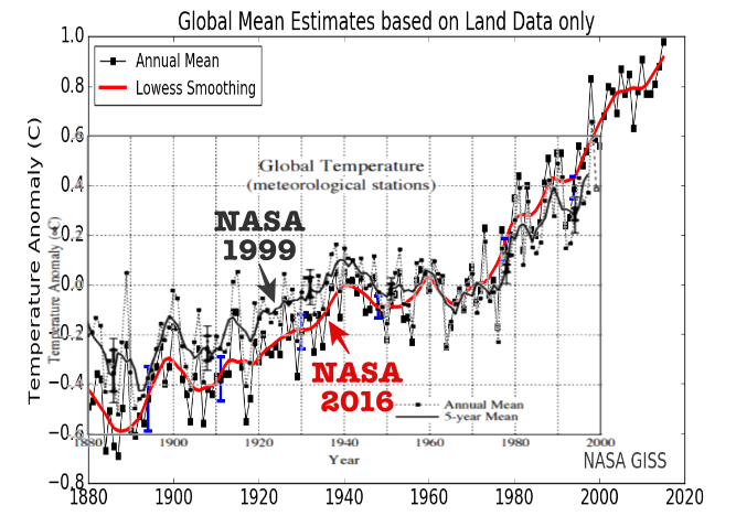
Now they show more than 1C warming from 1880 to 1997.
The graph below overlays the 1999 and 2016 versions, and shows how they cooled pre-1980 years and warmed post-1980 years.
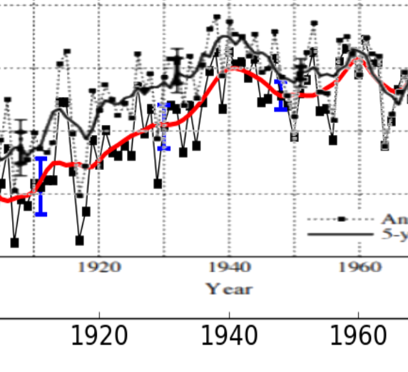
This closeup shows how they have altered their data outside of their own blue error bars. The data has been altered by almost 200% of the size of the 1930 error bar. No one outside of government would get away with such glaring malfeasance for very long.
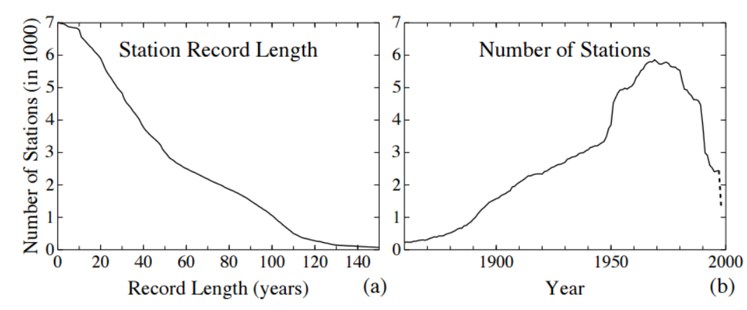
The current NASA graph shows a sharp warming after 1970. This coincides with 80% station loss after 1970. NASA is losing their cooler rural stations and skewing the data with hot urban stations. Also note that most of their remaining stations did not exist in the hot 1930’s.
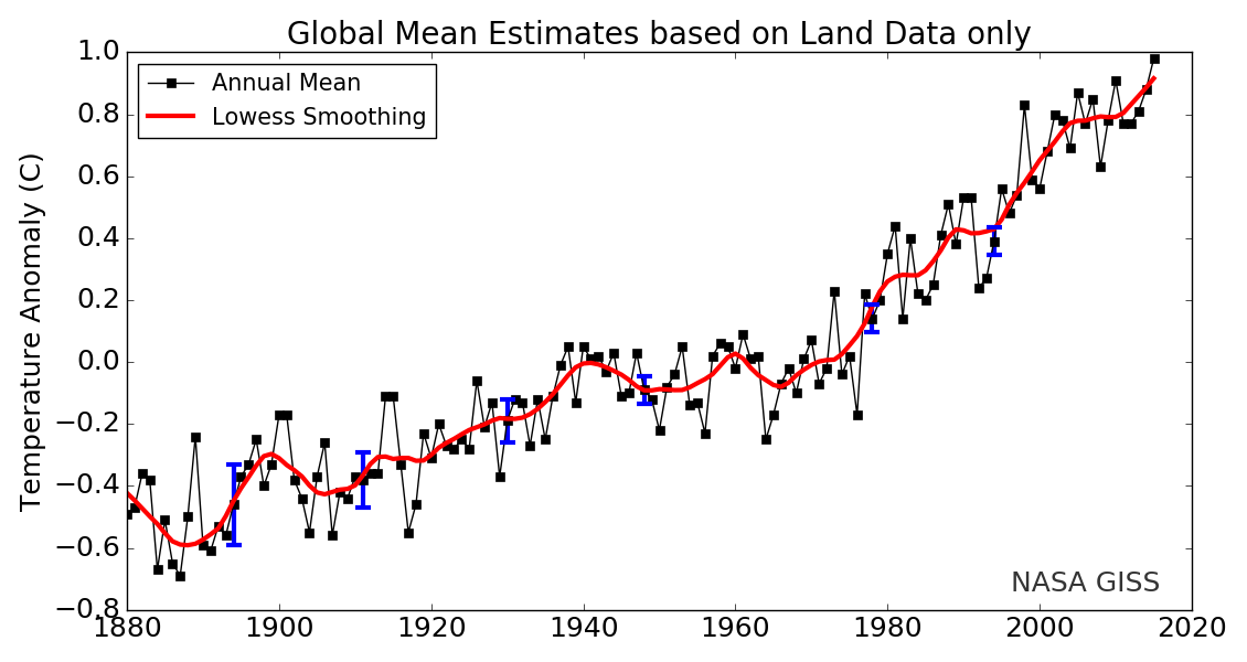
The surface temperature record is complete garbage, but it has been carefully manipulated to produce the results politicians want. So the US space agency ignores satellite measurements of the troposphere, and uses temperatures from concrete jungles instead.
