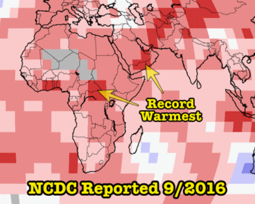
NOAA says that Earth was red hot in September, with many places being the hottest ever!
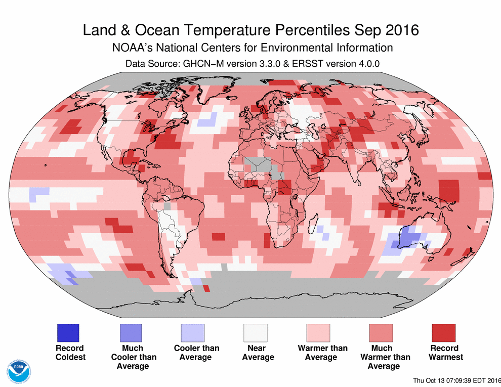
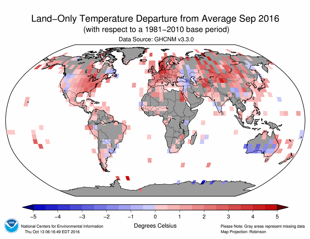
Only problem is, they don’t have thermometers on about half of the land surface, and many of their record temperatures are fake. Grey areas below represent missing data.
Note the record hot temperatures reported in Yemen, Oman, Central African Republic, South Sudan and The Congo.
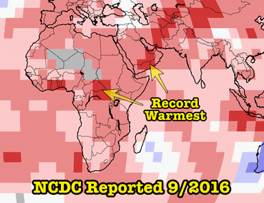
They don’t have any thermometers in those regions. The claimed record temperatures are completely fake.
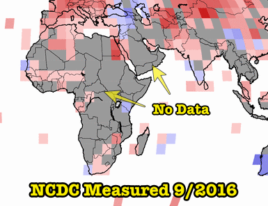
Satellite temperatures show that NOAA’s record hot Africa was actually just about normal in September.
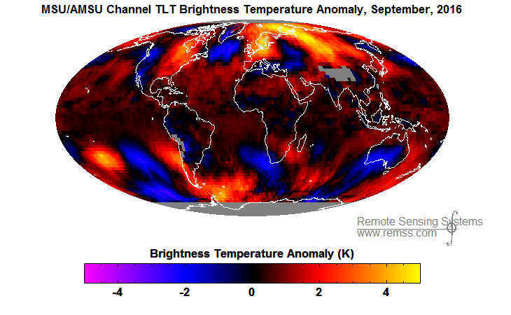
RSS / MSU Data Images / Monthly
Claims of record heat from NASA and NOAA are completely fraudulent, and are being made for political purposes. They have nothing to do with with climate or science.
Make the lie big, make it simple, keep saying it, and eventually they will believe it.
- Adolf Hitler
Disclaimer : Mosher says the science behind this is golden.
Re Mosher and golden … it is golden when it comes to putting $$$$ in his jeans ;-)
And as usual any region measured as below normal gets adjusted up.
Here’s the NOAA’s explanation of their percentile map. http://www.ncdc.noaa.gov/monitoring-references/dyk/global-mntp-percentiles
It says within this page “It is important to note that each grid point’s period of record may vary, but all grid points displayed in the map have a minimum of 80 years of data. For the global temperature anomaly record, the data does extend back to 1880. But not all grid points have data from 1880 to present.”
I’m assuming this means the greyed out areas in the anomaly record don’t have 80 years of data but in the period of info they do have, these are shown as the highest percentiles in that limited data record.
Cam,
there are NO stations in the “grey” areas. So how can they say that?
You are assuming wrong. They don’t have any thermometers there.
Even if there were thermometers reporting back to NOAA in those regions, why is there such a divergence between satellite measurements of those areas and the supposed thermometer readings? If there are thermometers there, there is something that is artificially inflating the reported temperatures for those areas.
Any way you cut it, something is rotten in Yemen, Oman, Central African Republic, South Sudan and The Congo, with respect to reported temperatures.
You are quibbling over how the lies are made. It doesn’t matter how the lies are made. There are lies being made.
There aren’t any thermometers there
With all the billions being spent on “Climate Change” research, uh isn’t data collection one of the priority items on the agenda? I mean really, if you don’t have any data to go on, what are you supposed to do, make it all up?
Didn’t someone on these boards a few days ago coin the term, “Tamperature”?
Perfect! Must remember that terminology!
Interestingly, In the one place in the world where they have a pristine surface data set (USCRN), UAH and RSS are almost an exact trend match.
Over the past year, El Nino effects have nudged the trend of a dead flat trend to a very slight +ve trend.
…but that should drop back down to a ZERO trend in a few more months.
I guess for more than 90% of the globe the data they use for the calculations before 1970 are nothing but absolute rubbish (extrapolation of no reliable values). Most of the land area was scarcely occupied and almost every country from Africa, Central and South America, Oceania and even Asia only had ‘reliable’ records for their main cities. As a matter of fact except for the U.S. and western Europe there is probably no possible minimum confidence for most of the available data. And how could they assess the sea surface temperatures between 1880 and 1970 (90 years)? That’s another mistery unless they have time-travelling machines to send modern satellites to the past and recover them presently. This is all so fake that it is even difficult to imagine how the world leaders could be falling in this pseudoscience tale. I mean if they really are because we see nothing happening in the developing countries related to stop carbon dioxide emissions.
“And how could they assess the sea surface temperatures between 1880 and 1970 ”
They actually only started getting reasonable direct sea surface temps in 2003 with the ARGO deployment. Before that, much of the SH was basically unmeasured and very patchy is areas it was, being mainly on standard commercial ship lanes hence very susceptible to variable currents , long and short term..
This chart from Bod Tisdale shows what I mean.
20% or less coverage before 2003
I guess the only reliable data from sea surface temperature is the one taken by Leo DiCaprio and his thermometer at 2:20 a.m. on April 15, 1912, North Atlantic, about 375 miles (600 km) south of Newfoundland. After all, he died that day in the Titanic sunk.
“After all, he died that day in the Titanic sunk.”
His acting died long before that !!
Australia has pretty good records going back to around 1890.
They have been “adjusted” and the very hot period around 1890-1910 written out of the data, but there is still a good solid historical coverage of most of the occupied part of Australia.
Japan also has a very good surface record going back to 1900. two distinct step, basically ZERO trend otherwise.
Here’s the graph of Japanese data from 1950 – 1990
Cam, that does seem to be the case. See my comment below (Oct. 22, 5:38 AM).
Tony and Steve and Cam Stewart and Brad and Gail, wherever you are,
I have relayed some of the stuff on this site. After explaining their long list of accomplishments a climate person corrected me as saying he recognized this content as part of the popular misdirections. (Why do they start with their credentials only to provide a conclusion with no support? What if Tony did that every time?)
I was hoping that over time these might be addressed. If they were more than a year ago, I missed them. Thank you for your time and effort.
“But the most important observational evidence includes:
• satellite radar altimeter measurements of global sea level, which show the oceans rising at rates of 3 mm per year that are much higher than for the 20th century (from tide gauges) and the previous several millennia (from geological studies of beach landforms and corals).
• satellite gravity measurements of net change in ice mass in Greenland, Antarctica and alpine glaciers showing about 150 cubic miles per year of net ice mass loss, responsible for about 1.5 mm/year of sea level rise. (The rest is from unsustainable human use of groundwater, about half a mm/year, and thermal expansion of warming sea water).
• satellite measurements of the difference between solar radiation input and re-radiation output from the Earth, which is running at an energy equivalent to 4-12 atomic bombs per second.”
Why on earth would anyone try to compare apples to oranges if they didn’t have to? Why would you use satellite measurements of sea level rise now, when tide gages were used in the 20th century? We continue to have tide gages and if you continue to use them you will see that there is no acceleration of sea level rise (anyone who measures things for a living can see though this scam. We all know that you use should use the same instrument when making measurements that you compare to one another. When they purposely switch instruments it is an obvious scam). Satellite gravity measurements (GRACE) also show very little sea level rise (or even seal level fall) if used for that purpose (seems to be a problem with GRACE). Radar altimeter measurements of Antarctica show that it is growing, both land and sea.
He loves satellites? Ask him why he ignores satellite temperatures.
DG, read my essay PseudoPrecision in ebook Blowing Smoke, or my comment yesterday to Dave Middleton’ guest post at WUWT on Ferinanda, Fl sea level rise. You apparently do not know the ~40 diff GPS land motion corrected long record PSMSL tide gauges show ~2.2mm/yr SLR, and no acceleration. Acceleration is atificially manufactured by ignoring tide gauges from 1993 on and grafting on satellite altimetry. The 2.2 is about right since it closes nicely with Argo estimates of thermosteric rise (0.6)plus GRACE estimates of ice sheet mass loss after making the diff GPS GIA correction to GRACE for Antarctica (1.6). The sat alt estimate does not close and is therefore too high. The WUWT comment and the essay both explain why. In short, waves.
Satellite error is +/- 3cm or more on sea level measurements so a fudged measurement of 3mm/year is as meaningless as it is TINY
There is NO ACCELERATION in the sea level from tide gauges which have a mean somewhere around 1.5 – 1.8 mm/years..
Gravity measurements are heavily influenced by moving subsurface magma types.. and the Greenland /Iceland magma blob has been quite active for a while. Grace was should to be wildly incorrect on Antarctic measurements
Satellite measurements show an INCREASE in outgoing radiation.
Satellite measurements of temperature show NO WARMING of the planet in 38 years apart from the effects of NON-CO2 El Ninos and ocean oscillation.
NONE.
The NH especially shows a very strong link to ocean cycles, particularly the AMO. It just so happened that the satellite era coincides with the upward leg of the AMO . Since the AMO peaked in 2006, average Arctic sea ice has had a ZERO trend
typo correction
Grace was SHOWN…..
Speaking of Greenland, anybody seen what’s happening this year. WOW !!
and
The MB of the Greenland ice cap grows while the Arctic sees higher than average temperatures and thus freezing is occurring more slowly so that we are now at about 2012 sea ice levels.
It’s all weather.
Last two days have seen a turn up .
And the temperature starting to drop.
dawgGoodie said – at 5:36 pm
… the most important observational evidence includes:
• satellite radar altimeter measurements of global sea level, which show the oceans rising at rates of 3 mm per year that are much higher than for the 20th century (from tide gauges) and the previous several millennia (from geological studies of beach landforms and corals).
As far as I know, because I’ve saved the old data from satellites and tide gauges, the satellite data is manipulated every time they publish a new realease. And it looks like the changes are agenda driven. Tide gauge data that I have from 2009 looks like the tide gauge data from 2015.
Colorado University’s Sea Level Research Group published a paper on their website titled; “Is the detection of accelerated sea level rise imminent?” Any reasonable person can apply the “Duck Test” and determine that it looks like they have already written the conclusions for the next release.
Besides that the Jason3 satellite is due to come on line, and I expect that it will generate all sorts of data manipulations. Color me surprised if the next data release doesn’t show accelerated sea level rise just like they said was imminent.
I have looked for weather stations in many areas using lat long… very hard to find. MANY of the squares where they say they do have data, they have absolutely no idea of the quality of that data. Some of those rectangles will be data from maybe one thermometer, stuck in the middle of a car park or on top of a building or next to a runway.
.
The whole surface data is.. A LOAD OF JUNK !!!
https://m.youtube.com/watch?v=RiuHOzykxC0
This goes over weather stations and is very eye opening
And that’s in the USA which one would expect to have pretty good surface stations.
Imagine what they are like in some other parts of the world !!!
I still have a challenge that not one of the warmist scammers has yet answered.. Find pictures of the surface station feeding the data to the 6 rectangles circled in yellow.
dawgGoodie, maybe you also should join the hunt to show us just how pristine the surface measurements are .
With so much missing data and so much data they know nothing about, …
……the NOAA people can FABRICATE ANY DARN TEMPERATURE THEY WANT TO FABRICATE.
There was an old Rolling Stones number ” When blue turns to grey”
For NOAA is , ” When blue and grey, turn to red.”
Looks at eastern part of Australia.
In fact.. look at how much blue does actually turn to red.
Its all just ONE MASSIVE FABRICATION.
Could someone point to a source for the “Land-Only Temperature Departure from Average Sep 2016” map?
Ah, never mind, after some digging, I found it here. It would be good to include links in the article though.
http://www.ncdc.noaa.gov/temp-and-precip/global-maps/201609?products%5B%5D=map-land-sfc-mntp#global-maps-select
The link is right below the map
No, it isn’t. There is only a link below the first map. The second map is not on the linked page.
Yes it is, you goose.
Link takes you straight to the chart.
Well at least you tried to help, but do ya think they will listen?
The page linked by the article does not have a map of “land-only” anything, except precipitation. All other maps on that page are land+ocean.
tonyheller, since you wrote the article, surely you could add the link that I provided above.
there’s a link that says “201609.gif (990×765)”
Try following you child-minded twerp. !!
A bit OT, but a great post on WUWT..
https://wattsupwiththat.com/2016/10/21/vox-poll-people-are-more-afraid-of-clowns-than-climate-change/
I particularly like this picture. :-)
I personally think that one of the biggest threats to the planet IS the “climate clowns”.
Looking at the brightness chart, it appears that most of the slight warm anomaly is still coming from that REGIONAL patch that has been floating over the north of eastern Europe/Asia. Rest of the globe looks pretty much on the normal.
It first appeared during the El Nino
When that dissipates, the global temps could drop quite a bit.
Next few months will be interesting.
Could someone point to a source for the claim that there are no thermometers in the gray areas?
Why do you think its grey !! DOH !!!!
There’s a challenge up above Scott.
6 yellow circles.. pics to show how good those thermometers are.
So, no answer to my question, Andy?
NO DATA..
WTF don’t you understand !!!
Can you answer it for us then?
So ScottM don’t know either! But wants yo play the big guy! Isn’t that right!
Read down the bottom right corner of the chart
“Please note: Gray areas represent missing data.”.
The thing is he can’t answer his own question, but plays like he knows stuff he doesn’t! Like they all do!
What is the point of asking a question if you know the answer? Is that what you do? People must get pretty annoyed with that.
Really, that isn’t what you were doing!
“People must get pretty annoyed with that.”
We get annoyed with stupidity !!
LMAO! So true AG55!
“Missing data” != “no data”. I am looking for a source for the “no thermometers” statement. I did not write the article so I don’t know why I am being asked to provide the missing citation. I will try later and see what I can find.
And you don’t know what you know not, that you are claiming you think you know!
Exactly!
I never made a claim to know. I am curious but you are unhelpful. I think you are just trolling and I will ignore future comments from you.
Sorry, but that was exactly what you were trying to do! So either you know something err you don’t!
And as for your trolling comment, you were the one to come here to a skeptical site with your views, so what does that make you when you accuse others of?
OMG, the DUMB is strong with this one !!
Probably a Hillary supporter! AM I right! LOL!
Too funny the trolls come here and claim everyone here is a troll, cause ya know that is what they all think. They are in their own special world where they think every where they go is their own safe space and anything else invadeing on that is a troll! That is what they think! LMAO!
And when way back when, when we were going to their web sites, and saying the same we are saying here we were called trolls and censored if we got the better of their arguements, Gone, dissappeared, not to be seen ever! LOL! That is how they work to keep their own kind subserviant to their cause! LOL!
We are not in it for money, or power, we just want to be able to earn a living and be left alone with out some other beaurocracy wanting to take control of our lives because they don’t like their life.
Now a trigger warning for precious ones out there, Vote for Trump! He wants less regs, less taxes, and lessof other people poking their noses in your lives.
Trump wants border enforcement, build the wall and monitor, but there is Tech out there that can see what isn’t seen. LOL!
“Note the record hot temperatures reported in Yemen, Oman, Central African Republic, South Sudan and The Congo. They don’t have any thermometers in those regions.”
Okay, I had some time to sit down and explore the NOAA site more deeply. One can find the stations for a given country by going to http://www7.ncdc.noaa.gov/CDO/cdoselect.cmd?datasetabbv=GSOD&countryabbv=&georegionabbv=
Click on “I agree to these terms” and from the next page, select a country from the dropdown box. (Unfortunately, there is no static link to each of the country pages, so anyone interested will have to confirm this themselves.)
Yemen: 45 stations
Oman: 54 stations
Central African Republic: 16 stations
South Sudan: 5 stations
The Congo: 15 stations
I hereby call bullshit on the “no thermometers” claim.
Wow, that’s an awful LOT of “missing data”
Someone has been very, very careless. ;-)
I wonder where it all went.
Off you go.. run off and find it. :-)
Just for fun , I picked up the data from one of those thermometers that went to 2016.
I guess we now know why it is “missing” :-)
How inconvenient, hey !
And central Africa
NOAA says “Record Warmest”
Gees Scott, you have done us a great service.. helping to show that even there own thermometers show that….
……………… THEY ARE LYING !!!
Well Done :-)
Probably best you STFU before you help us some more :-)
ScottM has no idea what he is talking about. there are no GHCN stations in those regions.
http://data.giss.nasa.gov/gistemp/stdata/
tonyheller you must have missed the first paragraph of the page with the globe: “In our analysis, we can only use stations with reasonably long, consistently measured time records.” That does not mean that you cannot calculate a percentile for the regions with low coverage (that percentile map is NOT the GISTEMP record). It does mean you cannot calculate an anomaly if the coverage for the base period is shoddy. These facts negate the very premise of your article, which is that “They don’t have any thermometers in those regions.” Your conclusion that “The claimed record temperatures are completely fake”, which relies solely on that premise, is therefore unsupported. An argument is sound if it is valid (i.e., logically correct) and the premises are true. Your argument is not sound. If you wish to put forth a sound argument to support your conclusion, then we can discuss that.
As I showed above. They do CREATE data.
They certainly don’t use the data from the thermometers you think they do, otherwise there would be NO TREND.
They are either FABRICATING or LYING..
or most likely BOTH.
The map is is clearly marked as GHCN stations. You are wasting my time with your intentional dissonance.
The red dots are the GHCN data points as used by GISS.
They do NOT have any data from the grey areas, that means that they have to CREATE or FABRICATE it.
.. END OF STORY.
Here’s the UAH chart
Very similar to RSS chart.
Notice, no record warmth anywhere near central Africa or Yemen
GISS are FABRICATING JUNK temperatures.
Let’s compare these data with other ones provided by Brazilian entities (for the Brazilian territory). Baseline is 1979-1995 and temperature anomaly is given for both the minimum and maximum temperature. You can go to the site of Instituto Nacional de Pesquisas Espaciais (INPE) and enter the periods by yourselves (it is in Portuguese but I guess you will have no difficulty at all). [BTW: ‘Pesquisa’ translates into ‘Research’, and ‘Precipitação’ to ‘Rainfall’).
Another data for Sept 2016. Notice the subtropical area comprising the 5 southernmost states of Brazil is comparable to the area of Texas,U.S..
Pingback: Non c'è chiarezza da parte del NOAA nei record delle temperature nel mese di settembre! : Attività Solare ( Solar Activity )
Pingback: Record Fraud From NOAA In September - Principia Scientific International