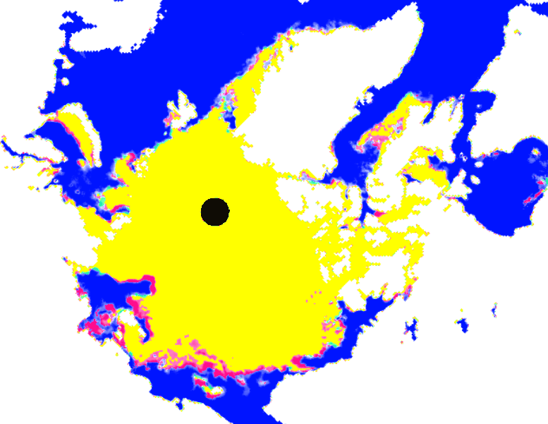
The Arctic melt season will be starting to wind down in the next three weeks, and there is very little going on.
Red shows ice extent loss over the past five days, and green shows gain.
Here is the same map for 2007, showing ice loss from July 10 through July 15.


Few “facts” make a bit of difference to a f-ing Dumbocrat
Something bizarre appears with the ice data in Antarctica.
With at least two more months of freezing in the dark to happen, the sea ice area has rapidly been reduced by about 1 million sq. kilometers within recent days…
with total global sea ice below normal now.
Antarctica ice was just recorded at record extent.
That sounds like a sensor defect.
Anyone know?
There was something on one of the other sites about a sensor defect…wasn’t paying much attention.
It’s normal, there was same last year as well.
did they have the same sensor problem last year as well then ?
Is the dot in the centre the North Pole?
Steve, rather than keep posting that one map, why not post the graphs of ice loss?
You can tell very little from that mapabout quanities as a snapshot each day, so much so that you have to resort to the highly non-scientific and non-quantity based comment “very little going on”
With comments “very little going on” and “winding down in the next 3 weeks” I am surprised you didn’t mention the sun is past it’s peak also like you normally do. None of these are very scientific and merely indicate what you want to happen.
The map would be better at least if you animated it over time to show the change. But better at the moment would be to look at this instead
http://www.ijis.iarc.uaf.edu/seaice/extent/plot_v2.csv
Andy
Include in the graph the circulation from the North Atlantic Current, Mister Jackass
“NOAA? We have a problem.”
10th July: 8,135,962 km2
15th Julu: 7,745,907 km2
Sorry but ice loss has been 390,000 km2 in five days. 78,000 km2 a day. Almost 1000 Manhattans a day!
Could you do the same thing for July 10-15 of other years? We need a frame of reference for what constitutes a large or small amount of red/green pixels over a 5 day window. After all, over a short enough time frame it’ll always look like “nothing’s happening” even in a record year.
A suitable set for comparison might be 2006/2009 as examples of high-ice recent years, and 2007/2007 as examples of low-ice recent years. I know the satellites used have varied over that time frame, but it should still be clear enough for guesstimation.
I added 2007, which had high ice extent at the start of July.