
The Ministry of Truth in Boulder, CO
![20150905_171024[1]](https://realclimatescience.com/wp-content/uploads/2015/09/20150905_1710241.jpg)
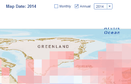
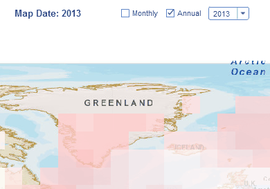
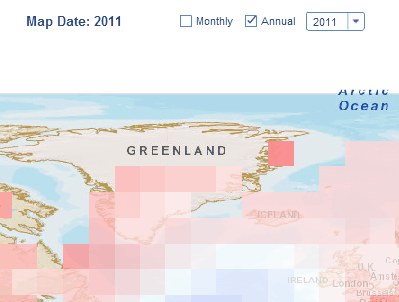
NOAA publishes maps every month showing the whole world bright red, and then claims temperatures have been above normal for 600 months in a row.
If we look at southwest Greenland, temperatures there have been below normal five years in a row and plummeting over the past decade, yet NOAA shows every one of those years above normal.


Reblogged this on WeatherAction News.
Apart from the 2010 outlier, that looks like a cooling trend since 1958 !!!
WOW !!!!!
Can you run a trend line through that, just for fun, SG ?
Reblogged this on Climatism.
Another example of their data smearing ,
https://www.ncdc.noaa.gov/sotc/service/global/map-percentile-mntp/201507.gif
Now look closely at the square containing Tasmania , the little island to the south of Australia , warmer than usual there right ? ….Wrong , Tasmania just recorded it’s coldest winter in 50 years
http://www.weatherzone.com.au/news/tasmanias-winter-coldest-in-nearly-50-years-bureau-of-meteorology-says/357035
Warmer than “average”. Whose “average”? What “average”?
More vague and meaningless alarmism.
Whenever there is a serious crime, you look for a motive and in this case the motive is extremely obvious, keeping the multi-billion dollar Government sponsored gravy train running. If there is a choice between the truth and maintaining their lavish funding, what do you think they are going to opt for? To pose the question is to answer it.
Using the GISS mapping tool you can adjust the base period, and make 2015 look a lot more like what it actually was.
Reblogged this on Climate Collections.