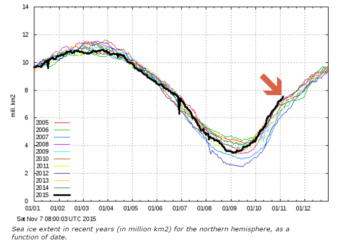
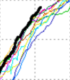
The Danish Meteorological Institute produces this graph of Arctic sea ice extent, which is the best graph available from any data source. It shows Arctic ice growing at a record pace, and the highest of any year since at least 2004.
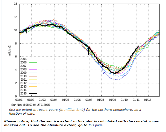
The features of this graph which make it more meaningful than the largely useless graphs from NSIDC and other sources are :
- They show the extent of 30% concentration ice, rather than 15%. This is a smaller number, but a better indication of the condition of the ice.
- It masks off don’t-care coastal zones.
- It shows the full range of years going back to 1995.
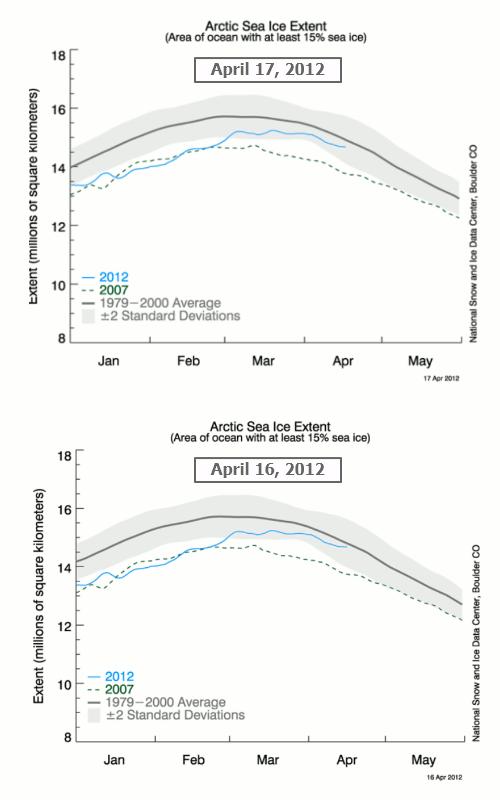
- They don’t tamper with data, like NSIDC did on April 17, 2012