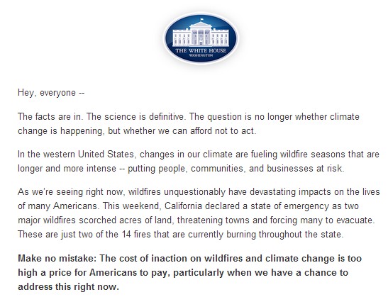
President Obama can stop fires, if you agree to give up your energy security and freedom!
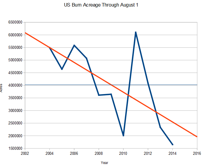
No mention that this is the quietest fire season in decades.
Half of the country voted for this genius.
President Obama can stop fires, if you agree to give up your energy security and freedom!
No mention that this is the quietest fire season in decades.
Half of the country voted for this genius.
I didn’t get through my whole ICCC presentation because I ran out of time, but here is the complete presentation. I plan to do a video slide show too at some point.
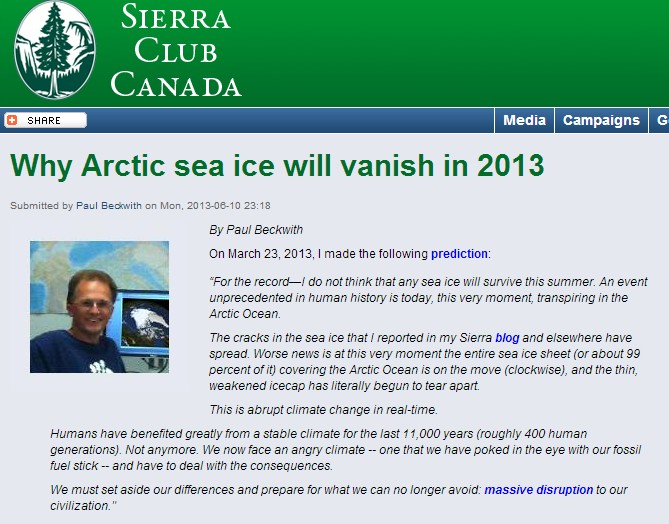
Mark Serreze calls me “breathtakingly ignorant.”
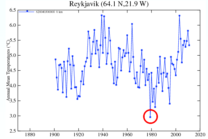
The red circle shows the year when NSIDC starts their Arctic sea ice graphs. The mother of all cherry picks.
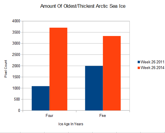
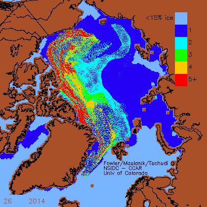
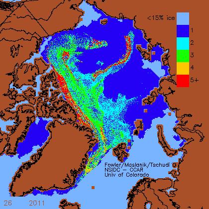
The last two years have been a real Arctic nightmare for greens who hate the human race, but it gets much worse. There has been a massive increase in the amount of oldest and thickest sea ice in the Arctic over the past three years, and next year is set to double the amount of five+ year old ice.
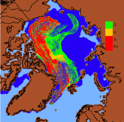
This is what the map is going to look like (more or less) in October, after the ice has its next birthday. A huge amount of 5+ year old ice. Next year is shaping up to be a complete catastrophe for Arctic alarmists.
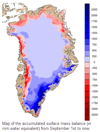
If you want accurate information about the Arctic, go to the Danish Meteorological Agency. They show that the vast majority of Greenland has gained ice over the past year
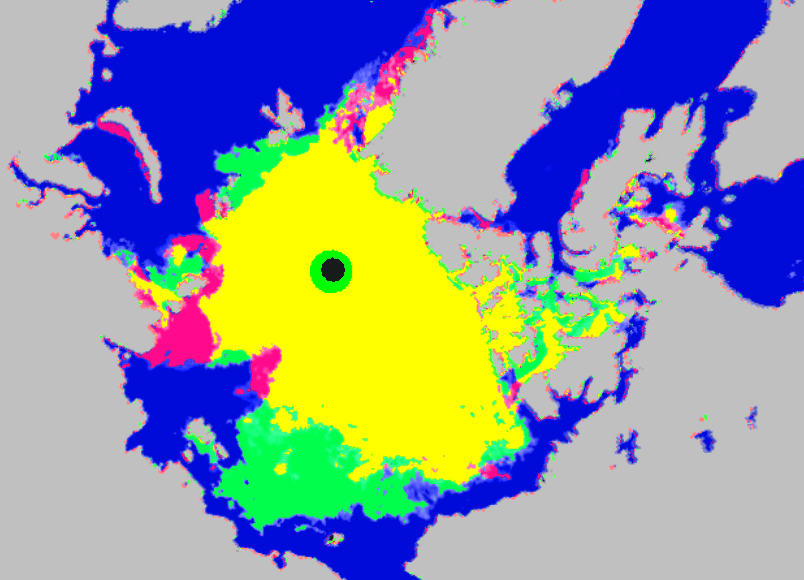
The map below shows changes in Arctic sea ice extent yesterday. Red is decrease, green is increase. There was essentially no change yesterday.
The next map shows changes over the past week.
This one shows the huge increase in ice since the same date in 2007.
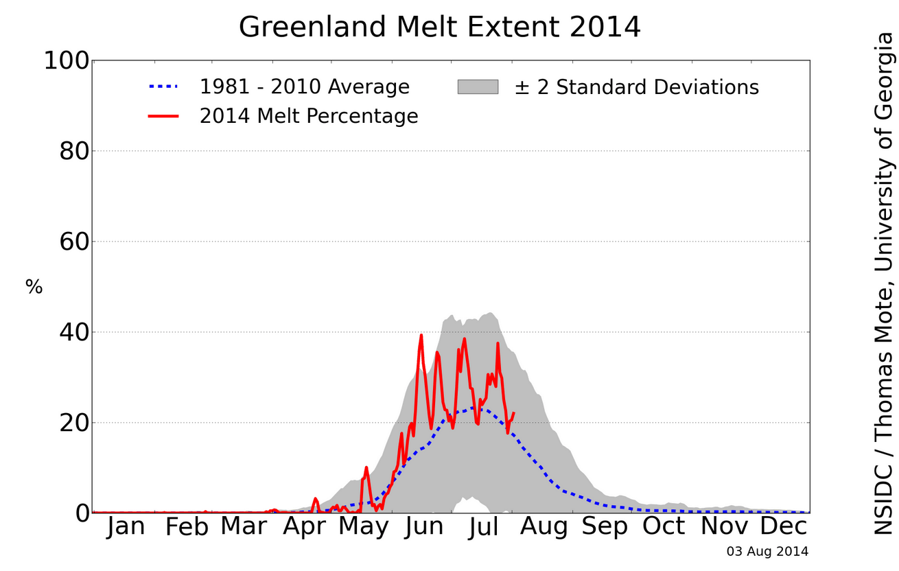
NSIDC shows Greenland melting out of control, far above average this summer.
Greenland Ice Sheet Today | Surface Melt Data presented by NSIDC
This makes no sense, because NCEP maps have showed Greenland temperatures well below normal this summer.
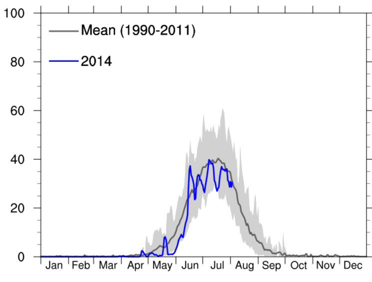
Now lets look at the DMI graph of the same thing. DMI shows Greenland melting well below normal this summer.
How did Mark Serreze’s NSIDC team pull off their Greenland nature trick? They included the cold 1980’s in their average, which was the coldest decade on record in that region.
There was essentially no melting that decade, which dragged the mean line way down. More evidence of why DMI is a better reference than NSIDC. DMI doesn’t have a global warming agenda. The NSIDC graph is extremely misleading, no doubt by design.
h/t to Chris Beal
A progressive is someone who can have all the facts right in front of him, and draw a completely irrational conclusion – which is the exact opposite of what the data is telling him.
Mike chose a “Native American” to exercise his progressive guilt. People who lost control of their land, 90% of them died, and the rest ended up living on crappy Indian reservations. The ultimate lesson in what happens when people are unwilling or unable to protect their borders from uncontrolled immigration.
So Mike concludes that we need to continue massive uncontrolled immigration into the US
This proof is so simple, that even a climate scientist couldn’t understand it.
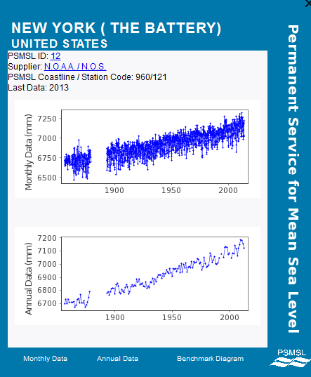
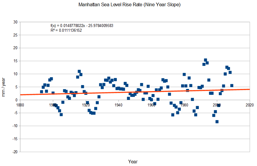
Sea level at Manhattan has been rising at a steady rate since the start of records in the 1850’s. The rate of rise has not accelerated or decelerated over the past 160 years. Experts blame it on melting glaciers.
http://www.psmsl.org/data/obtaining/stations/12.php
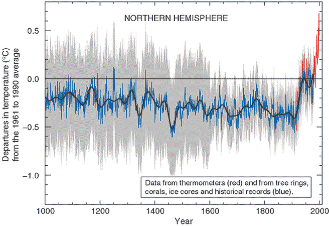
The hockey stick doesn’t start until 1910, yet the sea level rise rate was essentially identical before and after the hockey stick. This tells us that there is no correlation between GISS temperatures and sea level. One station is adequate for this analysis, because melting glaciers would raise sea level more or less equally at all locations.
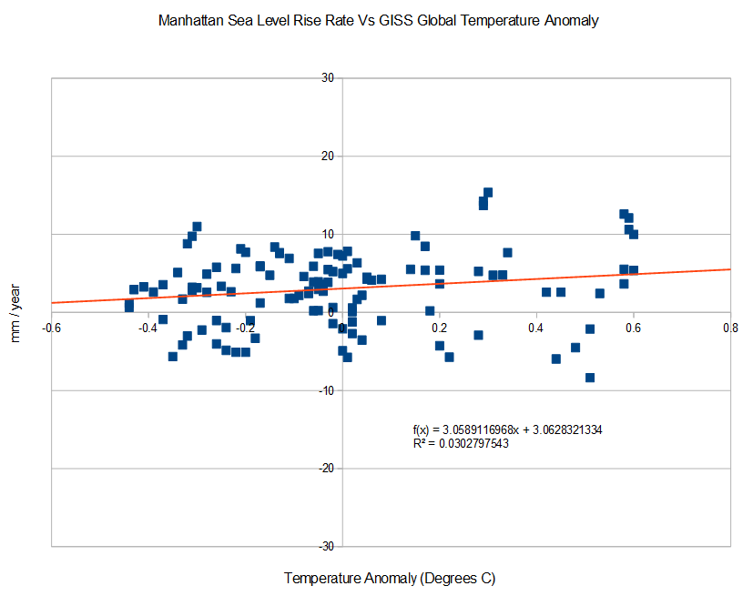
The graph below plots Manhattan sea level rise rates (9 year slope) vs. GISS 5 year mean global temperature anomaly. Again, there is no correlation between sea level rise rates and GISS temperatures. The fastest decline in sea level occurred near the highest temperature anomaly.
The next trend line is the second derivative of sea level at Manhattan. If there was acceleration occurring, there would be an upwards curvature. There isn’t any acceleration occurring.
You may ask how it is possible that sea level rise rates haven’t changed as the planet has warmed according to Hansen. There are two simple answers :