The Arctic lost 30% of its ice overnight, headed towards Al Gore’s promised 2014 ice-free Arctic
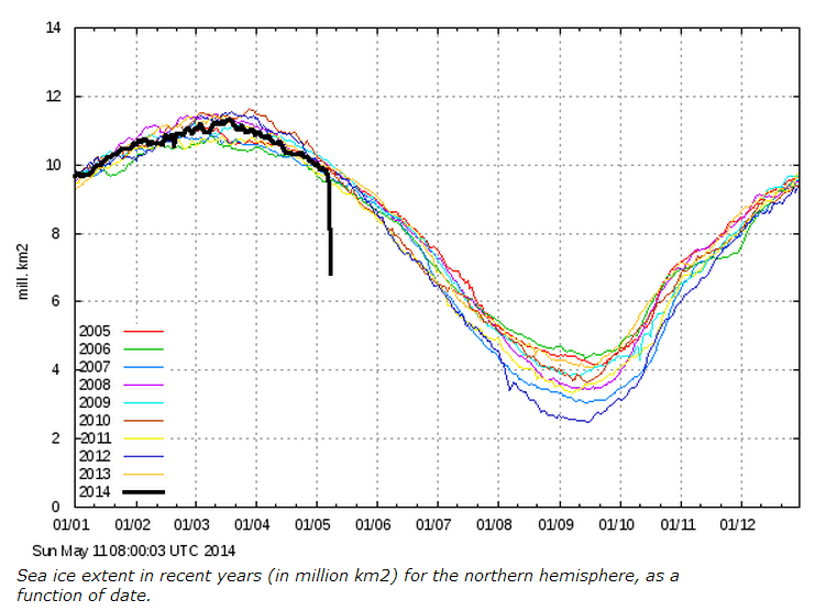
COI | Centre for Ocean and Ice | Danmarks Meteorologiske Institut
The Arctic lost 30% of its ice overnight, headed towards Al Gore’s promised 2014 ice-free Arctic
COI | Centre for Ocean and Ice | Danmarks Meteorologiske Institut
Obama can’t build a website, go bowling, balance a budget, tell the truth, or get along with other human beings – but he thinks he can control the weather 100 years from now.
We are getting very heavy snow here in Northern Colorado. I expect that in a few hours there will be tree branches down every where.
If you have ever used a min/max thermometer, you are aware of the time of observation bias problem. It is not a subtle problem.
Suppose you reset your thermometer at 3 pm, and the temperature is 60F. At 4 pm a cold front comes through and drops the temperature to -10F. The next day you bundle up in your Arctic expedition gear and go to read the maximum temperature. It reads 60F. You realize that the number is ridiculous, because it hasn’t been above 0F all day.
The solution is obvious, you reset the thermometer at night before you go to bed. I figured out the solution to the TOBS problem when I was seven years old, and I am sure just about every other station owner did too. You would have to be a complete idiot to not figure it out.
That being said, the actual TOBS “adjustment” being done by USHCN software doesn’t even vaguely match their documentation. The whole thing is complete BS.
I tried a better approach to the USHCN code. Previously I was averaging all monthly temperatures from all stations in a given year together. The problem with this is that some months have more station data than others, and is made worse by the fact that the USHCN adjusted data had extra manufactured temperatures in May. This caused the warmer temperatures in May to get weighted more heavily in the adjusted data than in the raw data.
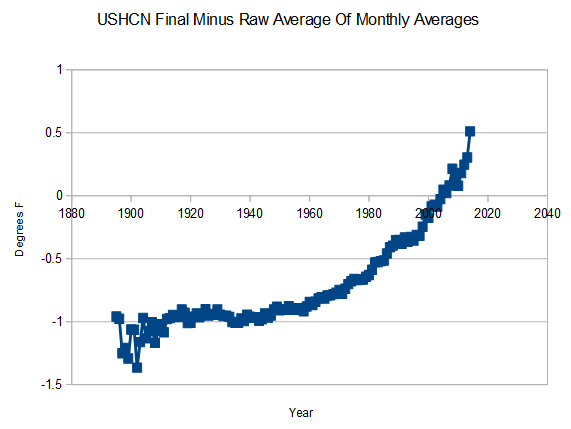
The new approach is to average the months individually across all stations, and then take the average of all monthly averages in that year. This eliminates the issues caused by a larger number of stations with May data in the USHCN adjusted data set, than in the raw data set.
The result is a much smaller spike in 2014, similar to what Anthony plotted. But it doesn’t change the fact that using my approach the adjustments go up rapidly after 1995, whereas Anthony’s tails off flat. That discrepancy is the $64,000 question.
Around 40 years ago, The Guardian wrote a story about Los Alamos – which said it was the location of the first atomic bomb test.
My mother wrote a letter to the editor :
We have lived in Los Alamos a long time, and don’t remember seeing any nuclear explosions. We probably would have noticed.
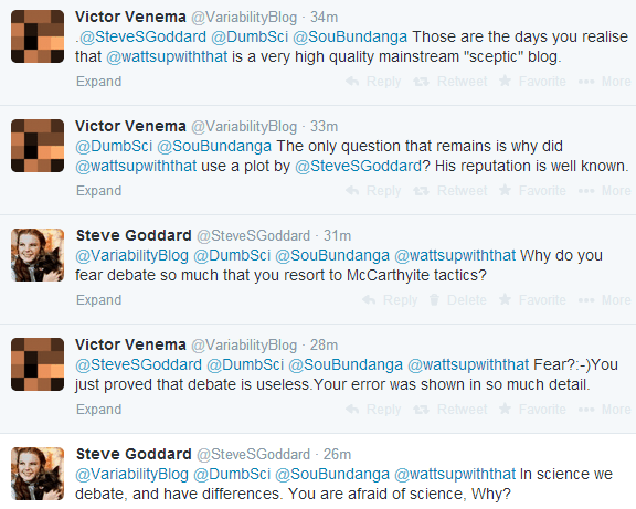
Anthony Watts made a post which alarmists see as critical of me. Normally, they bash Anthony and myself, but now they say that they have proof that I am both evil and stupid, and that I must be silenced. Differences of opinion and different approaches are simply not permitted in the world of orthodox religionists.
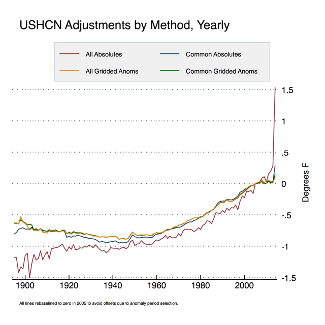
Anthony Watts posted his take on the USHCN adjustments. Here is my take on his take. Anthony’s graph shows my method in red.
The spike in 2014 is due to USHCN fabricating temperatures in their adjusted version. The adjusted version includes a lot of May temperatures from stations which USHCN doesn’t have any data for. May is a warmer month than January-April, so the USHCN final average gets elevated relative to the raw average, because the final version includes more (imaginary) May station data. If USHCN didn’t fabricate temperature data, this spike wouldn’t exist.
My method takes the average of all monthly readings at all stations in a given year, and subtracts the average of the raw data from the average of the final data. I assume a Monte Carlo distribution of missing data, which is probably a safe assumption for a large data set. This shows the total amount of adjustment for all of the USHCN temperature gymnastics. Zeke wants me to take the average of all of the individual station deltas. My approach is probably more meaningful because it also shows the effects of station loss.
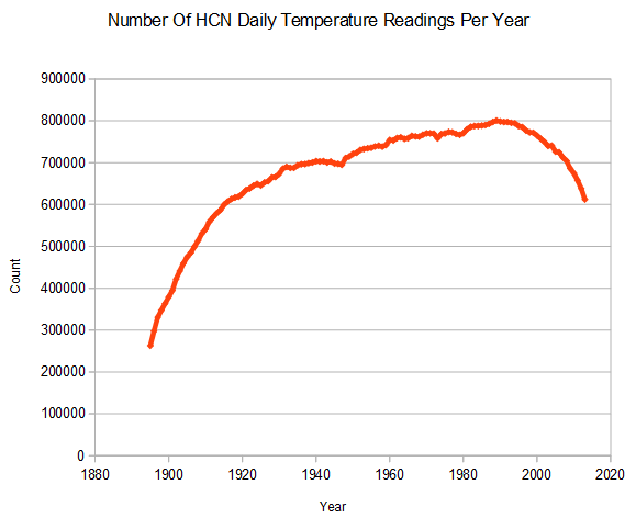
Note in Anthony’s plot, that my approach and his approaches are roughly parallel from 1930 to 1995. After 1995, my approach shows a sharp increase in slope while his tails off. Not coincidentally, since 1995 the number of stations has dropped dramatically. It is possible that stations which showed less warming (or more cooling) disappeared selectively after 1995. Whatever it is, this an important piece of information and should not be hidden by the methodology. I don’t know exactly why the methodologies diverge after 1995, but the fact that the break is coincident with a drop off in stations strongly hints at a possible correlation.
Gridding would provide a better average for the whole country than what I am doing, but that isn’t my intent. I’m just showing the average adjustment across all stations.
Zeke says “everybody uses anomalies” but that isn’t correct. NCDC publishes absolute temperatures for their US temperature data, and most of my comparisons are HCN raw vs. NCDC published.
As I showed yesterday, my approach to raw data (blue below) is pretty close to Hansen 1999, except for the USHCN V1 adjustments – which were much smaller than the V2 adjustments.
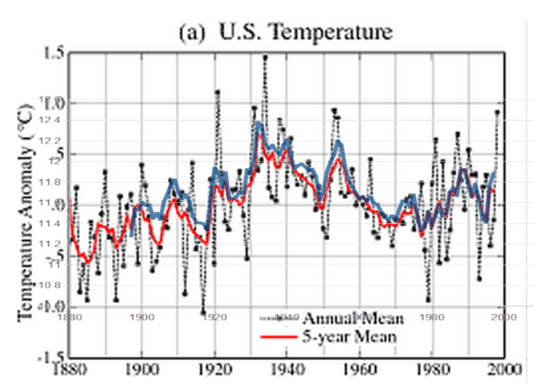
No matter how you look at it, USHCN and NCDC are cooling the past – when they should actually be cooling the present due to UHI.