Our progressive friends and the LSM thought it was hilarious in 2008, when Sarah Palin predicted a Russian invasion of the Ukraine if Obama was elected.
[youtube=http://www.youtube.com/watch?v=FdDqSvJ6aHc]
Our progressive friends and the LSM thought it was hilarious in 2008, when Sarah Palin predicted a Russian invasion of the Ukraine if Obama was elected.
[youtube=http://www.youtube.com/watch?v=FdDqSvJ6aHc]
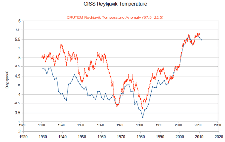
CRUTEM in orange. GISS in blue.

The graph below shows GISS Reykjavik temperature in blue and CRUTEM in orange.
The animation below flashes between GISS V2 and V3
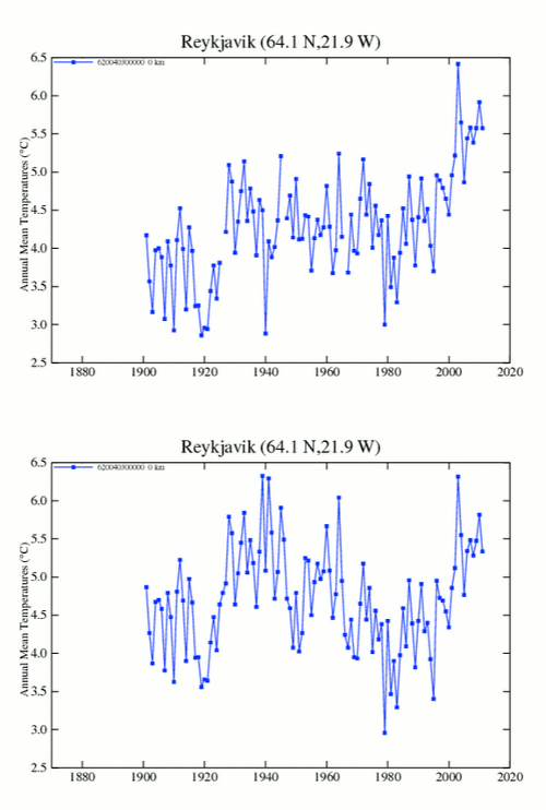
Enron accountants would blush at NOAA/NASA data tampering.
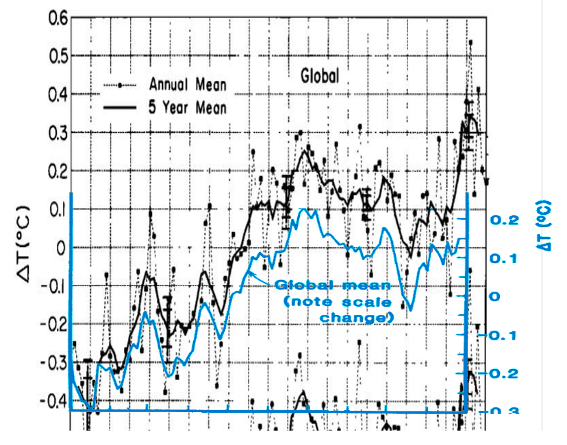
Hansen says that CO2 warming overwhelms natural variability. He might have been holding the paper upside down.
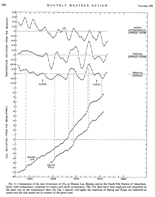
journals.ametsoc.org/doi/pdf/10.1175/1520-0493(1978)106<0755%3AGTVSMA>2.0.CO%3B2
The IPCC’s justification for tossing Briffa’s trees after 1960 was that they were made defective by too much CO2, and didn’t match the surface record – i.e. were too producing readings too low.
This is utter nonsense on all counts. More CO2 would cause more growth, and thus produce wider tree rings and produce false readings which were too high, not too low.
But the biggest BS is the claim that Briffa’s trees didn’t match thermometer readings. The graph below shows untampered US data on top of Jones, Briffa, et. al 1998.
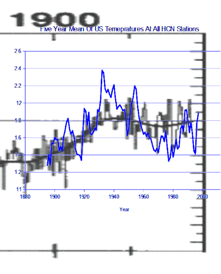
There was actually quite a good match between Briffa’s trees and the raw data. It wasn’t until Hansen, Karl et al started tampering with the data that the mismatch appeared.
So they tampered with the data, then tossed Briffa’s trees because they didn’t match the tampered data, then used the tampered data in place of Briffa’s trees.
Enron would blush at such accounting fraud.
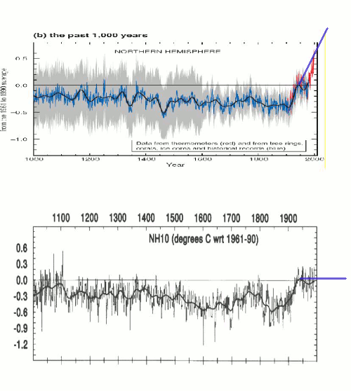
As of 1998, there wasn’t anything scary happening to the climate. But then everything changed. The animation below switches between Jones et al 1998, and Mann’s hockey stick.
Around that same time, Hansen did the same thing to the US temperature record.
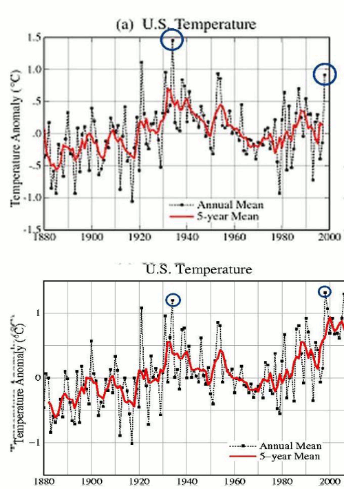
Experts tell us that this is all good science. They also receive $29 billion per year from the government to push this abomination.
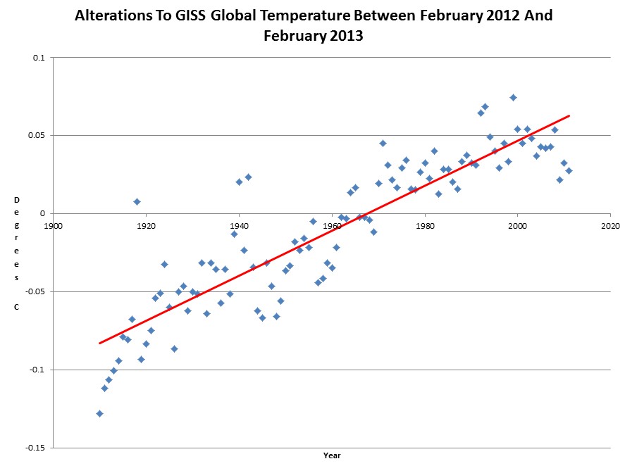
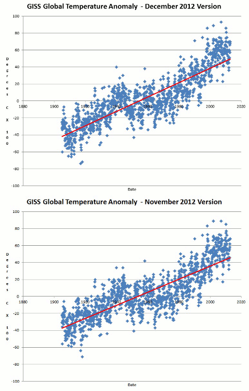
For almost 35 years, NASA has been altering the temperature record to make the slope of warming appear steeper. The large change below was made just over a year ago. These changes have occurred repeatedly and consistently – and almost invariably in the same direction.
Black is 1980 Vinnikov et al. Red is current GISS. About 0.3C has been knocked of the 1940 temperature “blip”.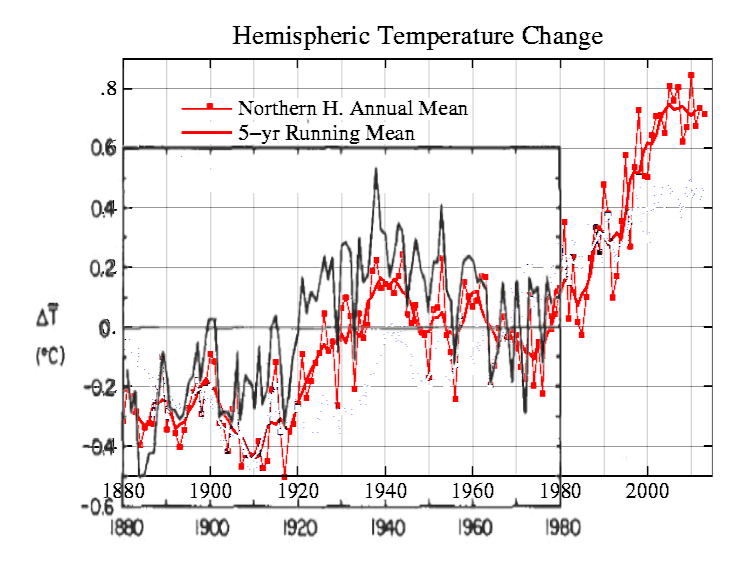
From: Tom Wigley <[email protected]>
To: Phil Jones <[email protected]>
Subject: 1940s
Date: Sun, 27 Sep 2009 23:25:38 -0600
Cc: Ben Santer <[email protected]>It would be good to remove at least part of the 1940s blip, but we are still left with “why the blip”.
Between 1981 and 1987, Hansen was already quite busy cooling his own past. Blue is Hansen 1981. Black is Hansen 1987. Graphs are normalized to the most recent common five year mean in 1978.
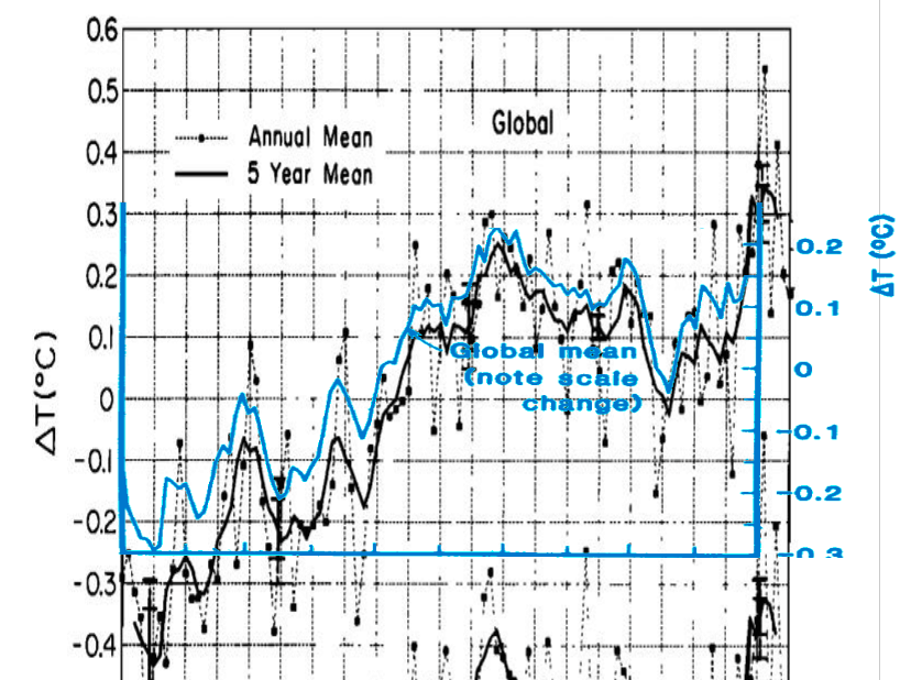
Another way of looking at this is to normalize to 1885 five year means. 1981 in blue.