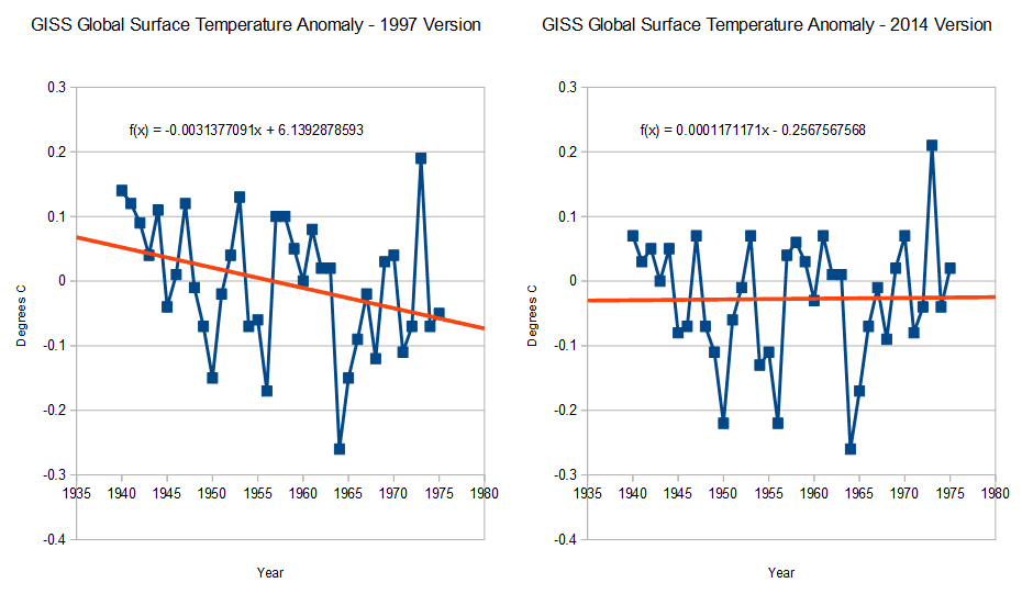
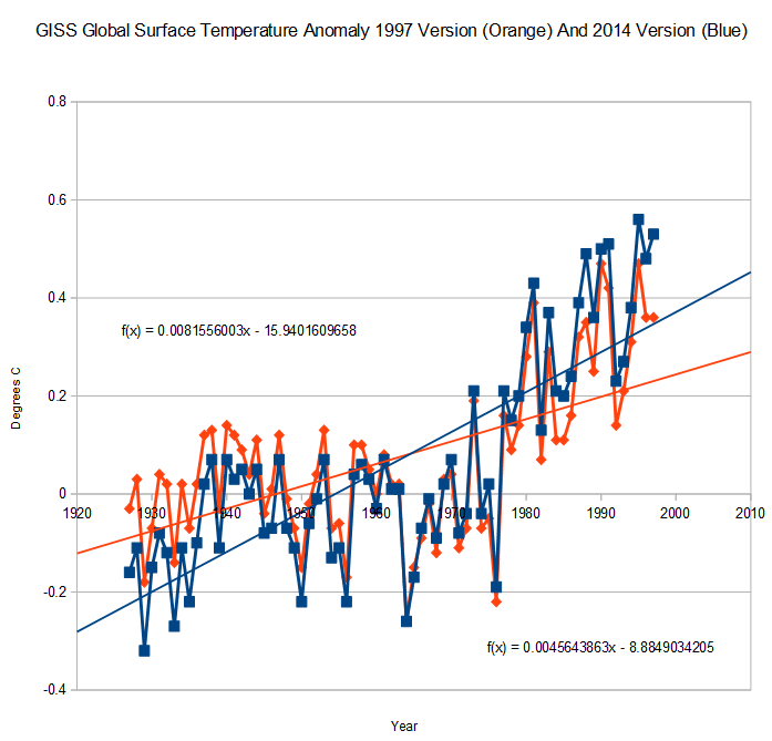
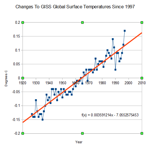
When our friends at NOAA and NASA do their data tampering, they pick a pivot point around the year 1960. Temperatures after 1960 get tampered upwards, and temperatures before 1960 get tampered downwards. The graph below shows changes to the GISS global surface record since 1997.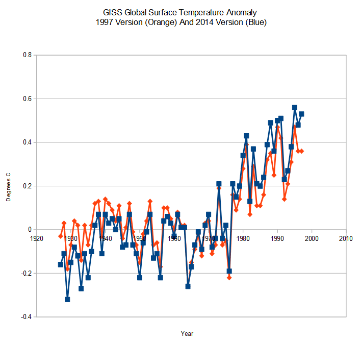
By splitting their data tampering around a central pivot point, it doesn’t look “all that bad”
The next graph shows the identical data tampering, normalized to 1997. In this view you can more easily see the hockey stick of cheating which they have done just since 1997.
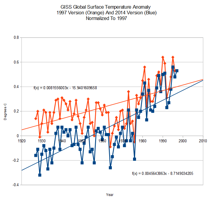
The pivot point is thus an essential part of this scam. It is a way of hiding the magnitude of their tampering.