Prior to 2010, the University of Colorado prominently displayed an error map right below their satellite sea level map, like the one below taken off the Internet archive.
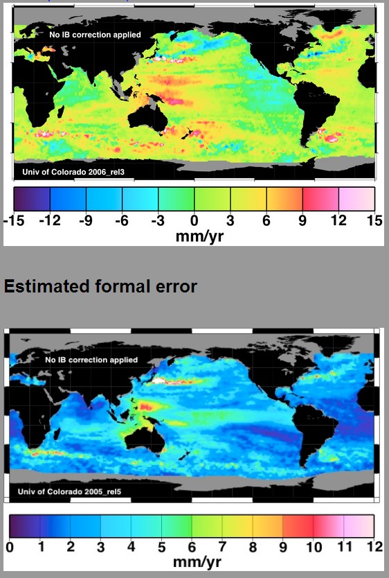
They no longer include the error map
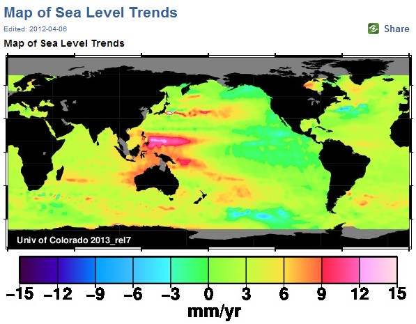
The animation below shows their little problem. It alternates between the blue error map, and their current trend map. In their claimed high sea level rise areas, the error is almost as big as the trend – in some places it is greater than the trend.
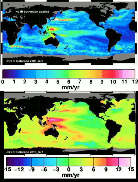
To make matters worse, the claimed global trend of 3 mm/year is heavily weighted by the large numbers – which are the least reliable. Satellite sea level is the basis for alarmists fraudulent claims that sea level rise rates have increased since 1992, something which tide gauges show no evidence of.