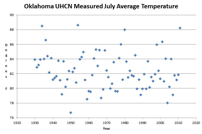
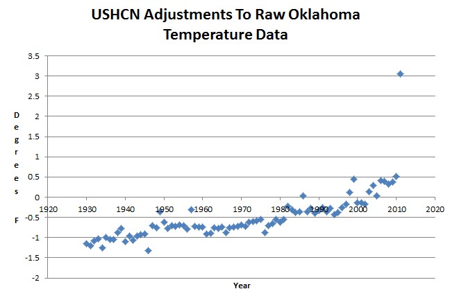
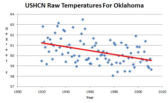
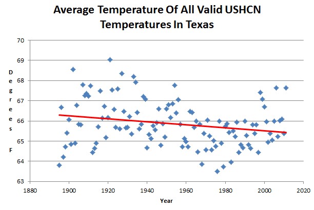
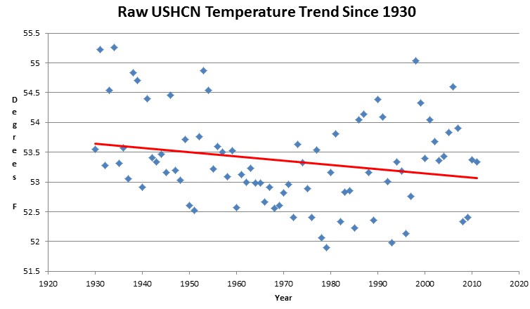
Since 1930, the average of all valid USHCN thermometer data shows a half degree decline in temperatures across the US.
But we keep hearing about the high ratio of record maximums to record minimums in the US. Below I will show you what they are doing.
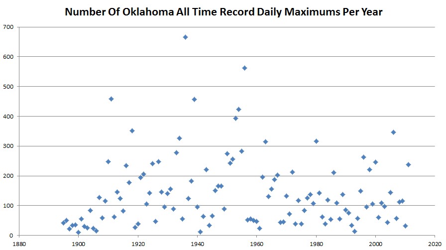
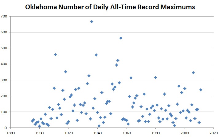
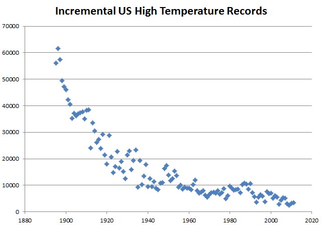
I changed the counting algorithm to be completely unbiased. If ten different years tie for the all-time record high at a specific location on a specific date, they all get counted as the record. This increases the total number of records.
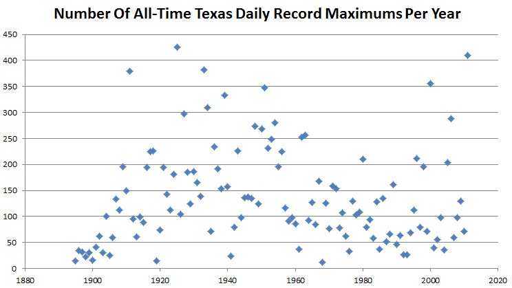
All-time high temperature records in the 1930s were far more common than they have been in recent years.
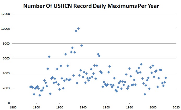
All-time low temperature records peaked in the 1920s and 1970s.

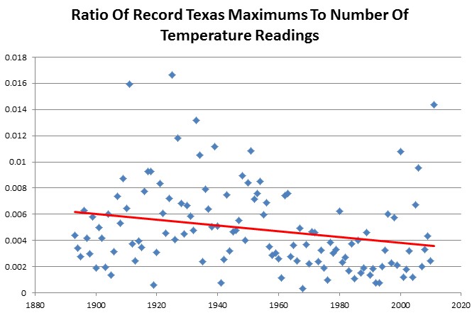
But here is the statistic trick. The ratio of highs to lows has been increasing lately. This is very misleading because the ratio of two small numbers is meaningless. Record highs and record lows have both been on the decline.
The far more important statistic is that the number of record highs has been declining.
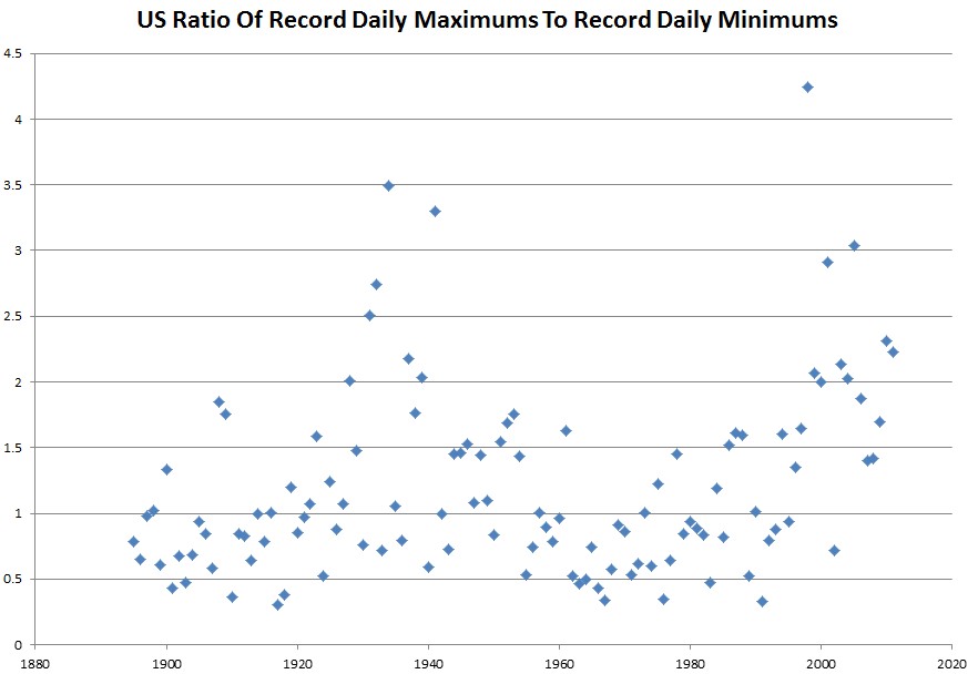
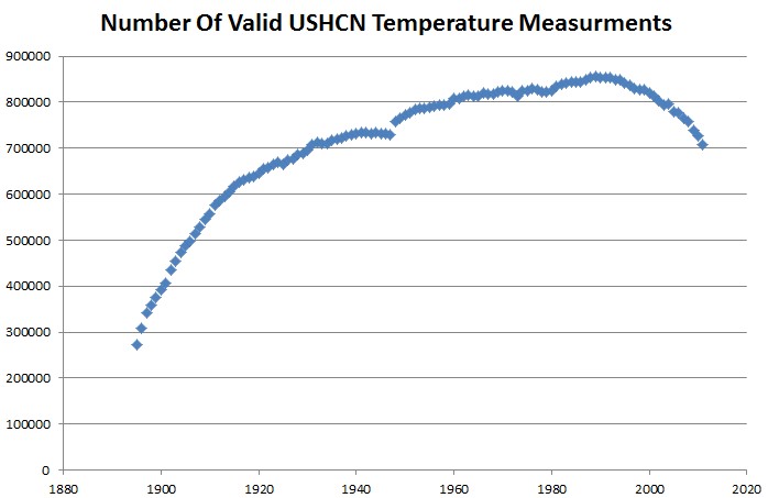
But this is worse than it seems. Note that there was a large spike in the ratio after 1990. Something else happened around that time – the number of stations dropped off dramatically. If NOAA was purging rural stations, that would cause the spike, because the record would be affected more heavily by UHI effects.