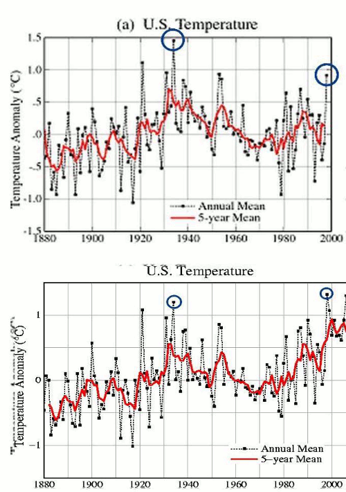
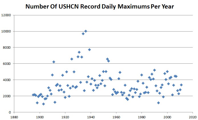
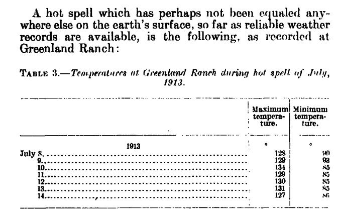
Alarmists like Jeff Masters have been touting the useless statistic of the ratio of record highs to record lows as a sign of global warming. The graph below shows why it is useless.
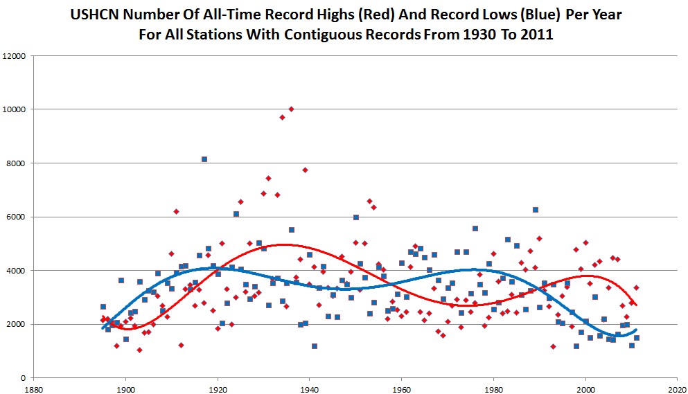
The graph plots yearly counts of all of the daily all-time record highs and lows in the USHCN database, for all stations which were operating in both 1930 and 2011. A station is marked as having a record if it has the highest temperature reported for any year, or tied for the highest temperature.
The lines are sixth order fits. The first thing that stands out is that the number of record maximums and minimums has tailed off markedly in the last 70 years. Also, the signals are very noisy, and appear to be cyclical and converging.
It is a testament to how poor the science is, that experts would take one small set of data points from one small geographical location, without any historical context, and draw conclusions about “global warming.”
These people are more ignorant and more superstitious than the witch burning crowd in The Holy Grail.