
The graph below is a composite of a 1979 paper in the Journal of Physical Oceanography (red) the second IPCC report (black) and University of Illinois Arctic sea ice data. Current anomalies are a little lower than the early 1960’s and early 1970’s.
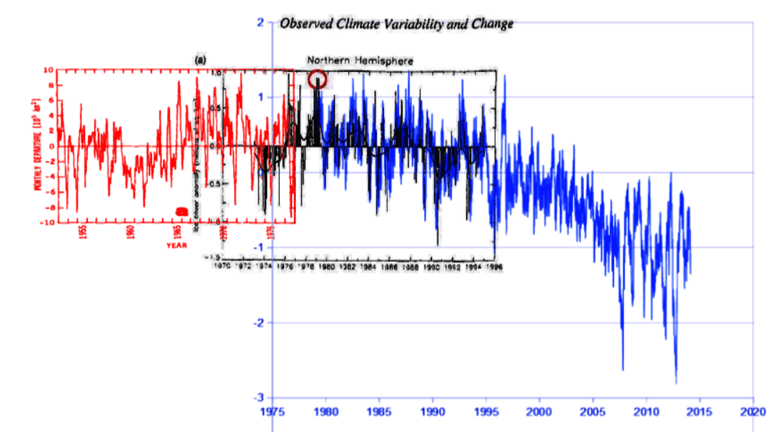
journals.ametsoc.org/doi/pdf/10.1175/1520-0485(1979)009<0580%3AAAOASI>2.0.CO%3B2
arctic.atmos.uiuc.edu/cryosphere/timeseries.anom.1979-2008
h/t to Alec aka Daffy Duck


OT:
Naked political propaganda from NASA. No scientific data just libtard manufactured talking points.
http://climate.nasa.gov/scientific-consensus
Interesting make believe on that page, Justa Joe. At the very top, NOAA’s presentation states:
“Ninety-seven percent of climate scientists agree that climate-warming trends over the past century are very likely due to human activities . .”
Note the, “over the past century,” time frame. Then. they go on to quote what their chosen “leading scientific organizations worldwide” public statements.
Statements from 11 orgs, agencies, etc., are listed on the page.
Of the 11, 5 of the brief statements refer to a time period defined as, “the past 50 years,” “the past half century,” “since the middle 1900s,” “of the past 50 years,” “since the mid-20th century,” with one limiting it to, “in recent decades.”
Looks like NOAA wants to push back the date for the “consensus” onset of AGW, from the mid-1900’s to the turn of the 20th Century.
That would take care of that nasty issue with the earlier pre-anthropogenic natural global warming.
You might also like this one
Temps vs CO2, 1958 – 1977
https://fbcdn-sphotos-f-a.akamaihd.net/hphotos-ak-frc3/t1/p403x403/1924705_728095133902163_314625402_n.jpg
pdf http://journals.ametsoc.org/doi/pdf/10.1175/1520-0493(1978)106%3C0755%3AGTVSMA%3E2.0.CO%3B2
Thanks.
Now I’m bewildered, uh, has your site been hacked again? Your chart drops off a flat cliff but the text claims the bottom of the cliff is similar to the heights? It’s an inverted hockey stick, very supportive of climate alarm, no? Sea ice loss in your own chart is sudden and unprecedented.
Great find! I’m adding the article to my file. Figure 5 noted on p. 6/585.
Much of the most radical tampering in the temp record began around 2000. So, I’ve never had any faith in their sea ice construct. How many times have we seen it suffer an “adjustment” just as it was about to cross the mean?
I’ll bite.. where does pre-satellite era data come from? Were polar bears employed to survey the ice area?
The recent data about the Arctic ice seems strange because it’s the first time that we see all these oscillations with such detail, but it’s clear that the ice has been recovering since 2008.
2007 was the only year that the ice stayed at levels close to the record minimum for the entire year. 2011 was close to 2007 in this regard.
All the other years since 2008 have shown some recovery during the winter or early spring, and in 2013 also the summer. The best recent years after 2013 are 2008 and 2009.
The connection with solar radiations is quite evident.
With some luck we could be back to 2000 levels this year, and 2001-levels in 2015.
The ice extent seems to vary as a stable forced periodic system and we’re almost at the point where we can kind of “prove” this with the data.
I see no recovery, which would be a longer term analysis anyway. What I do see is that 2013 summer ice was less than 2007.
Interesting fact: whenever the minmum extent record is broken in summer, ice reformation to the following winter will also happen at a record rate. Figuring out why that is stregthens your brain.
Probably the dumbest comment of the day.
A self referential fair comment Steve. I’m impressed! Have you looked closely at your own graph recently?
Here’s a few I prepared earlier:
http://GreatWhiteCon.info/2014/03/the-arctic-sea-ice-recovery-vanishes/
I see the same thing Berynn. And to answer your brain teaser — if the ice extent is smaller in summer, there is more area available to refreeze in winter.
BTW, don’t get miffed by Steve’s insults — it is his way of saying that you spotted the flaws in his arguments.
Congrats, you two clowns won a special award
http://stevengoddard.wordpress.com/2014/03/16/drewski-and-berynn-think-2013-summer-ice-extent-was-lower-than-2007/
Wow Steve,
I am flattered. But we shouldn’t take all the credit, after all it was YOUR graph that we were reading.
Then you should learn how to read graphs, and distinguish the difference between autumn 2012 and autumn 2013.
As I said Steve, it is your graph. Perhaps you can put one of your flashing red circles on it and label it more clearly.
You don’t know what you’re talking about.
2013 Arctic Sea Ice Extent was larger than 2007 Arctic Sea Ice Extent during the entire year.
Beginning at the end of July, sea ice extent in 2007 plummeted and dropped far below the extent in July of 2013 .
Summer sea ice in 2007 plummeted in the Summer but increased quickly in the fall and by December, 2007 & 2013 were near tied.
Exactly,
http://arctic-roos.org/observations/satellite-data/sea-ice/observation_images/ssmi1_ice_ext.png
Jeez. That’s not the point. The operative word is “see”! Don’t any of the denizens of “Real Science” have a funny bone anywhere in their bodies?
Where are you getting your figures?
According to http://nsidc.org/arcticseaicenews/2012/08/arctic-sea-ice-breaks-2007-record-extent/ the September 18, 2007 daily extent was 4.17 million square kilometers (1.61 million square miles).
If you check the archives for September 2013 (access right panel), it says: “On September 13, 2013, sea ice extent dropped to 5.10 million square kilometers (1.97 million square miles).”