The Moment When Barack Obama Slowed The Rise Of The Seas

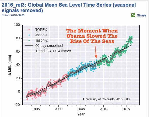
I am absolutely certain that generations from now, we will be able to look back and tell our children that this was the moment when the rise of the oceans began to slow .

  • Barack Obama   June 3, 2008

Screen Shot 2016-08-28 at 7.55.42 PM

This entry was posted in Uncategorized. Bookmark the permalink.

17 Responses to The Moment When Barack Obama Slowed The Rise Of The Seas

  1. gregole says:

    Barack seems “absolutely certain” of a number of things that simply are not true.

    http://www.snopes.com/politics/obama/50lies.asp

  2. AndyG55 says:

    Those are NOT Topex, Jason etc

    they are AGW “EXCEPTATION ADJUSTED” Topex and Jason.

  3. AndyG55 says:

    Its pretty ugly, but here is the 2000 version overlaid on the 2003

    Adjustments, just when they needed to tell the “fairy tale”

    • Olaf Koenders says:

      Nice one.

      I like the way old data always comes back to haunt them and hopefully throw them in jail.

    • Steve Case says:

      AndyG55 says: August 29, 2016 at 5:47 am
      Its pretty ugly, but here is the 2000 version overlaid on the 2003
      Adjustments, just when they needed to tell the “fairy tale”

      Yes indeed, great find. I’ve been posting similar stuff for some time now and it’s great to see that others are finding the same crap.

      Here’s my first effort
      http://oi59.tinypic.com/24e8482.jpg
      from a few years ago.

      A redo of the idea (below) shows the rate of sea level rise as a function of time. Each line on the graph is from a separate release from CU’s Sea Level Research Group. As you can see, over the last decade or so the rate has been steadily bumped up. And if you look carefully at the last red line, 2016_rel3, it looks like they are starting to lower the earlier values.

      The New Jason3 satellite was launched in January 2016 and hasn’t come on line yet. But when it does I expect the data to be changed. That coupled with the latest paper from CU Is the detection of accelerated sea level rise imminent? Is going to be used to generate a whole heap of bullshit.

      Well anyway, here’s that graph:

    • Steve Case says:

      AndyG55 says: August 29, 2016 at 5:47 am
      Its pretty ugly, but here is the 2000 version overlaid on the 2003
      Adjustments, just when they needed to tell the “fairy tale”

      Yes indeed, great find. I’ve been posting similar stuff for some time now and it’s great to see that others are finding the same crap.

      A redo of the idea (below) shows the rate of sea level rise as a function of time. Each line on the graph is from a separate release from CU’s Sea Level Research Group. As you can see, over the last decade or so the rate has been steadily bumped up. And if you look carefully at the last red line, 2016_rel3, it looks like they are starting to lower the earlier values.

      Here’s my first effort
      http://oi59.tinypic.com/24e8482.jpg
      from a few years ago.

      The New Jason3 satellite was launched in January 2016 and hasn’t come on line yet. But when it does I expect the data to be changed. That coupled with the latest paper from CU Is the detection of accelerated sea level rise imminent? Is going to be used to generate a whole heap of bullshit.

      Well anyway, here’s the latest:

  4. Steve Case says:

    For some stupid reason my post isn’t showing up.

    • Steve Case says:

      Let’s see if I can post the graph first:

      • Steve Case says:

        Here’s the text that was supposed to be with it:

        AndyG55 says: August 29, 2016 at 5:47 am
        Its pretty ugly, but here is the 2000 version overlaid on the 2003
        Adjustments, just when they needed to tell the “fairy tale”

        Yes indeed, great find. I’ve been posting similar stuff for some time now and it’s great to see that others are finding the same crap.

        A redo of the idea (below) shows the rate of sea level rise as a function of time. Each line on the graph is from a separate release from CU’s Sea Level Research Group. As you can see, over the last decade or so the rate has been steadily bumped up. And if you look carefully at the last red line, 2016_rel3, it looks like they are starting to lower the earlier values.

        Here’s my first effort
        http://oi59.tinypic.com/24e8482.jpg
        from a few years ago.

        The New Jason3 satellite was launched in January 2016 and hasn’t come on line yet. But when it does I expect the data to be changed. That coupled with the latest paper from CU Is the detection of accelerated sea level rise imminent? Is going to be used to generate a whole heap of bullshit.

        Well anyway, here’s the latest:

      • Steve Case says:

        Can’t get the text to show up, Hmmmm I’ll remove all the HTML and slap it up here

        • Steve Case says:

          AndyG55 said: August 29, 2016 at 5:47 am “Its pretty ugly, but here is the 2000 version overlaid on the 2003
          Adjustments, just when they needed to tell the “fairy tale”

          Yes indeed, great find. I’ve been posting similar stuff for some time now and it’s great to see that others are finding the same crap.

          My latest (Above) shows the rate of sea level rise as a function of time. Each line on the graph is from a separate release from CU’s Sea Level Research Group. As you can see, over the last decade or so the rate has been steadily bumped up. And if you look carefully at the last red line, 2016_rel3, it looks like they are starting to lower the earlier values.

          The New Jason3 satellite was launched in January 2016 and hasn’t come on line yet. But when it does I expect the data to be changed. That coupled with the latest paper from CU “Is the detection of accelerated sea level rise imminent?” is going to generate a whole heap of bullshit.

Leave a Reply to AndyG55 Cancel reply

Your email address will not be published. Required fields are marked *