
Gavin tweeted this feeble attempt yesterday to blow off my criticisms.
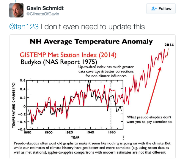
He didn’t want to update it, so I updated it for him. His graph has completely removed the 0.5C cooling from 1940 to 1970. That is the first half of his fraud.
Next comes the part of his fraud which he says “pseudo-skeptics don’t want you to pay attention to” i.e. the post-1970 hockey stick. I’ve been paying attention to that for years, and he has blocked me and ignored it. The upper half of Gavin’s graph is even worse than the lower half. He shows a huge amount of warming since 2000, which has simply not occurred.
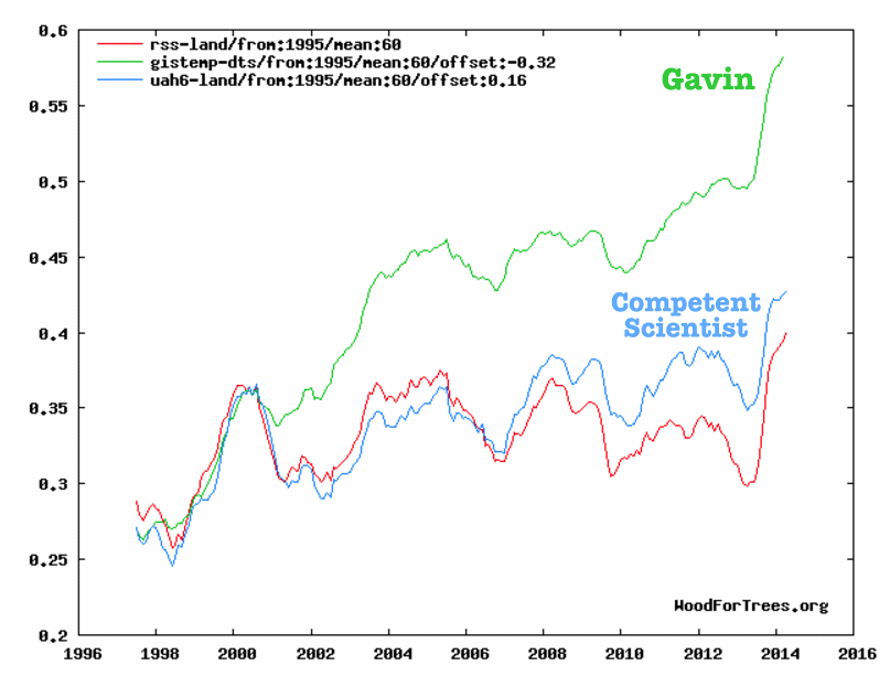
Wood for Trees: Interactive Graphs
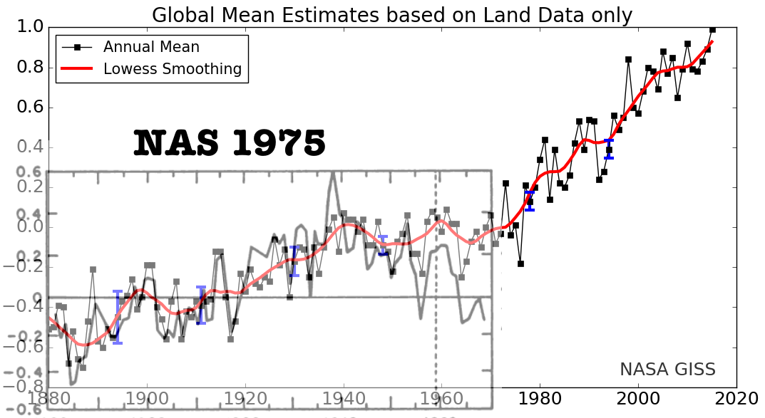
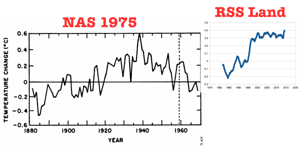
So what does a realistic global temperature graph look like? I combined the satellite graph with the 1975 NAS graph, and used Gavin’s 0.2C warming from 1970 to 1979 to normalize the two graphs. That is undoubtedly too much warming, but I will use it for the sake of argument. What we see is there was 0.5C warming from 1880 to 1940, and only 0.2C additional warming since 1940.
Gavin is a key player in the largest scientific fraud in history. There is no legitimate evidence that CO2 has any meaningful impact on the temperature record. Gavin has been doing Obama’s dirty work, like any other political appointee. He has not been behaving like a scientist.
