
NOAA, NASA and the EPA specialize in generating fraudulent climate graphs, but few are easier to disprove or more fraudulent than this one, which shows that the area of the US experiencing hot summers is increasing and has reached record highs. It is derived from NOAA’s completely fake Climate Extremes Index.
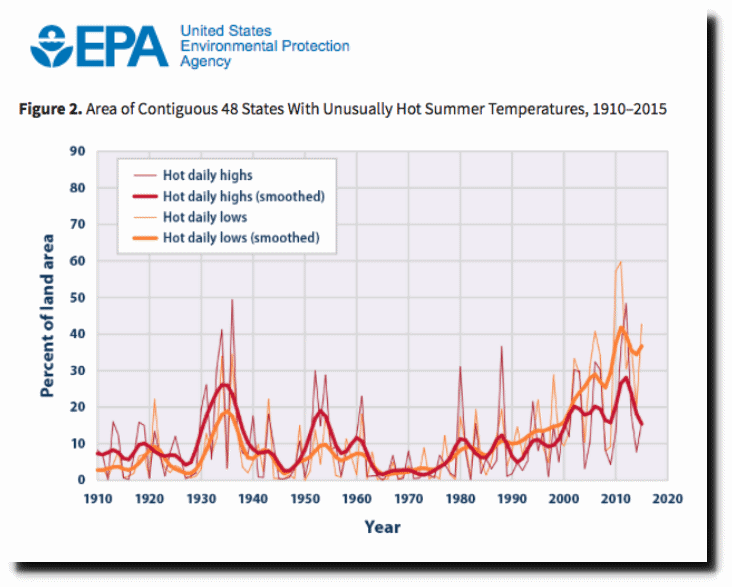
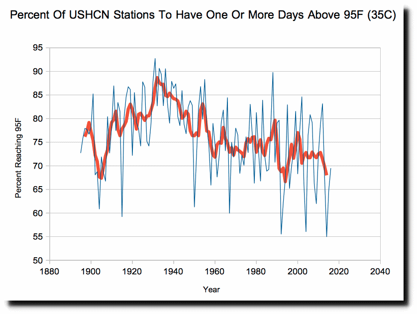
The graph is wildly inaccurate and shows the exact opposite of what is happening. US summers are getting much cooler. The number of stations to reach 95F during the year has plummeted.
The number of stations to have ten days over 95F in a given year has plummeted.

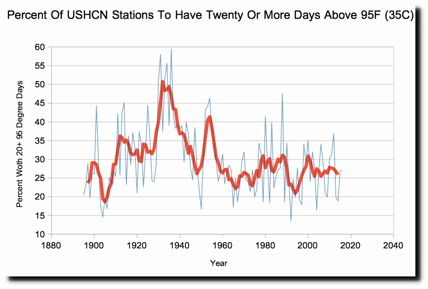
The number of stations to have twenty days over 95F in a given year has plummeted.
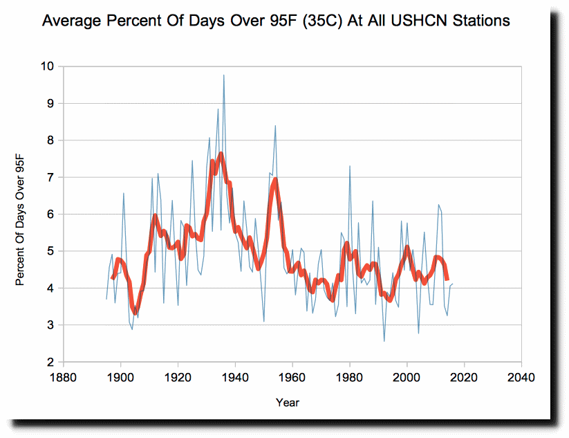
The average percentage of days over 95F are plummeting.
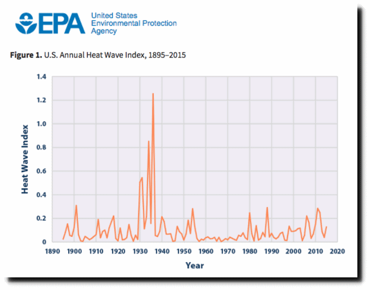
These climate criminals are not very good at covering their tracks however. The same EPA web site has another graph which shows the same thing as my graphs.
Congress needs to shut down this scam, and expose the criminals behind it.
