
The National Climate Assessment claims unambiguous warming globally and in the US since 1880.
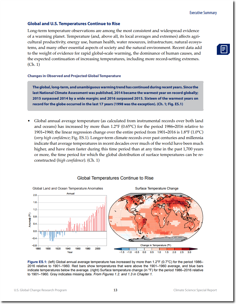
They show a very detailed graph and map which expresses the claimed warming.
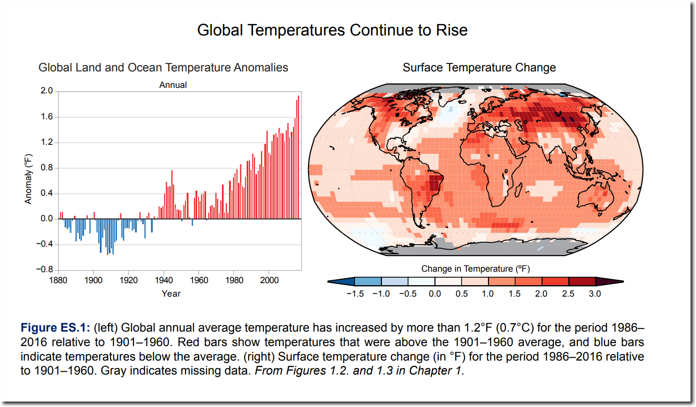
All that red looks pretty scary. Red is the color of fire, and it isn’t hard to convince some people that their carbon sins will lead to hell fire.
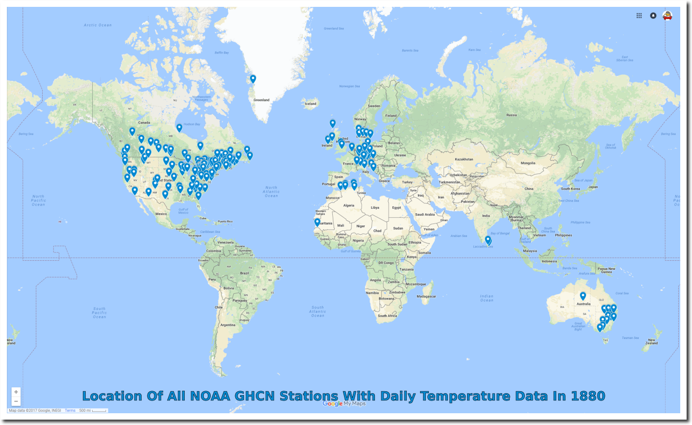
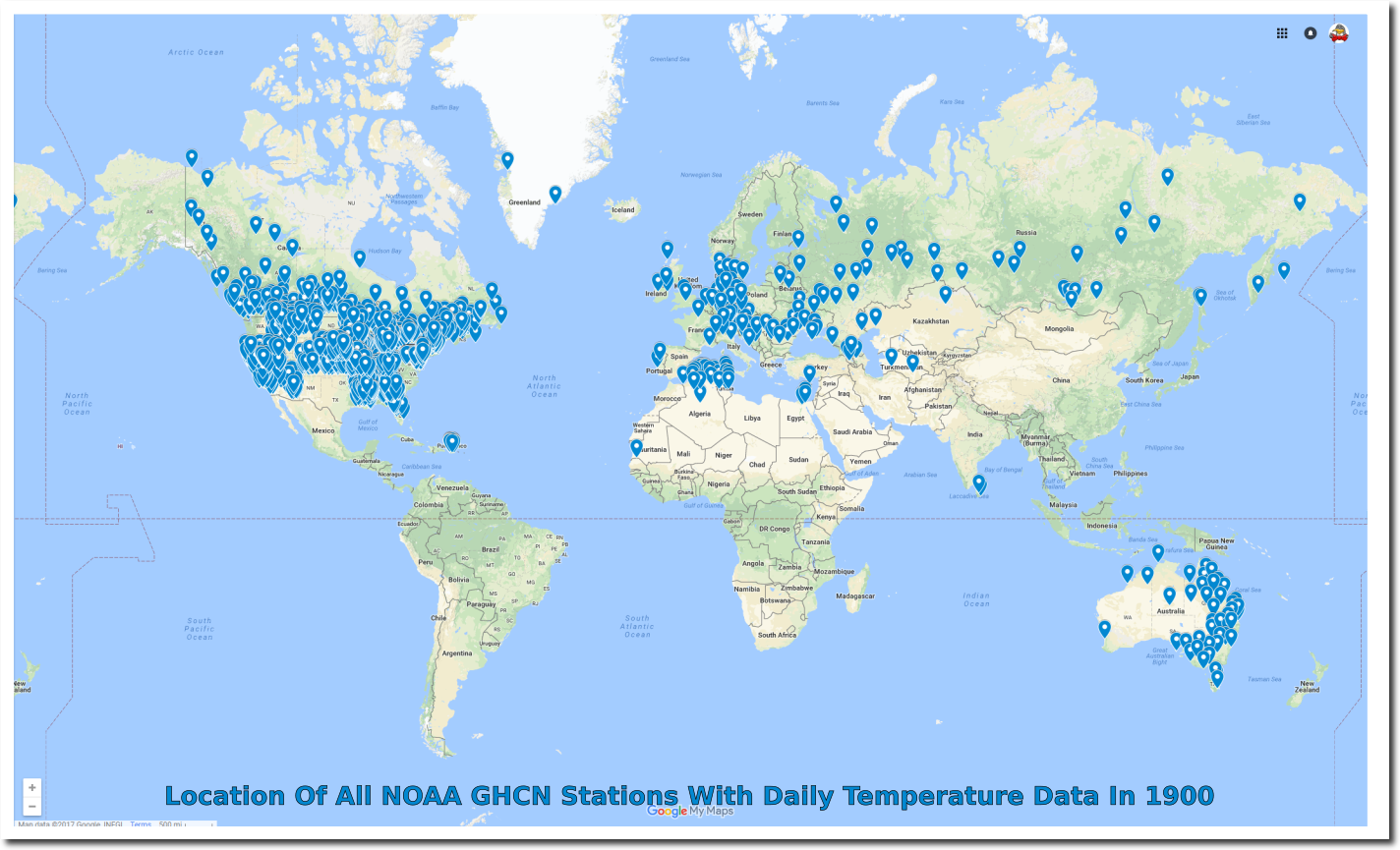
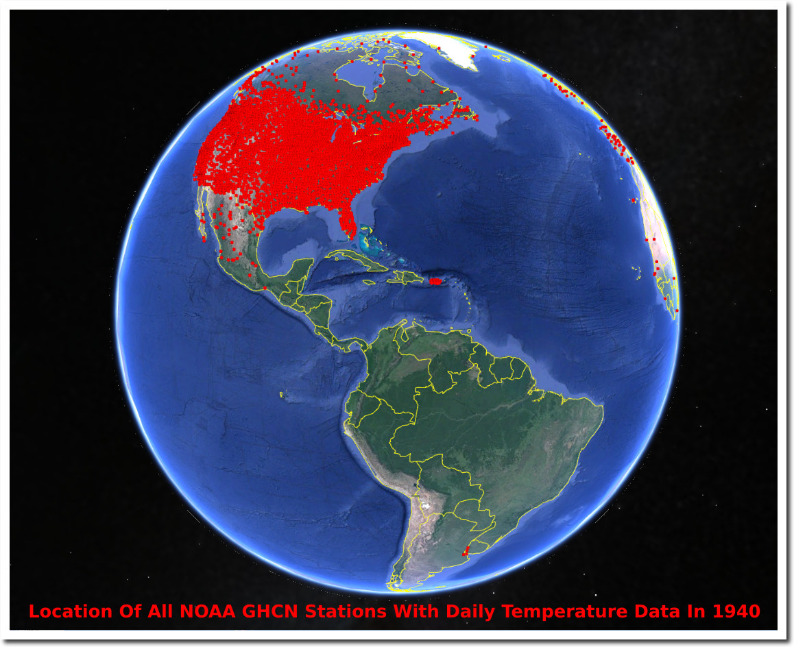
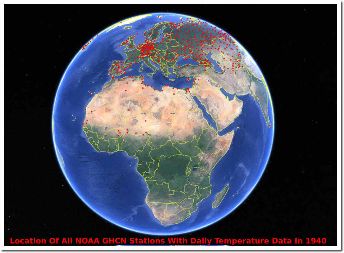
What they aren’t telling is that their graph and map are fake. They have no idea what global temperatures were in 1880, 1900, 1920, 1940, or in fact the present, because outside of the US there is very little verifiable data.
ftp://ftp.ncdc.noaa.gov/pub/data/ghcn/daily/ghcnd-inventory.txt
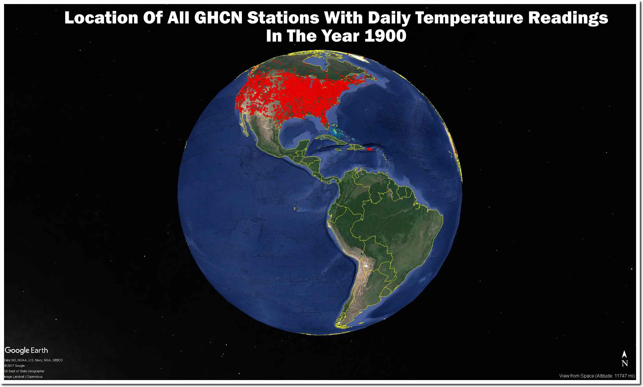
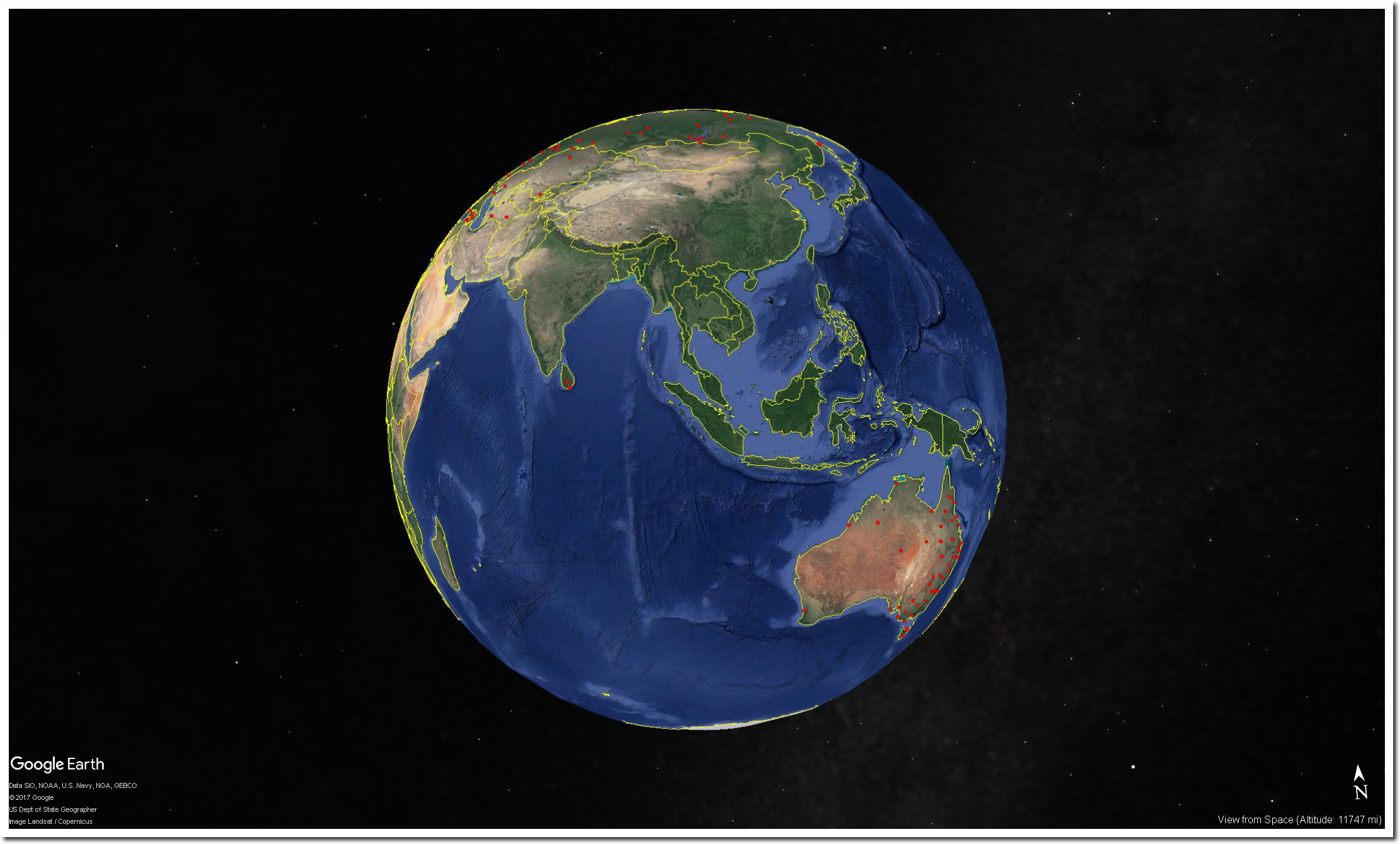
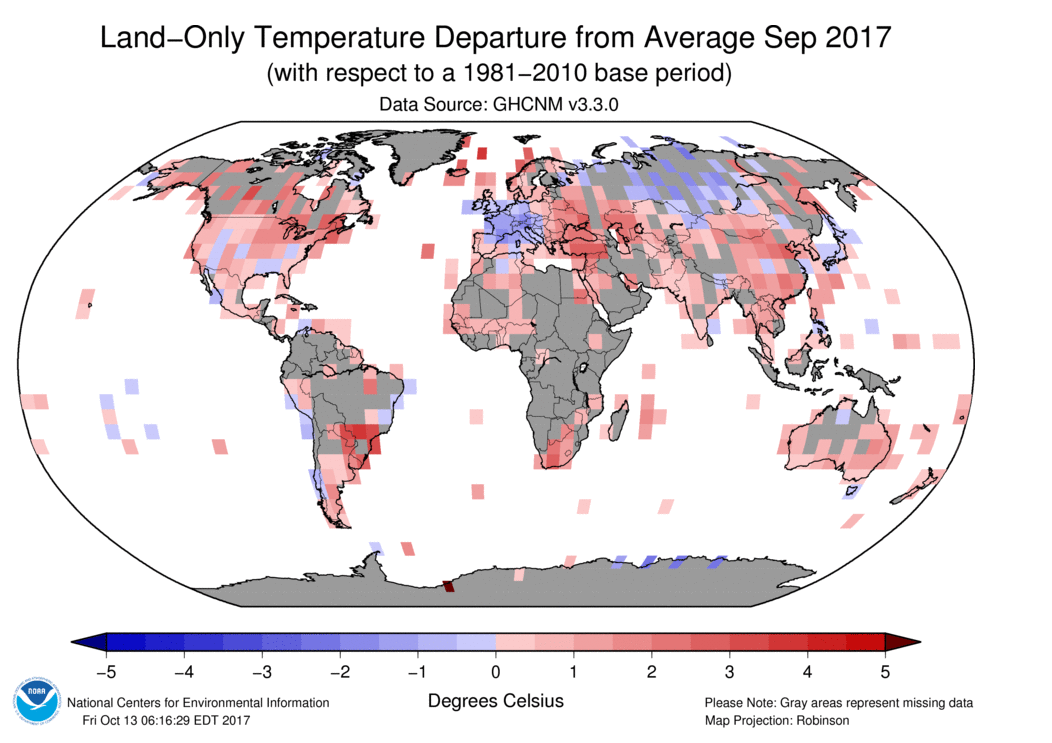
As late as 1940, there was almost no daily coverage of South America or Africa.
ftp://ftp.ncdc.noaa.gov/pub/data/ghcn/daily/ghcnd-inventory.txt
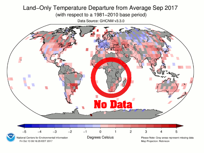
NOAA’s current data in Africa and much of the rest of the world is still fake. They make up record temperatures in countries where they have no thermometer data.
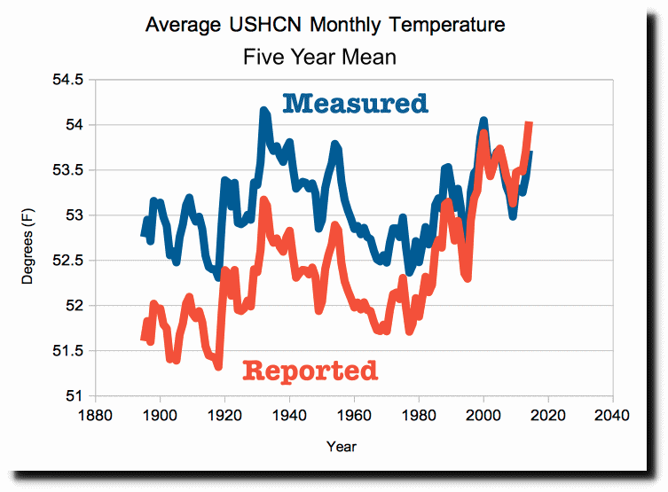
Real temperatures Reported temperatures
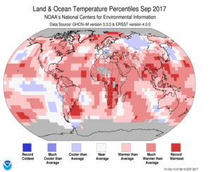
By their own admission, the ocean data is also fake.
date: Wed Apr 15 14:29:03 2009
from: Phil Jones <[email protected]> subject: Re: Fwd: Re: contribution to RealClimate.org
to: Thomas Crowley <[email protected]>Tom,
The issue Ray alludes to is that in addition to the issue
of many more drifters providing measurements over the last
5-10 years, the measurements are coming in from places where
we didn’t have much ship data in the past. For much of the SH between 40 and 60S the normals are mostly made up as there is very little ship data there.Cheers
Phil
The only location on Earth with good long term daily temperature data in the US.
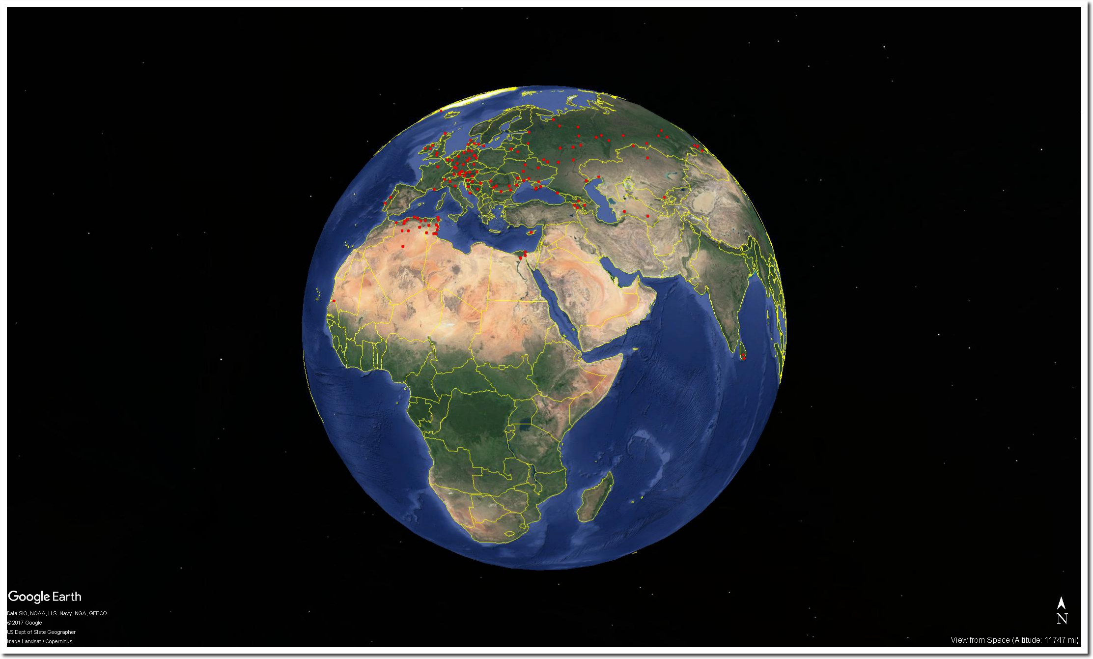
ftp://ftp.ncdc.noaa.gov/pub/data/ghcn/daily/ghcnd-inventory.txt
Before NOAA tampers with their data, the US shows no warming over the past century.
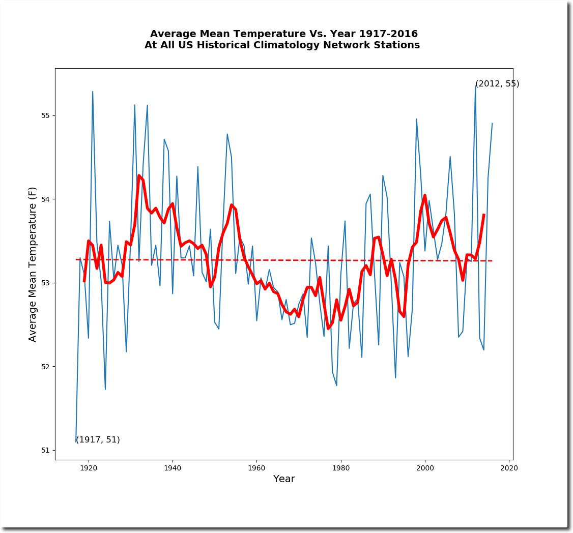
The lack of US warming wrecks global warming theory, so NOAA and NASA tamper with their own data to create fake warming.
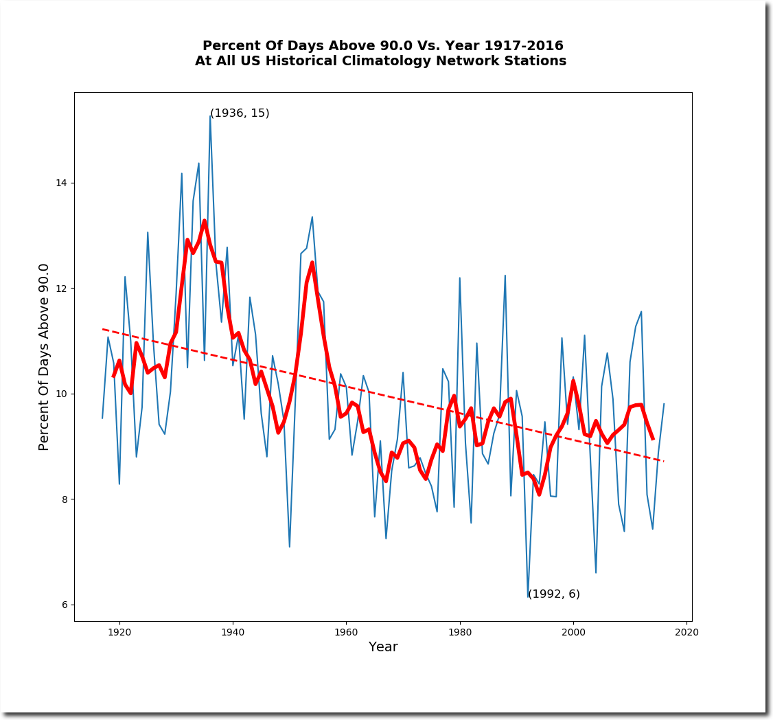
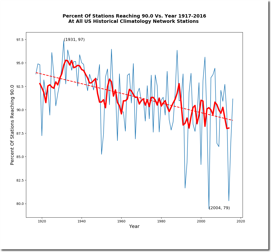
The frequency and coverage of hot weather has plummeted in the US over the past century. The US isn’t getting hotter – afternoons are getting cooler.
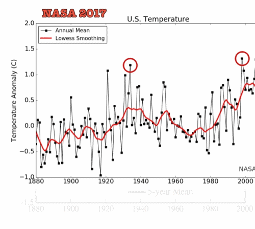
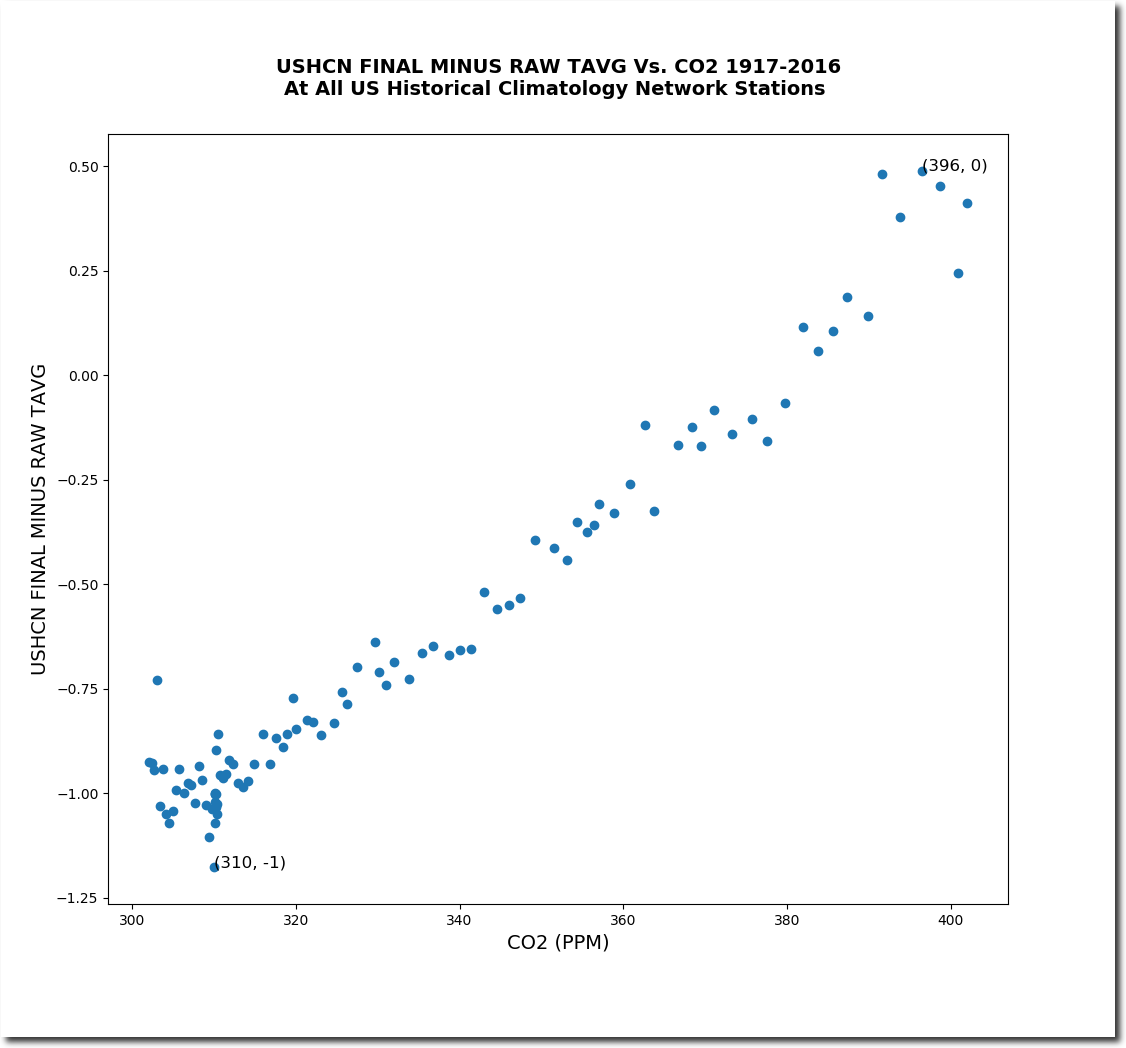
The US temperature data is tampered with by NOAA in a massive hockey stick.
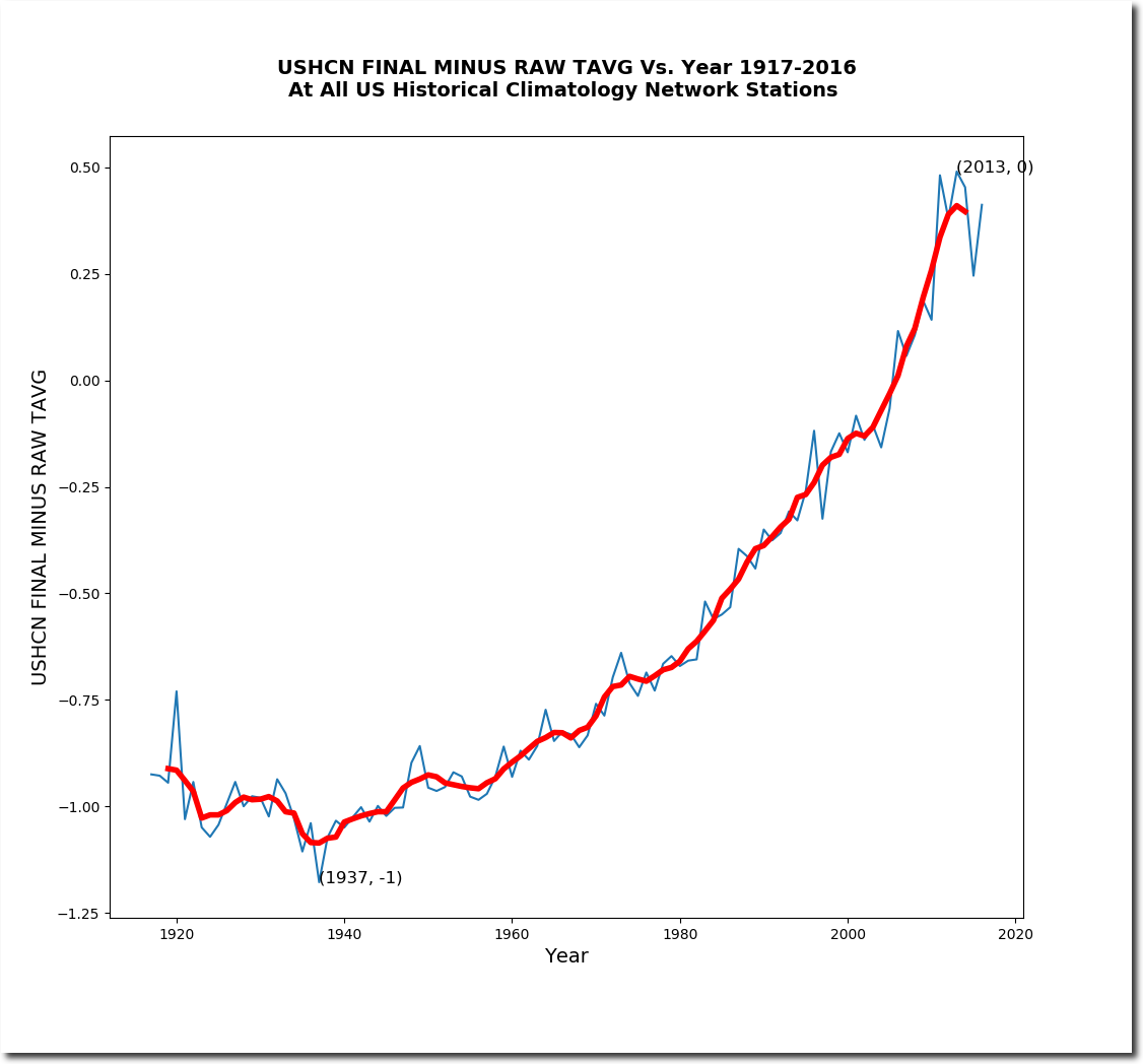
Which is designed to bring the data precisely in line with CO2 theory.
NOAA knows perfectly well that the US is not warming.
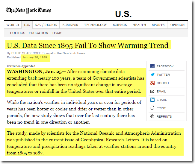
U.S. Data Since 1895 Fail To Show Warming Trend – NYTimes.com
US and global temperatures are constantly being tampered with to cool the past and warm the present.
US tampering :
Global tampering :
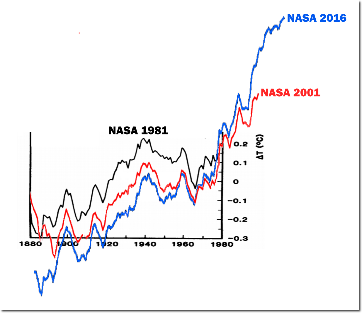
1981: Challenge_chapter2.pdf 2001: Fig.A.ps current: Fig.A.gif
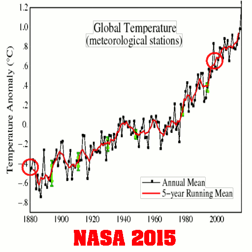
2001 version : Fig.A.ps 2015 version: Fig.A.gif
All of the claims in the National Climate Assessment about global warming are unsupportable junk science, made largely with fraudulent or imaginary data. Global warming is the biggest scam in science history. It has been thoroughly corrupted by tens of billions of dollars of government money – which fake climate scientists refuse to let go of.
The only thing global and unambiguous in the National Climate Assessment, is the level of junk science and fraud it represents.
