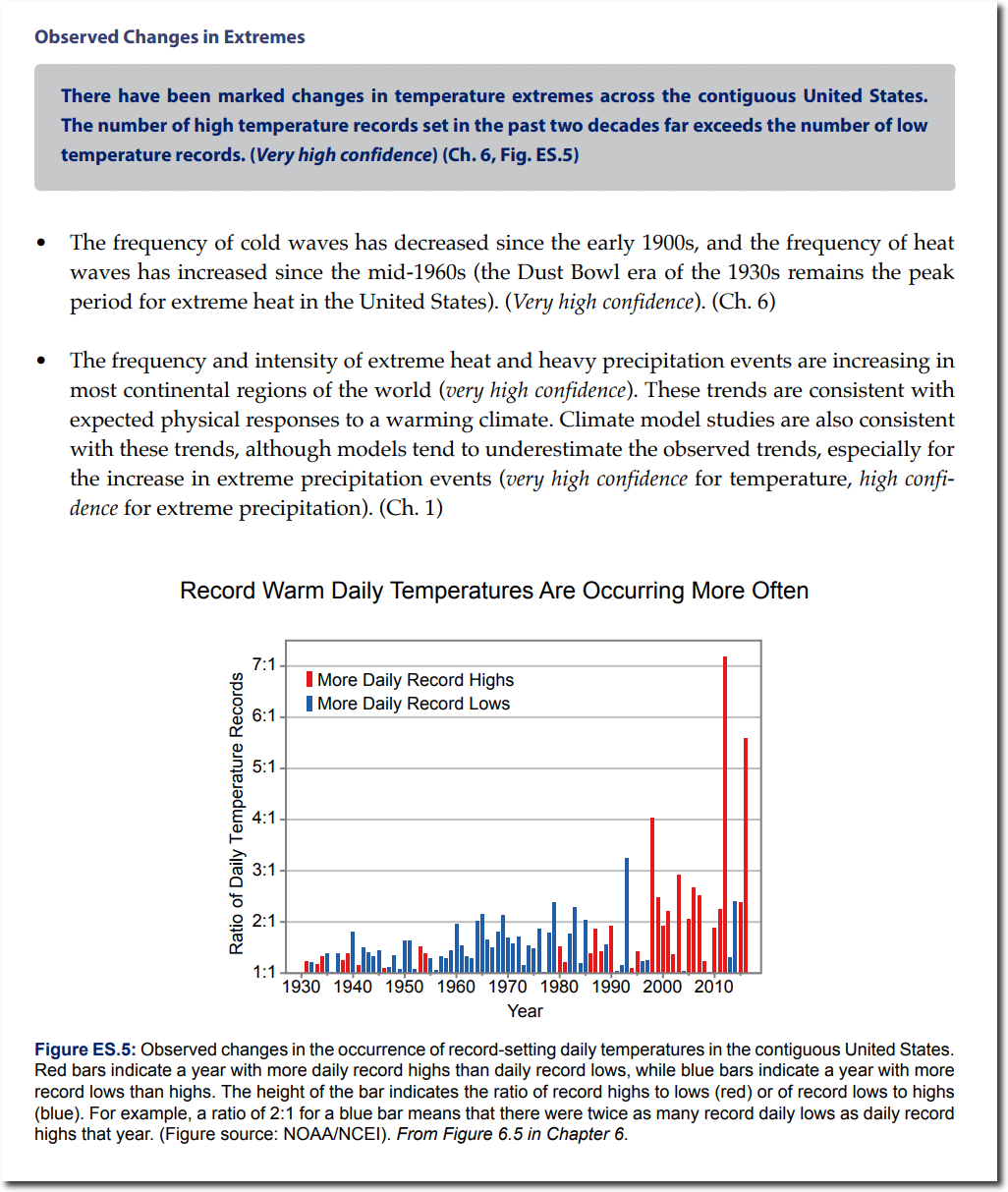
Katharine Hayhoe and her partners in crime have officially released their National climate assessment, which includes this graph, which claims “Record Warm Daily Temperatures Are Occurring More Often”
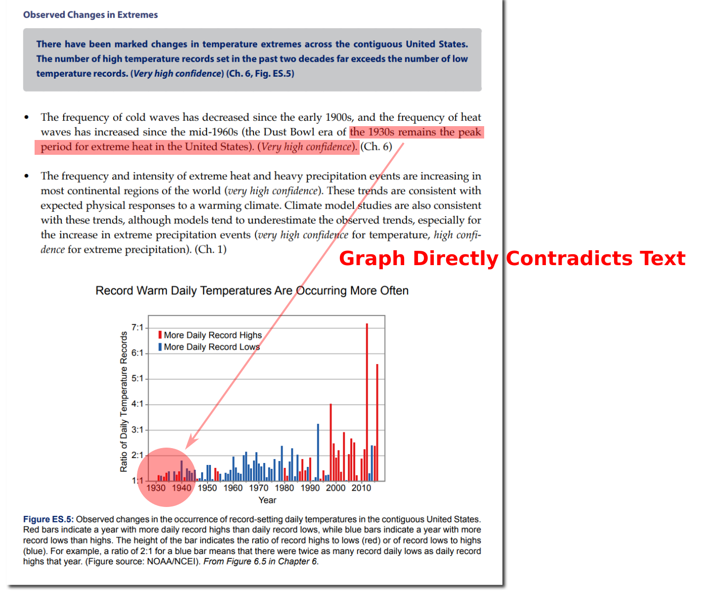
The first thing I noticed is that the text in the report does not match the graph. They say :
the Dust Bowl era of the 1930s remains the peak period for extreme heat in the United States
Yet the graph right below it does not show the 1930’s as being hot.
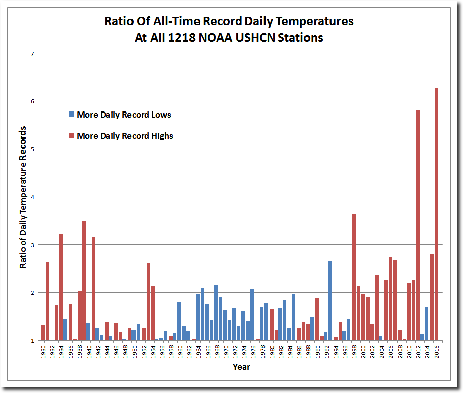
Unfortunately for Katharine and her band of climate fraudsters, I have software which does this calculation. The graph below is the correct version. Their graph is more or less correct after 1970 – but the pre–1970 data is completely fraudulent. They removed all of the hot weather from 1930 to 1954. NOAA does not make adjustments to daily temperatures, so they can’t use that excuse.
The report claims :
Record Warm Daily Temperatures Are Occurring More Often
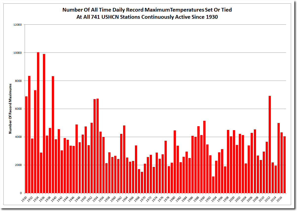
That is an outright lie. Record warm daily maximum temperatures have decreased sharply since 1930 – the start date of their graph.
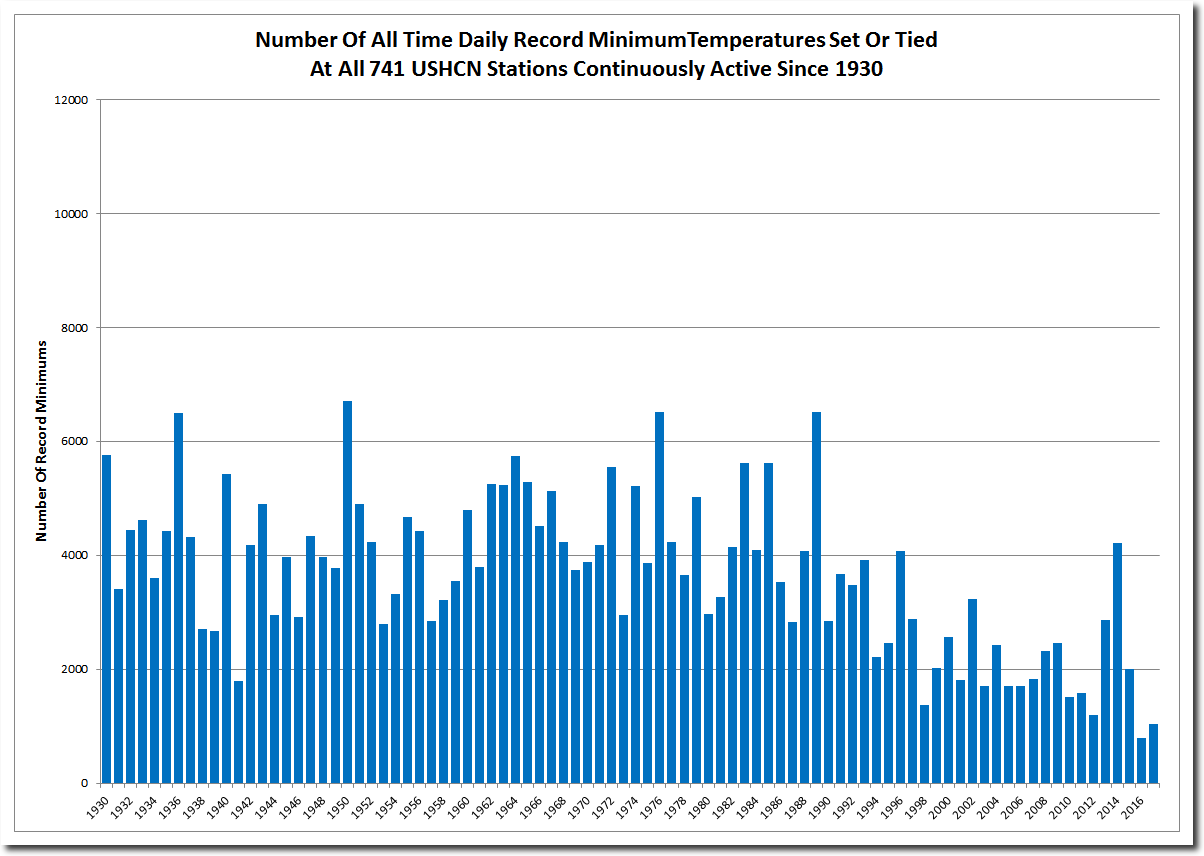
The number of record daily minimums has also decreased.
The US climate is getting milder, with fewer very hot or very cold days.
So why the big spikes in 2012 and 2016?
This is a classic divide by zero error. Ratios become unstable when the denominator becomes small. The numbers are meaningless. No serious scientist would release a wildly flawed and dishonest graph like Katharine Hayhoe does on a consistent basis.


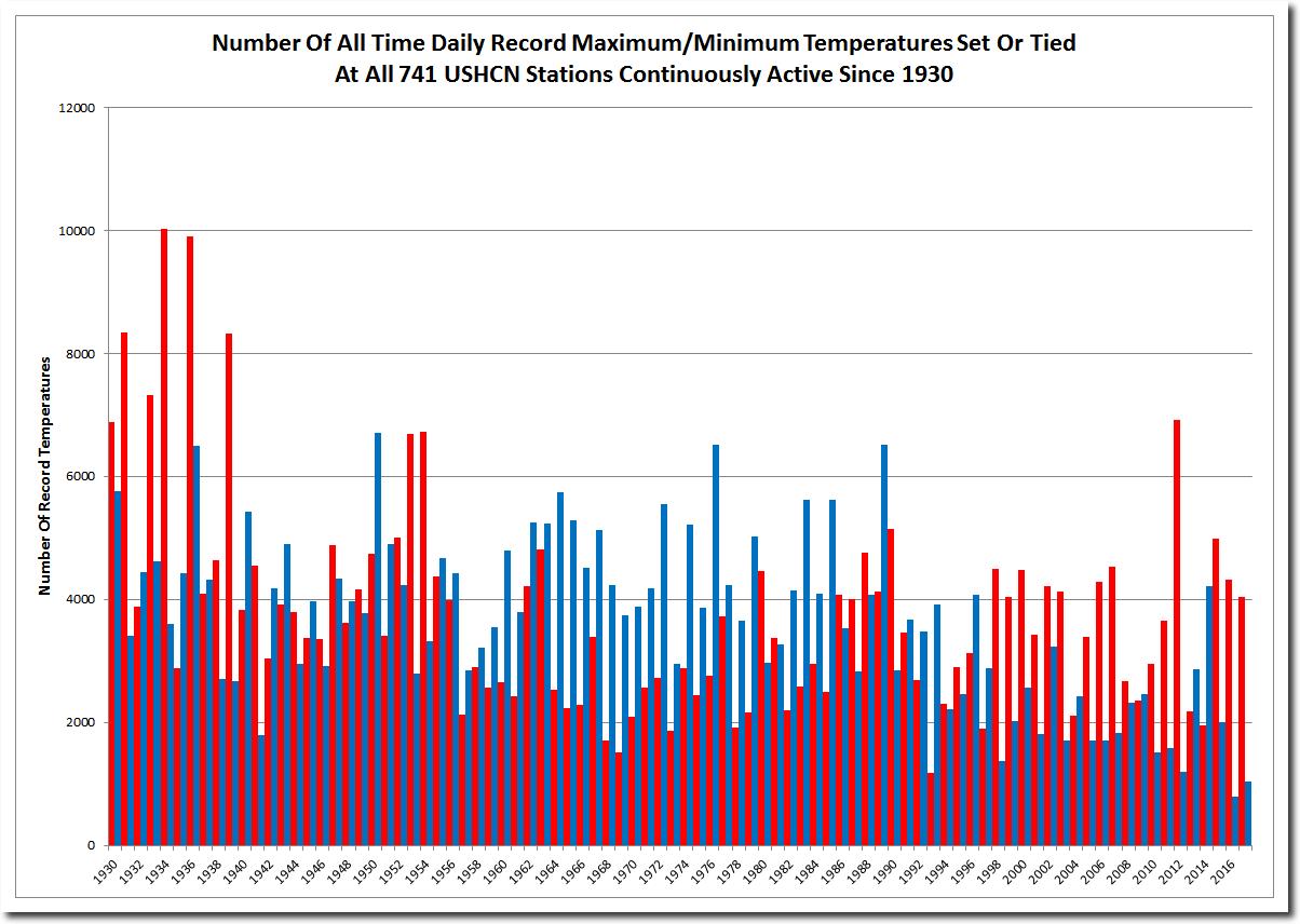

So the red one shows the hot temperature? because of population getting bigger it’s getting hot temperature since 1900’s.