NOAA US Data Tampering Update

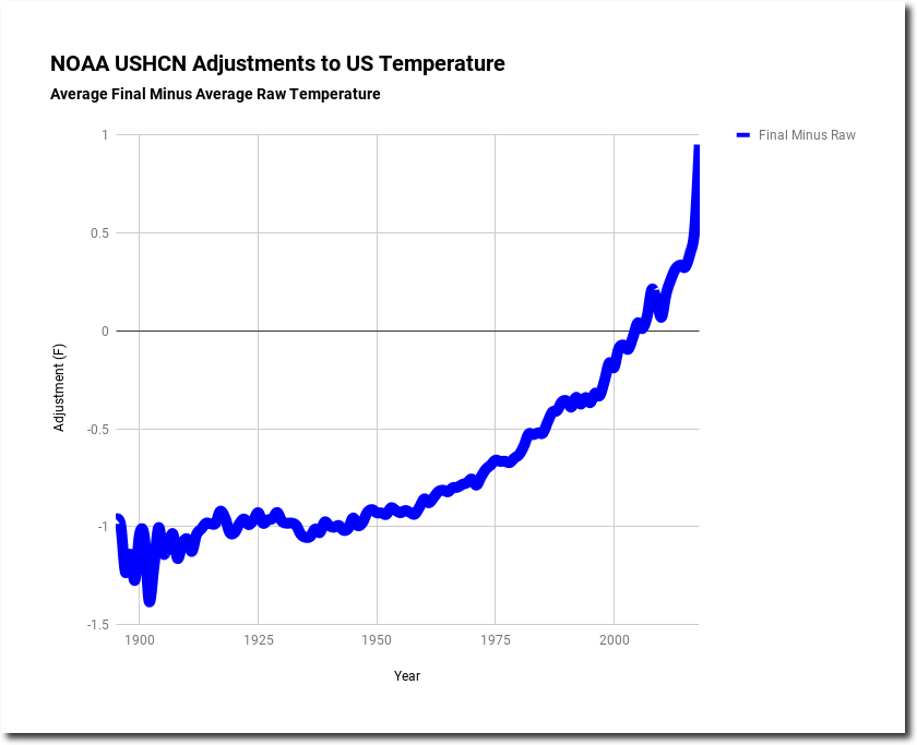
Measured US temperatures show cooling over the last 90 years.  This doesn’t suit the needs of the climate mafia, so NOAA massively alters the data to turn cooling into warming.  NOAA cools the past by more than one degree, and warms the present by nearly one degree.  Then other climate scientists use this fake data to confirm fake theories about CO2 emissions warming the planet.

Spreadsheet

This entry was posted in Uncategorized. Bookmark the permalink.

15 Responses to NOAA US Data Tampering Update

  1. NavarreAggie says:

    It amazes me how much this is ignored. While I haven’t done the analysis, I would bet that this tampering alone accounts for most of the difference between terrestrial and satellite temperature records, the residual error being a function of location differences, measurement techniques, etc. If you could ever disprove CAGW with one graph, this would be it.

    • tonyheller says:

      Particularly amazing is how this data is ignored by some prominent skeptics.

      • garyh845 says:

        Should be that every Republican (and any willing Democrat) politician would have copy of your graphics here in their coat pocket, and anytime that they are asked about ‘man-made’ global warming (though few use the term man-made any more), they’d pull it out, and say – here is what is man-made – most all of it . . by men and women sitting in their offices.

      • Kent Clizbe says:

        Tony,

        “Skeptics” is a better term–or better yet, self-styled-skeptics.

        There is a large contingent in the self-styled-skeptic community that just craves acceptance by the fraudster community. They want to publish in the “Climate Science” journals. They want to talk to PC media. They crave respect.

        These “skeptics” become the alarmists’ best friends. They do the dirty work of the alarmists. They attack Realists. They denigrate logical arguments. They defend the consensus.

        So, of course they ignore your clear evidence of fraud and deceit.

        Don’t despair, though!

        In the fullness of time….

  2. Dee says:

    The nice thing about it all is that it’s being done openly, under the gaze of a sleeping public.

    Here, NASA explains that their adjustments have added heat to the tune of half a degree Celsius to the 20th century US records, to “correct”

    https://data.giss.nasa.gov/gistemp/faq/

    And here, in 2011, the US Government Accountability Office informs the public that 42% of USHCN weather stations were wrongly sited too close to extensive paved surfaces or obstructions such as buildings and trees.

    Meaning they were prone to recording artificially high temperatures.

    • garyh845 says:

      Seems that when it comes to any sta situated in an urban setting – notably any in large metro areas (like Los Angeles’s downtown location) that because of the urban heat island effect, that the adjustments should be one of lowering later readings. They do just the opposite, lower older temps, and raise more recent years?

    • Advocatus Diaboli says:

      I’d like to see Tony directly attack GISS’s rationale, given in the link above, for using “adjusted” data. (See especially the FAQ question, “How can we combine the data of the two stations above in a meaningful way?”)

      Or if he or someone else has already done that on this blog, then a link to that discussion will be very helpful.

      To my mind, the most useful graphs Tony publishes are the ones that give raw data for stations that reported throughout the whole period (filtering out the effects of adding or removing stations), to show that temps are actually decreasing.

  3. GW Smith says:

    Measurements are hard, you need good eyes. Counting is easier, you only need your fingers and toes.

  4. EdB says:

    “NOAA cools the past by more than one degree, and warms the present by nearly one degree”

    With 95% of the ocean as a big unknown before the satellite era, the “data” on ocean temperatures is simply made up. Add to that the lack of Arctic weather station coverage, Antarctic, Africa, South America.. an honest scientist would refrain from using “global” average temperatures prior to the satellite era.

  5. If there were any error in Tony’s temperature data, parasitical Climate Cassandras would be blaring about it in headlines. American nuclear energy was victimized by the same rumormongers. Every nuclear reactor saves thousands of lives a year by replacing more dangerous plants. Yet gangs of insinuators formed counterfeit consensuses to camouflage the fact, drowning it in documendacities and handwringing appeals for politicians to send forth men with guns. Their names are recorded. Show me any attacker of U.S. nuclear energy from the Cold War era and I’ll show you a brainwasher out to ban ALL American energy generation today.

  6. frederik wisse says:

    Please take a close look at todays arctic ice-maps by US satellites .
    What can you notice ? Arctic sea-ice is increasing for the moment !
    In MAY ! Without doubt NOAA will continue goofing the world . Let us hope that there will not be any significant volcanic explosion within short handing the alarmists a new excuse for their falsifications of reality .Tony , muchos gracias .

    • steve says:

      I saw a video of some smug self-described “scientist” trying to explain that the increase in ice is ALSO due to global warming.
      So, in other words, if the ice shrinks .. .GLOBAL WARMING!
      So, in other words, if the ice increases .. .GLOBAL WARMING!

    • Steven Fraser says:

      Using DMI published Ice Volume, thr highest value this year (so far) was on April 28, and has not declined very much since then. If it keeps this low rate of decline a bit longer, ( actually day-to-day wavering), the current-day value will be crossed by more prior years, which peaked earlier. The next closer higher value yesterday was 2013, and only 21 cu km more than yesterday. For comparison, yesterday rose 37 cu km HIGHER.

      Of the 16 years reported, the 2018 peak was the 13th latest, only exceeded by 2102 (Apr 30), 2008(May 5) and 2007(May 7).

  7. Mark aka supergriff says:

    This is actually two separate realities. The blue line is a blue state graph and the red line is a red state graph. We need a government program to promote the production of more diverse colored graphs. Perhaps we can hire some crayola execs tired of competition and looking for perpetual care in the govt sector.

Leave a Reply

Your email address will not be published. Required fields are marked *