
Eli Melaas is bragging that Blue Hill, MA has the best temperature record in the US.
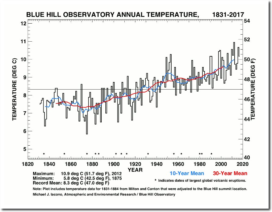
And he provided this graph.
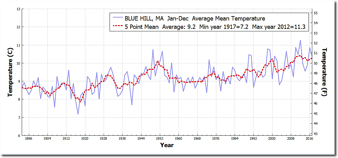
This is what the actual USHCN daily data looks like.
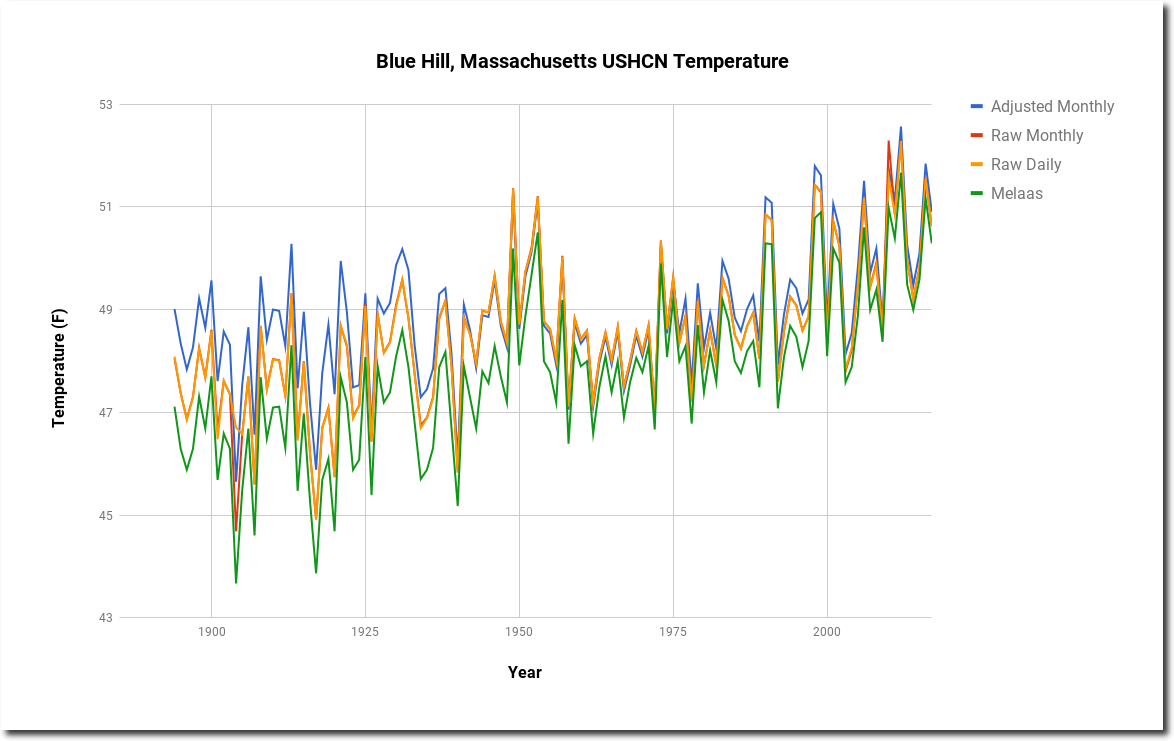
I plotted four versions of the graph – Melaas, USHCN raw daily, USHCN raw monthly, and USHCN adjusted monthly. As you can see there is a huge spread, other than the two raw data sets which agree almost exactly.
Here is the graph from the NOAA web site. Essentially identical to the USHCN adjusted.
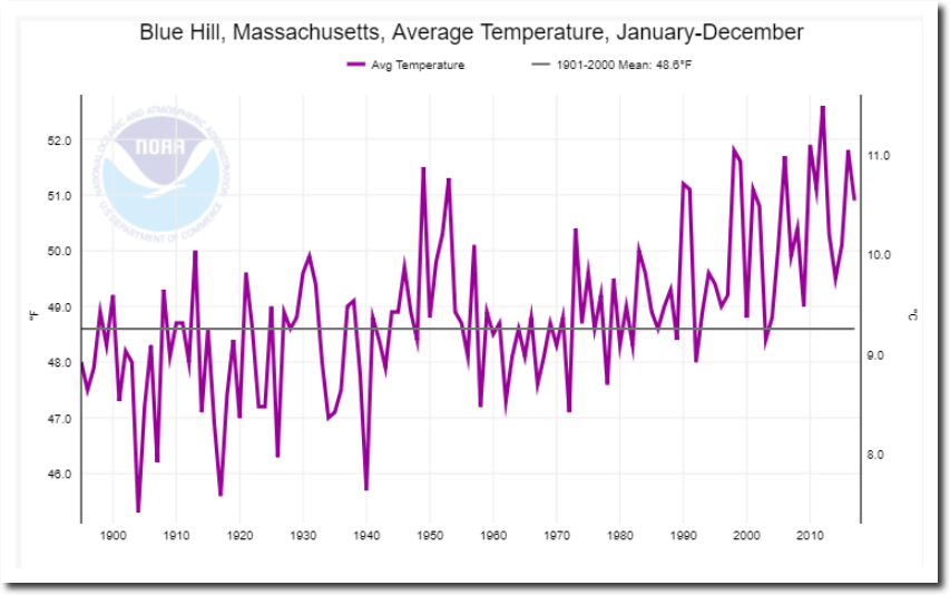
Climate at a Glance | National Centers for Environmental Information (NCEI)
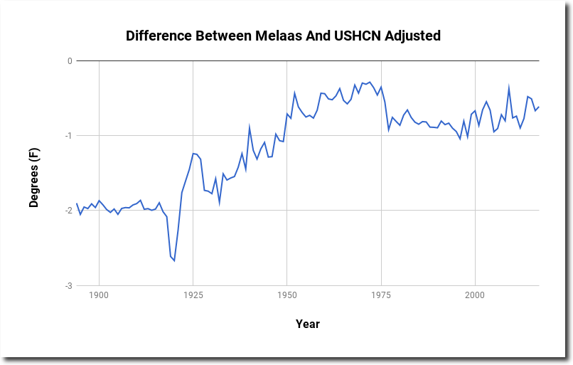
Blue Hill is one of the few USHCN stations where NOAA warms the past with the adjustments. Melaas version of the data shows a lot more warming than other data sets. Here is the difference between Melaas and USHCN adjusted temperatures.
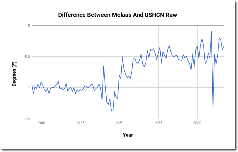
Here is the difference between Mellas and USHCN raw temperatures.
If the Blue Hill station is so good, why is the data being tampered with? And why does Melaas’ graph show so much more warming than the other graphs?
