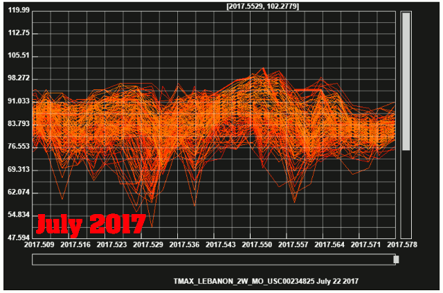
July, 1936 was about 15 degrees hotter than July, 2017 in the Midwest. The animation below shows the daily maximum temperatures at all Midwest USHCN stations during both years.
Email Subscribe
Disrupting the Borg is expensive and time consuming!
-
Recent Posts
Recent Comments
- Jack the Insider on That Didn’t Take Long
- Eli the Pit Bulldog on Journalism Runs Even Drier
- Ulric Lyons on Arctic Still Refuses To Melt As Ordered
- Eli the Pit Bulldog on Green Energy
Archives
- August 2022
- July 2022
- June 2022
- May 2022
- April 2022
- March 2022
- February 2022
- January 2022
- December 2021
- November 2021
- October 2021
- September 2021
- August 2021
- July 2021
- June 2021
- May 2021
- April 2021
- March 2021
- February 2021
- January 2021
- December 2020
- November 2020
- October 2020
- September 2020
- August 2020
- July 2020
- June 2020
- May 2020
- April 2020
- March 2020
- February 2020
- January 2020
- December 2019
- November 2019
- October 2019
- September 2019
- August 2019
- July 2019
- June 2019
- May 2019
- April 2019
- March 2019
- February 2019
- January 2019
- December 2018
- November 2018
- October 2018
- September 2018
- August 2018
- July 2018
- June 2018
- May 2018
- April 2018
- March 2018
- February 2018
- January 2018
- December 2017
- November 2017
- October 2017
- September 2017
- August 2017
- July 2017
- June 2017
- May 2017
- April 2017
- March 2017
- February 2017
- January 2017
- December 2016
- November 2016
- October 2016
- September 2016
- August 2016
- July 2016
- June 2016
- May 2016
- April 2016
- March 2016
- February 2016
- January 2016
- December 2015
- November 2015
- October 2015
- September 2015
- August 2015
- July 2015
- June 2015
- May 2015
- March 2015
- January 2015
Hi Tony!
This looks promising. I don’t fully get what is red and what is orange? Shouldn’t red be on top?
Two areas of critique from the other side are:
-He is not “gridding” the data. Fact: Minimal impact for USHCN!
and
-He is not using anomalies. Fact: Real temps are clearer! but still something to claim for the laymen…
One idea to close both gaps, but still producing clear graphs, could be to look at a stations average temp (base temp) and then see how anomalies fluctuates between years for individual base temps.
I did that in the graph the Scott, who turned out to be a “graph dyslectic”, the other day and I repeat it below.
What I have done is:
– Calculate the average Max temp for every station during its lifetime (1900-2017) for every month, i.e. 12 base temperatures per station
– Grouping stations by the different base temperatures
– Calculate average anomaly for every base temperature from stations that shares same base temp.
– Comparing unadjusted and adjusted data.
Below you see USHCN 1930-1939 as gray. 1934 is read and 2012 is blue. Dotted is NOAA adjusted.
To me, and I am biased here, this clearly shows how 2012 could become the “hottest” year evvehh. It was simply because of a milder winter. If you instead compare 20-35C it is a totally different story… (Sorry for the center grades but you get it). If you look at the high 24-32 gray span that is 1936 (should have colored it). 1936 failed the hottest list because of a very cold spring (again gray far below 0 in the beginning).
I argue that stations with similar base temperatures should react similarly to sun, back radiation and what have you. This way of viewing things also makes it very clear that impact is NOT linear. Colder stations are more easily heated than warmer ones. (This is actually a no brainer but effectively hidden with the common anomaly methods).
Even if you don’t want to use this, is this a good idea???
Thanks
Gridding is meaningless for station data, which is located at a single point. Gridding only comes into play when climate scientists want to obfuscate their fraudulent adjustments.
Gridding is the fundamental method of modern climate science. Here is how it’s been done at the Climate Research Unit of Dr. Phil Jones of the University of East Anglia:
More here, for anyone with a strong stomach.
Gridding can be a useful even necessary tool but in the wrong unethical hands has exactly the same problem as gerrymandering political voting zones. There just is not substitute for integrity and when one gets down to it that is what the fundamentals of science and statistics require of those that create them to be useful tools for gaining knowledge and understanding.
https://arstechnica.com/science/2017/07/satellite-temperature-record-update-closes-gap-with-surface-records/
Doesn’t this count?
I have blogged numerous times how the climate mafia forced Carl Mears into making that change.
https://www.youtube.com/watch?v=8BnkI5vqr_0
Mears does not appear to be blinking out an SOS. The closer the results between satellites get, the closer they are to ground stations.
Did you read the ARS article?
A few hours has passed.
Now anybody can respond. If idiotic I want to know…