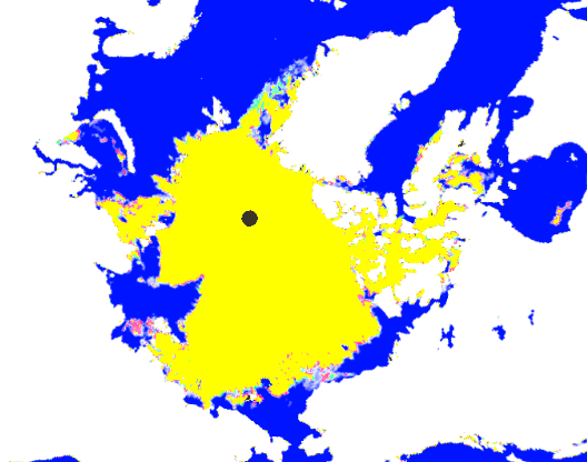
At the peak of the Arctic melt season, ice extent loss has essentially stopped. Green shows areas of increased ice since Sunday, and red shows the opposite.
Disrupting the Borg is expensive and time consuming!
Google Search
-
Recent Posts
- 65 Years Of Progress!
- El Nino To The Rescue?
- Worst March Drought On Record
- ChartGL Process Control Demo
- The Biggest Money Laundering Scam
- Drought In The Headwaters Of Lake Powell
- Unrealistic Expectations Of Water Availability
- Did Bill Gates Do This?
- Worst March Drought On Record In The US
- The Real Hockey Stick Graph
- Analyzing The Western Water Crisis
- Gaslighting 1924
- “Why Do You Resist?”
- Climate Attribution Model
- Fact Checking NASA
- Fact Checking Grok
- Fact Checking The New York Times
- New Visitech Features
- Ice-Free Arctic By 2014
- Debt-Free US Treasury Forecast
- Analyzing Big City Crime (Part 2)
- Analyzing Big City Crime
- UK Migration Caused By Global Warming
- Climate Attribution In Greece
- “Brown: ’50 days to save world'”
Recent Comments
- Bob G on 65 Years Of Progress!
- Gordon Vigurs on 65 Years Of Progress!
- Bob G on 65 Years Of Progress!
- Bob G on 65 Years Of Progress!
- Mike Peinsipp on El Nino To The Rescue?
- Mike Peinsipp on El Nino To The Rescue?
- Robertvd on El Nino To The Rescue?
- arn on El Nino To The Rescue?
- Bob G on El Nino To The Rescue?
- Bob G on El Nino To The Rescue?


And the yellow is a special snow cone flavor for Al and Mike.
How can you actually tell from that map what the ice losss / gain is visually? Better to check the calculated data from here
http://www.ijis.iarc.uaf.edu/seaice/extent/plot_v2.csv
Shows ice loss, provisional for today, for last 2 days as
-50552
-78800
Which is neither large nor small. But it does show there is some loss.
Andy
Why bother; you can see the red areas in the picture.