Using my new tool set, I am homing in on what is wrong with the California temperature record.
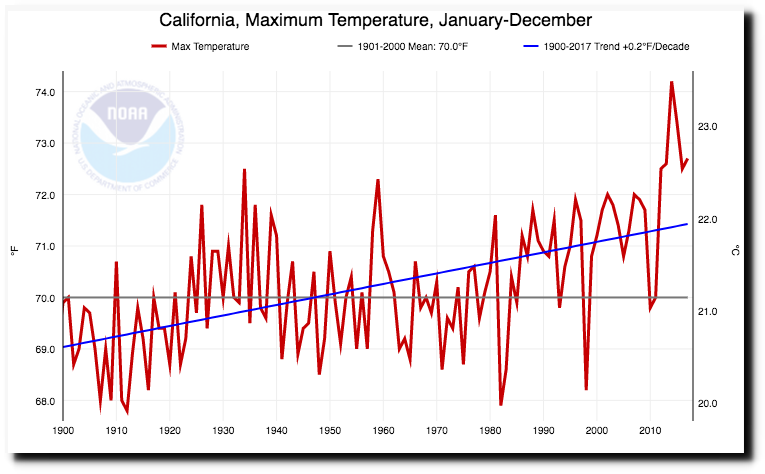
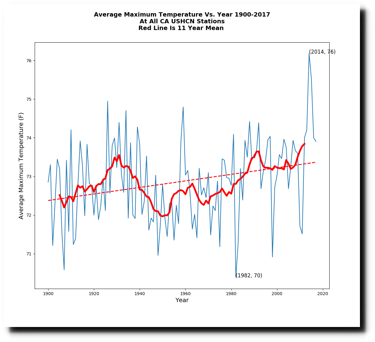
The first problem is just their usual data tampering, which doubles the slope. This is what the raw data looks like.
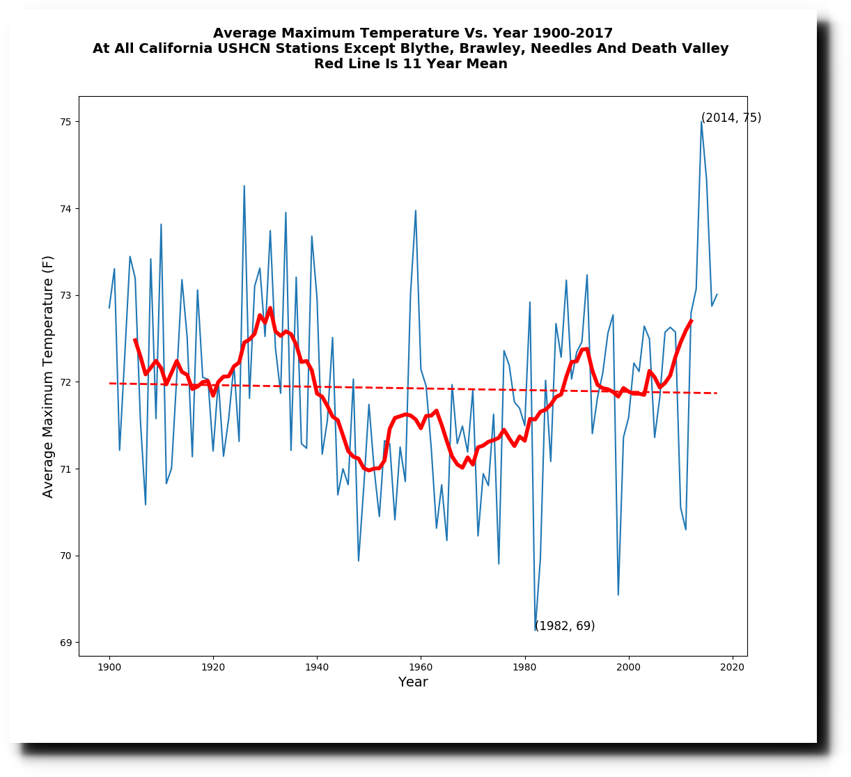
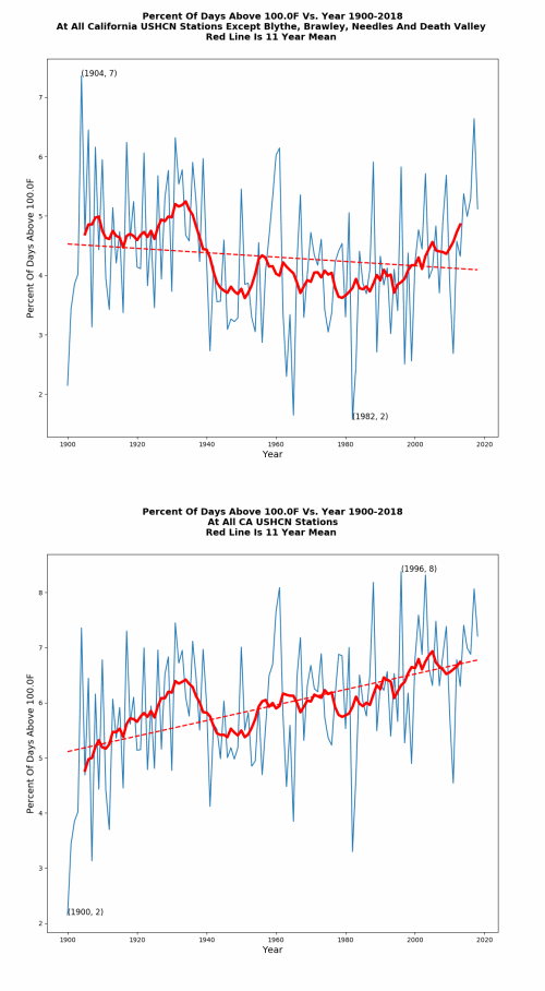
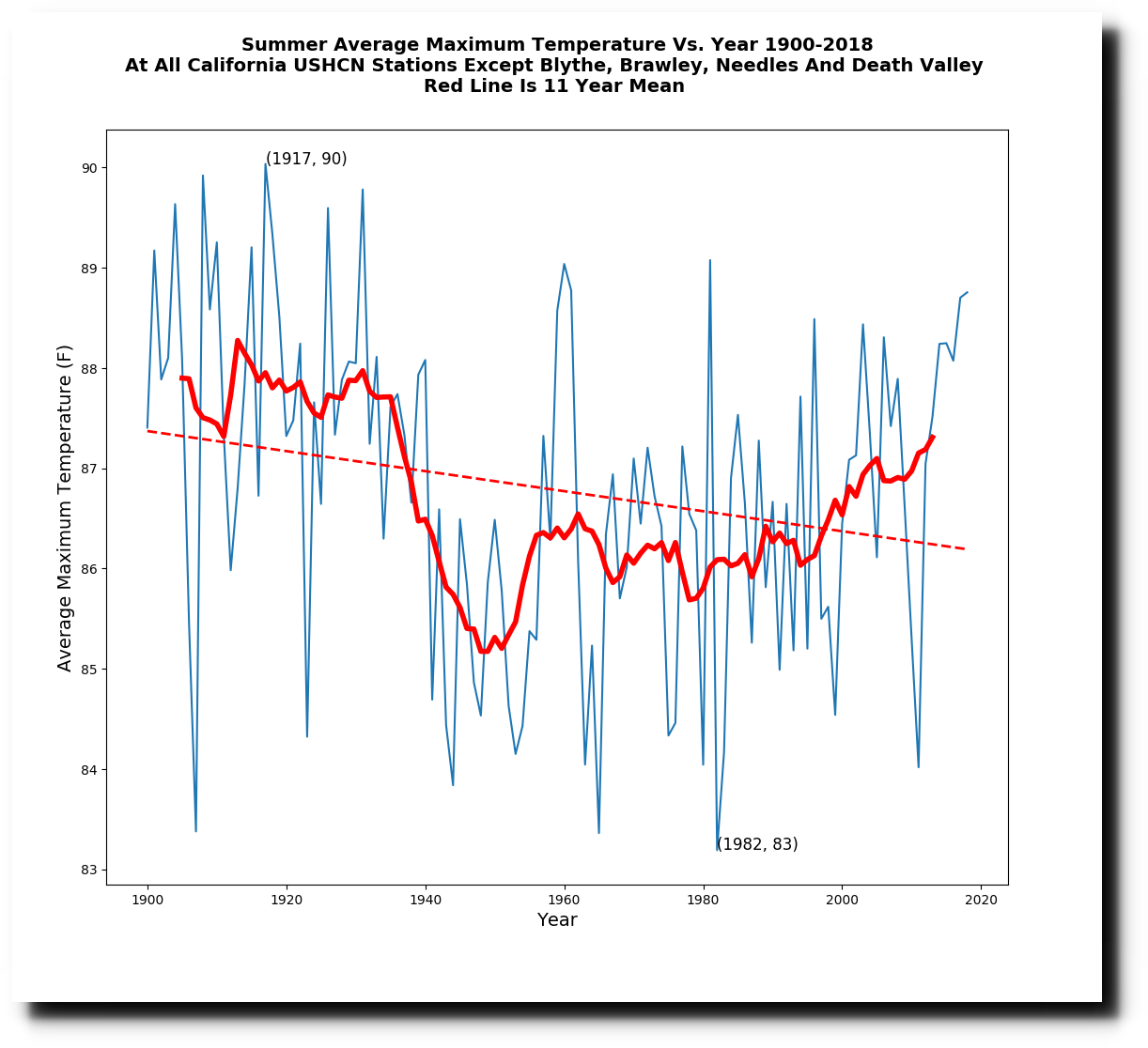
But the real dirty trick is that they successively added four hot stations over time, which pushed the temperature up on the right side of the graph. Brawley was added in 1910, Blythe was added in 1913, Needles was added in 1940, and Death Valley was added in 1961. If those stations are removed, then California maximum temperatures show no trend.
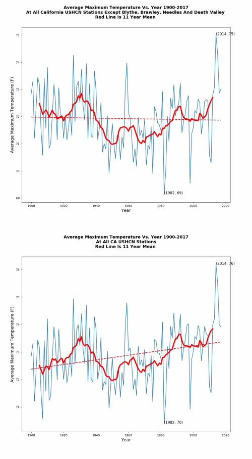
The animations below show how the successive additions of those four stations completely changed the California temperature graphs, and perverted science.
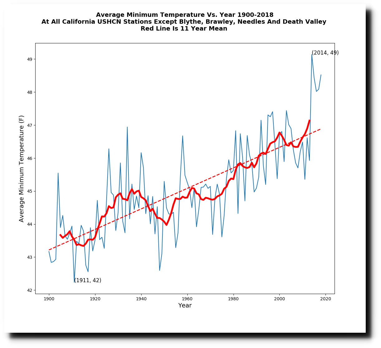
Minimum temperatures have increased, and I suspect this is primarily due to Urban Heat Island effects. I will be looking at this more soon.
The spike in 2014 was due to the El Nino, and primarily affected winter temperatures. Without the four hot stations corrupting the trend, California summers have cooled sharply since the 1920’s.

