


Disrupting the Borg is expensive and time consuming!

Google Search
-
Recent Posts
- You Can’t Fool Mother Nature
- Cattle And The Climate
- One Atomic Bomb Per Hour
- New Video : Analyzing Oil And Gas
- Is Antarctica Melting?
- High Speed Analysis And Visualization
- El Nino To The Rescue?
- Fake News Update
- Growth Of Antarctic Sea Ice
- 65 Years Of Progress!
- El Nino To The Rescue?
- Worst March Drought On Record
- ChartGL Process Control Demo
- The Biggest Money Laundering Scam
- Drought In The Headwaters Of Lake Powell
- Unrealistic Expectations Of Water Availability
- Did Bill Gates Do This?
- Worst March Drought On Record In The US
- The Real Hockey Stick Graph
- Analyzing The Western Water Crisis
- Gaslighting 1924
- “Why Do You Resist?”
- Climate Attribution Model
- Fact Checking NASA
- Fact Checking Grok
Recent Comments
- Ivan G Wainwright on You Can’t Fool Mother Nature
- conrad ziefle on You Can’t Fool Mother Nature
- Bob G on You Can’t Fool Mother Nature
- Gordon Vigurs on You Can’t Fool Mother Nature
- arn on Cattle And The Climate
- Bob G on Cattle And The Climate
- Robertvd on Cattle And The Climate
- Bob G on Cattle And The Climate
- Robertvd on Cattle And The Climate
- Billyjack on Cattle And The Climate
New Video : New York Times – All The Fake Arctic News Unfit To Print
Posted in Uncategorized
Leave a comment
My Arctic Forecast Vs. Government Climate Experts
Three weeks ago I made this forecast of fraud and deception by the science community.
Instead of reporting the huge gain in ice and massive failure of their forecasts, climate alarmists will report that extent was “8th lowest on record.”
My forecast was spot on.
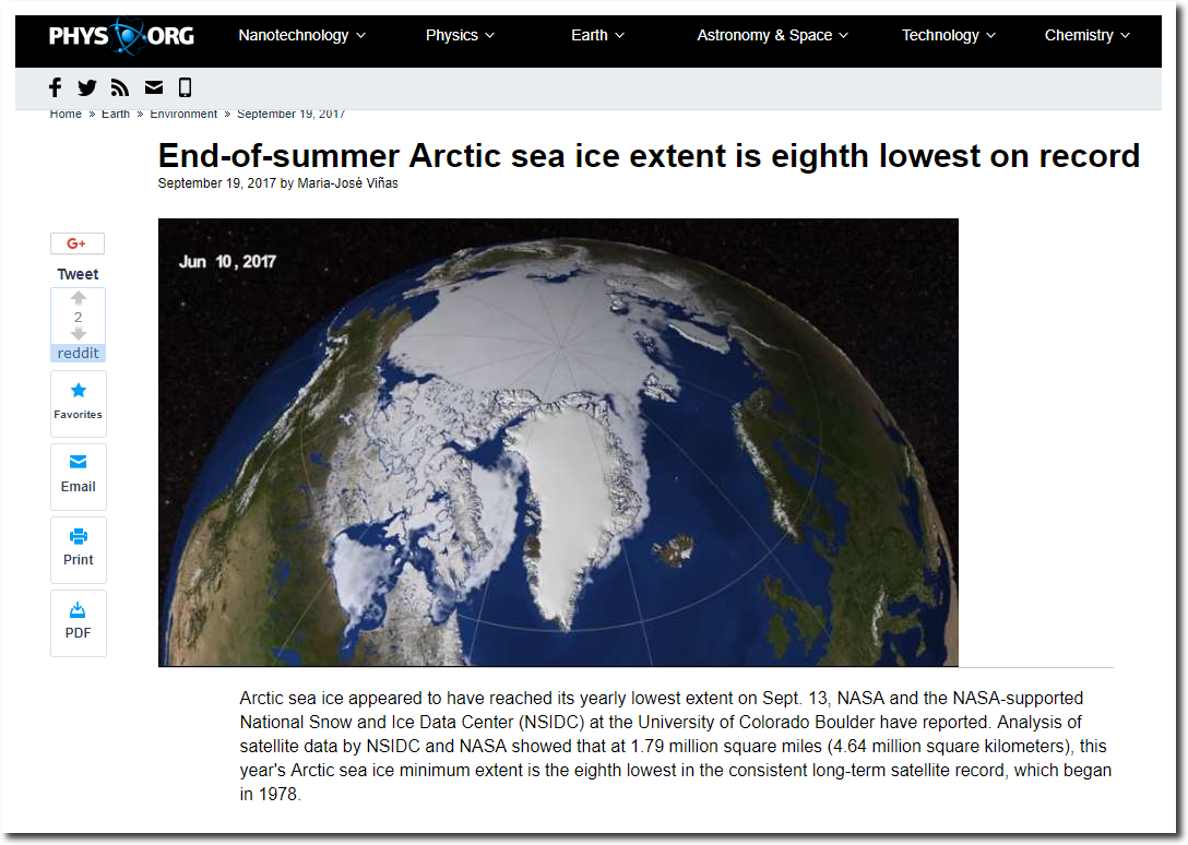
https://phys.org/news/2017-09-end-of-summer-arctic-sea-ice-extent.html
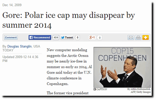
Compare my forecasts vs. their forecasts. They get paid billions of dollars and win Nobel Prizes to lie about the Arctic. I tell the truth about the Arctic – for free.
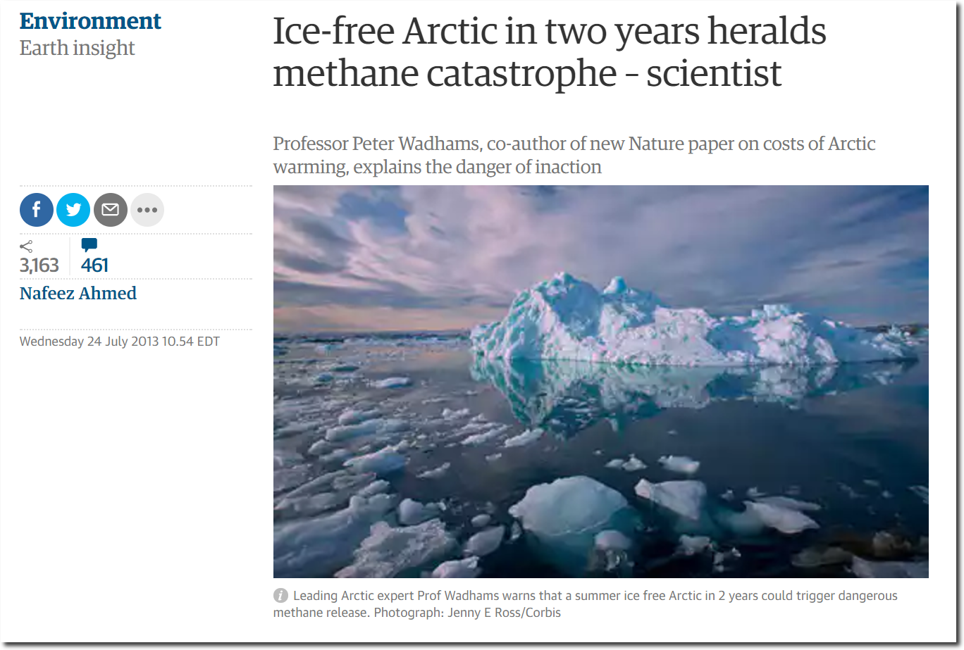
Ice-free Arctic in two years heralds methane catastrophe – scientist | Environment | The Guardian
Posted in Uncategorized
Leave a comment
More Bird Wars
Today, the Kestrel chased this guy out of the tree.




Posted in Uncategorized
Leave a comment
National Anthem Protests
Barack Obama playing pocket pool during the National Anthem in 2008

Posted in Uncategorized
Leave a comment
More Spectacular Arctic Fraud At The New York Times
The New York Times just published another fake climate article – this time about the Arctic. They start the article with the claim that satellites were first used to study the Arctic in 1979.
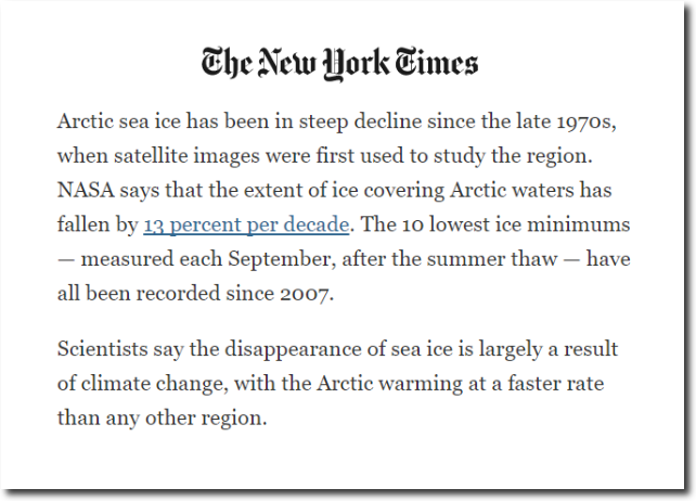
We Charted Arctic Sea Ice for Nearly Every Day Since 1979. You’ll See a Trend. – The New York Times
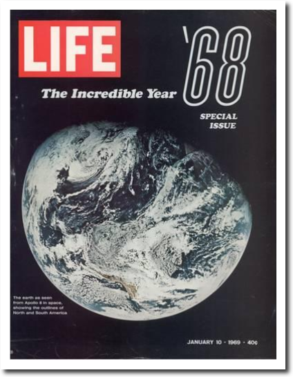
Given that we traveled to the moon in 1969, it is absurd to suggest that satellites weren’t used to study the Arctic before 1979. Here is a 1964 satellite image of the Arctic which was published in National Geographic in 1965.
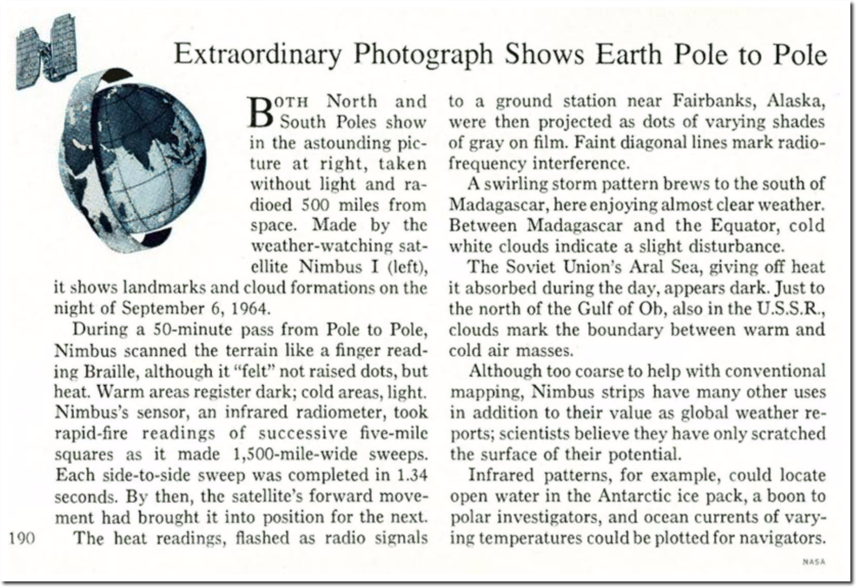
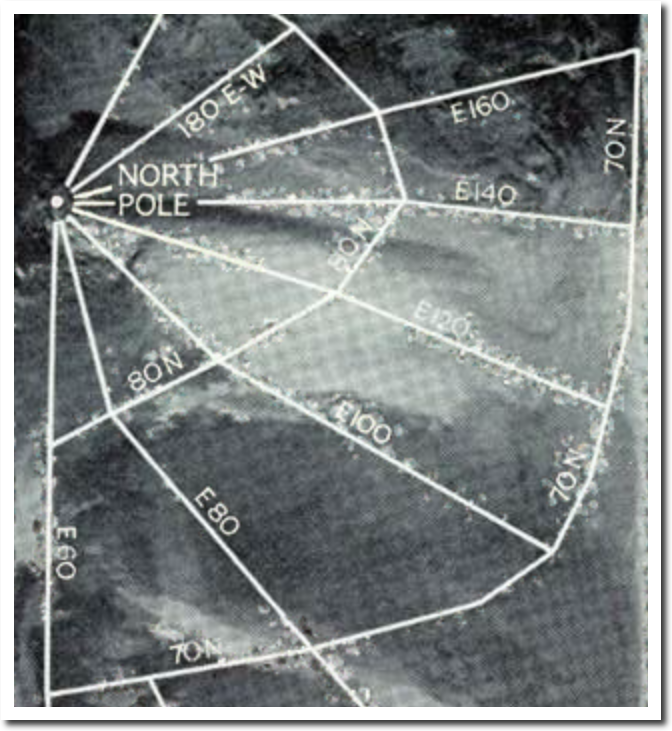
The National Geographic Archive | February 1965 | page 1
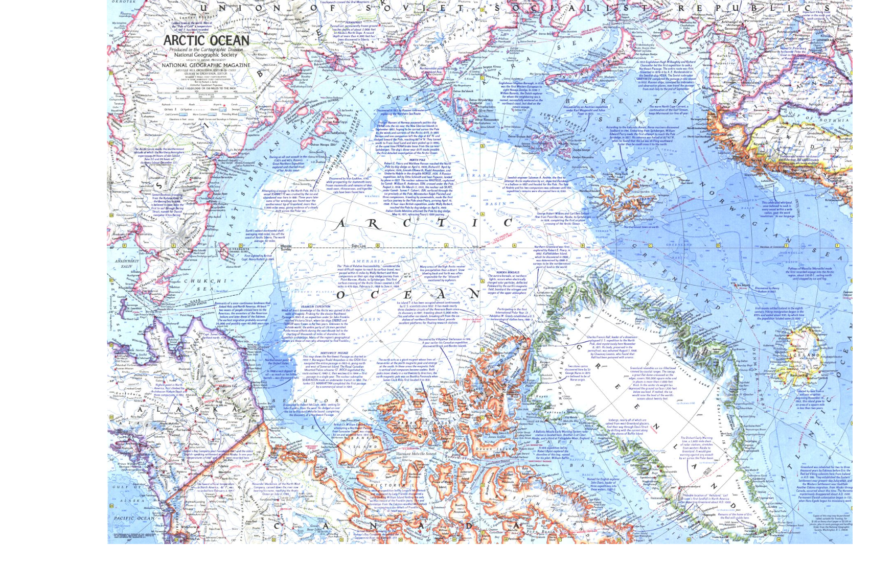
Here is a detailed National Geographic Arctic sea ice map from 1971.
Here is a detailed satellite image of Antarctica from 1976, also published in National Geographic.
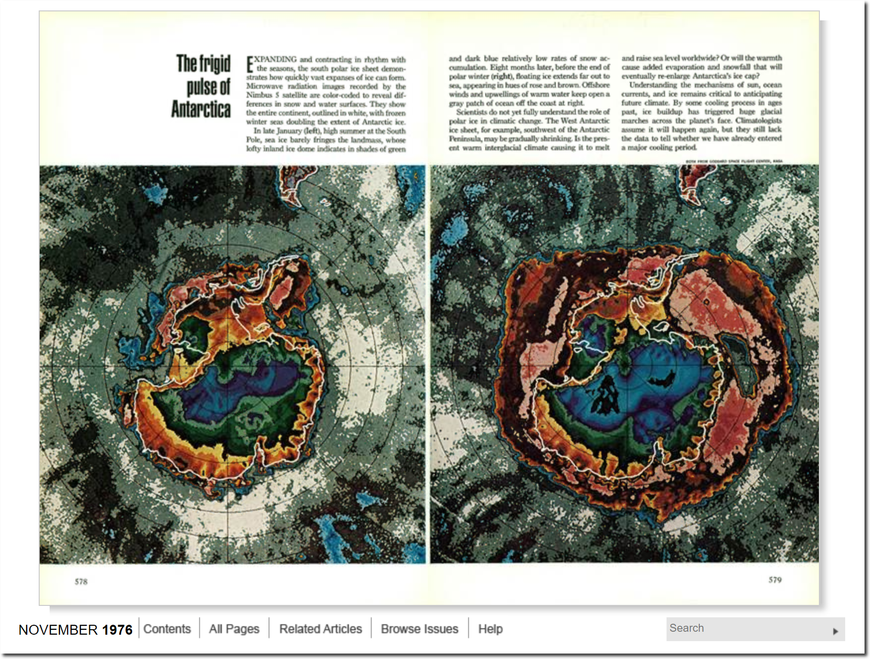
The National Geographic Archive | November 1976 | page 1
The 1990 IPCC report included NOAA Arctic satellite data back to 1973, when it was much lower than 1979.
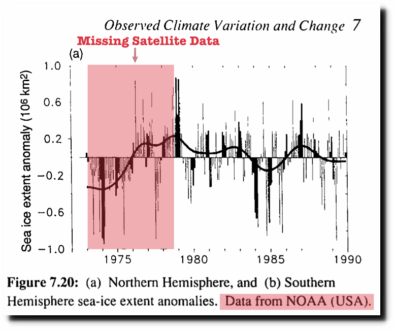
In a spectacular display of scientific malpractice, NOAA now hides all of the pre-1979 peak Arctic sea ice data. By starting right at the peak, they produce a fake linear downwards trend.
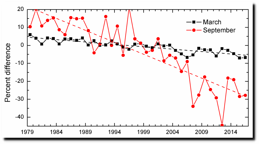
ftp://ftp.oar.noaa.gov/arctic/documents/ArcticReportCard_full_report2016.pdf
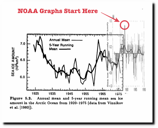
This 1985 DOE climate change report had Arctic data back to 1925, which showed little ice from the 1930s to the 1950s.
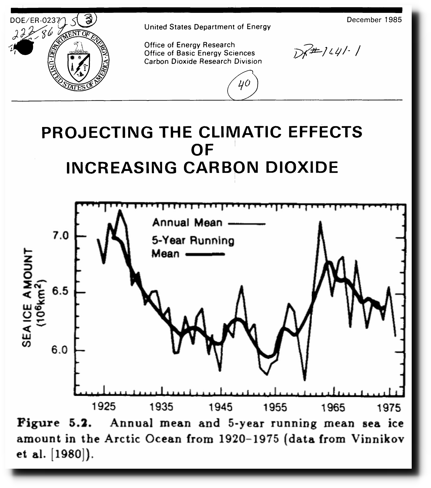
Projecting the climatic effects of increasing carbon dioxide (Technical Report) | SciTech Connect
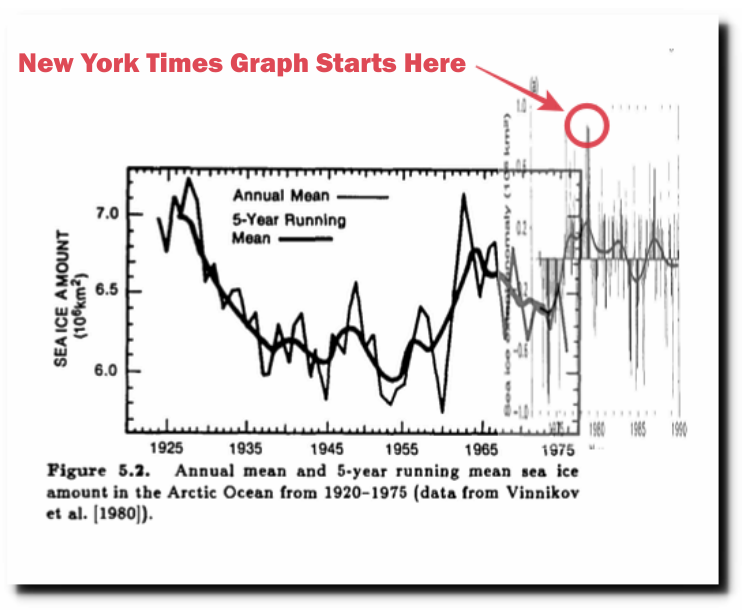
So why did the New York Times cherry pick 1979 as their start date? Because it came at the end of three of the coldest US winters on record , and Arctic sea ice was at a century peak. The graph below combines the 1985 DOE graph with the 1990 IPCC graph.
If the New York Times authors had bothered to research their own paper, they could have found this out for themselves. It was very warm in the Arctic in 1958
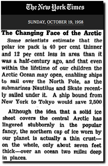
The Changing Face of the Arctic; The Changing Face of the Arctic – The New York Times
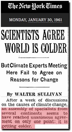
Three years later, the New York Times reported a unanimous consensus that earth was cooling.
By 1970, the Arctic climate was becoming more frigid, the ice was getting “ominously thicker” – and scientists were worried about a new ice age.
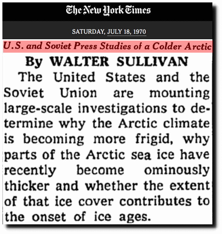
U.S. and Soviet Press Studies of a Colder Arctic – The New York Times
The polar ice cap had expanded 12% by 1975, after shrinking 12% before 1958. Icelandic ports were blocked with ice for the first time in the 20th century.
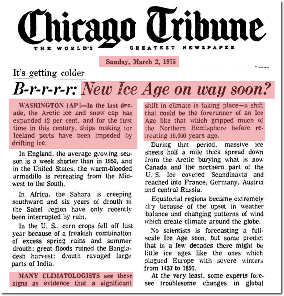
March 2, 1975 – B-r-r-r-r: New Ice Age on way soon? | Chicago Tribune Archive
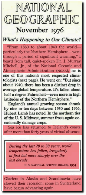
National Geographic : 1976 Nov, Page 575
By hiding all the data before the 1979 peak, the New York Times is defrauding its readers. Arctic climate is cyclical – not linear.
Ninety-five years ago, the Arctic was having a meltdown.
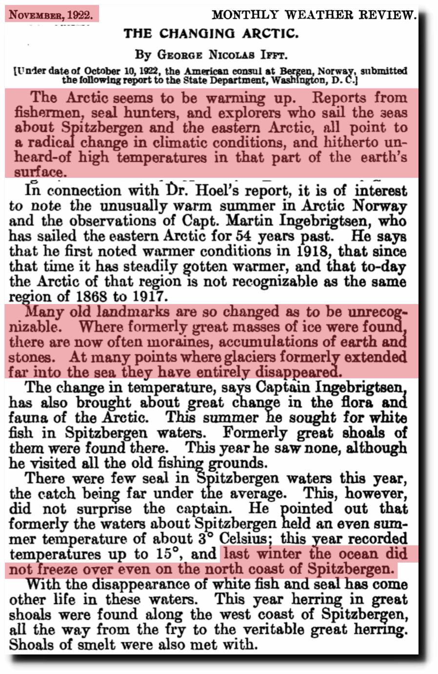
https://docs.lib.noaa.gov/rescue/mwr/050/mwr-050-11-0589a.pdf
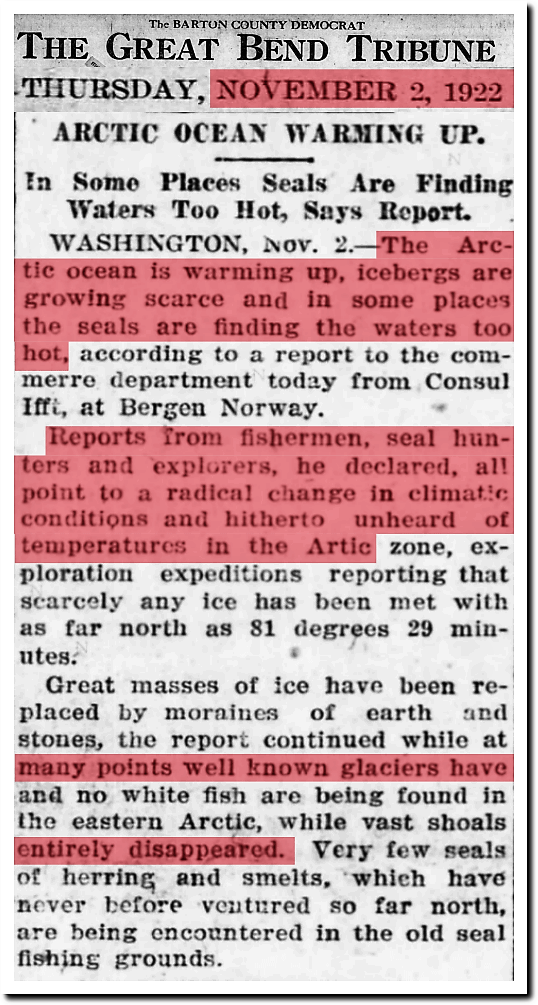
2 Nov 1922, Page 1 – Great Bend Tribune at Newspapers.com
Eighty years ago, the Arctic was having a meltdown.
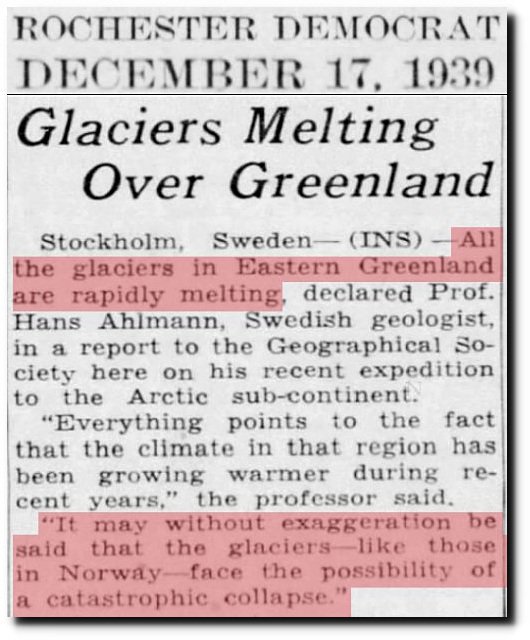
17 Dec 1939, Page 15 – Harrisburg Sunday Courier
Sixty five years ago, the Arctic was having a meltdown.
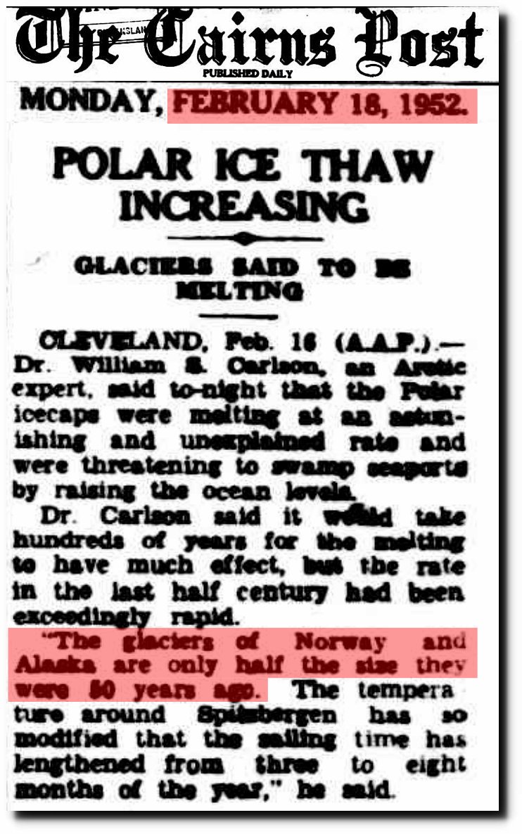
18 Feb 1952 – POLAR ICE THAW INCREASING
Then the New York Times went on to obscure their graph (below) to hide the fact that there has been a large increase in minimum extent since 2012. Note the “End of summer minimum” label is at the 2012 minimum – not the 2017 minimum.
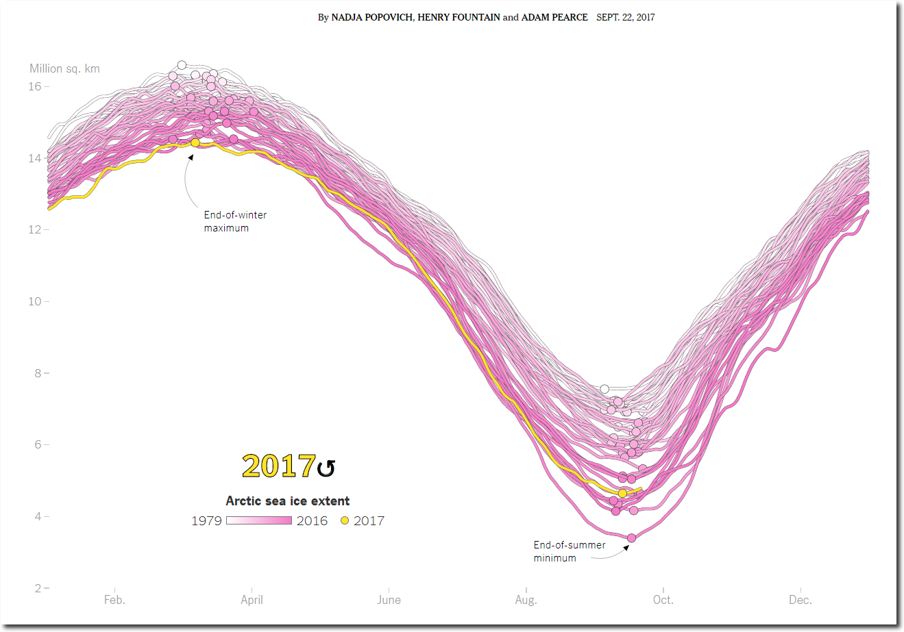
The Arctic minimum extent has been increasing for a decade. The New York Times doesn’t want their readers to know this.

masie_4km_allyears_extent_sqkm.csv
The New York Times is defrauding their readers at many levels. It is the fake news we have learned to expect from them.
Posted in Uncategorized
Leave a comment
Plummeting September 22 Temperatures In The US

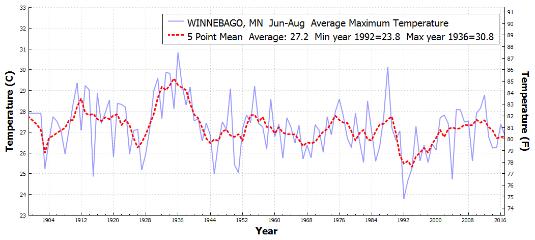
The first day of autumn used to be a hot day in the US, but temperatures have plummeted over the past century.
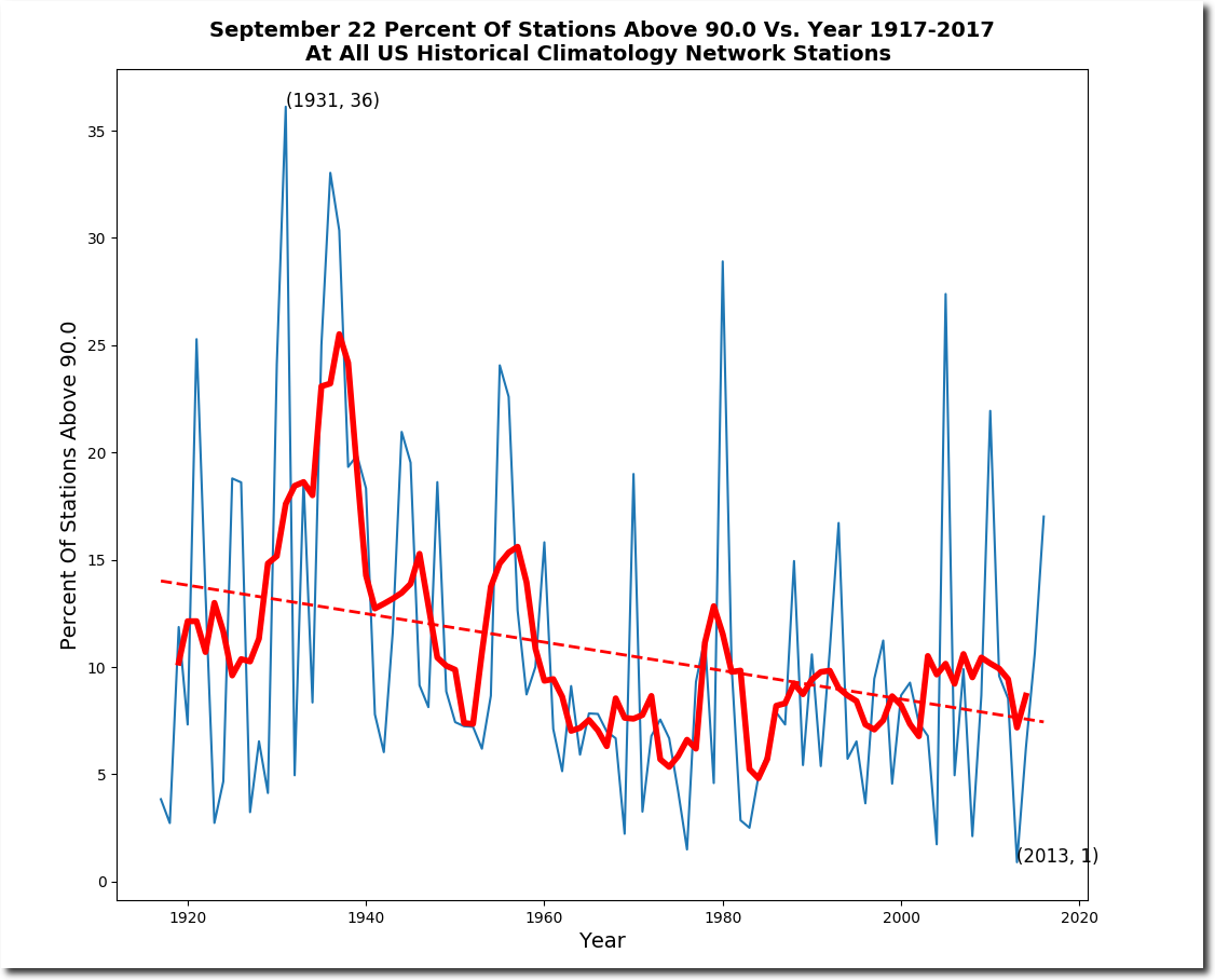
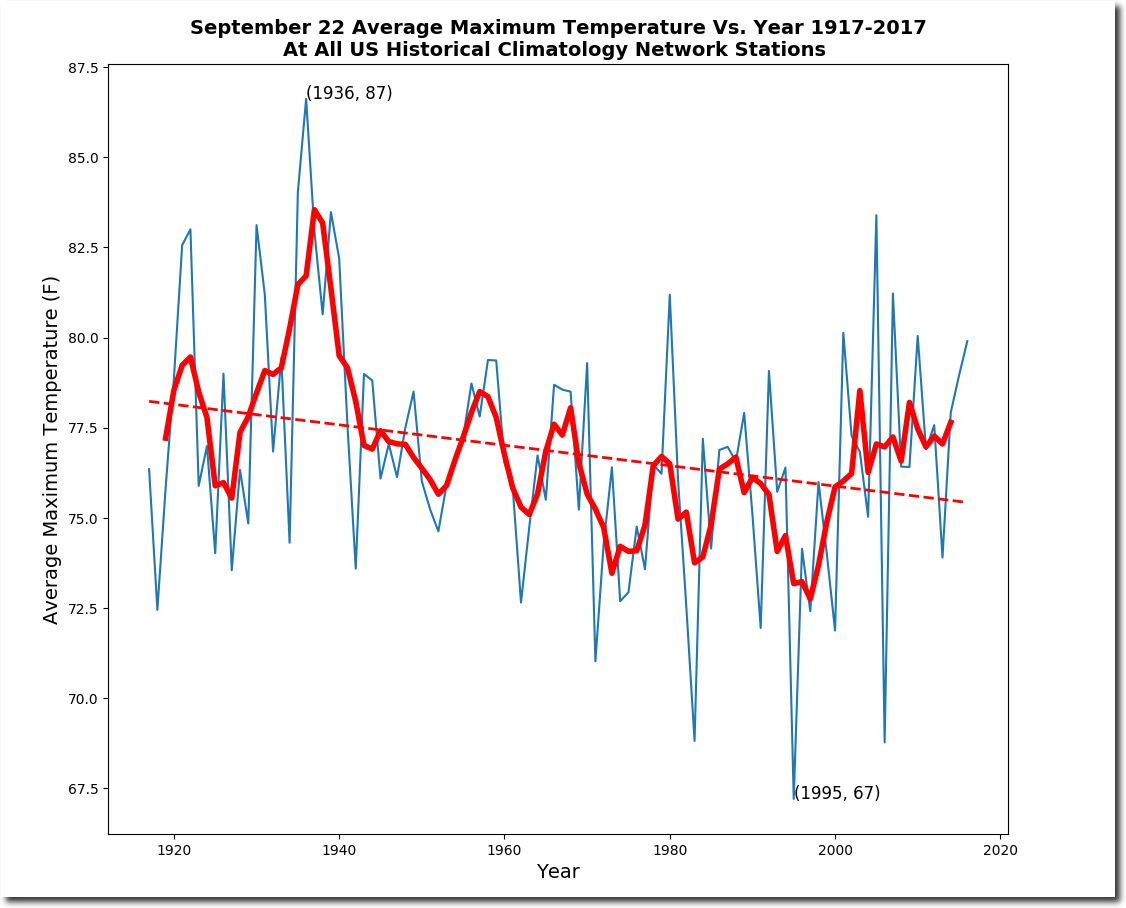
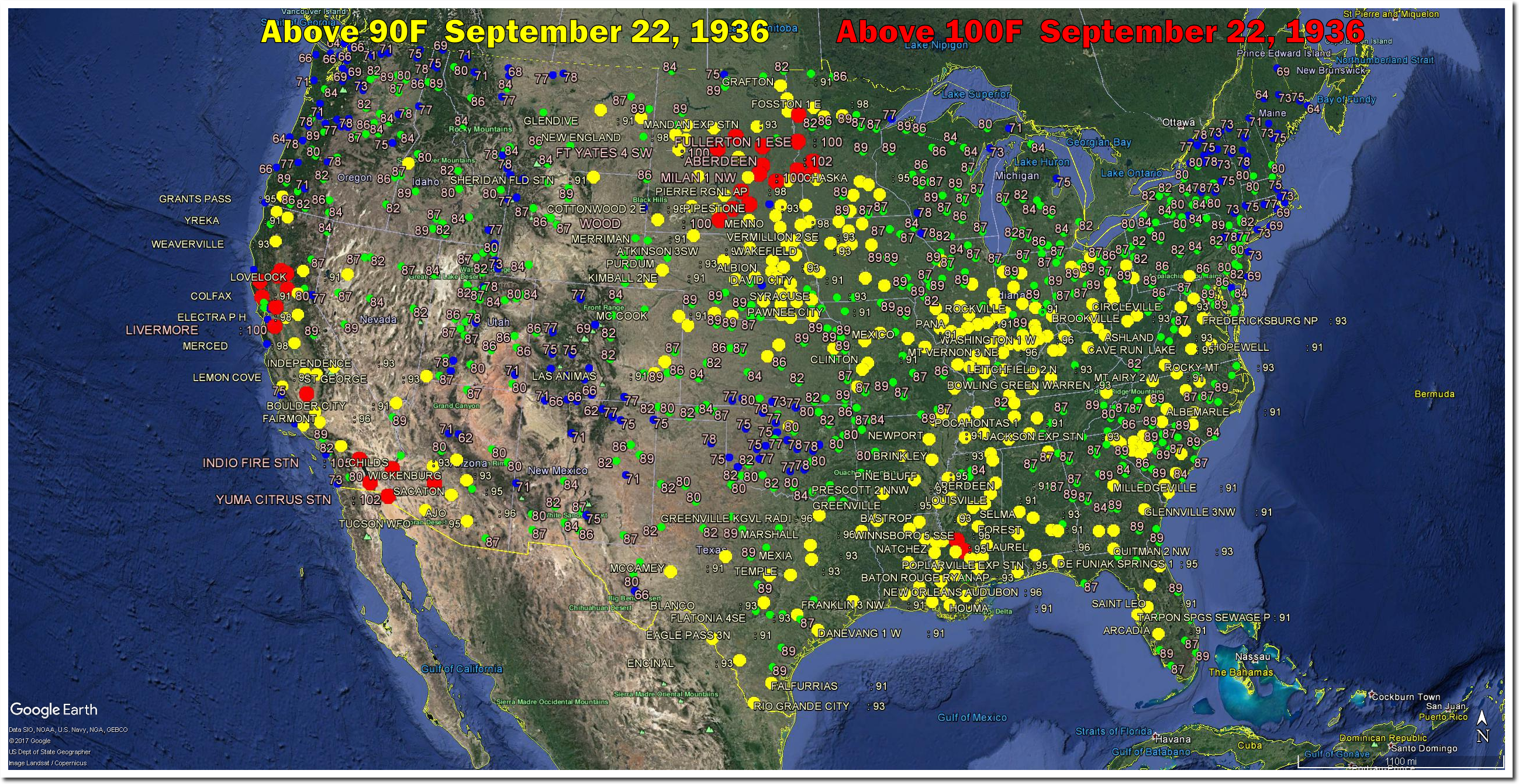
On this date in 1936, North Dakota, South Dakota and Minnesota were all over 100 degrees.
After the 1930’s, September 22 temperatures in Milan, Minnesota dropped nearly 30 degrees.
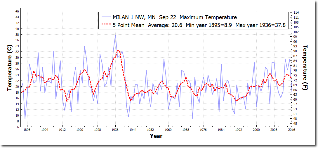
Milan, Minnesota had sixteen one hundred degree days in 1936, but they have not had a hot summer since CO2 hit 350 PPM in 1988.
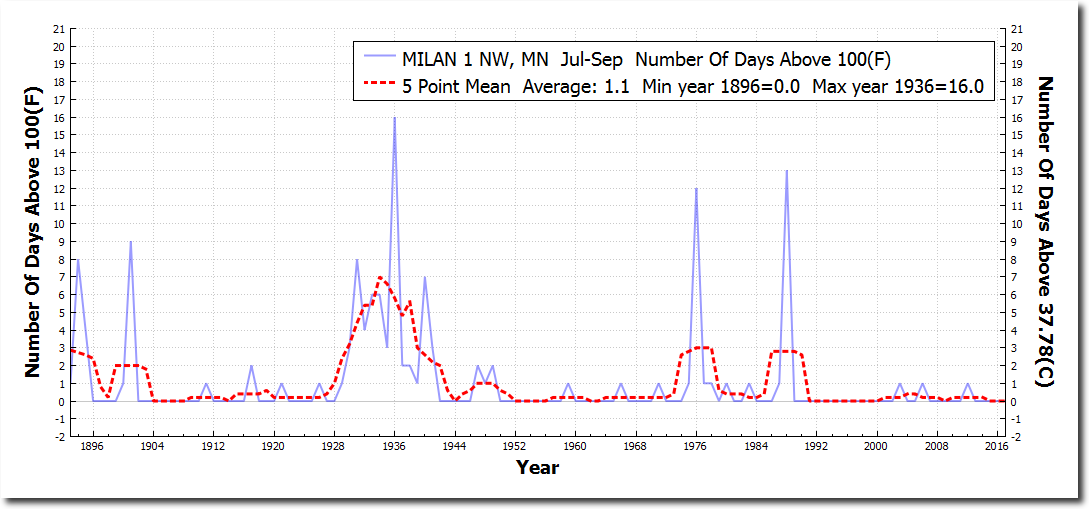
Summer temperatures in Minnesota have dropped sharply since the 1930’s
Heidi Cullen and her band of criminals at Climate Central claim the exact opposite, because they are paid to lie about the climate.
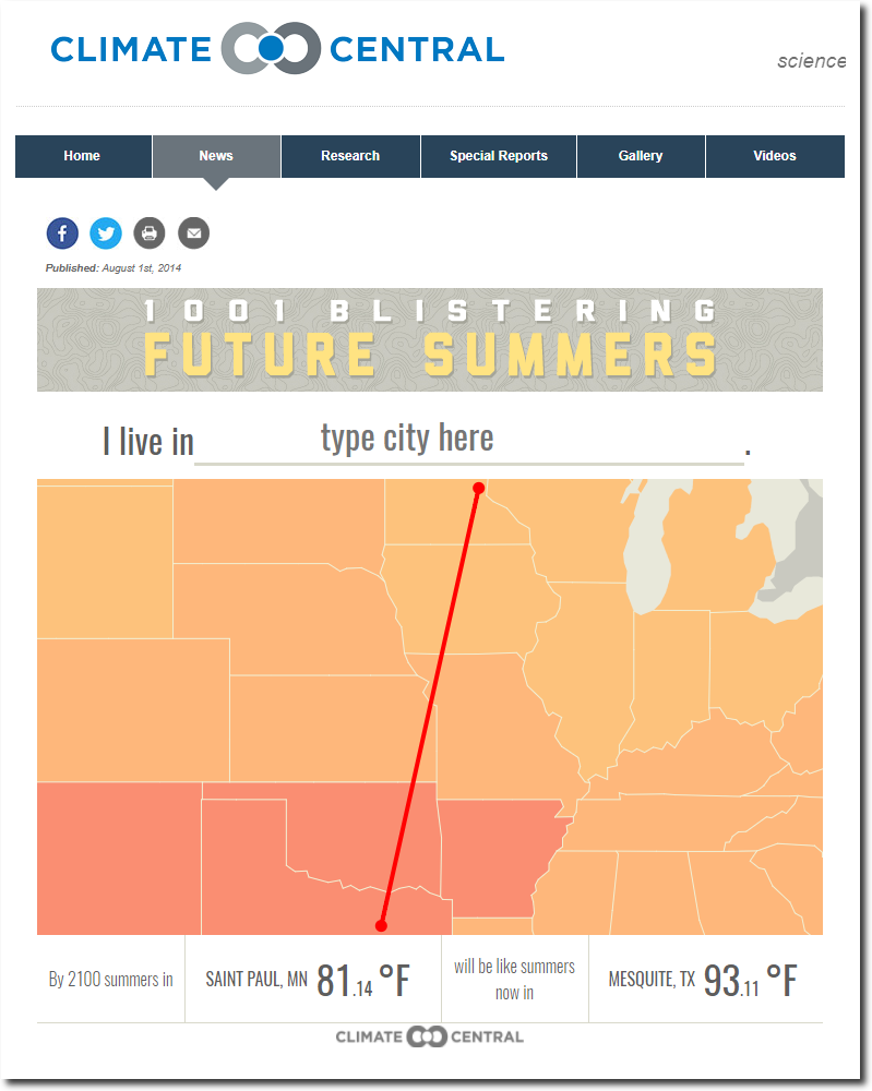
Blistering Future Summers for 1,001 U.S. Cities | Climate Central
Posted in Uncategorized
Leave a comment
Little Change In Arctic Sea Ice Since 1971
Arctic sea ice extent is well above the ten year mean.

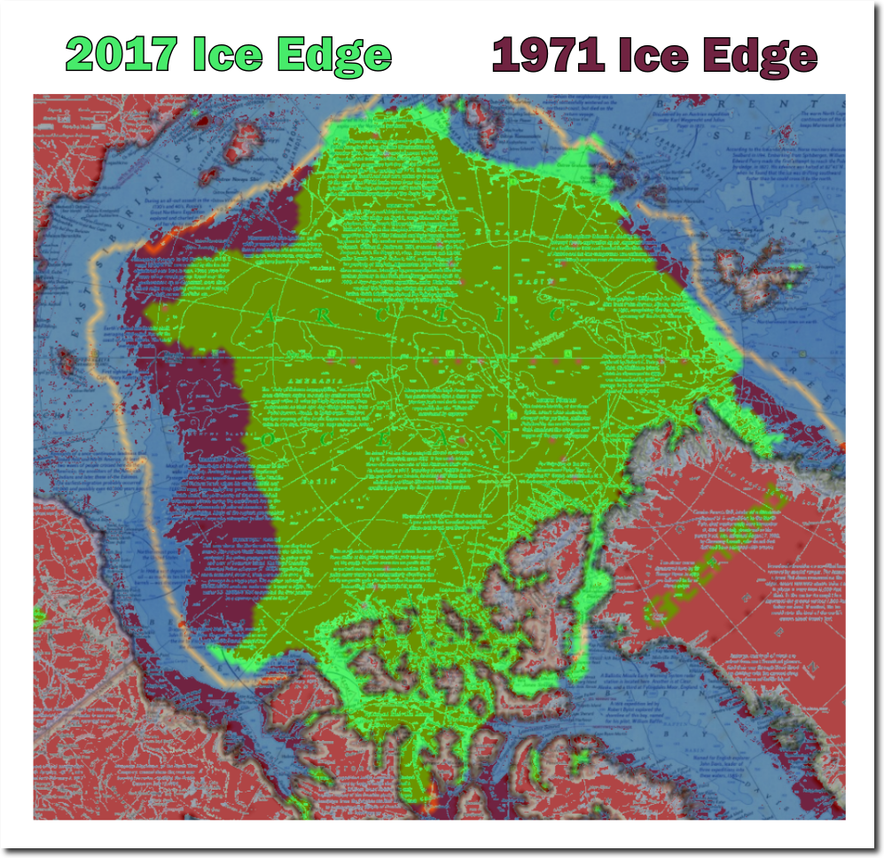
National Geographic published this map of the Arctic multi-year sea ice edge in 1971
Here is the current map for Arctic sea ice – all of this ice is by definition multi-year ice, because it has all survived the summer.
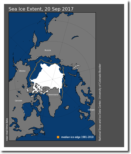
N_20170920_extn_v2.1.png (420×500)
The next image overlays the two. Green is 2017 and red is 1971. There is a little bit less ice thank 1971. Also note that the 1971 ice edge was inside of the NSIDC pink median line.
Government agencies like NOAA, NASA and NSIDC start their sea ice graphs in 1979, in order to make it look like there is a linear decline in sea ice.
ftp://ftp.oar.noaa.gov/arctic/documents/ArcticReportCard_full_report2016.pdf
NOAA claims they don’t have satellite data before 1979, but they are lying. The 1990 IPCC report showed NOAA satellite data back to 1973, which was much lower than 1979.
In fact, there is good ice data going back to the 1920’s, which shows that ice extent was very low in the 1940’s and 1950’s.
Projecting the climatic effects of increasing carbon dioxide (Technical Report) | SciTech Connect
This agrees with historical accounts at the time.
The Changing Face of the Arctic; The Changing Face of the Arctic – The New York Times
I combined the DOE and IPCC graphs, to show what government agencies are up to. They start their linear graphs at the century maximum sea ice extent.
Then fraudsters like John Cook release completely fake graphs like this, so that they can blame it on “human activity”
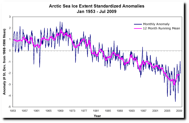
Human activity is driving retreat of Arctic sea ice
Arctic warmth and melting is cyclical. In 1922 the Arctic was melting rapidly.
2 Nov 1922, Page 1 – Great Bend Tribune at Newspapers.com
Instead of trying to understand past warmth, government climate scientists simply try to bury it with fake data.

Data.GISS: GISS Surface Temperature Analysis: Analysis Graphs and Plots
Like all of the other climate scams, the Arctic melting scam is based on junk science, hidden data, fake data and corrupt scientists.
Posted in Uncategorized
Leave a comment
Astrology And Climate Science
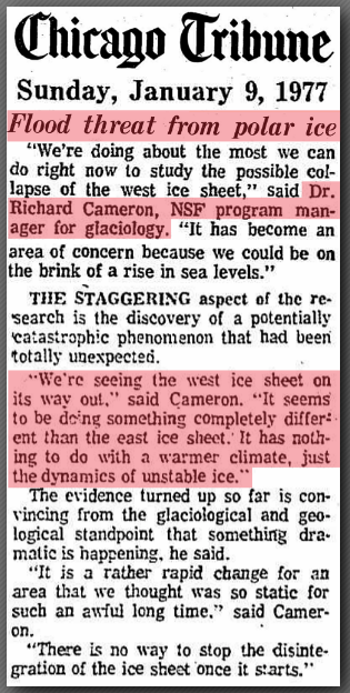
Forty years ago, the front page of the Chicago Tribune featured astrologer Jeanne Dixon, and a warning that the West Antarctic Ice Sheet was going to collapse and drown us all. That was during the global cooling scare.
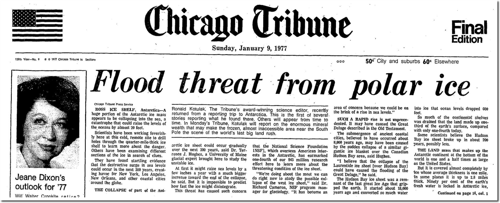
January 9, 1977 – Flood threat from polar ice | Chicago Tribune Archive
It was one of the coldest winters on record in the US. It snowed in Miami, and they blamed the Polar Vortex and California drought on global cooling.
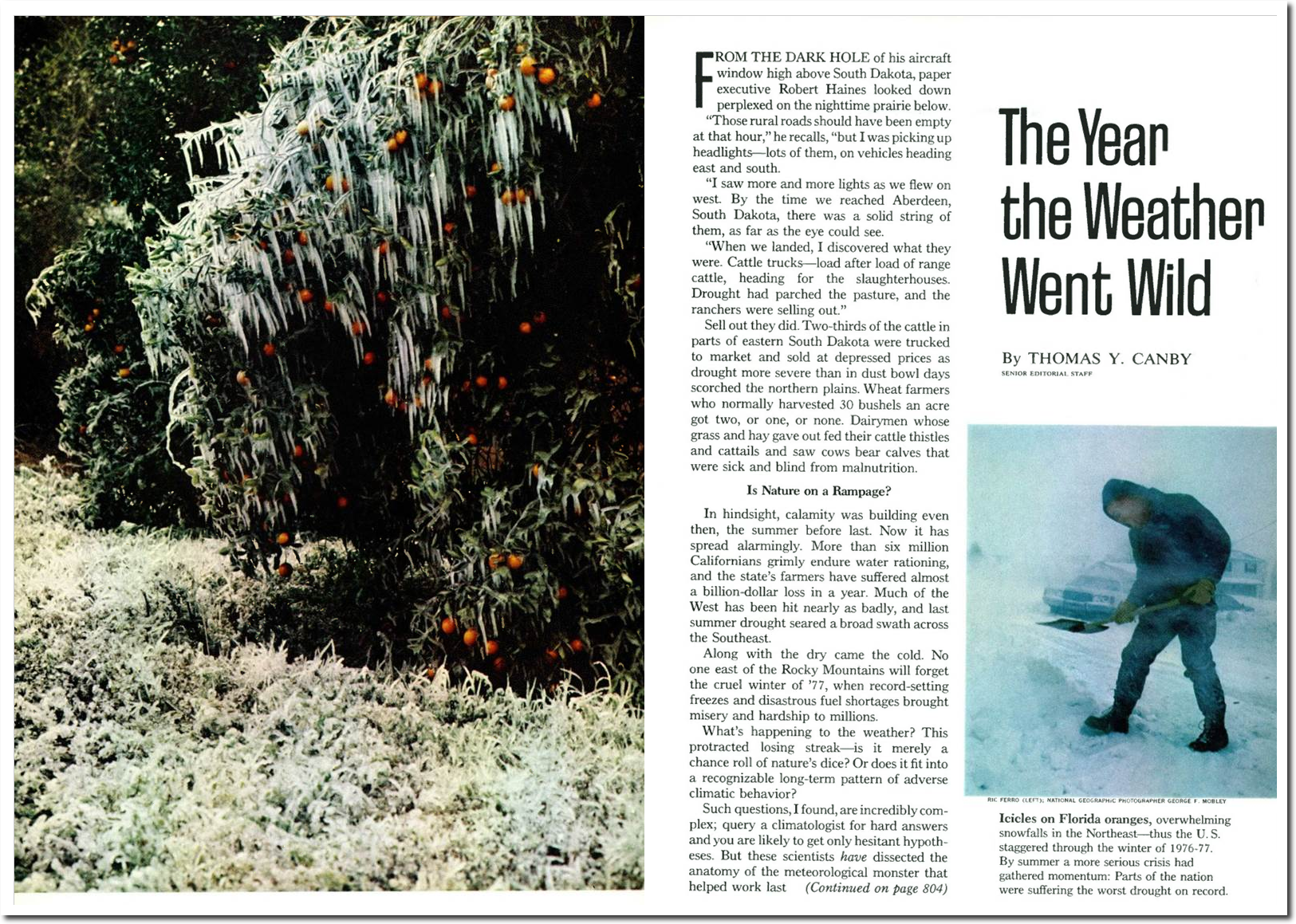
The National Geographic Archive | December 1977 | page 1
The National Science Foundation Program Manager said that in 1977 that collapse of the West Antarctic Ice Sheet had nothing to do with a warmer climate.
“We’re doing about the most we can do right now to study the possible collapse of the west ice sheet,” said Dr. Richard Cameron, NSF program manager for glaciology.
‘We’re seeing the West ice sheet on its way out,” said Cameron. “It seems to be dring something completely differ! eot than the east ice sheet. It has nothing to do with a warmer climate, just the dynamics of unstable ice.”
The West Antarctic Ice Sheet retreated 30 miles from 1840 to 1930, when CO2 was below 300 PPM.
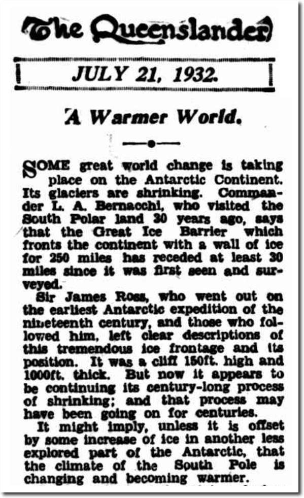
21 Jul 1932 – A Warmer World. – Trove
A Warmer World.
SOME great world change is taking place on the Antarctic Continent. Its glaciers are shrinking. Commander L.A. Bernacchi, who visited the South Polar land 30 years ago, says that the Great Ice Barrier which fronts the continent with a wall of ice for 250 miles has receded at least 30 miles since it was first seen and surveyed. Sir James Ross, who went out on the earliest Antarctic expedition of the nineteenth century, and those who fol lowed him, left clear descriptions of this tremendous ice frontage and its position. It was a cliff 150ft. high and 1000ft. thick. But now it appears to be continuing its century-long process of shrinking; and that process may have been going on for centuries.
January 9, 1977 – Flood threat from polar ice | Chicago Tribune
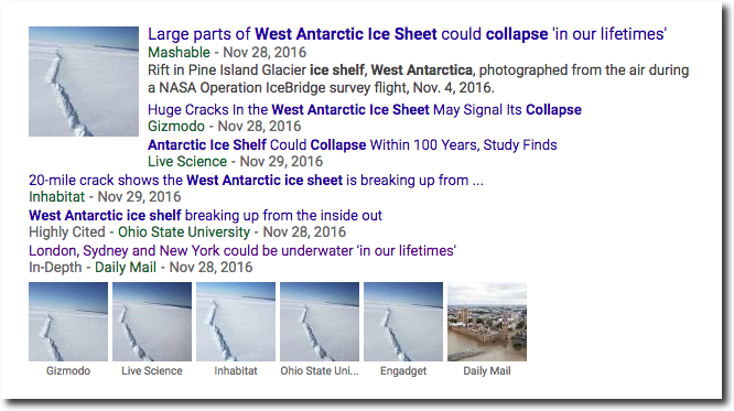
But facts, history and data don’t make any difference to climate alarmists. They have a huge money making scam to maintain, and will say anything to keep their criminal venture alive.
Posted in Uncategorized
Leave a comment
Latest From The California Permanent Drought
Last year, climate experts, Democratic politicians and the press announced the California Permanent Drought™
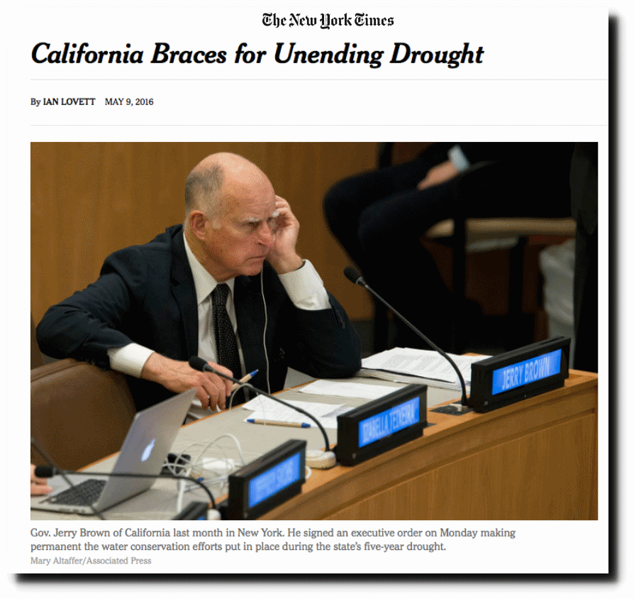
California Braces for Unending Drought – The New York Times
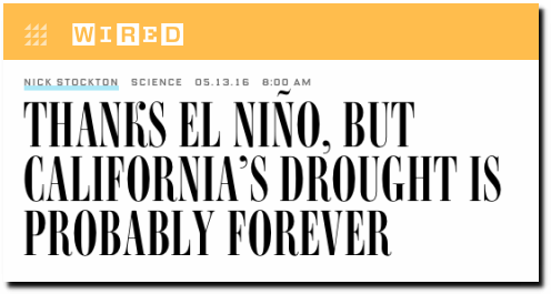
Thanks El Niño, But California’s Drought Is Probably Forever | WIRED
Since then, California has had one of their wettest years on record.
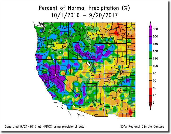
https://hprcc.unl.edu/products/maps/acis/wrcc/WaterPNormWRCC.png
The scientists, politicians and journalists behind the climate change scam are complete morons, and have no clue what they are talking about.
Posted in Uncategorized
Leave a comment