Peak, minimum, and maximum temperatures are declining.
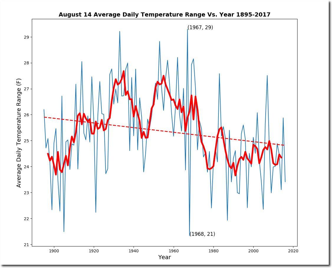
1967 had the largest temperature range, and 1968 had the smallest.
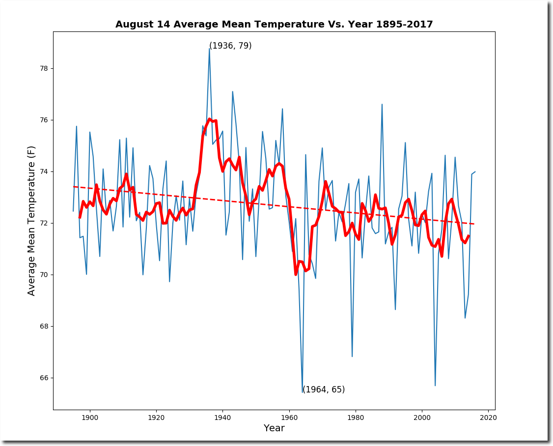
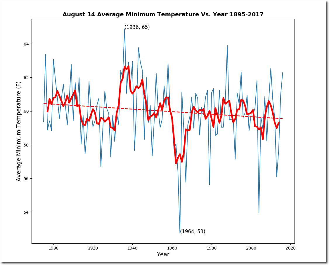
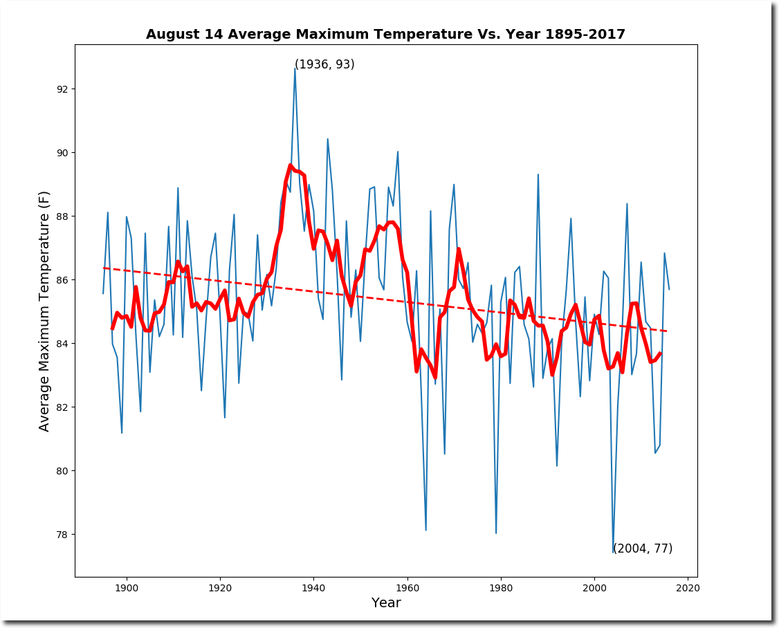
Peak, minimum, and maximum temperatures are declining.
1967 had the largest temperature range, and 1968 had the smallest.
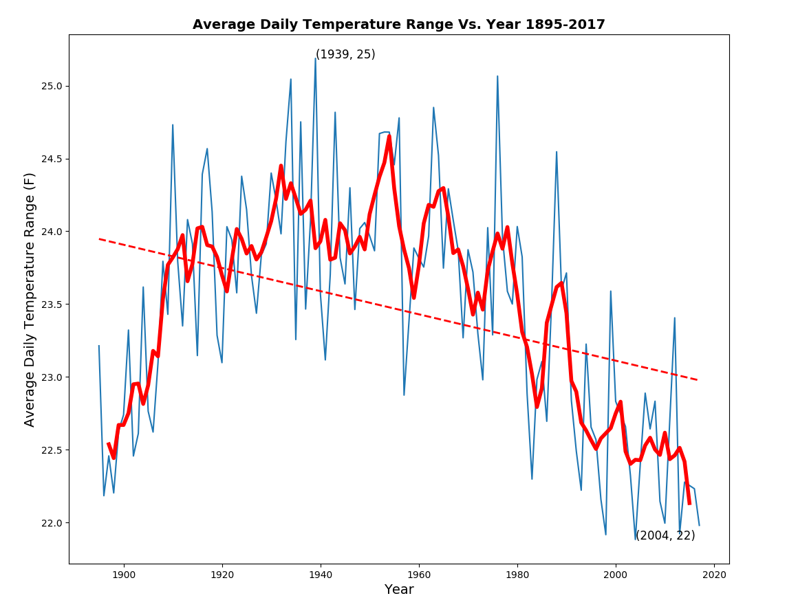
The frequency of hot days and cold nights is decreasing, as is the average daily temperature range. In other words, the climate is getting less extreme.

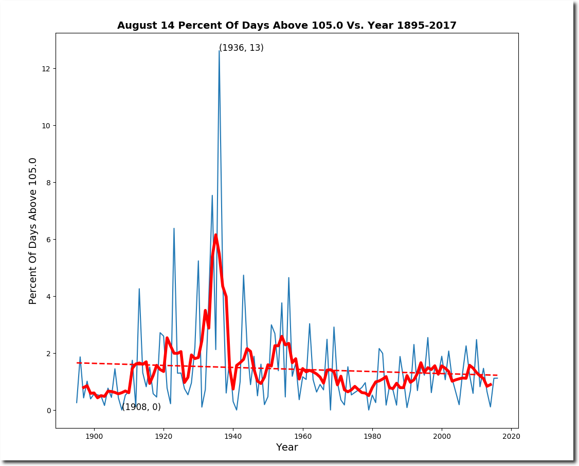
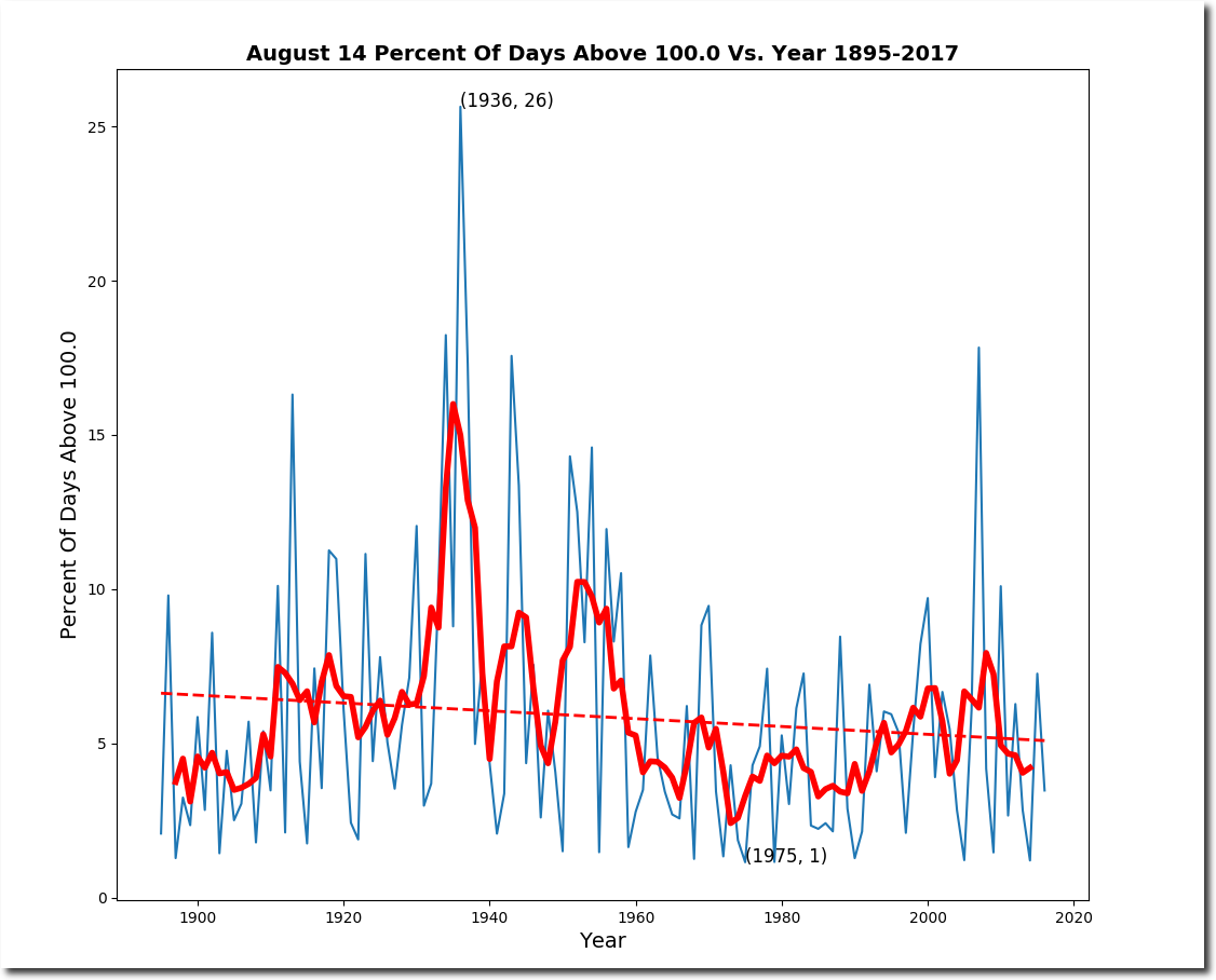
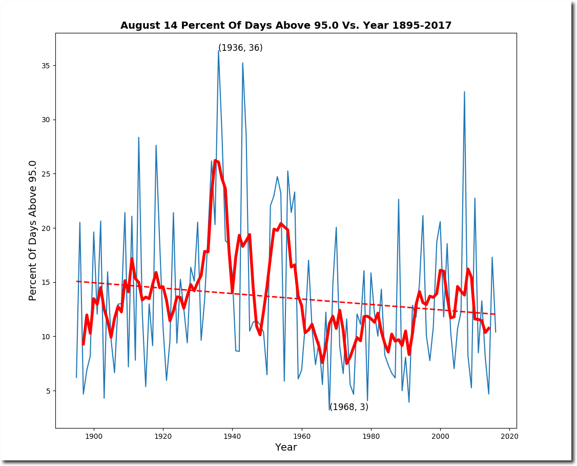
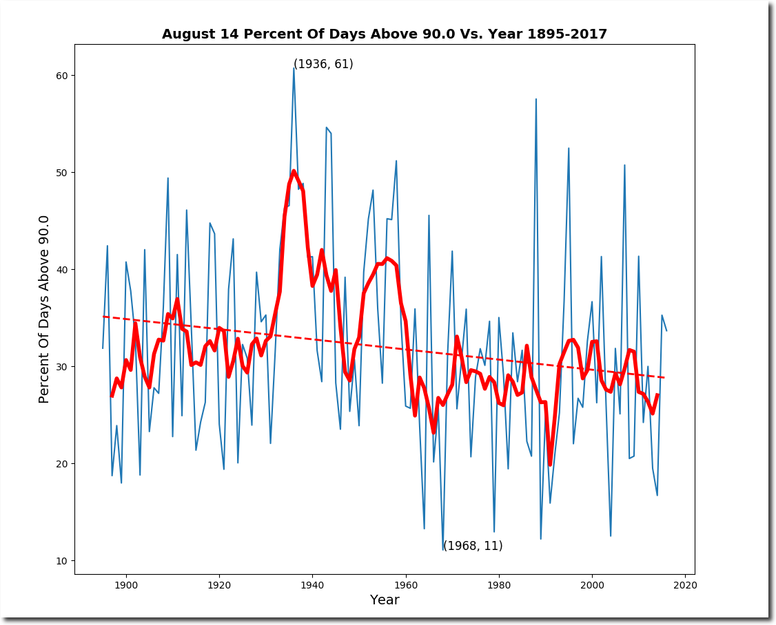
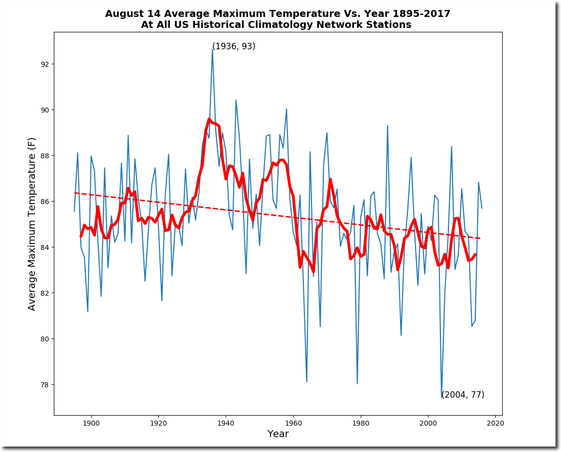
August 14 temperatures peaked in the US in 1936, then plummeted to a record low in 2004.
The heatwave of August 14, 1936 killed many people and brought temperatures up to 120 degrees.
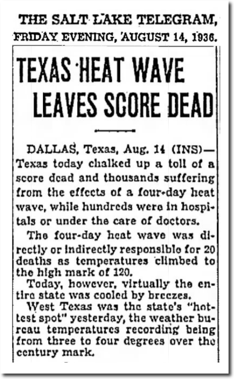
14 Aug 1936, 3 – Salt Lake Telegram
The entire central portion of the US was over 100 degrees, with Kansas at 115 degrees..
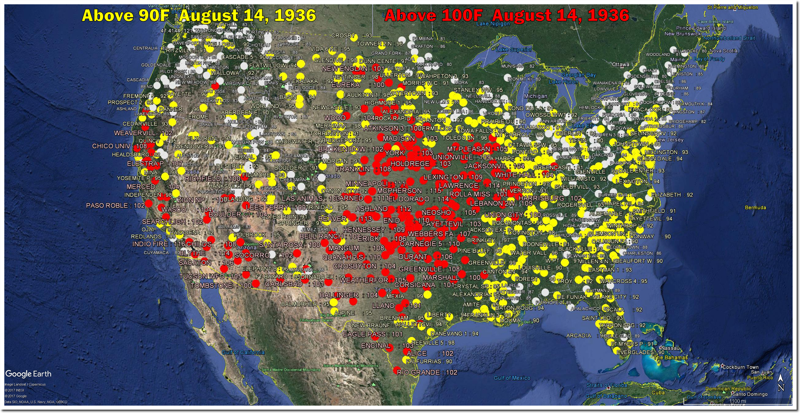
If this happened now climate scientists would say they were 100% certain it was your fault, and demand immediate world communism to solve the problem.
There is more ice than the area of Texas and temperatures are below freezing, but it is all going to melt in the next two weeks. And if you don’t believe it, you are an evil fossil fuel funded denier seeking to destroy the planet.

‘The North Pole could ice-free by next summer’ | World Economic Forum
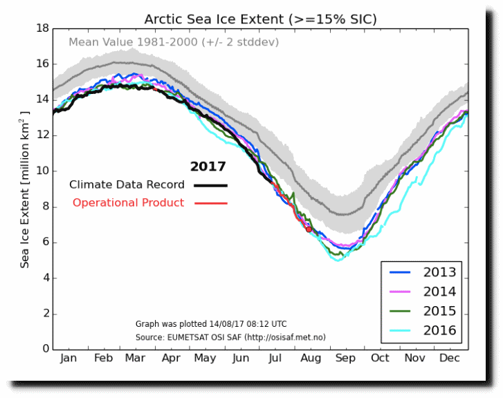
Ocean and Ice Services | Danmarks Meteorologiske Institut
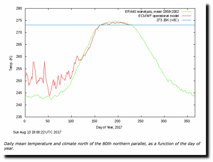
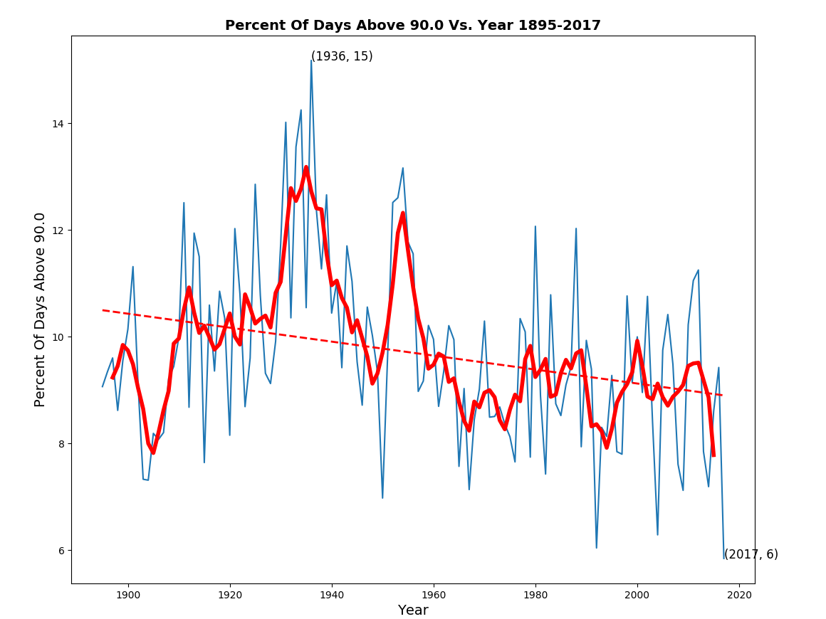
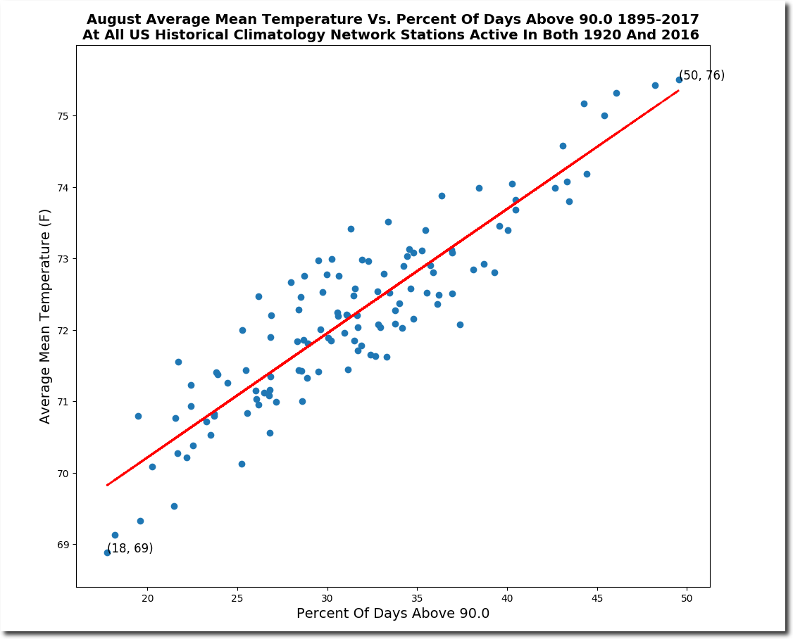
According to the best data set in the world, the frequency of hot days has been plummeting in the US.

Climate experts have quite predictably been brushing off my frequency of hot days plots, saying that it isn’t a good indicator of temperature trends. The data says the exact opposite. The correlation is excellent.
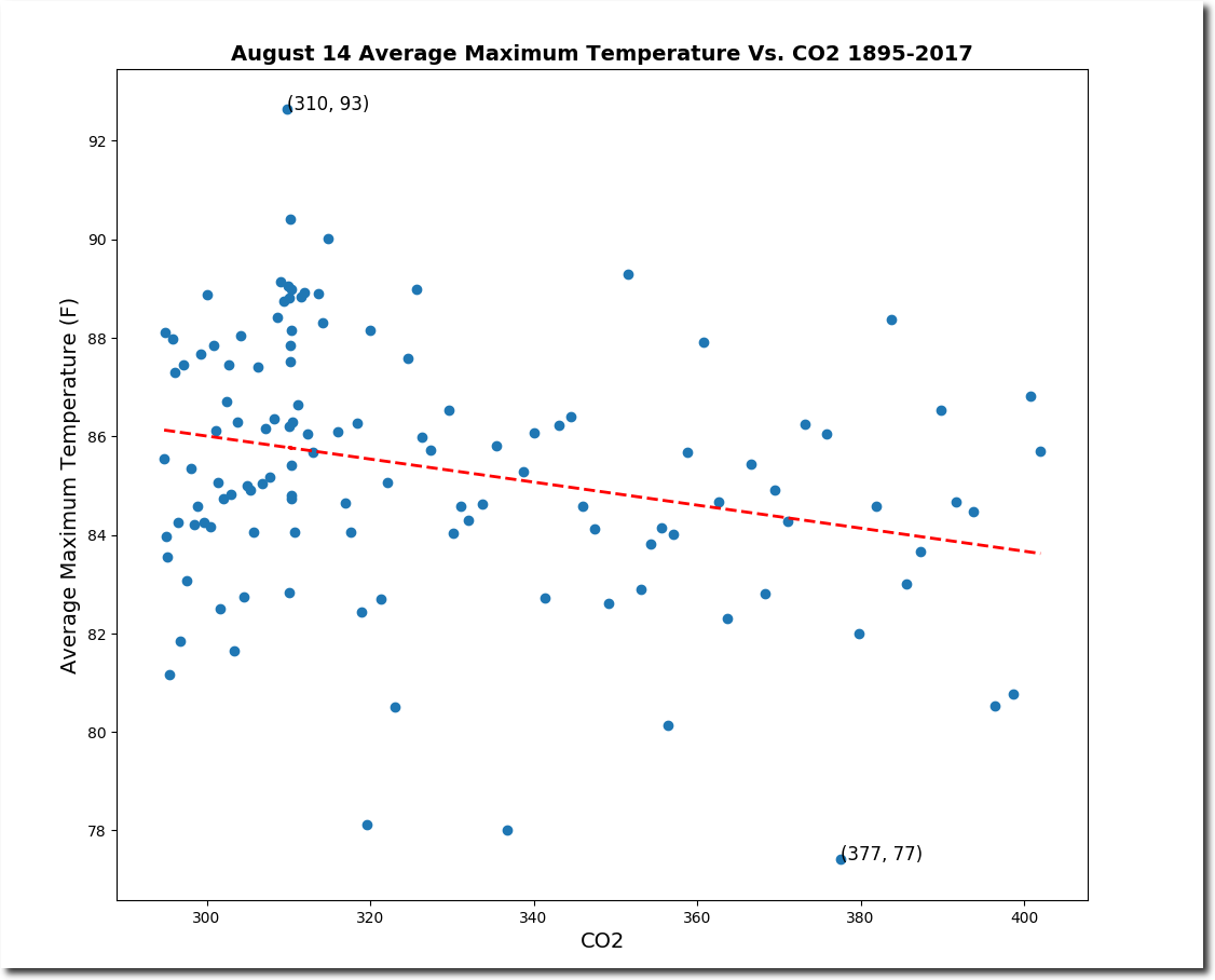
Experts prefer to correlate temperature trends vs. CO2, which has no correlation whatsoever.
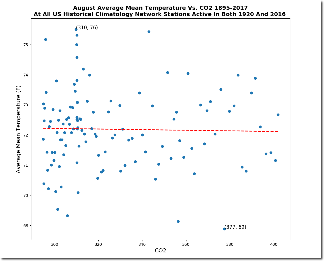
After showing them these plots, their next line of defense is the US is only 5% of the Earth.”
The problem with that argument is that almost all of the below 330 PPM daily temperature data is from the US. So the US is actually 90+% of the Earth’s historical temperature data.
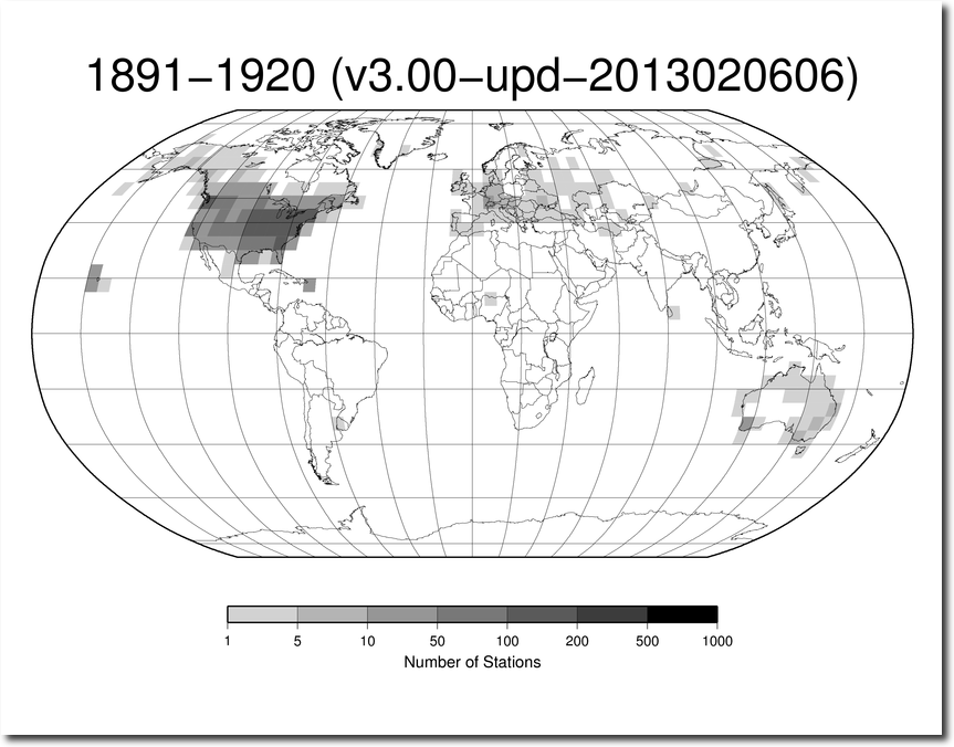
station-counts-1891-1920-temp.png (825×638)
After that attack fails, then they invariably go to the “people didn’t know how to read thermometers back then” defense. So why are they publishing all of their fake temperature graphs if they don’t believe them? And if they don’t believe that CO2 correlates with high temperatures, why do they keep saying CO2 correlates with high temperatures?
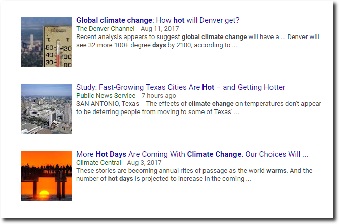
There is no science in climate science. These people are simply making stuff up to keep their government grant money coming in. They are criminals, not scientists.

I just moved the UNHIDING link over to Google Drive.
(The latest ghcn.exe executable is here. Replace the one in the HIDING\release directory with that.)

It will look like nothing is happening, but after a few minutes when the temperature data set is processed, this window will pop up.
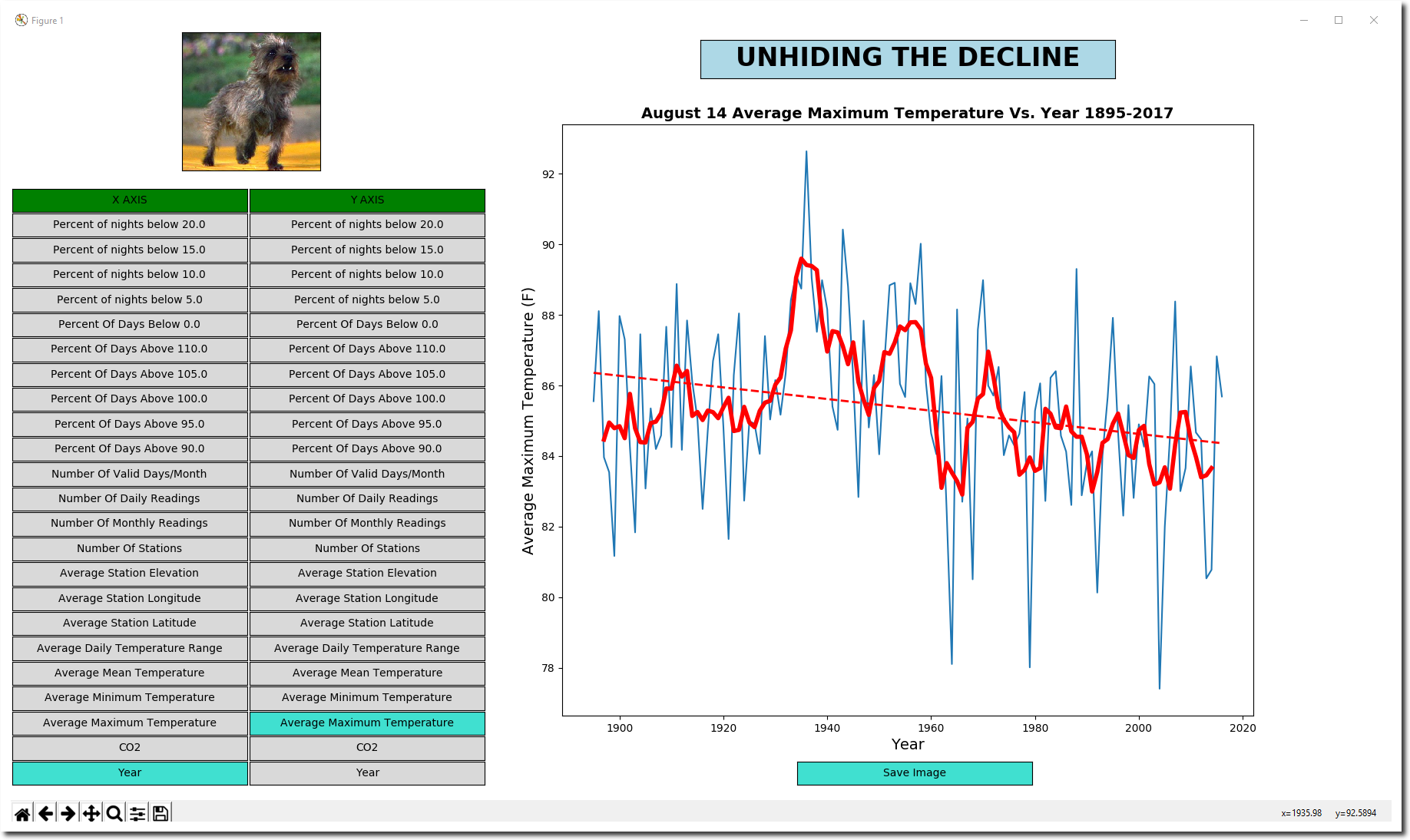
You can generate hundreds of different graph types very quickly by simply clicking on an X-axis option (left column) and Y-axis option (right column) . Click on the “Save Image” button to create a .png file, which is in the same directory you ran ghcn.exe from. It also generates a csv file in that directory with all of the stats.
Other command line options include :
The algorithm is very simple.
That is it. The algorithm is an improvement over my previous software, which lumped all daily data from all stations together per month. That unfairly weighted stations which reported more days relative to stations which reported fewer days.
If you find any bugs, let me know! There may well be some. I just started this project last weekend.
To get the latest US.txt from NOAA, you can run this script from a Mac/Linux/Cygwin/Mingw command prompt. That is why I included the US.txt in the zip file.
Argentina looks like it is warming – fast.
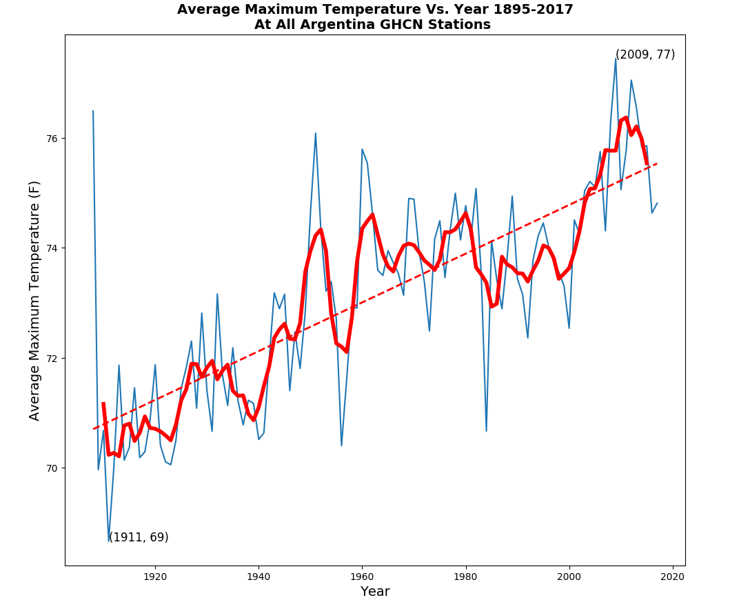
No, Argentina looks like it is cooling fast.

Oh wait, only one station in Argentina before 1960. In Buenos, Aires – a massive Urban Heat Island.

Argentina is typical of the global temperature record – incoherent garbage. Yet magically, all of the players (NOAA/NASA/CRU/BEST) come up with the same graph. It couldn’t possibly be due to fraud and collusion.