Disrupting the Borg is expensive and time consuming!
Google Search
-
Recent Posts
- On The Road Again
- Vandalism At The Reflecting Pool
- Fifty Years Ago Today
- Truth Or Consequences
- US Climate Trend Maps
- Declining Spring Snow Cover In Northern New Mexico
- You Can’t Fool Mother Nature
- Cattle And The Climate
- One Atomic Bomb Per Hour
- New Video : Analyzing Oil And Gas
- Is Antarctica Melting?
- High Speed Analysis And Visualization
- El Nino To The Rescue?
- Fake News Update
- Growth Of Antarctic Sea Ice
- 65 Years Of Progress!
- El Nino To The Rescue?
- Worst March Drought On Record
- ChartGL Process Control Demo
- The Biggest Money Laundering Scam
- Drought In The Headwaters Of Lake Powell
- Unrealistic Expectations Of Water Availability
- Did Bill Gates Do This?
- Worst March Drought On Record In The US
- The Real Hockey Stick Graph
Recent Comments
- Gordon Vigurs on On The Road Again
- Bob G on On The Road Again
- Gordon Vigurs on On The Road Again
- Bob G on On The Road Again
- Bob G on Vandalism At The Reflecting Pool
- arn on On The Road Again
- Gordon Vigurs on On The Road Again
Smoking Gun? Or Software Bug?
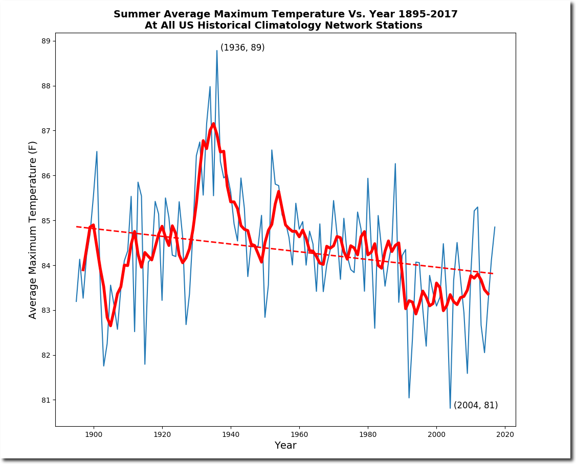
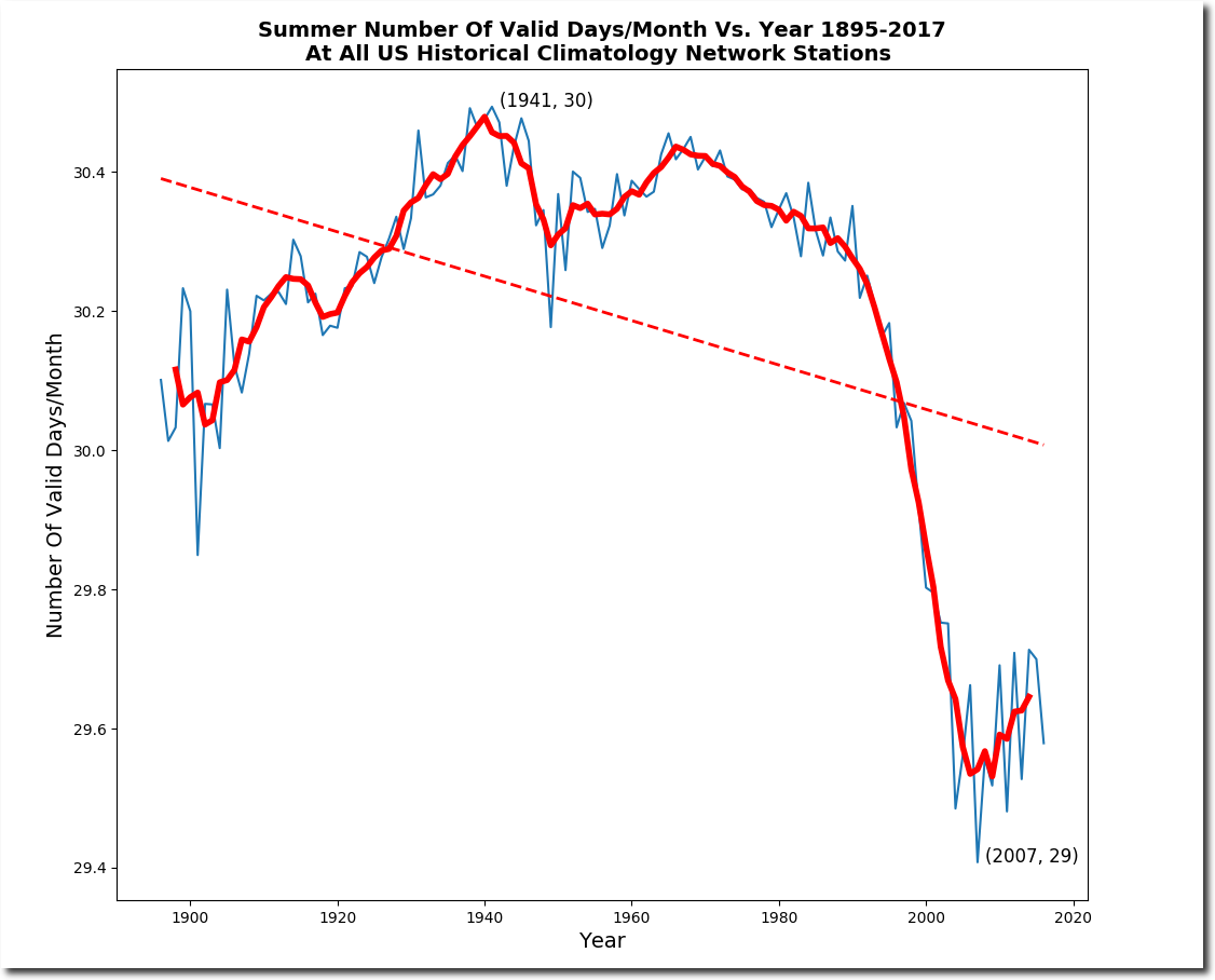
My new UNHIDING THE DECLINE software shows that US summer temperatures never recovered after the fall following the eruption of Mt. Pinatubo in 1991. I’m using a new, fairer algorithm for calculating this which weights all stations equally, regardless of how many days they report in a month. It also shows a 120 year cooling trend. My previous software showed 1992 cooler than 2004. I believe the new algorithm is more accurate.
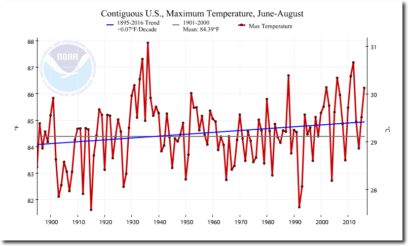
NOAA’s fake graph shows the exact opposite. It shows an immediate recovery from the eruption, and a long term warming trend.
Climate at a Glance | National Centers for Environmental Information (NCEI)
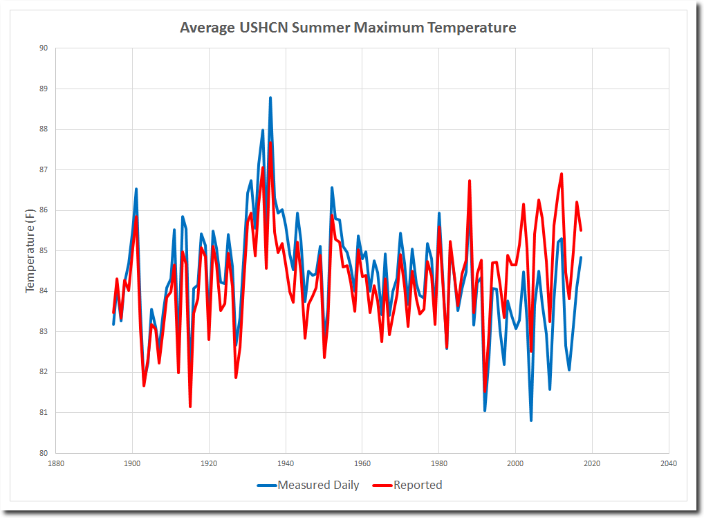
The next graph plots both sets of data. Note the massive divergence after Pinatubo.
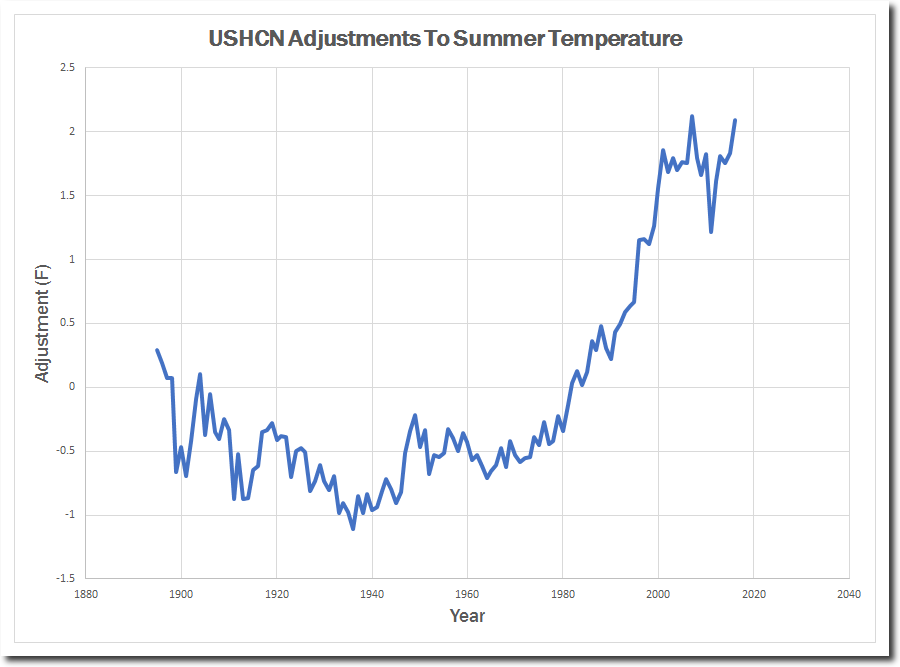
This graph shows the massive data tampering NOAA is engaged in. Nearly three degrees, and a hockey stick after 1990.
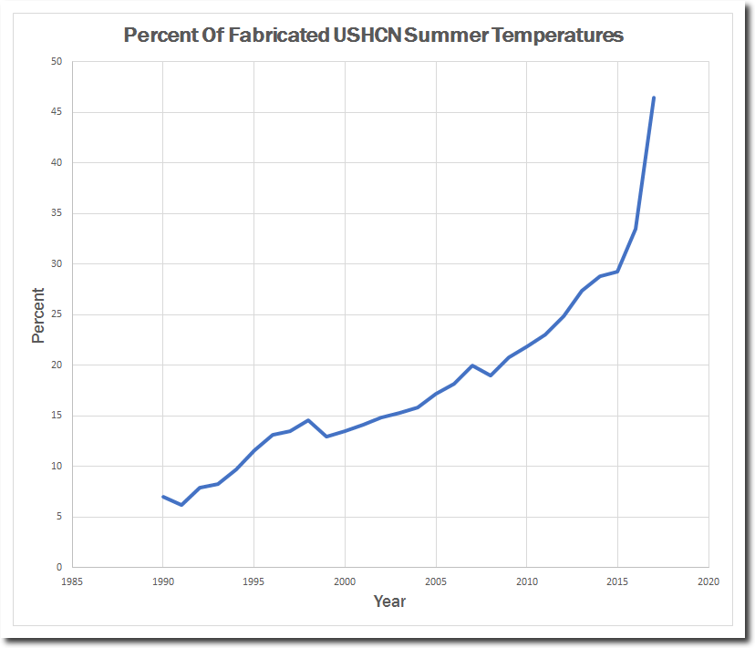
Since 1990, NOAA has gone from 6% fabricated temperatures to almost 50% fake data in 2017.
Note that since 1990 they have had a huge decrease in the number of temperature readings per month listed in their database. Between missing stations and missing days, adjusted data is almost half fake.
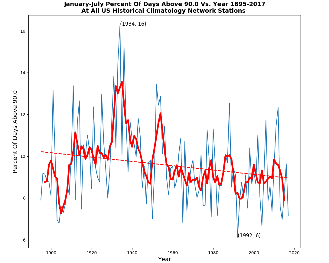
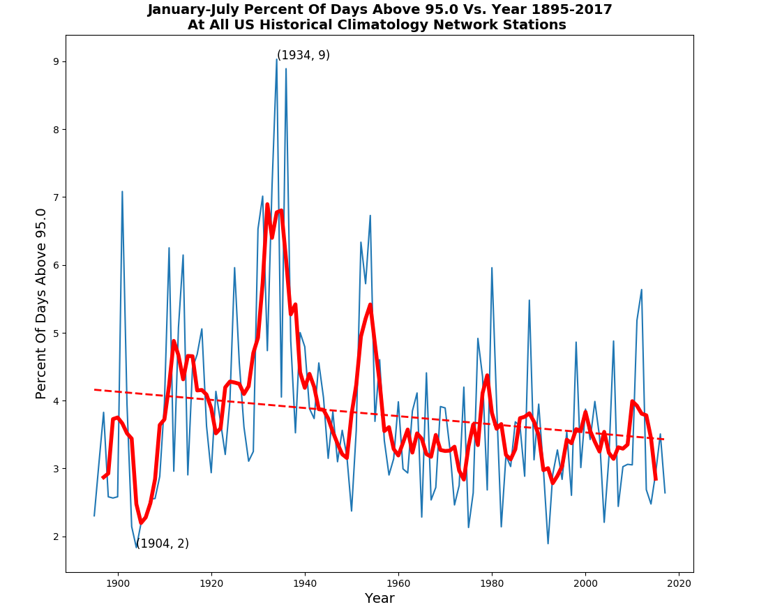
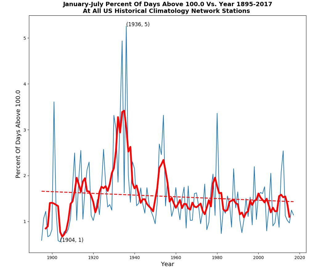
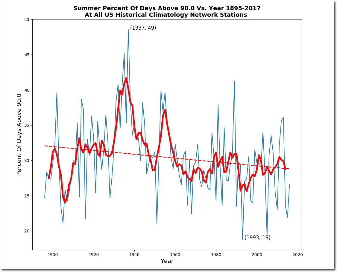
Other evidence is the frequency of hot days, which shows the same pattern as the raw averages.
It is possible that I have a bug in my new software. It is also possible that I am closing in on nailing down how their temperature data racketeering works. It appears that they are replacing cold readings with fake hot ones.
Posted in Uncategorized
Leave a comment
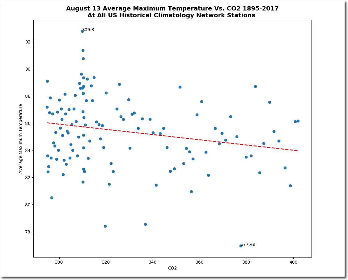
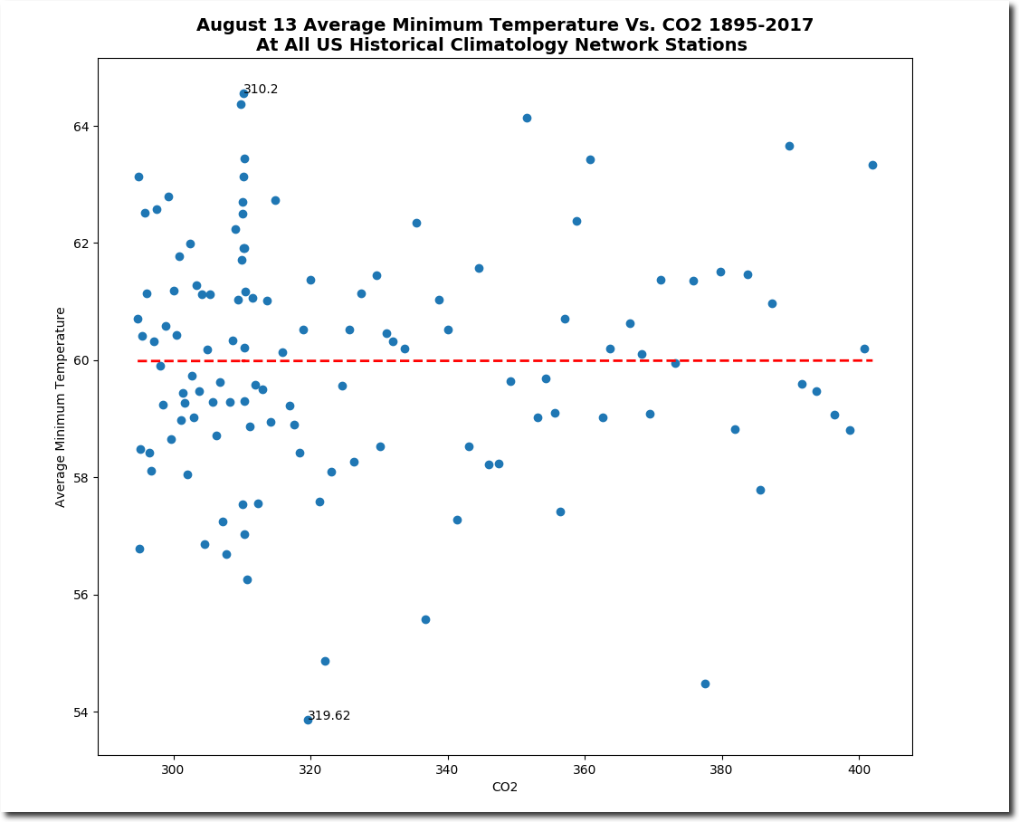
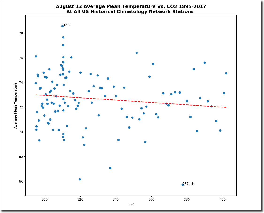
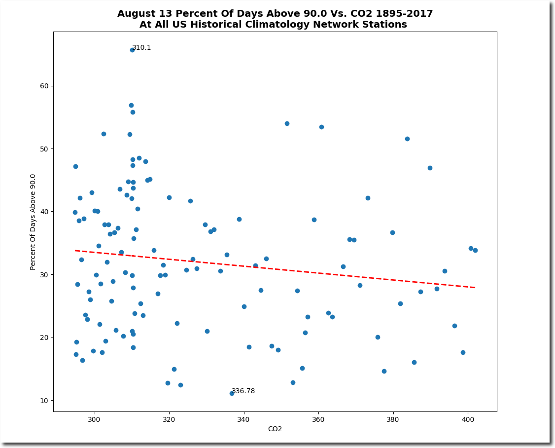
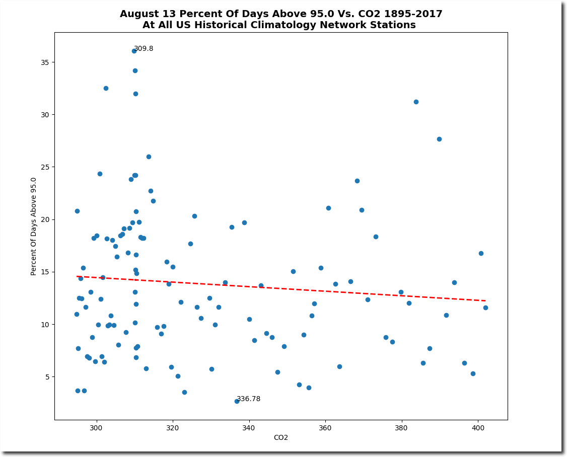
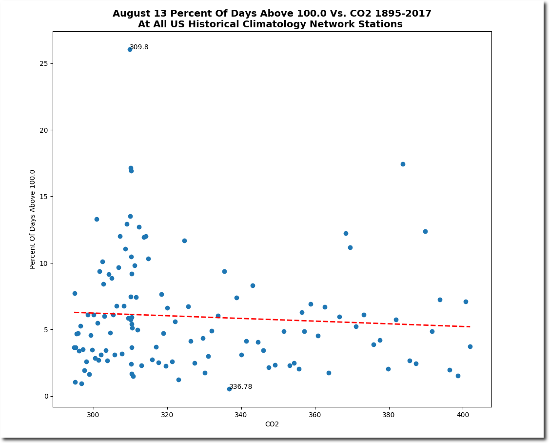
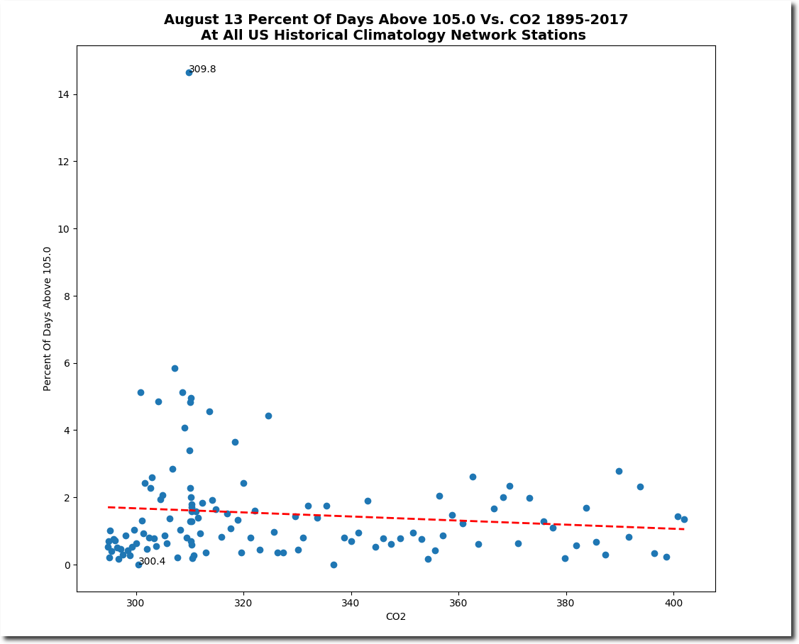
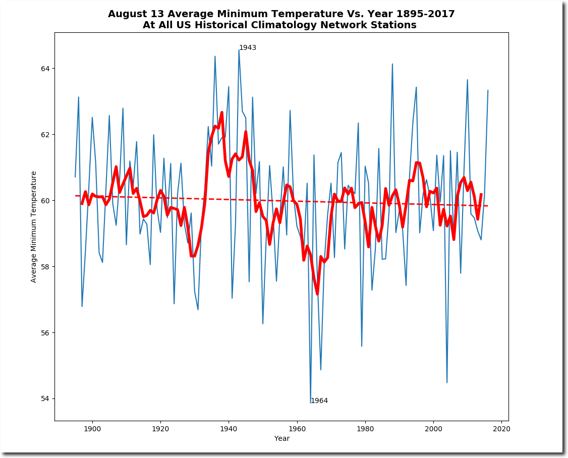
Plummeting August 13 Temperatures In The US
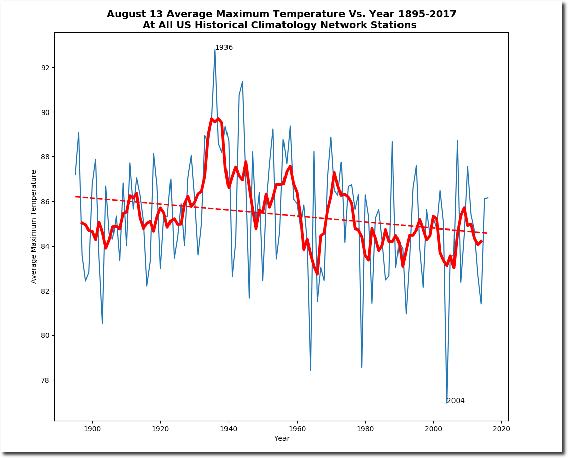
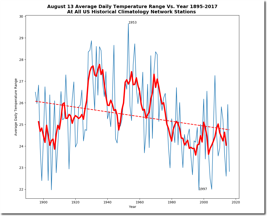
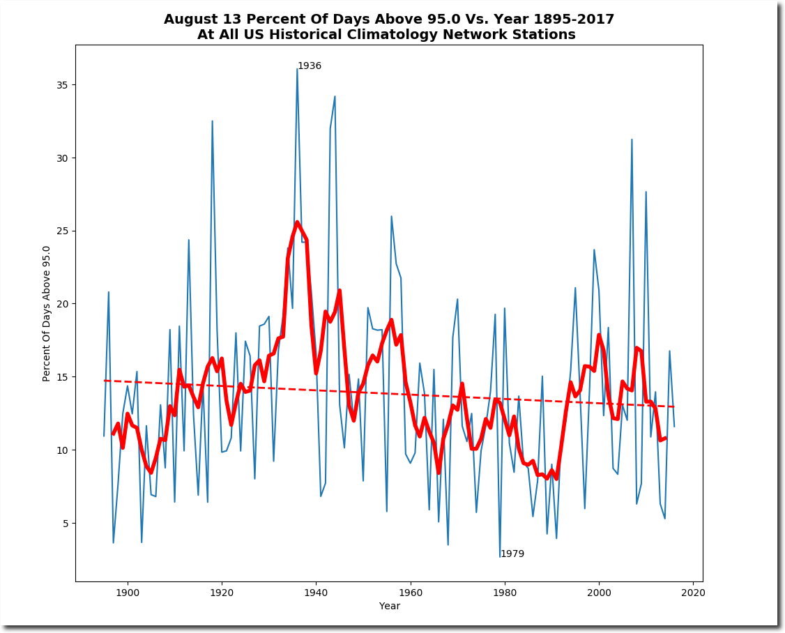
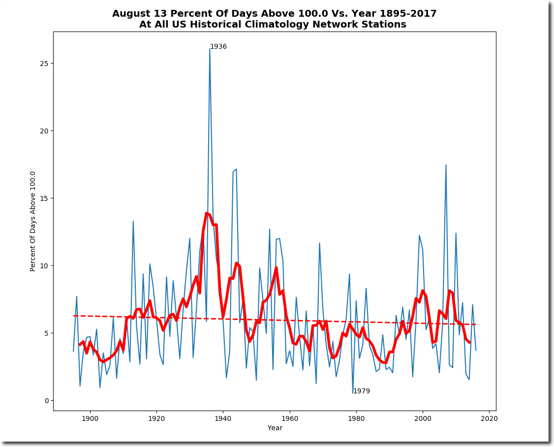
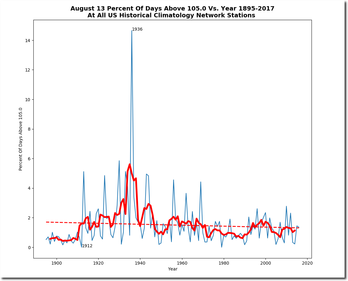
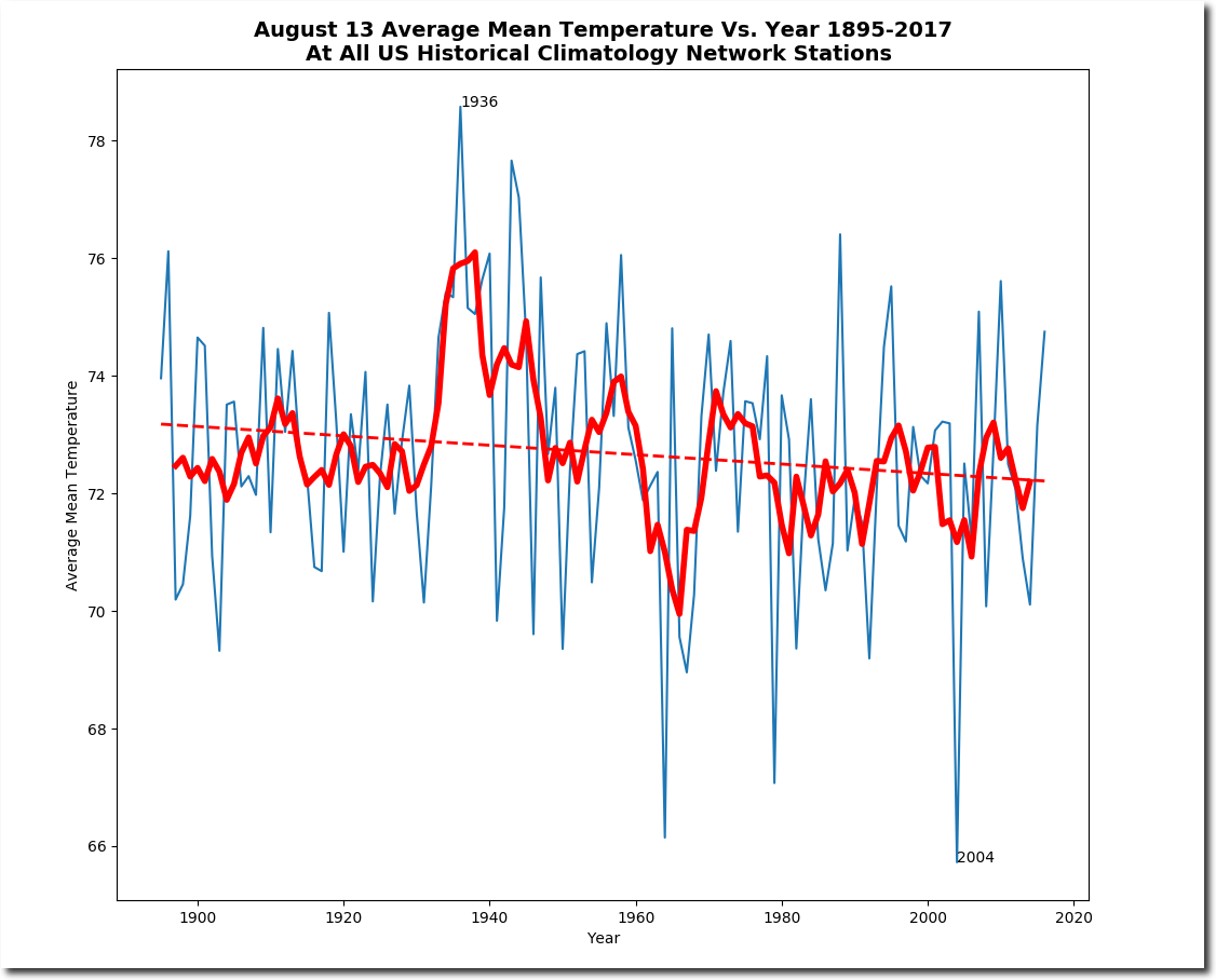
On this date in 1936, the US was incredibly hot. Minneapolis, Kansas was 119 degrees, 32 degrees warmer than their forecast maximum today of 87 degrees. Experts say this is the hottest year ever, and temperature extremes are getting much larger.
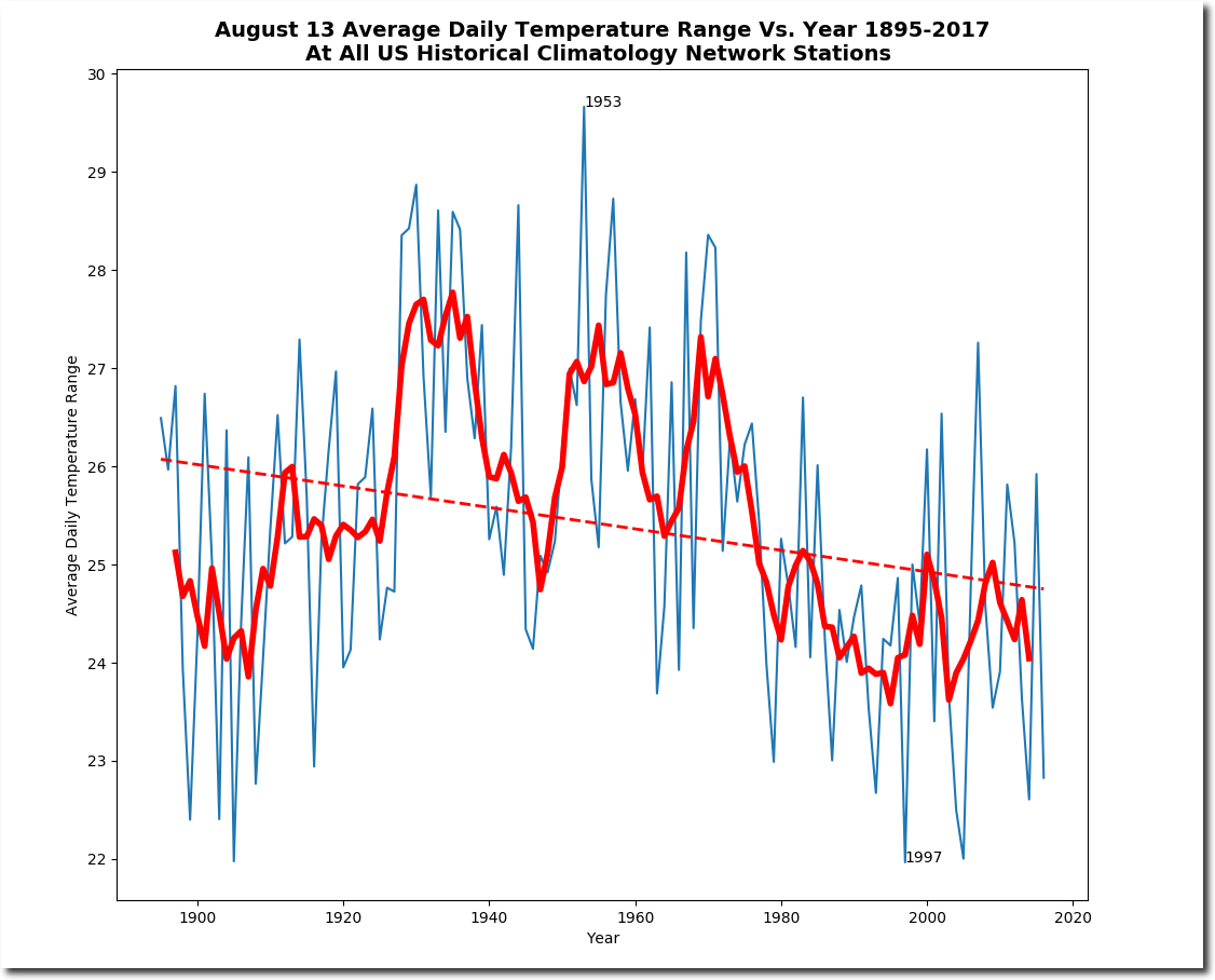
The data shows the exact opposite of expert claims. The range of daily temperatures is plummeting – indicating that the climate is becoming much milder.
Government climate experts are criminals – not scientists.
Posted in Uncategorized
Leave a comment
UNHIDING THE DECLINE
Update : There were some errors in the initial release. Please try again.
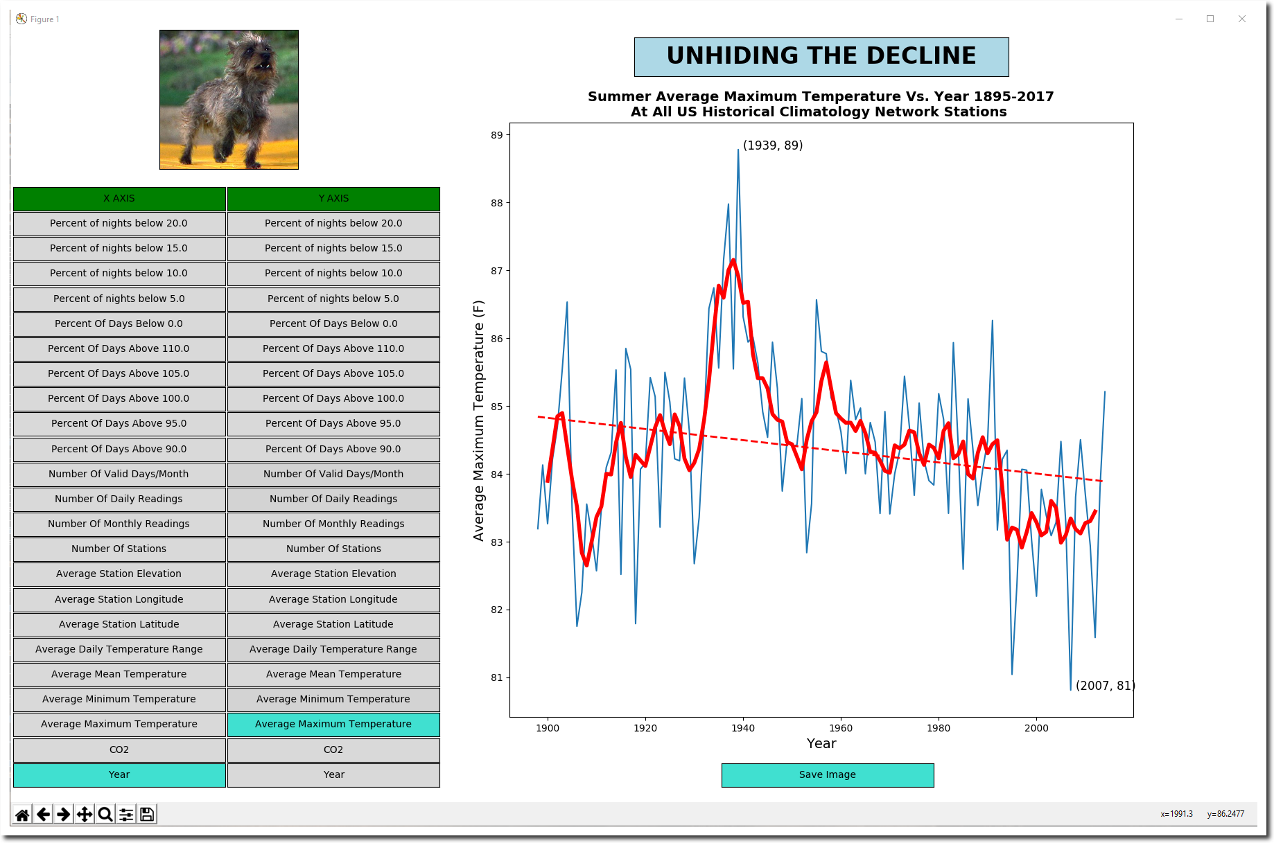
This is the initial release of my new GHCN software, titled UNHIDING THE DECLINE. It is designed to allow you to process large GHCN databases on a small computer with little memory, and make graphs very quickly.
The initial release is just for people who have python available. This includes any Mac or Linux user, and any Windows user who is willing to make the effort to install python3 and a gnu environment like cygwin or mingw. I will release a Windows exe file soon.
Open a terminal window
python3 -m pip install matplotlib
python3 -m pip uninstall numpy
python3 -m pip install numpy==1.12.1
Download these two files from dropbox : GHCNPY.tgz get
tar xzvf GHCNPY.tgz
cd GHCNPY
Try this command to reproduce the plot above. It will take several minutes to bring the screen up, as it has to process the data
python3 ghcn.py US.txt summer text=”USHCN”
You can generate hundreds of different graph types very quickly by simply clicking on an X-axis option (left column) and Y-axis option (right column) . Click on the “Save Image” button to create a .png file, which is in the same directory you ran the ghcn.py script from. It also generates a csv file in that directory with all of the stats.
Other command line options include
- spring
- fall
- month=[1-12]
- date=[mmdd]
- first_year=[yyyy]
- last_year=[yyyy]
- target_type=[MIN/MAX/BOTH]
- target_min=[temperature F] (used for stats)
- target_max=[temperature F] . (used for stats)
- state=[AZ/AK/CO…..]
- required_range=[YYYY:YYYY] . ( station must have been active in both years)
The algorithm is very simple.
- Average all daily temperature records for one station for one month (that is how NOAA organizes them)
- Average all of the 1200 station averages for that month
- Repeat for all 12 months, and all years from 1895 to the present.
That is it. The algorithm is an improvement over my previous software, which lumped all daily data from all stations together per month. That unfairly weighted stations which reported more days relative to stations which reported fewer days.
To update the USHCN database, change the permissions on the bash get script, and run it “./get” . That will create a new US.txt file.
If you find any bugs, let me know! There may well be some. I just started this project last weekend. I’ve been at this for 12 straight hours and need to get out on my bike!

Posted in Uncategorized
Leave a comment
Plummeting Summer Temperatures In Missouri
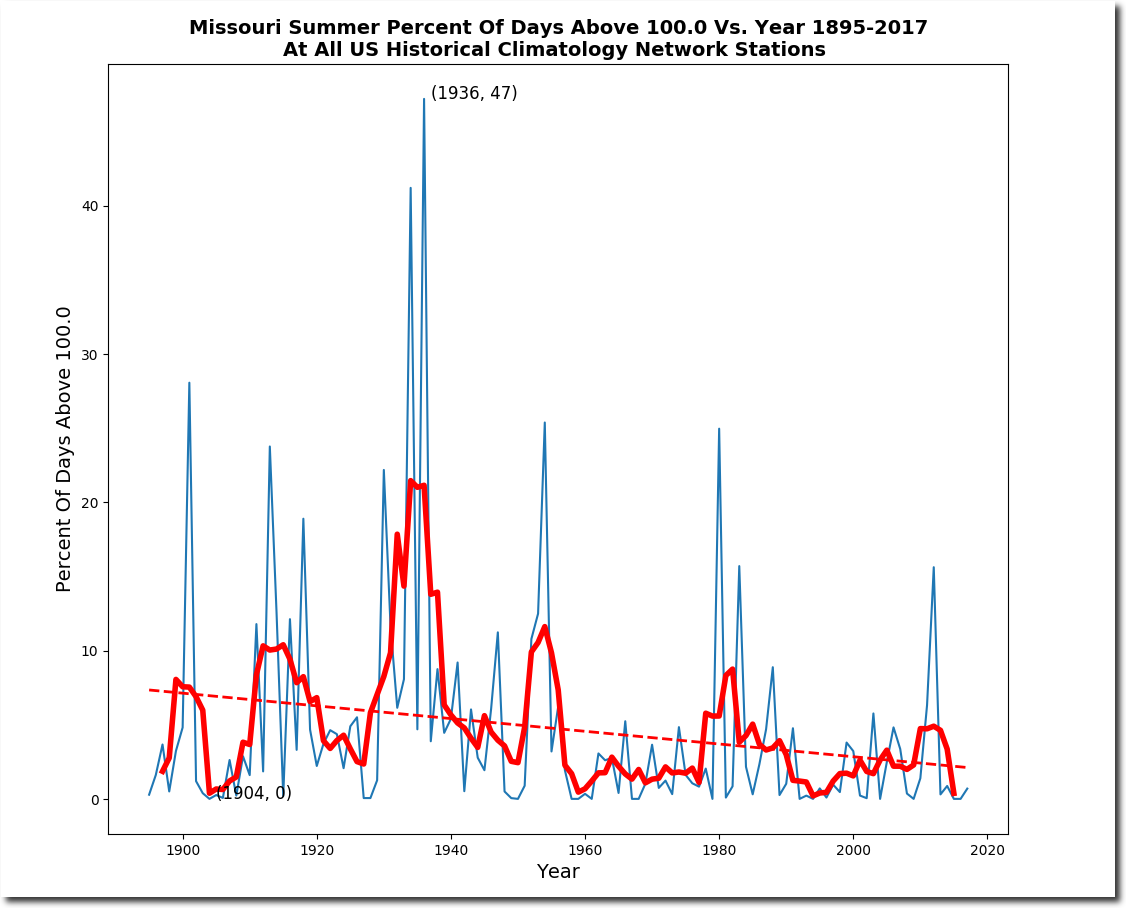
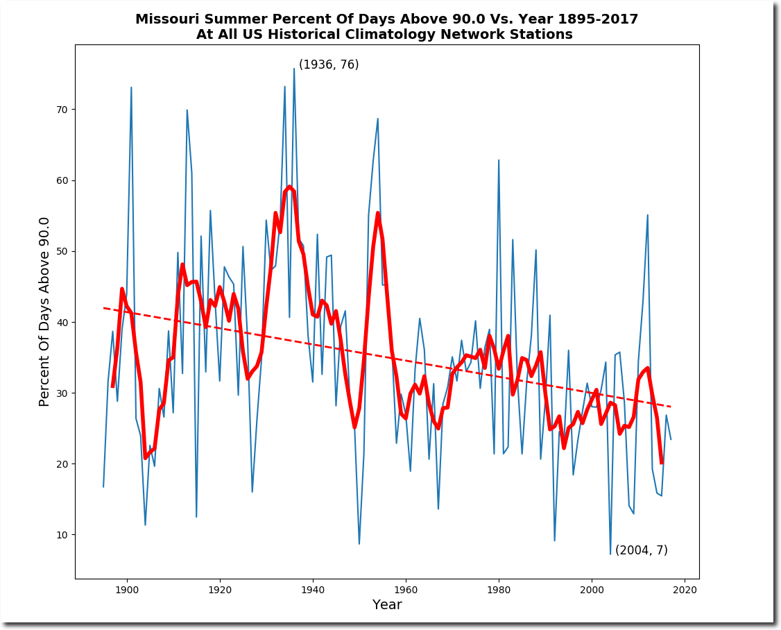
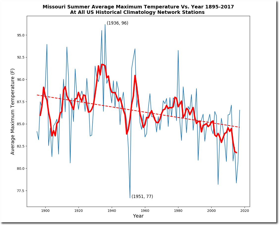
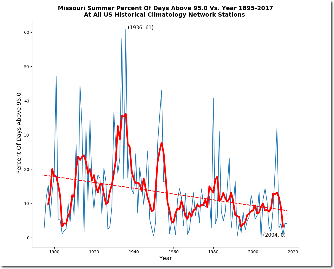
Summers have cooled over most of the US during the past century, but in Missouri summer afternoon temperatures have dropped about 10 degrees since the 1930’s.
Meanwhile, Heidi Cullen and her band of criminals continues to defraud the public.
U.S. Faces Dramatic Rise in Extreme Heat, Humidity | Climate Central
Posted in Uncategorized
Leave a comment
The Trouble With Our Liberal Friends …
The trouble with our Liberal friends is not that they’re ignorant; it’s just that they know so much that isn’t so.
Ronald Reagan
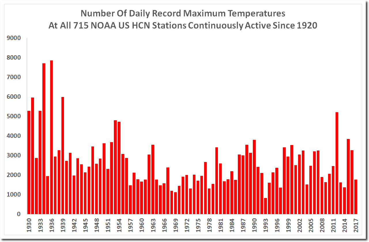
Every time I post a graph like this, some geniuses weigh in and say – of course the number of records go down – because it becomes harder to beat the old records.
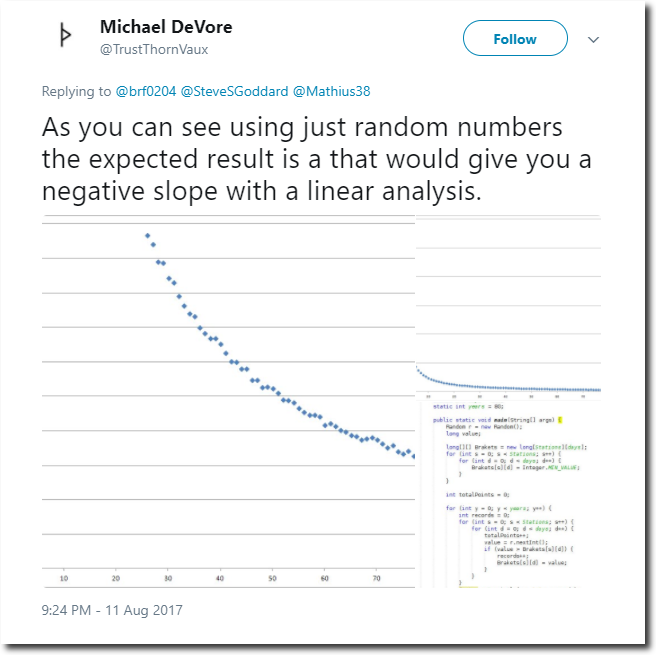
This is a typical response.
Here is the algorithm. It makes no difference if you run it forwards, backwards or randomly. The graph gets the same results. There is no time bias.
RECORD_TMAX = 0
RECORD_LIST = []
for year in range(1895, 2016) :
if (TMAX[year] > RECORD_TMAX ) :
# New record becomes the only entry in the record list.
# All prior holders are cleared
RECORD_LIST = [year]
RECORD_TMAX = TMAX[year]
elif (TMAX[year] == RECORD_TMAX ) :
# Ties are added to the record list
RECORD_LIST.append(year)
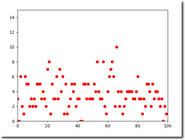
If the world was warming, the graph would be mirrored and the number of records would be increasing. Enough fake excuses! Here is an actual test of the algorithm.
import random
YEAR = []
RECORD_COUNT = []
for year in range(0, 100) :
YEAR.append(year)
RECORD_COUNT.append(0)
for day in range(1, 366) :
TMAX = random.sample(range(0, 200), 100)
RECORD_TMAX = 0
RECORD_LIST = []
for year in range(0, 100) :
if (TMAX[year] > RECORD_TMAX ) :
# New record becomes the only entry in the record list.
# All prior holders are cleared
RECORD_LIST = [year]
RECORD_TMAX = TMAX[year]
elif (TMAX[year] == RECORD_TMAX ) :
# Ties are added to the record list
RECORD_LIST.append(year)
for record in RECORD_LIST :
RECORD_COUNT[record] += 1
import matplotlib.pyplot as plt
plt.plot(YEAR, RECORD_COUNT, "ro")
plt.axis([0, 100, 0, 15])
plt.show()
Posted in Uncategorized
Leave a comment