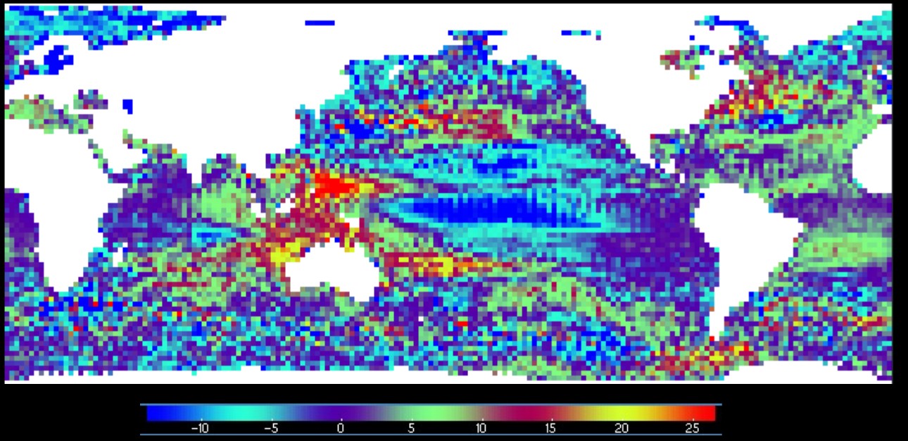
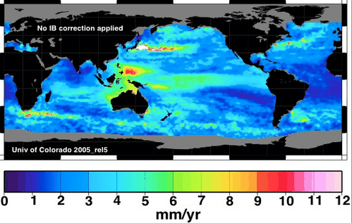
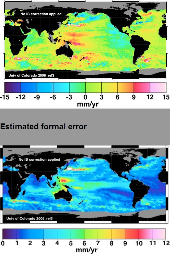
I located a 2007 version of the CU sea level error map, and its corresponding trend map.
Note the region north of New Guinea where the trend is 9 mm/year and the error is also 9 mm/year. This region severely skews the global numbers upwards. In other words, their 3mm/year trend claim is completely meaningless scientifically.
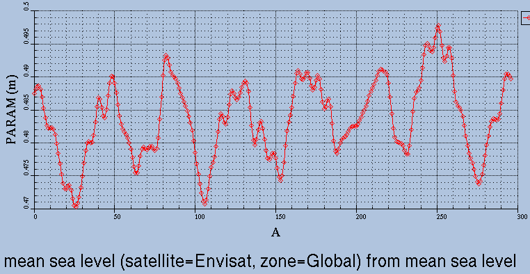
Global mean sea level results
Even worse is that they have taken the error map off their web site. Their fake 3 mm/year serves as the basis for many fraudulent claims by scientists that sea level rise rates have increased.
The most sophisticated satellite (ENVISAT) used to show 0.5 mm/year, before they quadrupled the numbers overnight , and then immediately euthanized the satellite.
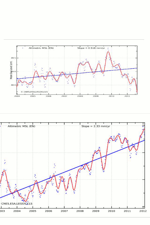
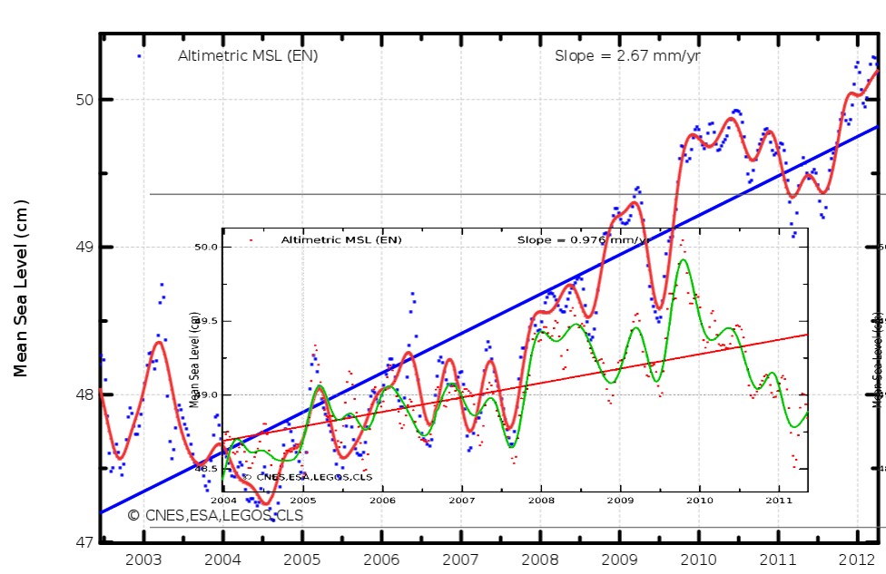
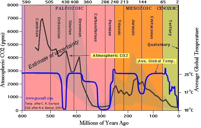
Current version of the graph
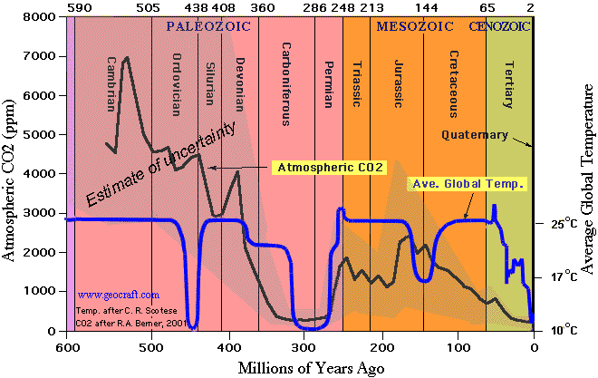
August 2011 version of the graph