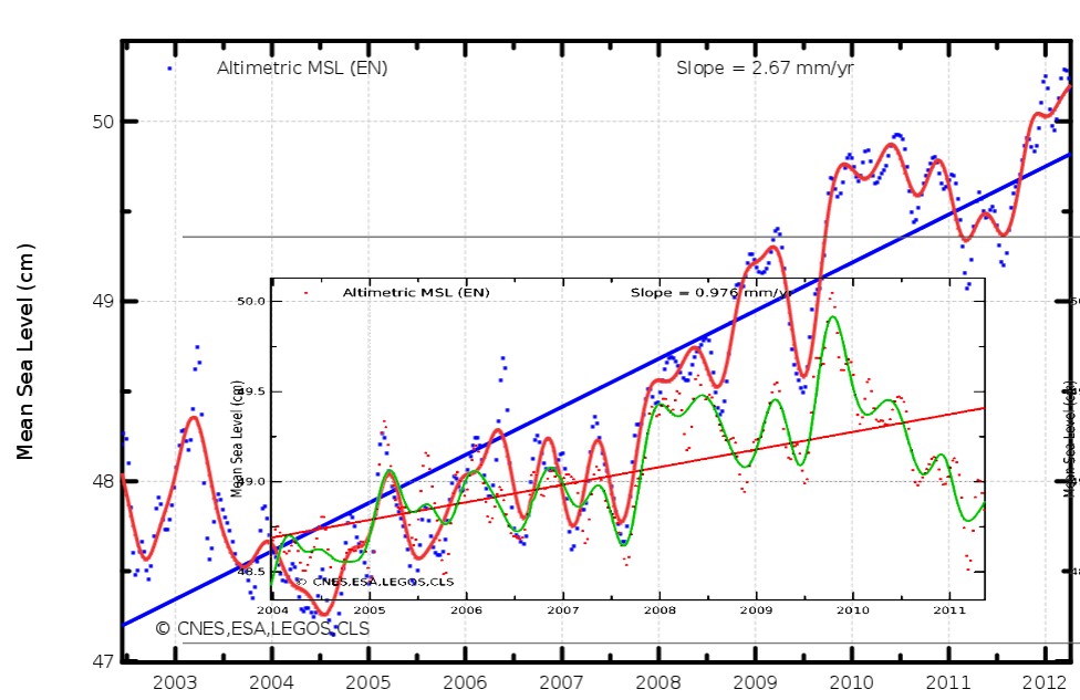
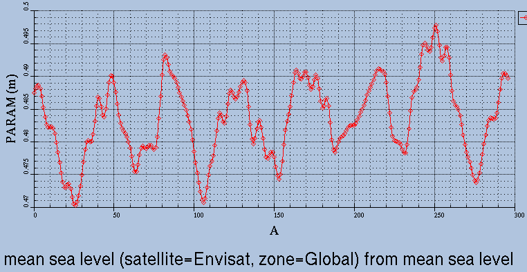
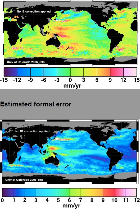
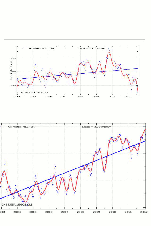
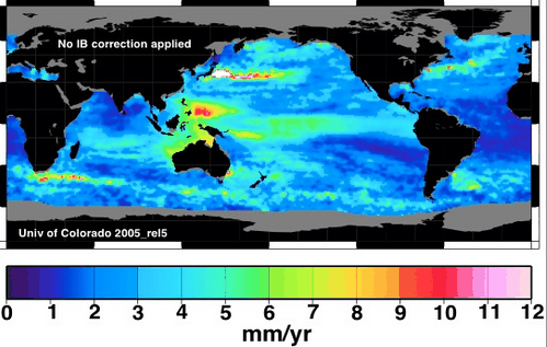
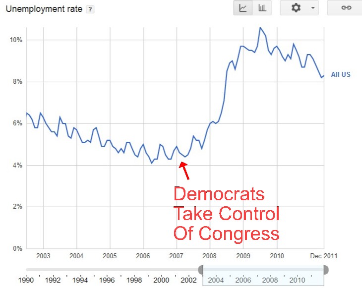
I captured this Envisat map on May 16, 2011 – before adjustments and tampering. It shows almost identical areas of rising sea level and falling sea level.
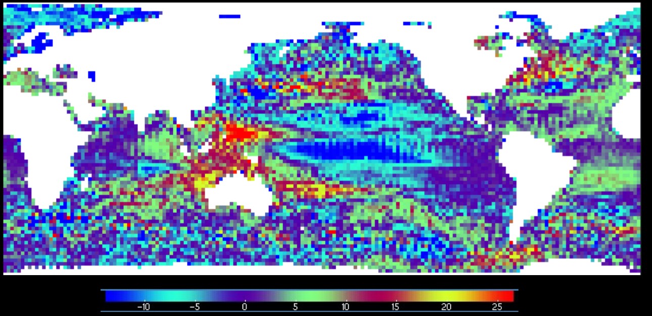
The next map flattens out regions of rising and falling sea level as either red or blue. The area of red and blue on the map is very similar, indicating that the area of the ocean where sea level is falling is similar to the area where sea level is rising.