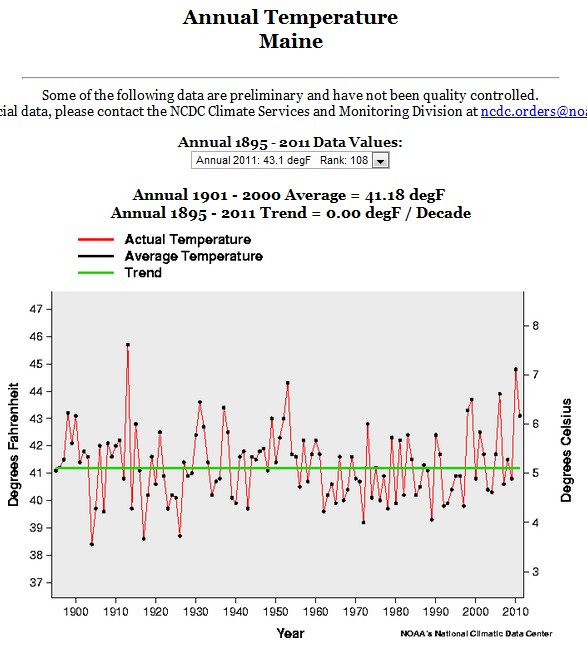
Hansen has this graph of global temperatures on the Columbia web site.
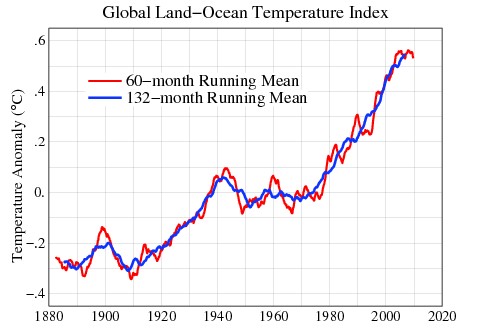
Global Temperature
In 1988, he generated these three forecasts for future temperature rise
Scenario A assumes continued exponential trace gas growth, scenario B assumes a reduced linear growth of trace gases, and scenario C assumes a rapid curtailment of trace gas emissions such that the net climate forcing ceases to increase after the year 2000.
Scenario A below assumed that annual CO2 emissions continued to increase, which is what has happened. Scenario B assumed that annual CO2 emissions decreased after 1988, which has not happened. Scenario C below assumes that humans essentially quit producing CO2 twelve years ago in the year 2000.
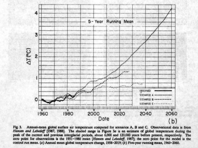
pubs.giss.nasa.gov/docs/1988/1988_Hansen_etal.pdf
The image below overlays Hansen’s claimed results on his forecasts. Actual temperature rise is less than Hansen’s zero emissions scenario C, and has gone completely flat over the last five years.
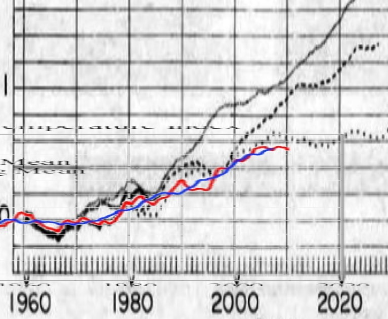
An honest scientist would admit that his theory was wrong, and move on. Hansen has instead ramped up the rhetoric, called for 25 metres of sea level rise, and said that people who disagree with him should be prosecuted.
In order to hide the unexpectedly slow increase in temperature, he has also stretched out the Y-axis of his graph. If he drew the temperature graph at the same scale as his 1988 forecasts, no one would even be paying attention any more. The graph below doesn’t look much like a hockey stick.