NOAA and NASA US temperature graphs have been massively altered over the past 20 years, to turn a 90 year cooling trend into a warming trend.
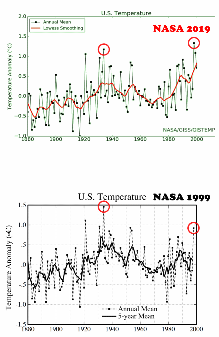
NASA 1999 NASA 2019
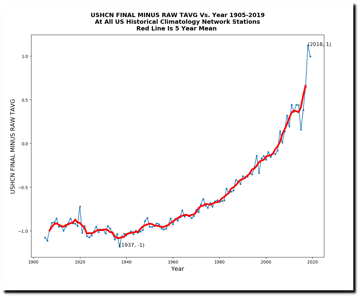
The adjustments are being made by cooling the past nearly 1.5F and warming the present more than 0.5F.
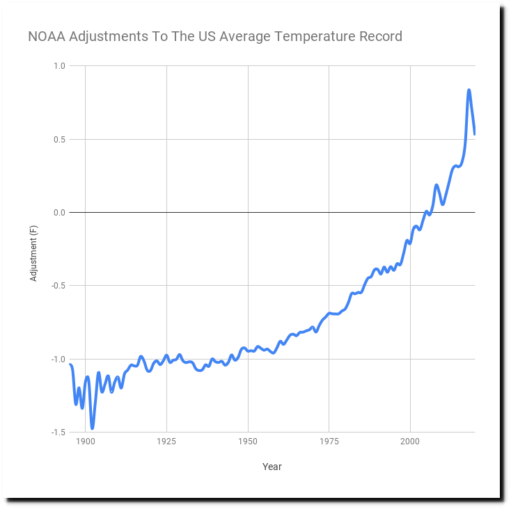
Final Data TOB Data Raw Data
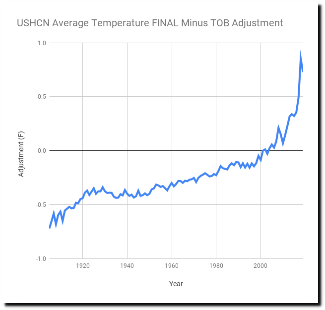
The adjustments from NOAA are done in two steps. The first adjustment is called the Time Of Observation Bias (TOB) adjustment, and the second is called the Final adjustment. You can see the magnitude of the adjustments in the graph below. The TOB adjustment accounts for about 0.6F, and the Final adjustment changes the data nearly 2.0F. The TOB adjustment has a fair amount of documentation, but the final adjustment is larger and not well documented.

These are the adjustments being made to the monthly maximum temperature record. The measured temperature data shows 2019 as the coolest on record, but the adjusted data shows 2019 as one of the warmest.
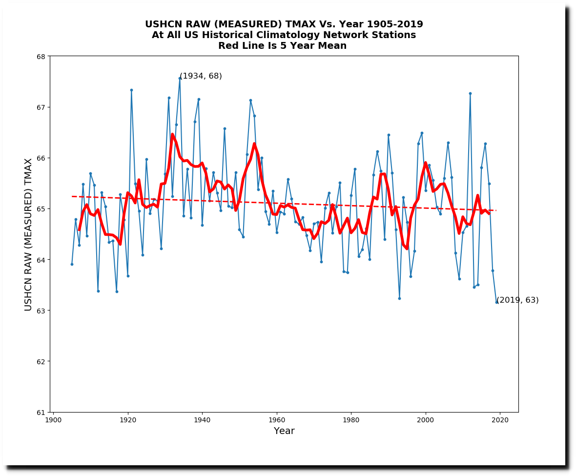
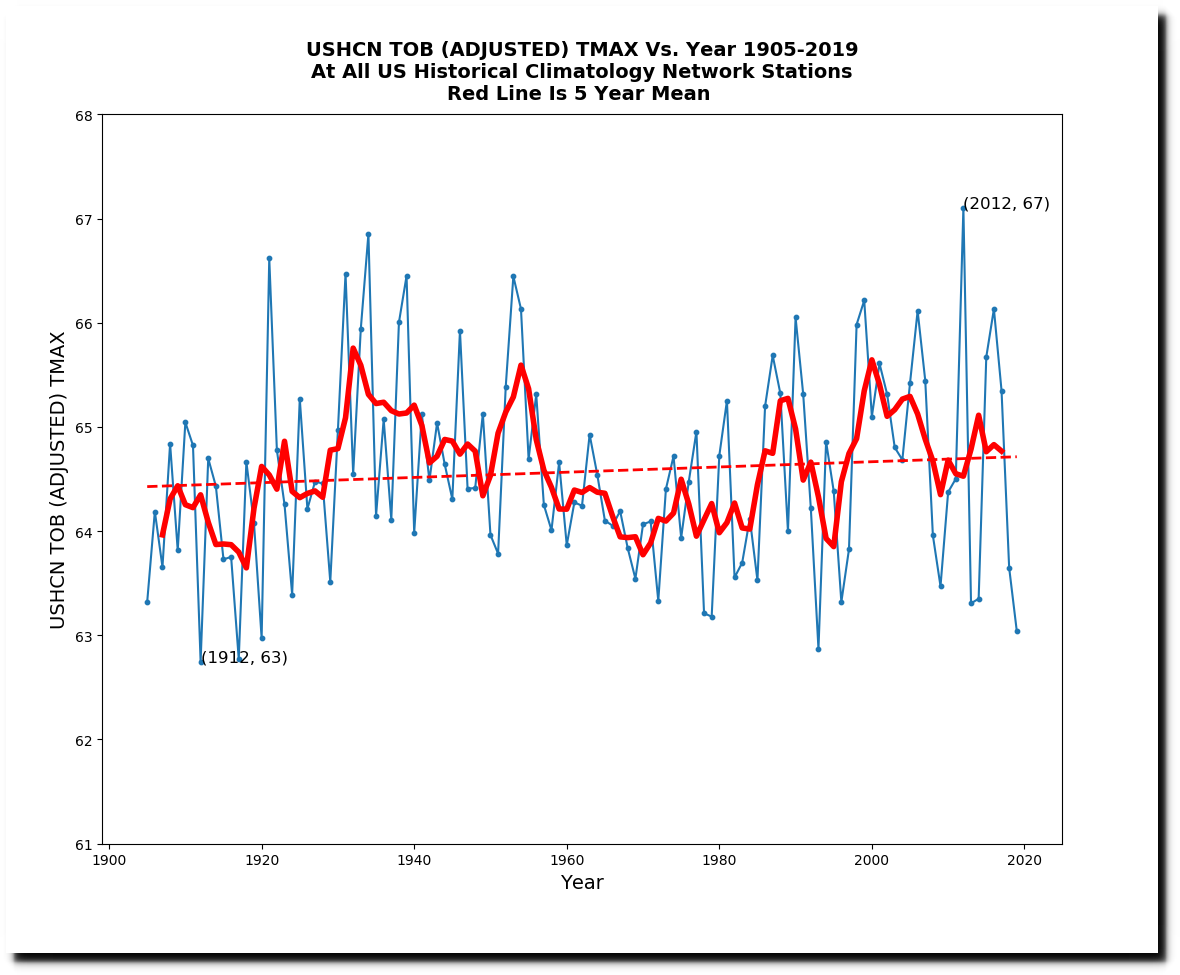
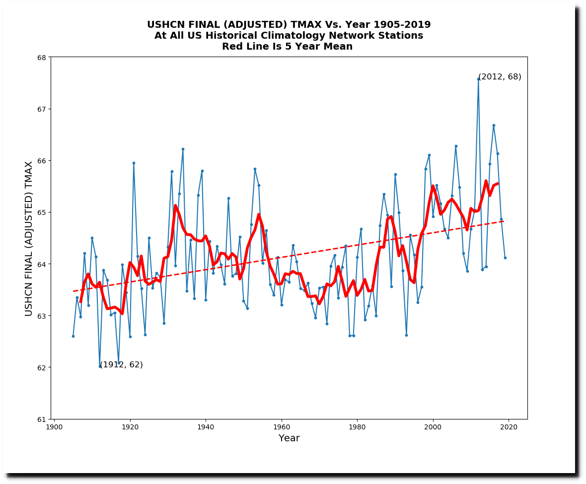
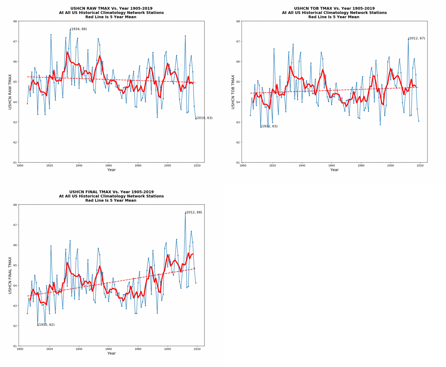
Below are the adjustments being made to the maximum temperature data.
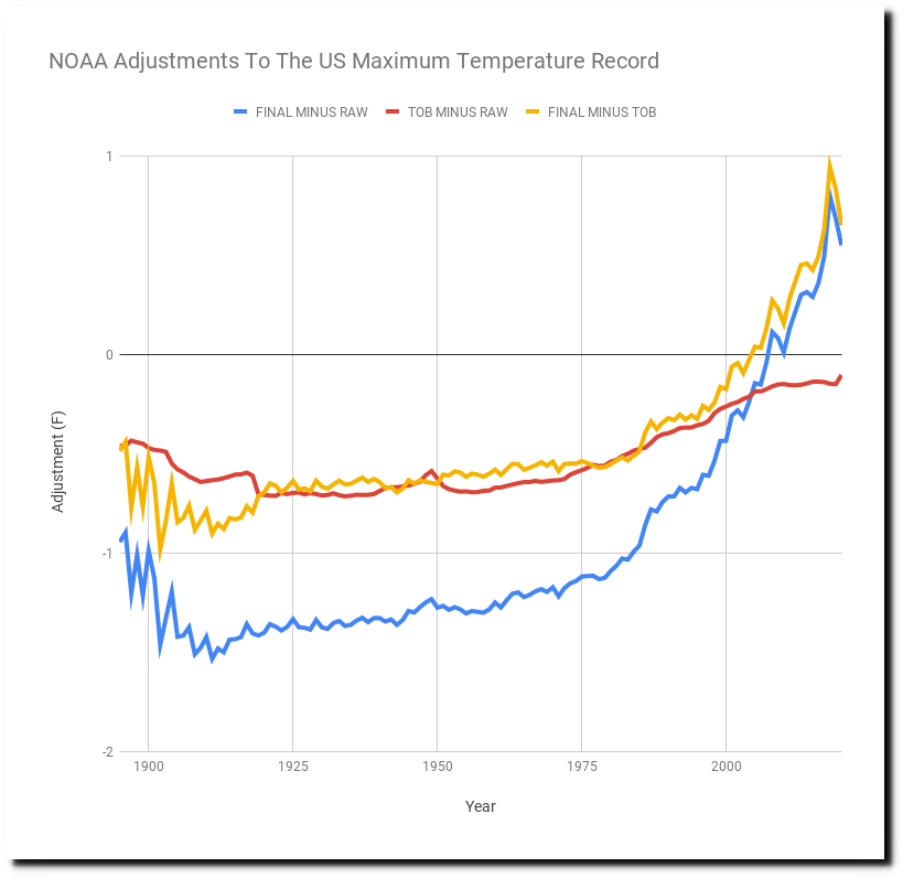
I’m going to first discuss the TOB adjustment, and then explain what I can determine about the opaque FINAL adjustment. The TOB adjustment accounts for about 0.6F warming since 1960. It is based on the idea that in the past people reset their min/max thermometers once per day, and that at most stations this was done during the afternoon. This will tend to cause double counting of hot days, and produce an incorrectly high average temperature for the month. Suppose that on day one it is 90 degrees at 3PM, and the thermometer is reset at 3PM. A cold front moves through that night, so day two is much cooler, but the min/max thermometer reports 90 degrees again, because it was reset at the previous days peak. Based on this theory, older temperatures are adjusted downwards.
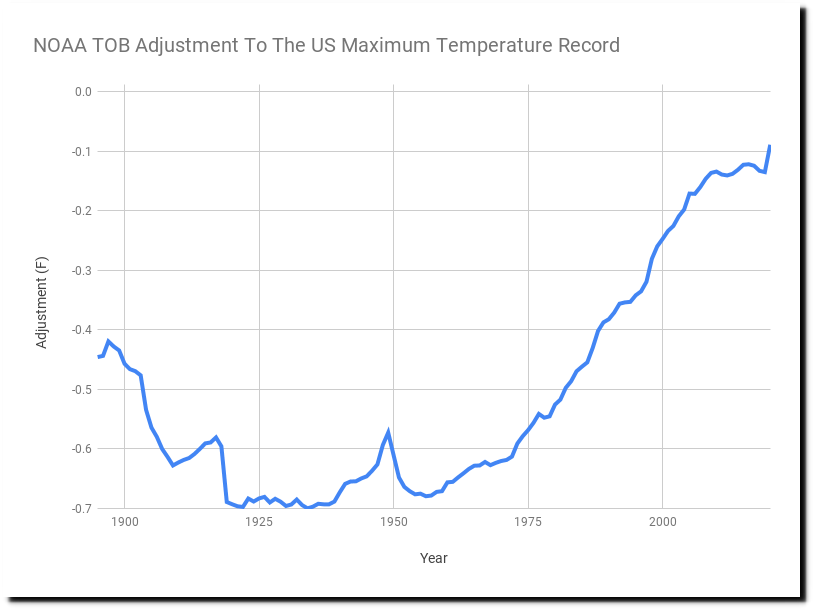
The TOB adjustment turns a long-term cooling trend into a warming trend.
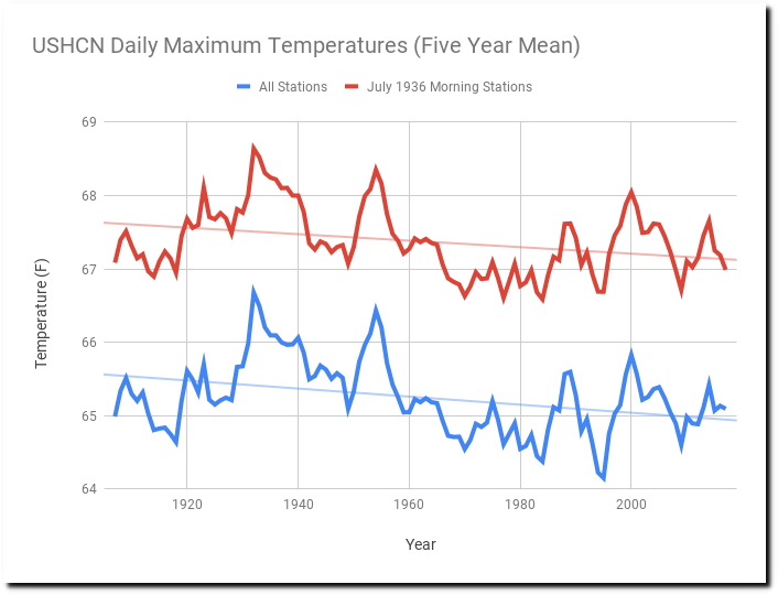
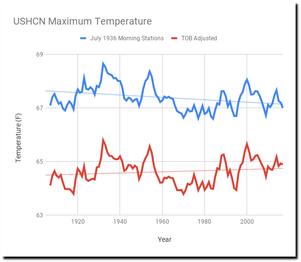
There is a simple way to test this out, and that is to eliminate potentially troublesome stations rather than trying to correct them. For the red line of this next graph, I use only the 254 stations which reset their thermometer in the morning or at night during July, 1936 – which was the hottest month on record in the US. This eliminates the possibility that Time of Observation Bias is causing the temperatures from 1936 to be recorded too high. The trend of the morning stations very similar to the trend of all stations, but is shifted upwards. This is because morning stations tend to be located at warmer locations, where people are likely to go read the thermometer during the morning. Both data sets show a cooling trend with similar slopes – which makes me believe that the TOB adjustment being made is too large.
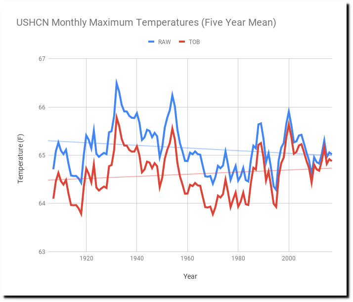
If the TOB adjustment being made was correct, the TOB adjusted trend below should parallel the morning station trend, but it doesn’t. The July, 1936 morning stations show cooling. but the TOB adjusted trend shows warming.
The TOB adjustment is highly questionable and probably too large, but it is much smaller than the mystery FINAL adjustment.
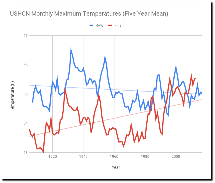
The FINAL adjustment is not well documented, but one thing that has been suggested is it includes a correction for changing station composition. This is easy to test by comparing the complete set of stations to the stable set of 148 stations with records going back at least 100 years. The graph below compares that, and shows that changing station composition does cause a little bit of cooling relative to the stable set of stations.

But that is only a tiny part of the massive final adjustment, shown below. For the rest of this discussion I will be referring to average temperatures.
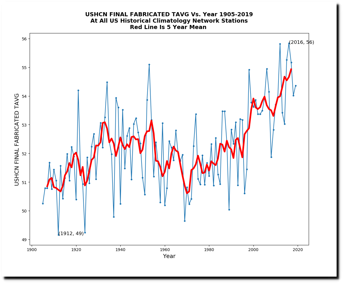
The most troubling part of the FINAL adjustment is that it is largely populated with non-existent data. If one of the 1,218 USHCN stations does not report in a given month, NOAA uses a computer model to estimate the temperature. Last year, 42% of the data was estimated or more appropriately called fabricated.
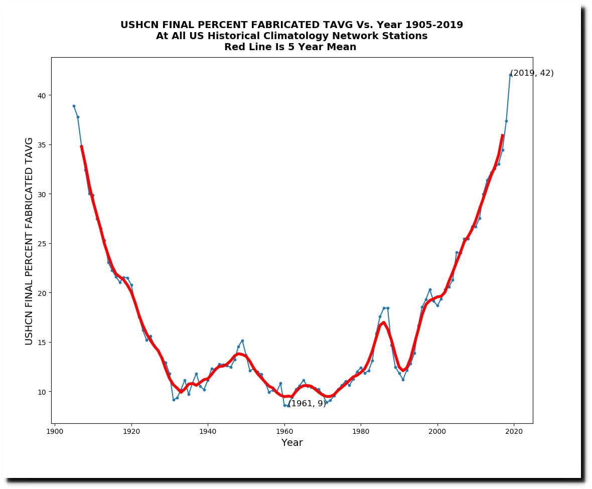
The 42% fabricated data shows a huge amount of warming.
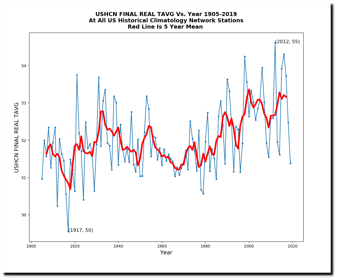
The other 58% of the adjusted data which has actual thermometer data underlying it, shows much less recent warming.
The next graph is a real smoking gun. It is the difference between the adjusted fabricated data, and the adjusted measured data. You can see that a huge amount of warming is being created from fake “estimated” data. Last year the fabricated temperature was three degrees warmer than the adjusted measured temperature.
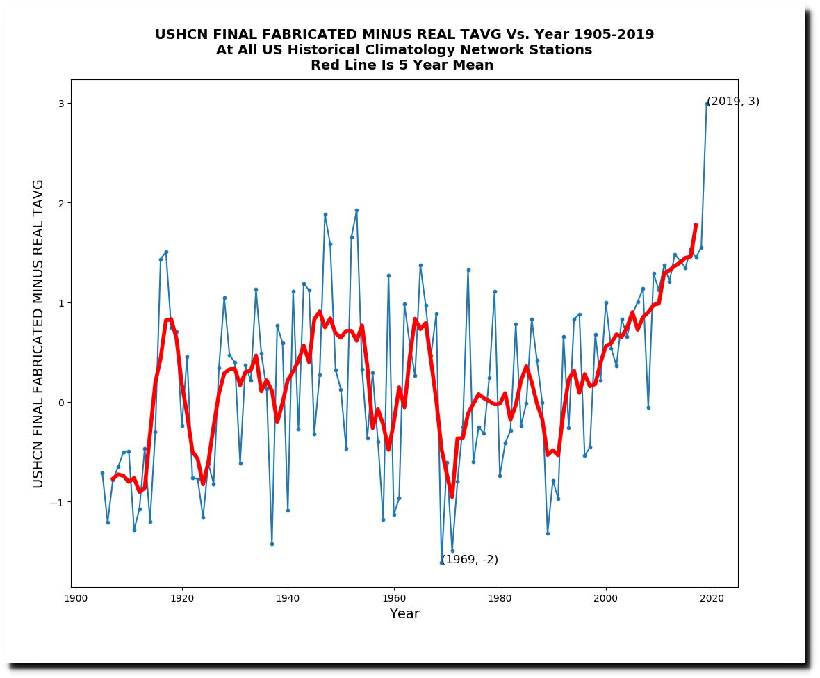
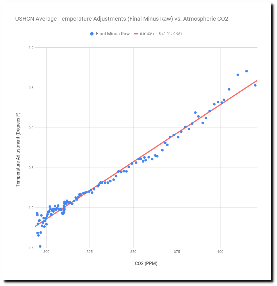
And the other large smoking gun is that the hockey stick of adjustments very closely tracks CO2. Data is being altered to match theory.