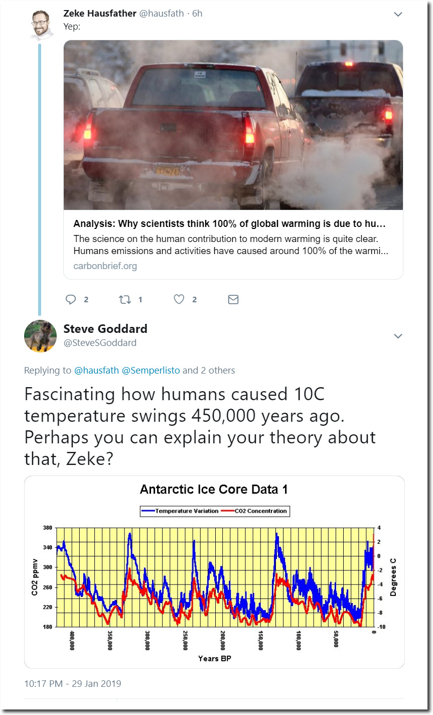
Obama’s ethics director, Walter Shaub, has no ethics.
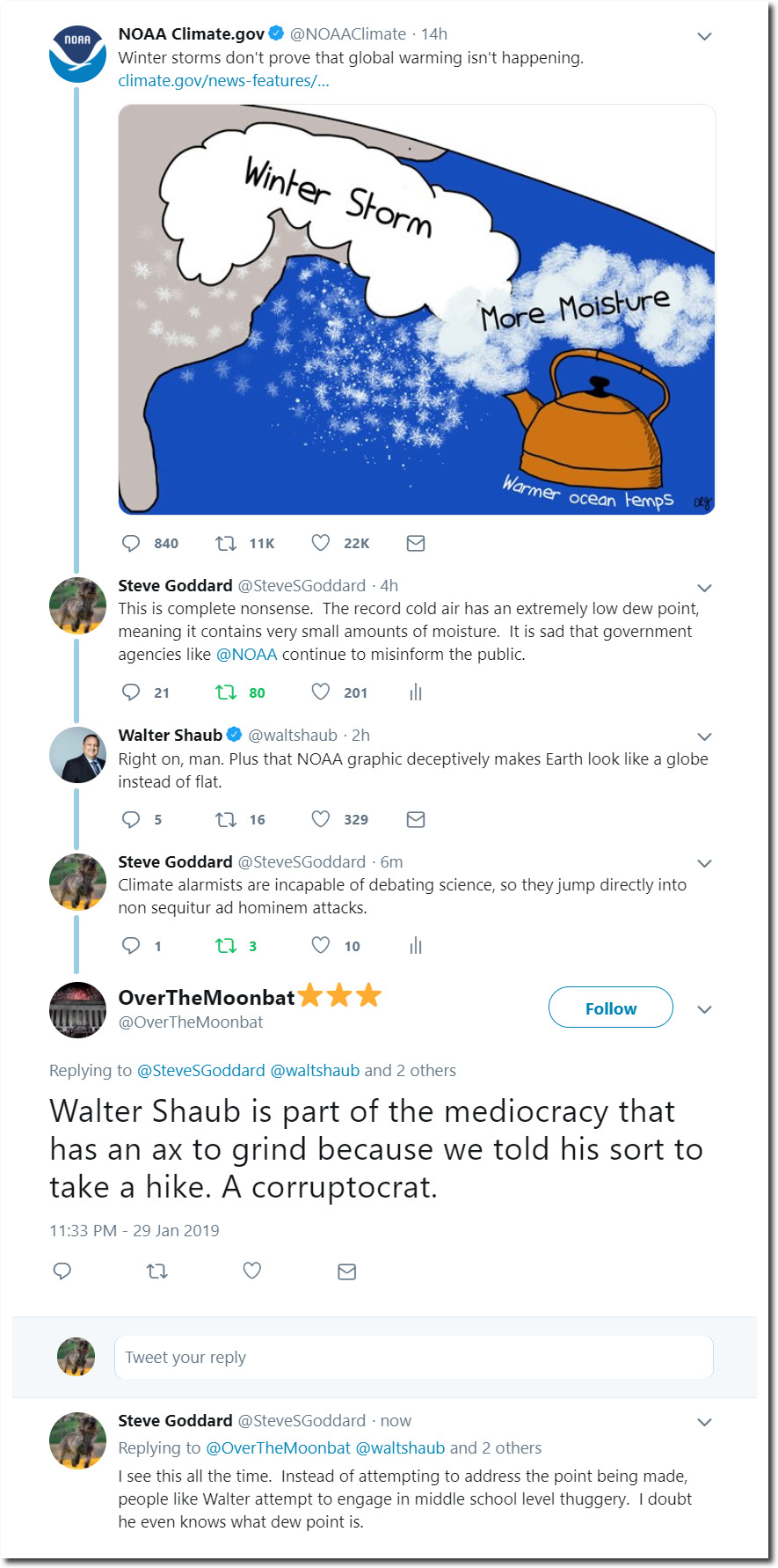
Steve Goddard on Twitter: “I see this all the time
Obama’s ethics director, Walter Shaub, has no ethics.
Steve Goddard on Twitter: “I see this all the time
Climate alarmists maintain many big lies, but none bigger than their claims about CH4 (methane.) With each successive UN IPCC report, they bump up the “Global Warming Potential” of methane. In 1995, it was 21 times stronger than CO2. In 2007, it was 25 times stronger than CO2, and in 2014, it was up to 28 times stronger than CO2.
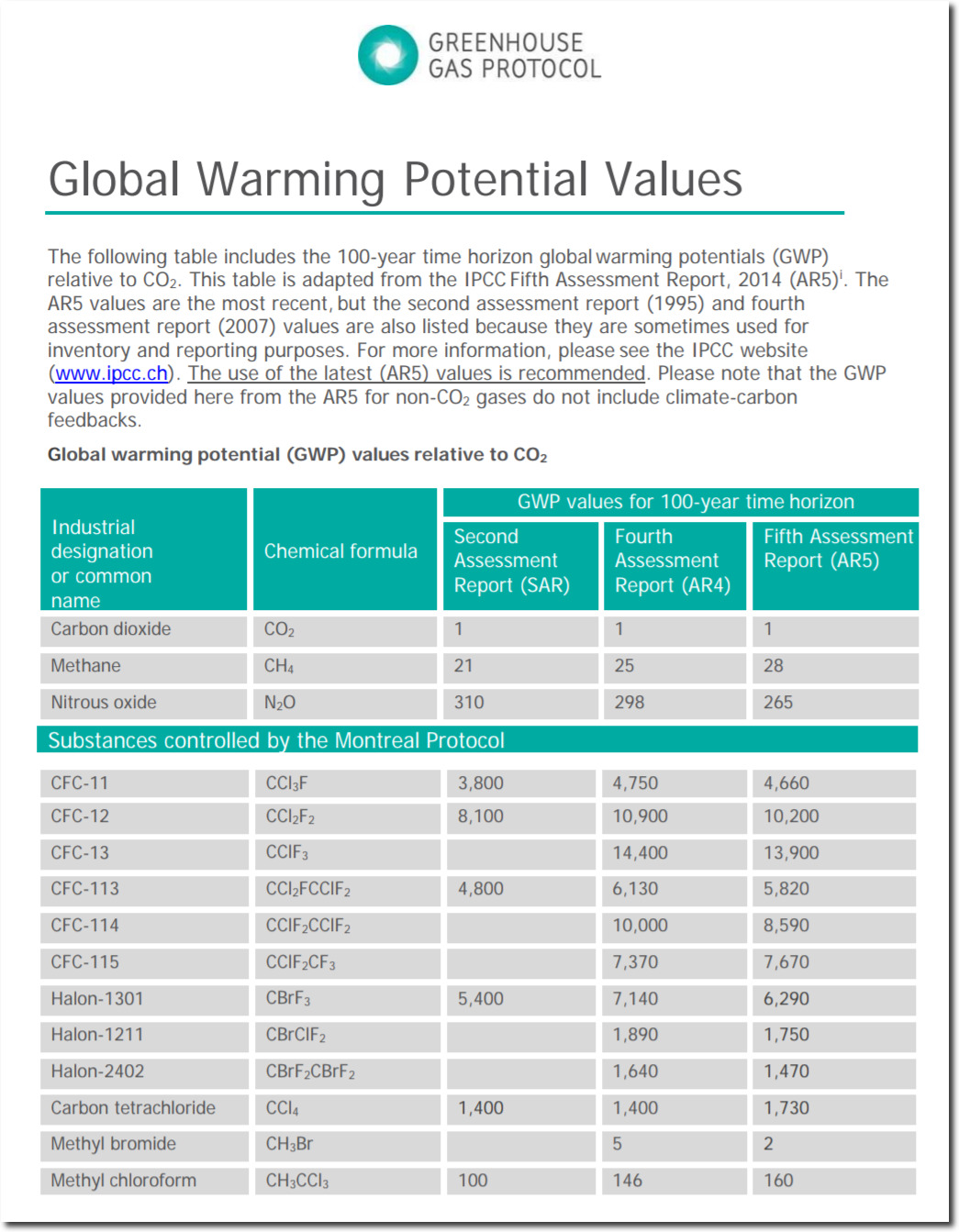
Global-Warming-Potential-Values
Also note the absence of H2O in the table above.
It is easy enough to test these claims out using their own models. The graph below was generated using the RRTM-LW model from AER, with their standard mid-latitude summer atmosphere parameters as input. This is the model used by the National Center for Atmospheric Research in their weather and climate models. The Y-axis shows the amount of downwelling longwave radiation (i.e. greenhouse effect) produced by different levels of greenhouse gases in the mid-latitude summer lower troposphere (952 mb.) The X-axis is logarithmic, with four values plotted for each gas.
Each of the three curves assumes constant (current) values for the other two gases.
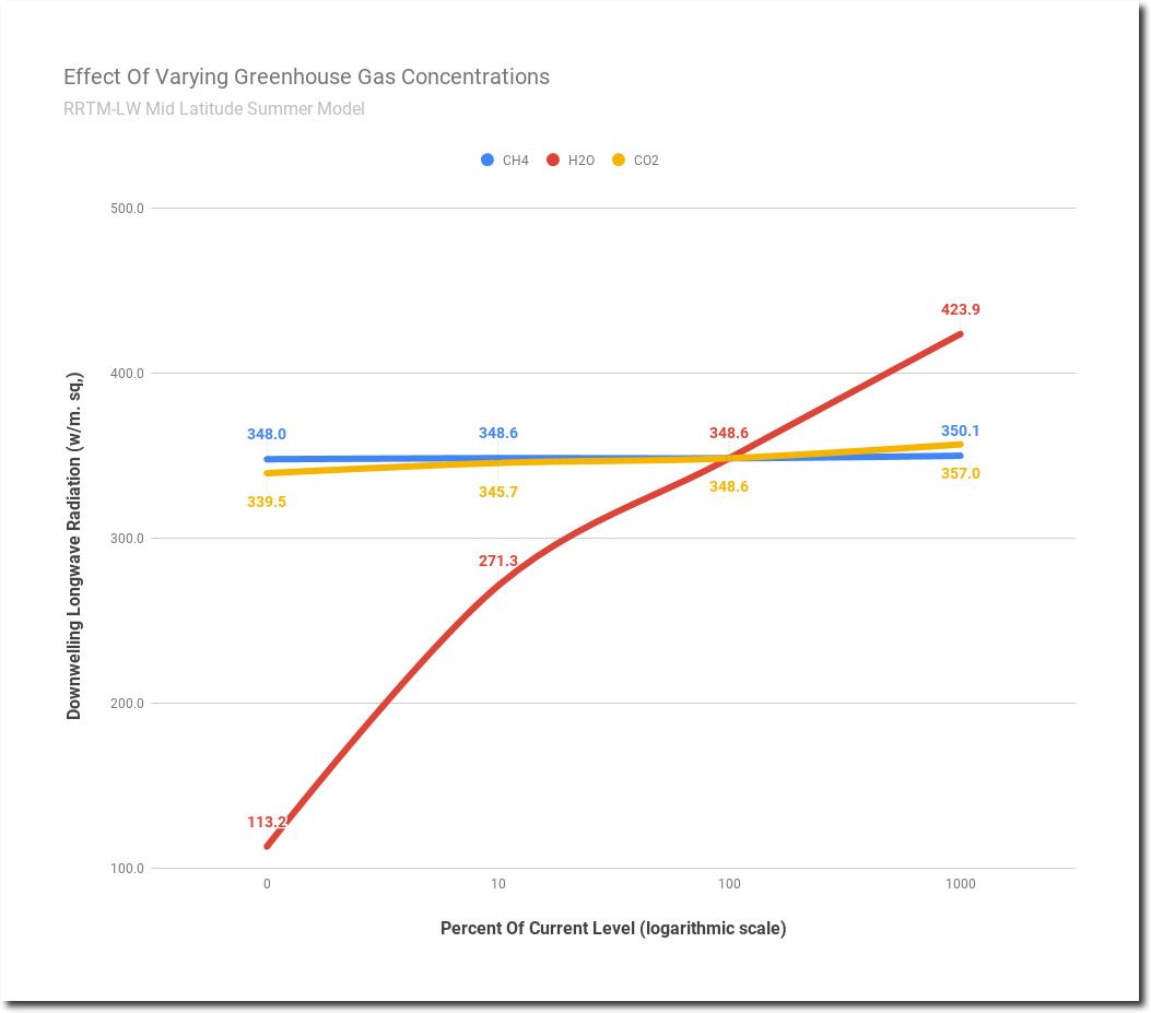
Water vapor (H2O) is far and away the dominant greenhouse gas. With no water vapor, the amount of DLWR would be less than one third of its current value.
CO2 is significant, but much smaller than H2O. CH4 (methane) is nearly inconsequential. If you reduce methane by 10X or increase it by 10X, the change in DLWR (downwelling longwave radiation) is small. Claims that CH4 is 28X stronger than H2O are complete nonsense and have no basis in science.
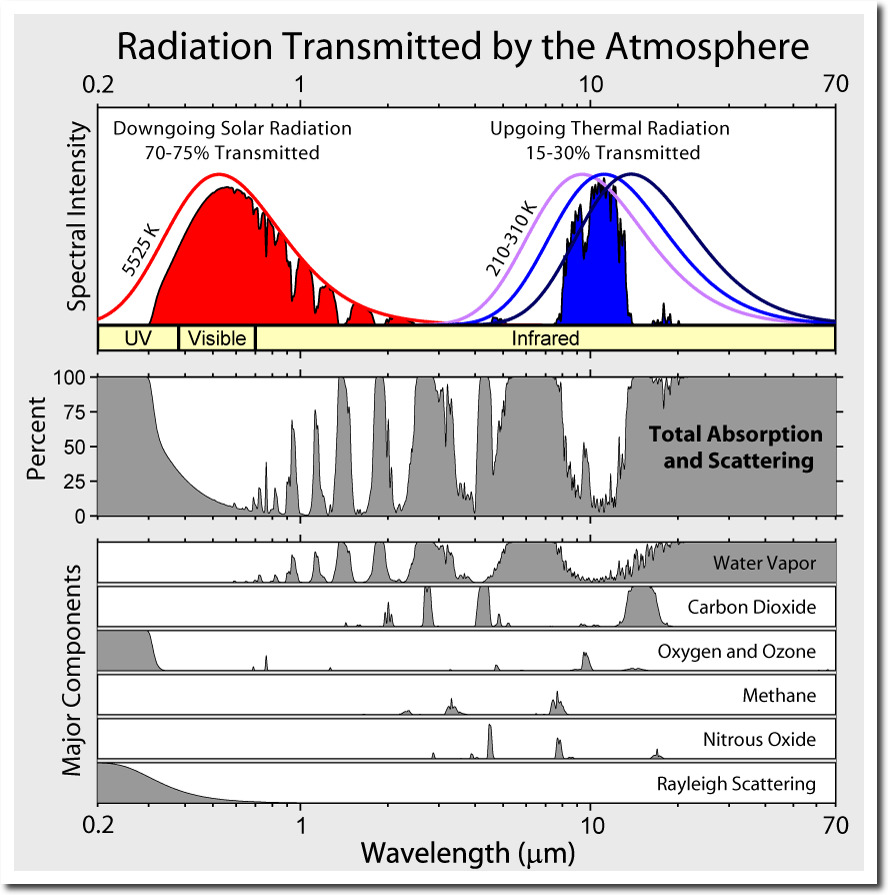
It is easy to see why methane is inconsequential in the spectral diagram below. Methane only has three small peaks, compared with the much larger and broader peaks of H2O and CO2. A good way to estimate greenhouse gas potential is to measure the area under the curve for each gas. The area under the methane curve is quite small compared to the areas under the H2O and CO2 curves.
File:Atmospheric Transmission.png – Wikimedia Commons
But methane has another problem, its peaks line up with H2O peaks, so those spectral bands are nearly saturated.
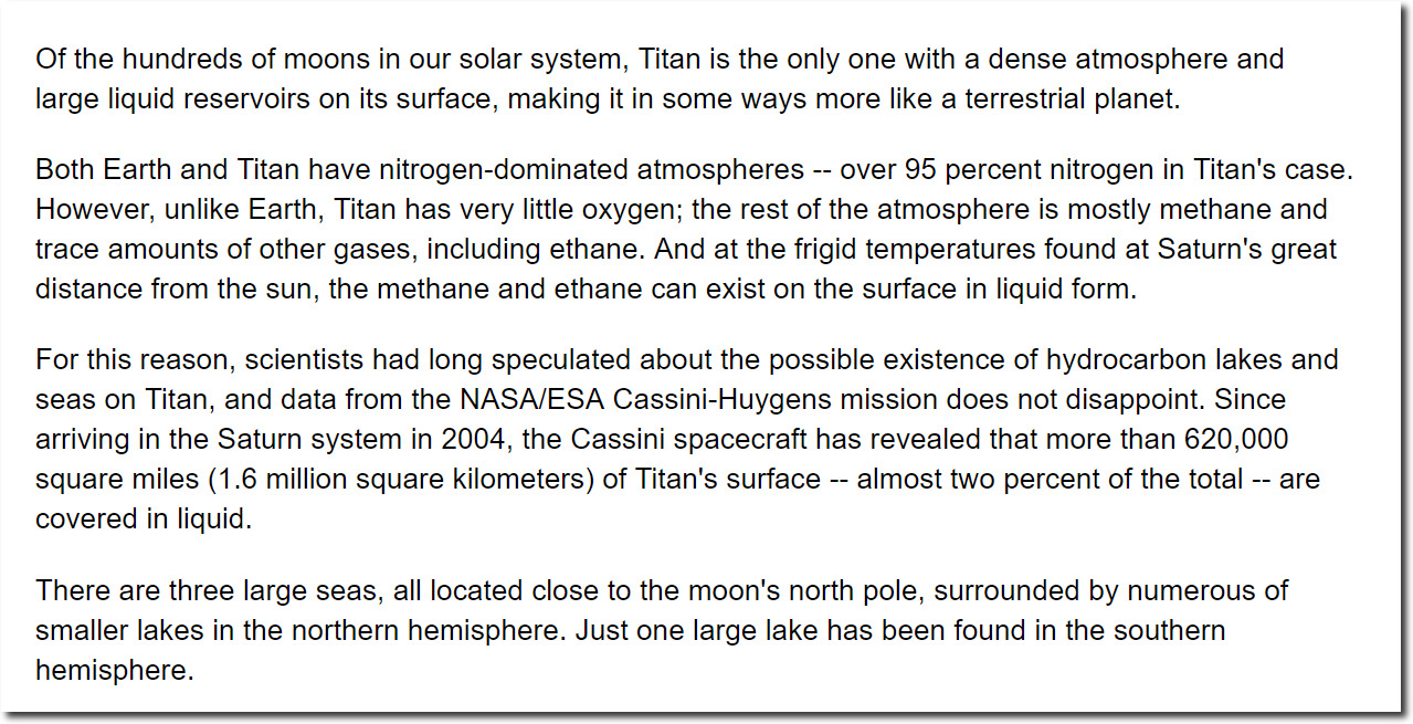
It is also impossible to build up large amounts of methane in an atmosphere which contains oxygen, because it quickly oxidizes in the presence of oxygen into H2O and CO2. That is why we use it for a fuel. The concentration of methane during mid-latitude summer is a tiny 1.7 PPM, but planets (including Earth) emit a lot of methane. Saturn’s moon Titan has methane seas. The reason Titan is able to hold its methane is because it has almost no oxygen.

Cassini Explores a Methane Sea on Titan | NASA
Earth is nothing like Titan, because we have oxygen. The global warming potential of methane on Earth is thus very small, and is nearly inconsequential compared to water vapor. So why is the IPCC lying about methane? The reason is very simple. They are attempting to restrict meat production by blaming methane emissions on livestock, and scaring people into thinking their cheeseburger will cause hurricanes and rising seas.
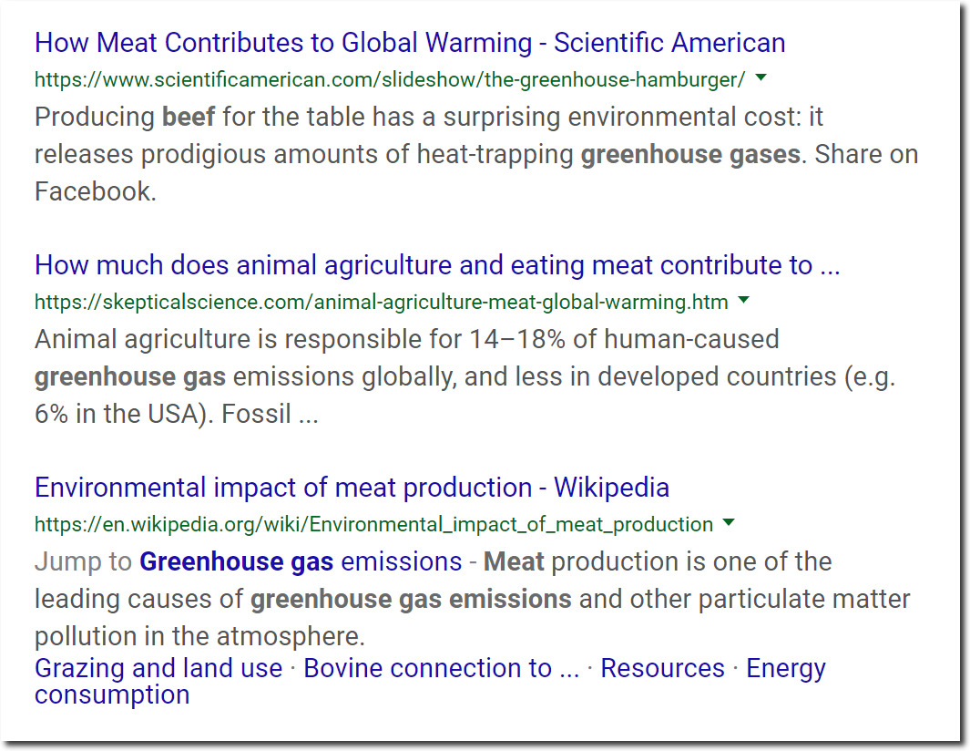
I don’t eat red meat, and very little of any other kind of meat. There are lots of good reasons to cut way back on meat consumption, but imaginary global warming is not one of them.
So why do we have oxygen on Earth? Because we have plants, which depend on CO2 to grow and generate oxygen.

Photosynthesis – Photosynthesis – Simple English Wikipedia, the free encyclopedia
By demonizing “carbon gases” CO2 and CH4, climate alarmists are demonizing life itself.
“If you tell a lie big enough and keep repeating it, people will eventually come to believe it. The lie can be maintained only for such time as the State can shield the people from the political, economic and/or military consequences of the lie. It thus becomes vitally important for the State to use all of its powers to repress dissent, for the truth is the mortal enemy of the lie, and thus by extension, the truth is the greatest enemy of the State.”
– Joseph Goebbels
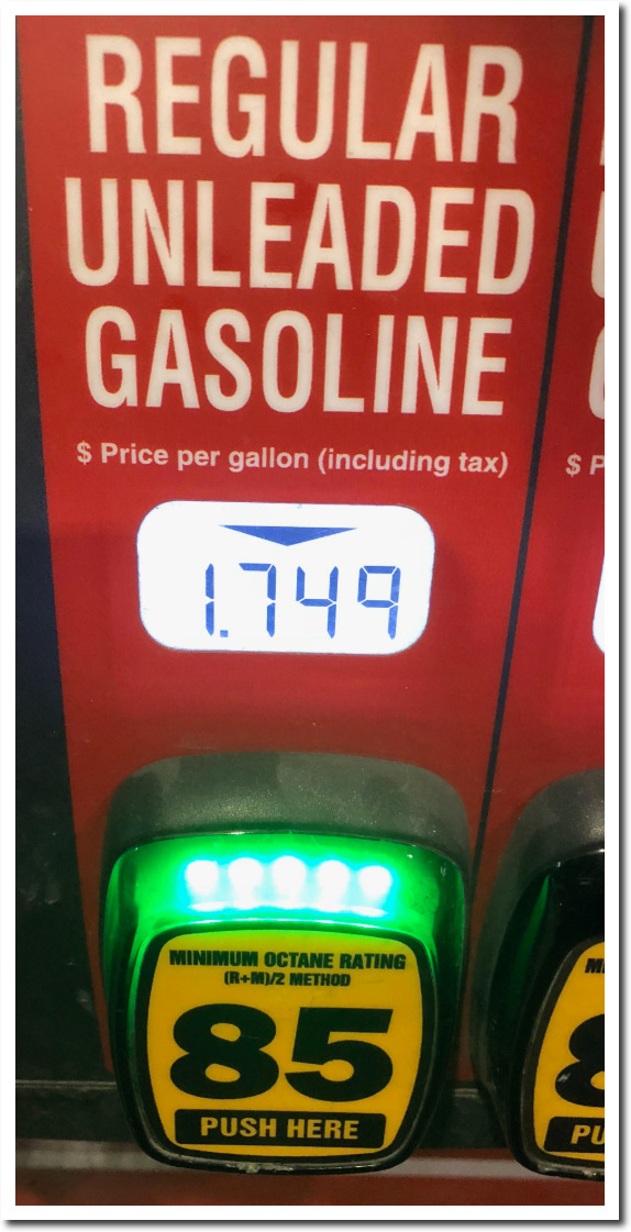
Gas was $4 per gallon when Obama made this speech.
This is what I paid tonight. Thank you President Trump.
Early in life I had noticed that no event is ever correctly reported in a newspaper.
– George Orwell
“If you don’t read the newspaper, you’re uninformed. If you read the newspaper, you’re misinformed.”
– Mark Twain
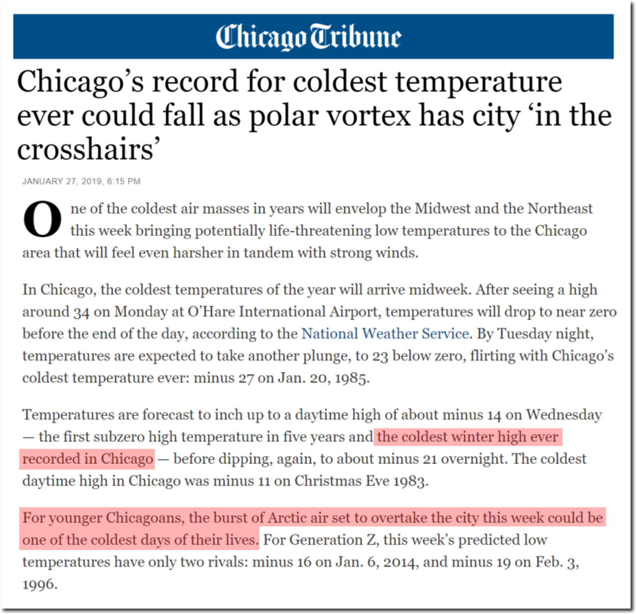
A couple of quotes in the article caught my attention.
the coldest winter high ever recorded in Chicago
Why winter? Does he think they have had summer afternoons which were colder?
For younger Chicagoans, the burst of Arctic air set to overtake the city this week could be one of the coldest days of their lives
It would be the coldest for everyone, not one of the coldest for younger Chicagoans. How can this week be one of the coldest days?
How does this kind of garbage make it past the editor? It should be no surprise that 97% of newspaper readers are misinformed about climate. Journalists can’t verbalize even the most basic information correctly.
I guess the armadillos will be moving south again.
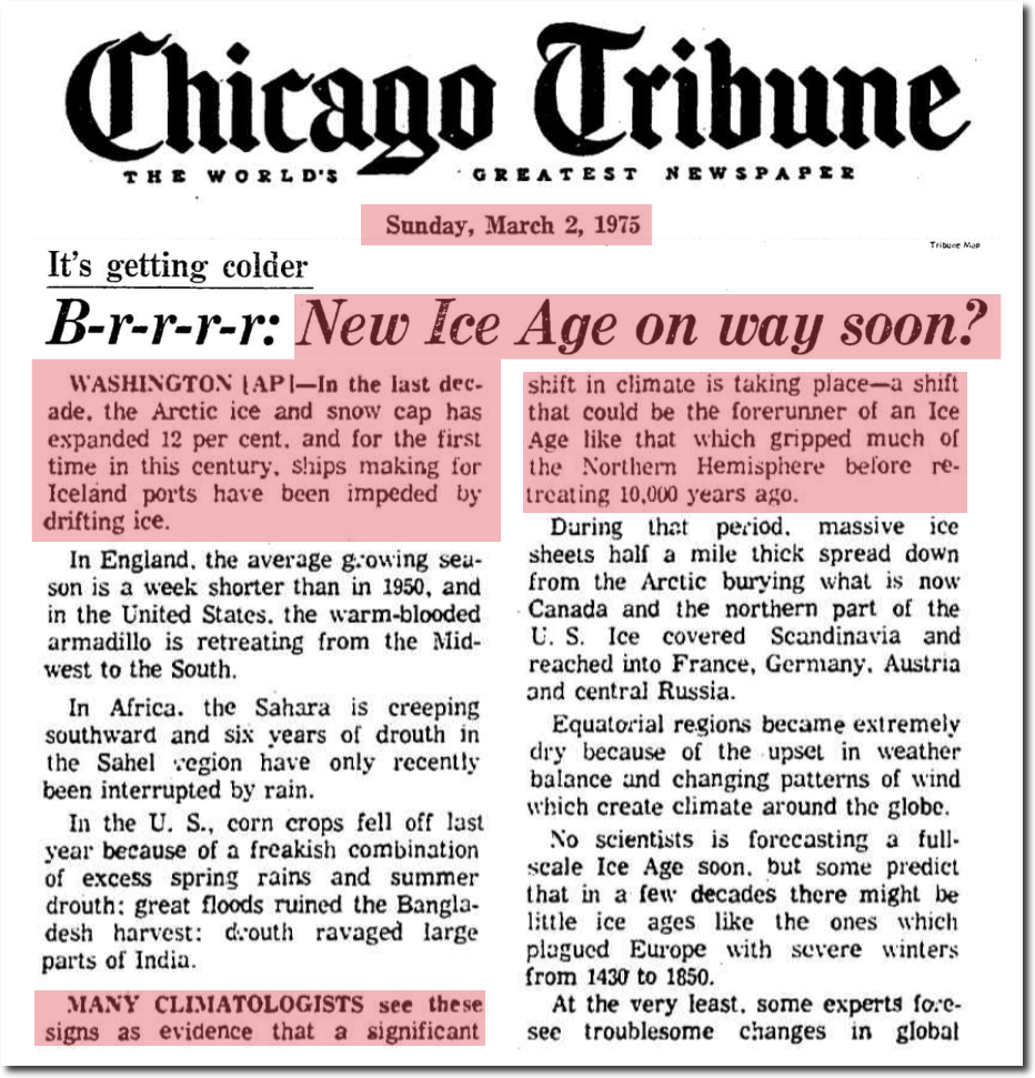
March 2, 1975 – B-r-r-r-r: New Ice Age on way soon? | Chicago Tribune Archive
NASA prominently features this graph of “global temperature” showing very close agreement between different data sets by different government agencies since 1880.
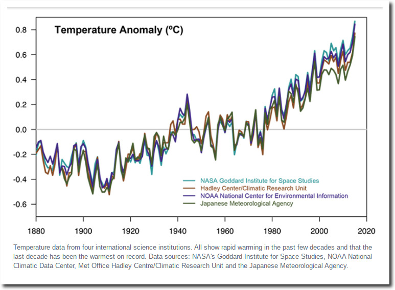
NASA: Climate Change and Global Warming
I am going to show you the evidence now why the only way this could have happened is via collusion between the agencies. There is not enough data available to generate a coherent global long-term temperature record, much less have close agreement by independent agencies.
In 1978, the New York Times reported there was too little temperature data from the Southern Hemisphere to draw any reliable conclusions.
International Team of Specialists Finds No End in Sight to 30?Year Cooling Trend in Northern Hemisphere
New York Times, January 5, 1978
The report, prepared by German, Japanese and American specialists, appears in the Dec. 15 issue of Nature, the British journal. The findings indicate that from 1950 to 1975 the cooling, per decade, of most climate indexes in the Northern Hemisphere was from 0.1 to 0.2 degrees Celsius, roughly 0.2 to 0.4 degrees Fahrenheit.
Data from the Southern Hemisphere, particularly south of latitude 30 south, are so meager that reliable conclusions are not possible, the report says. The 30th parallel of south latitude passes through South Africa, Chile and southern Australia. The cooling trend seems to?extend at least part way into the Southern Hemisphere but there have been indications of warming at high southern latitudes.
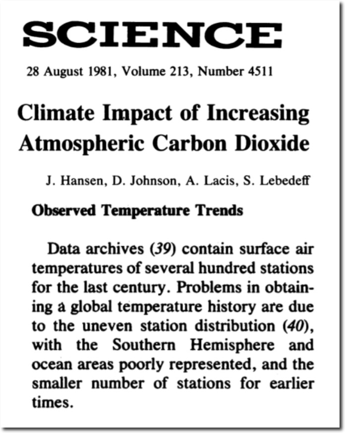
In 1981, NASA’s James Hansen reported the same thing. There is little historical data from the Southern Hemisphere and oceans.
Climate Impact of Increasing Atmospheric Carbon Dioxide | Science
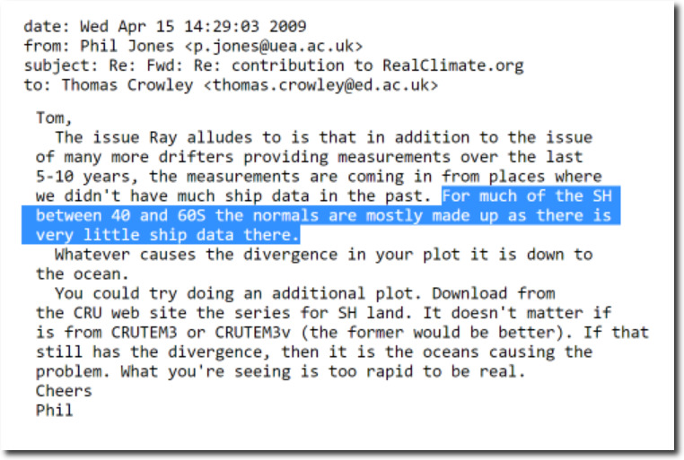
In this 2009 Climategate E-mail, Phil Jones from CRU said there was very little ship data in large areas of the Southern Hemisphere. and that the historical data in those regions was “mostly made up.”
Maps from NOAA show that there was very little quality thermometer data outside of the US in the year 1900.
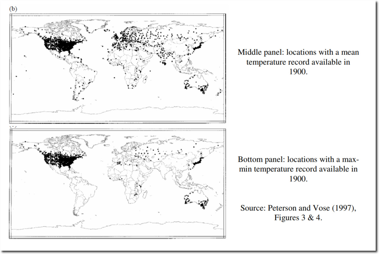
A Critical Review of Global Surface Temperature Data Products by Ross McKitrick :: SSRN
Same story in 1920. Very little quality data outside of the US, Western Europe, Japan and parts of Australia.
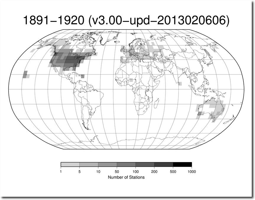
station-counts-1891-1920-temp.png (825×638)
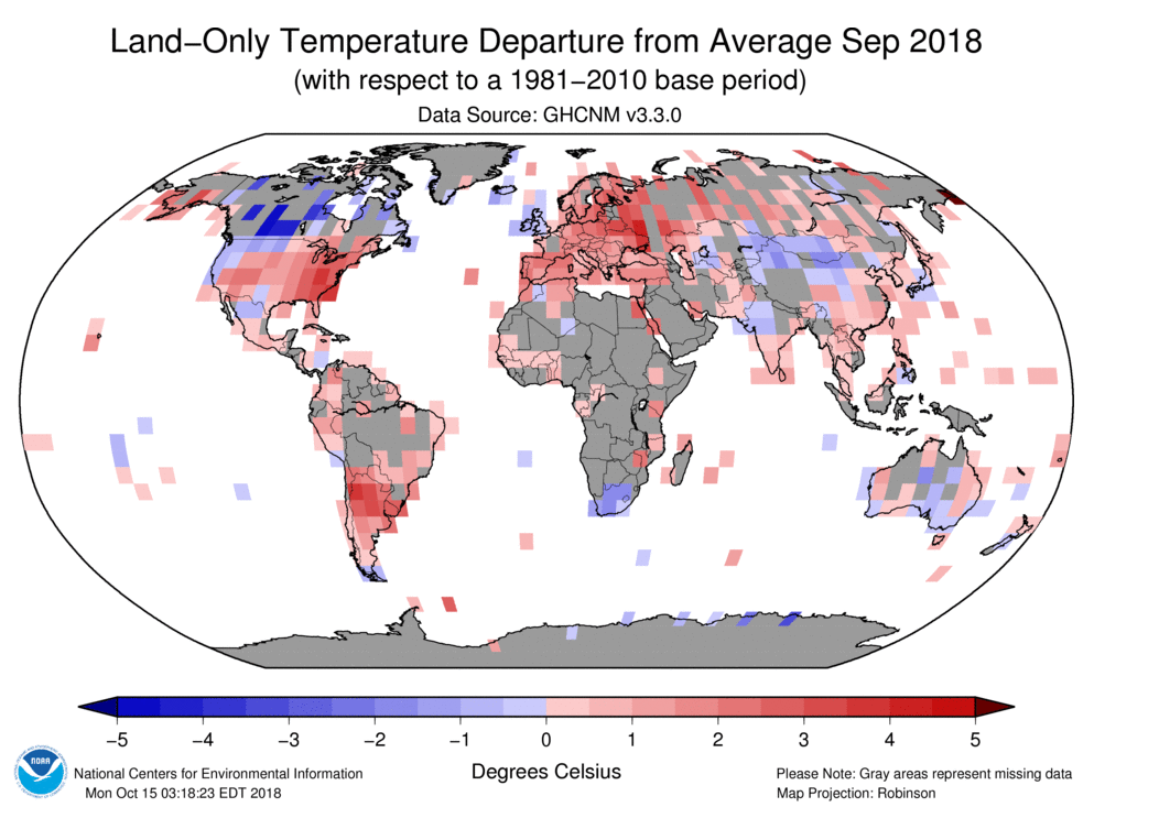
There are still very large areas of missing data, represented by gray in the NOAA map below.
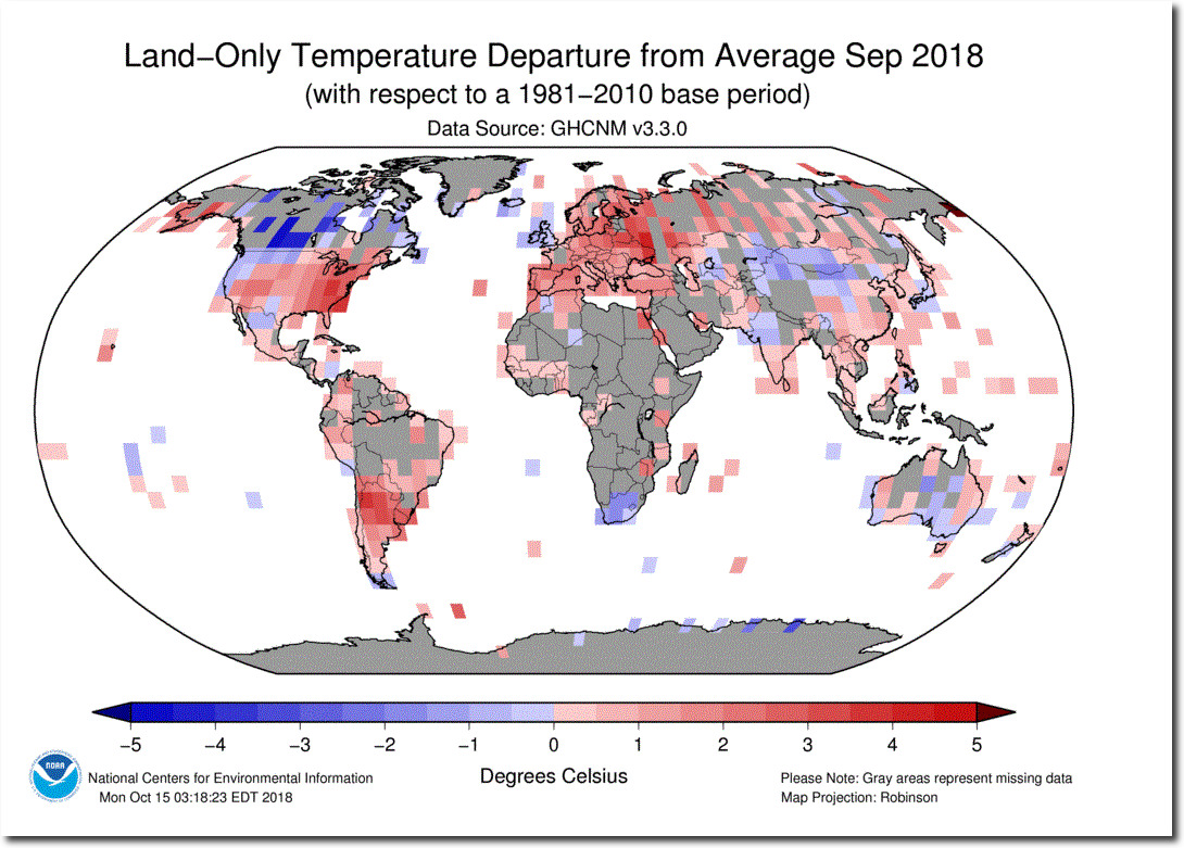
However, the lack of data doesn’t stop NOAA from declaring record heat in places with no thermometer data.
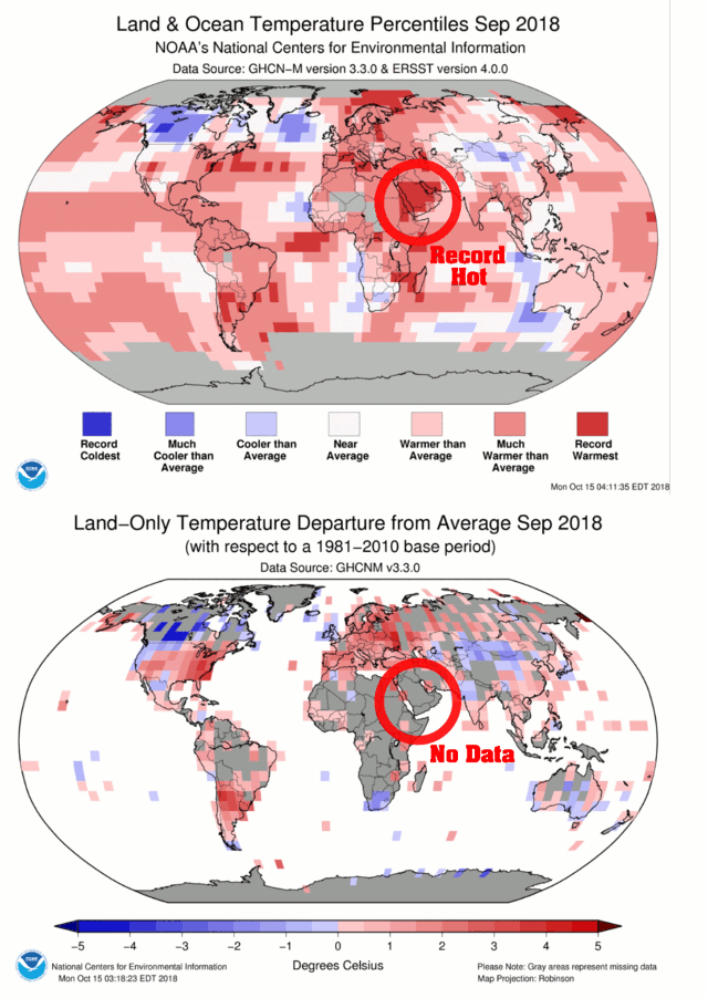
Fake Data – The Basis Of Climate Science | The Deplorable Climate Science Blog
The US has the only high quality long term temperature set covering a large area in the world, and the US temperature record is massively tampered with – to turn 90 years of cooling into warming.
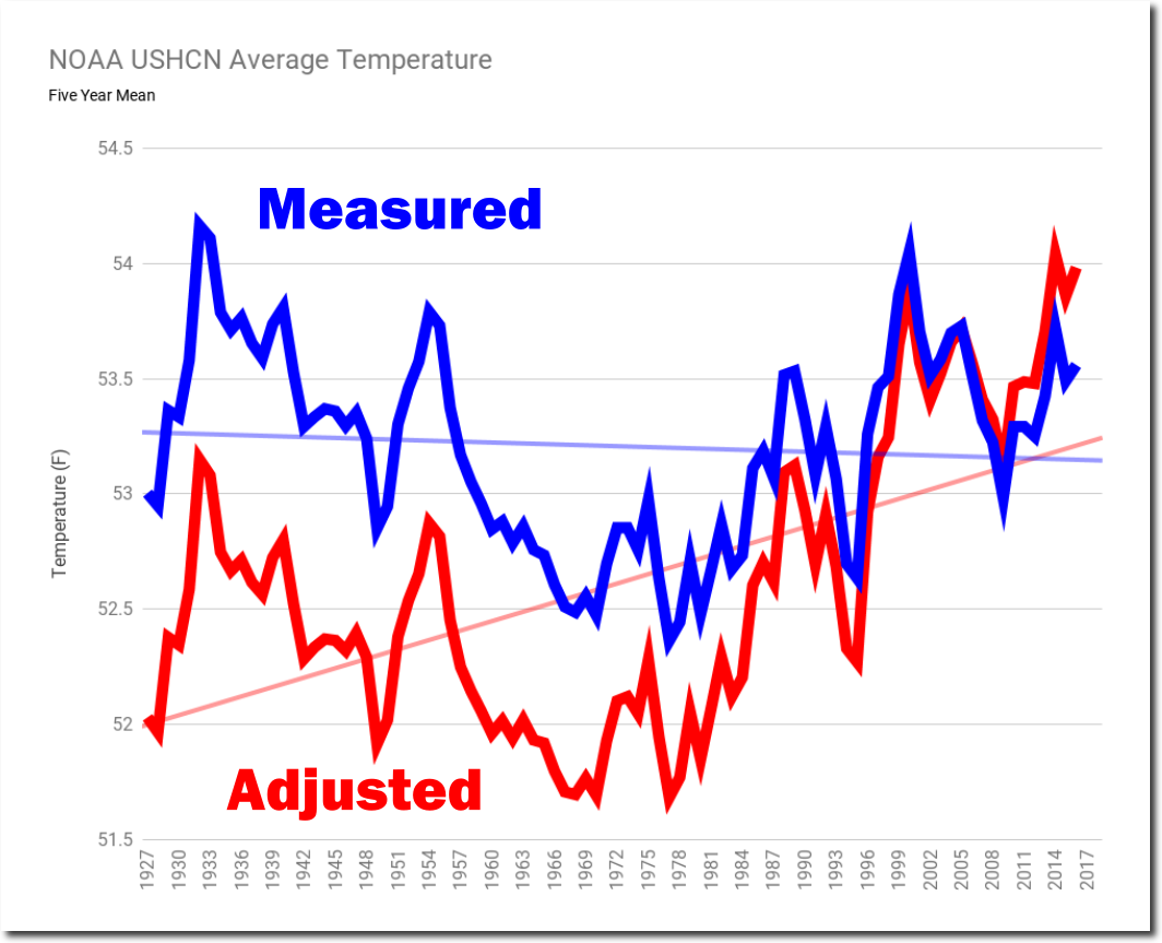
NOAA US Data Tampering Update | The Deplorable Climate Science Blog
No legitimate scientist would alter data like this. If they have theories about possible issues with the data, the correct way to handle it is to put error bars on the graph – not alter the data and present it as if it is the actual thermometer data. That is fraud, not science. Between 1999 and 2016, NASA completely altered the shape of the US temperature graph to turn seventy years of cooling into warming.
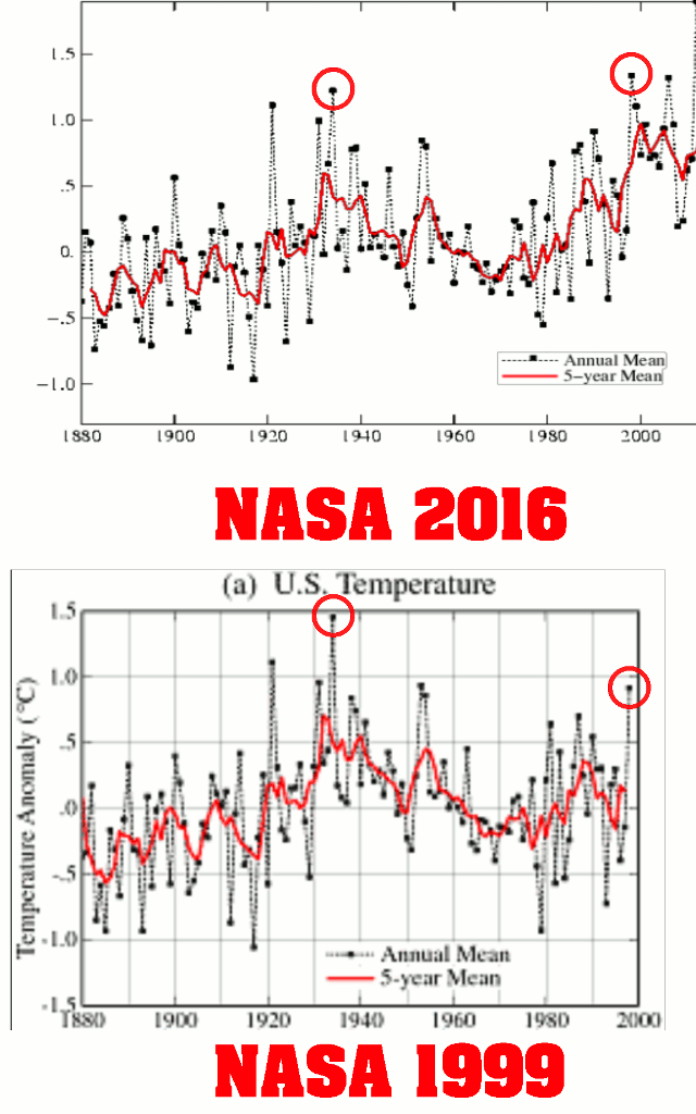
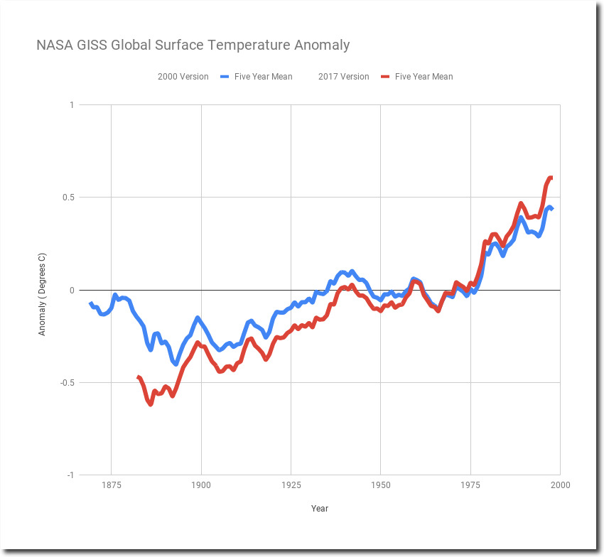
As far as global temperatures go, NASA has massively altered their own surface temperature record over the past 20 years, and have doubled pre-2000 warming. How can four different independent agencies come up with four very similar graphs, when NASA doesn’t even agree with themselves from 20 years ago?
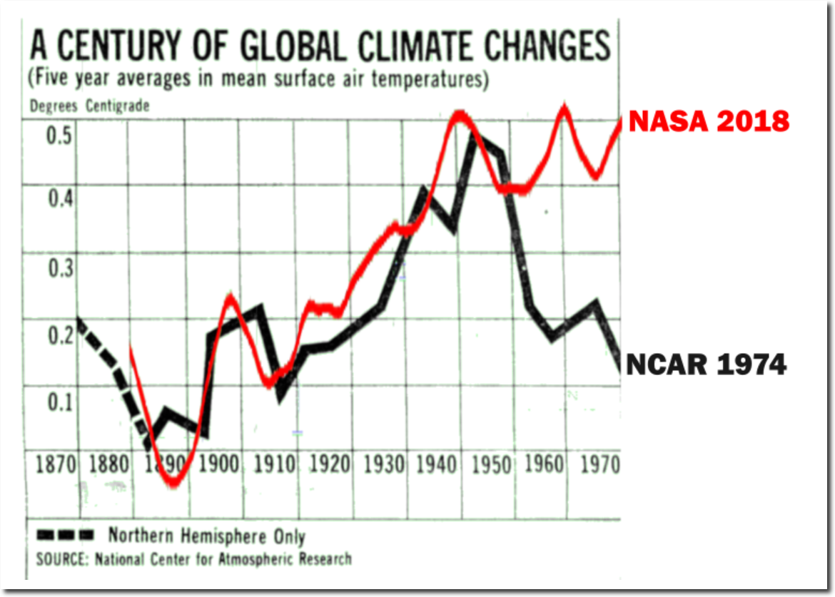
NASA surface temperature graphs have completely erased the post-1940 cooling seen in 1974 NCAR graphs.
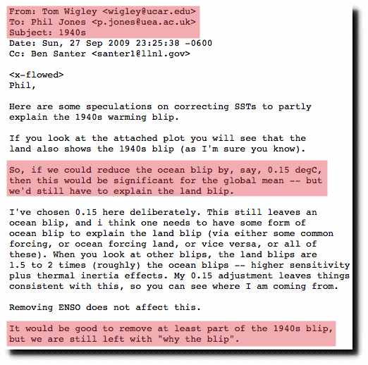
This removal of the “1940’s blip” was done intentionally. Climate scientists openly discussed their desire to get rid of the 1940s warmth.
But historical records show that the time around the 1940 was very warm – with glaciers rapidly melting in Greenland, North America and Europe.
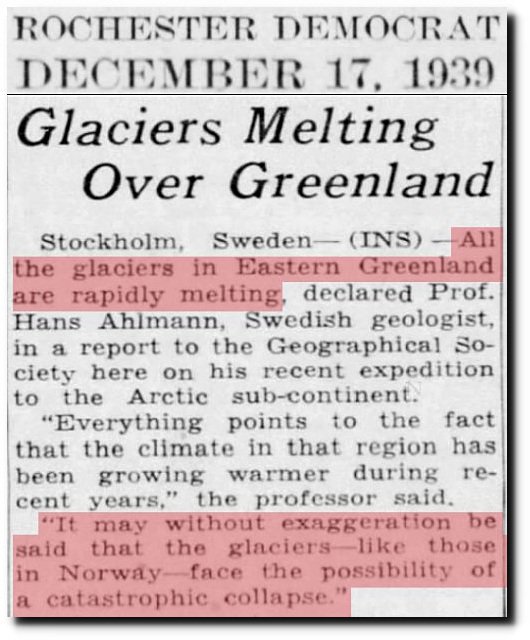
17 Dec 1939, Page 15 – Harrisburg Sunday Courier
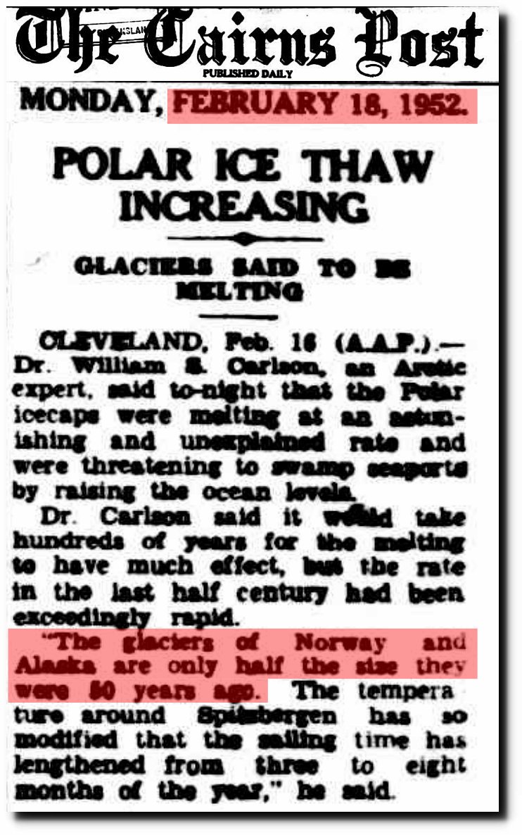
18 Feb 1952 – POLAR ICE THAW INCREASING
This warmth of the 1930s and 1940s, turned rapidly into cooling – which has been largely erased in current NASA temperature graphs.
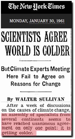
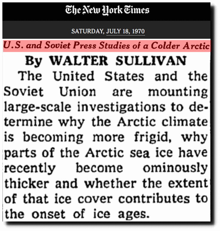
U.S. and Soviet Press Studies of a Colder Arctic – The New York Times
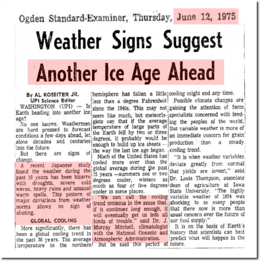
12 Jun 1975, Page 10 – The Ogden Standard-Examiner at Newspapers.com
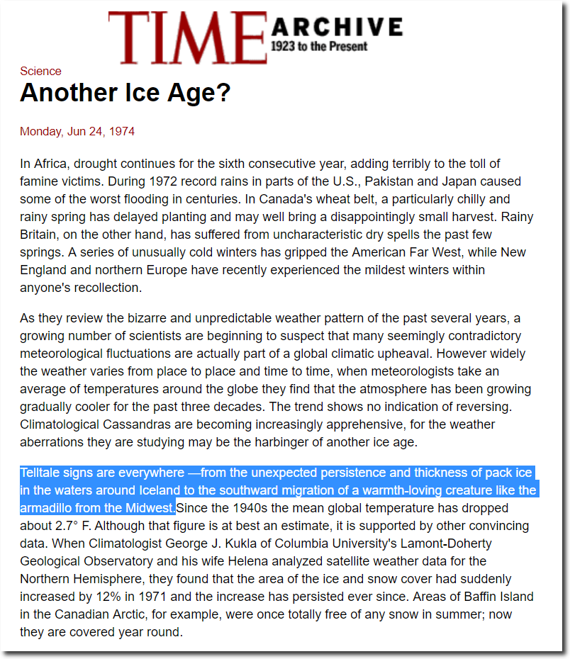
TIME Magazine Archive Article — Another Ice Age? — Jun. 24, 1974
A recent meeting of climate experts in Bonn, West Germany, produced the unanimous conclusion that the change in global weather patterns poses a severe threat to agriculture that could lead to major crop failures and mass starvation.
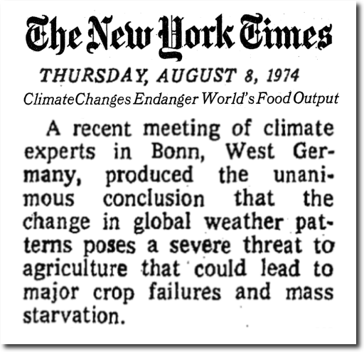
Climate Changes Endanger World’s Food Output – The New York Times
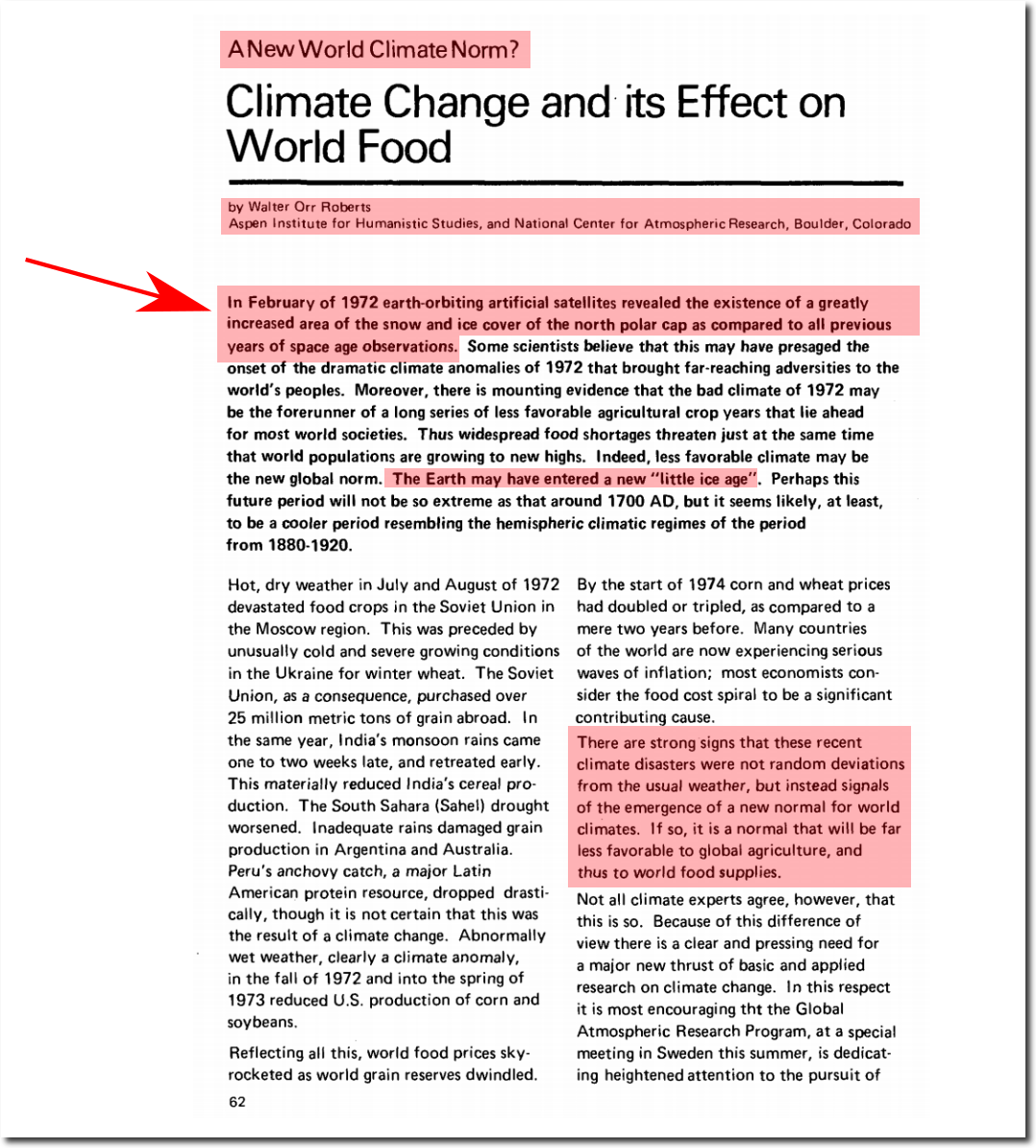
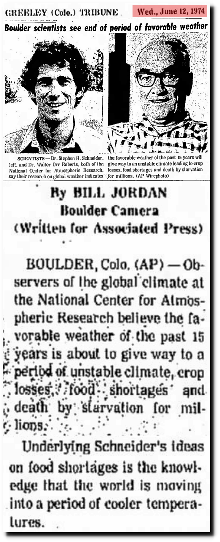
12 Jun 1974, Page 20 – at Newspapers.com
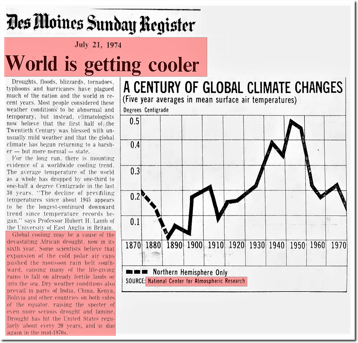
21 Jul 1974, 13 – The Des Moines Register at Newspapers.com
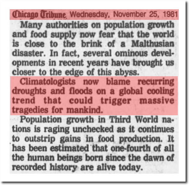
25 Nov 1981, 13 – Chicago Tribune at Newspapers.com
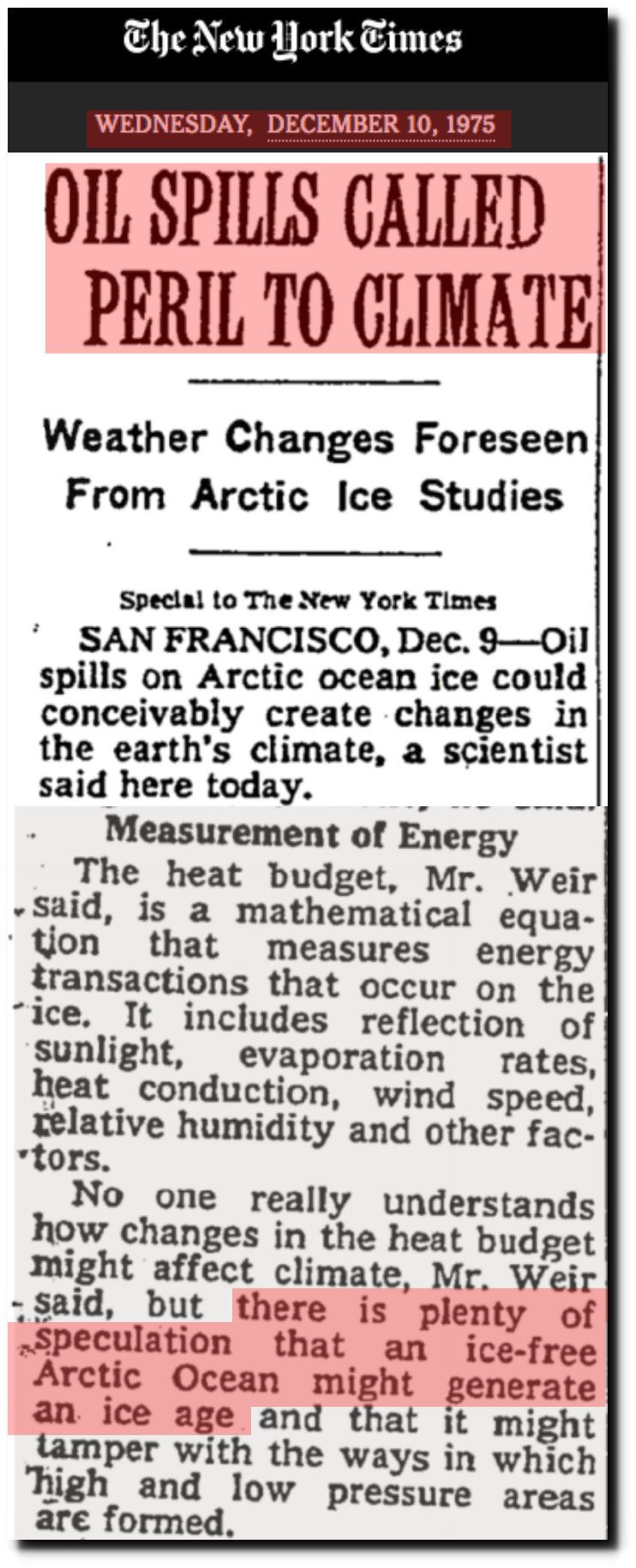
OIL SPILLS CALLED PERIL TO CLIMATE – The New York Times
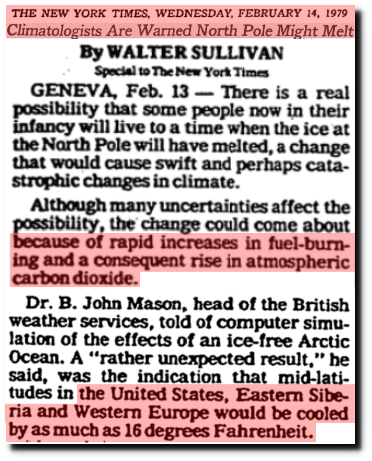
Climatologists Are Warned North Pole Might Melt – The New York Times
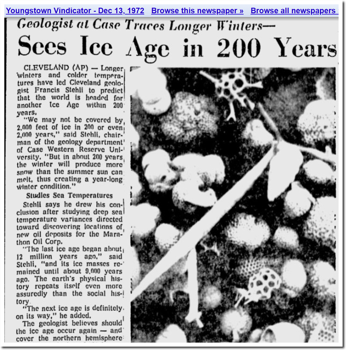
Youngstown Vindicator – Google News Archive Search
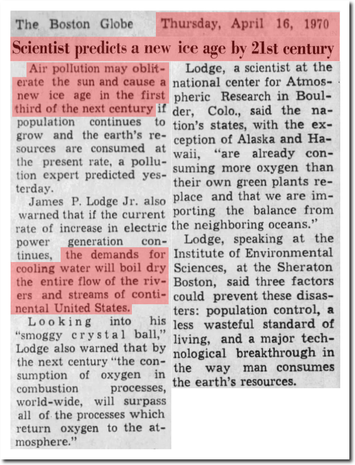
16 Apr 1970, 18 – The Boston Globe at Newspapers.com
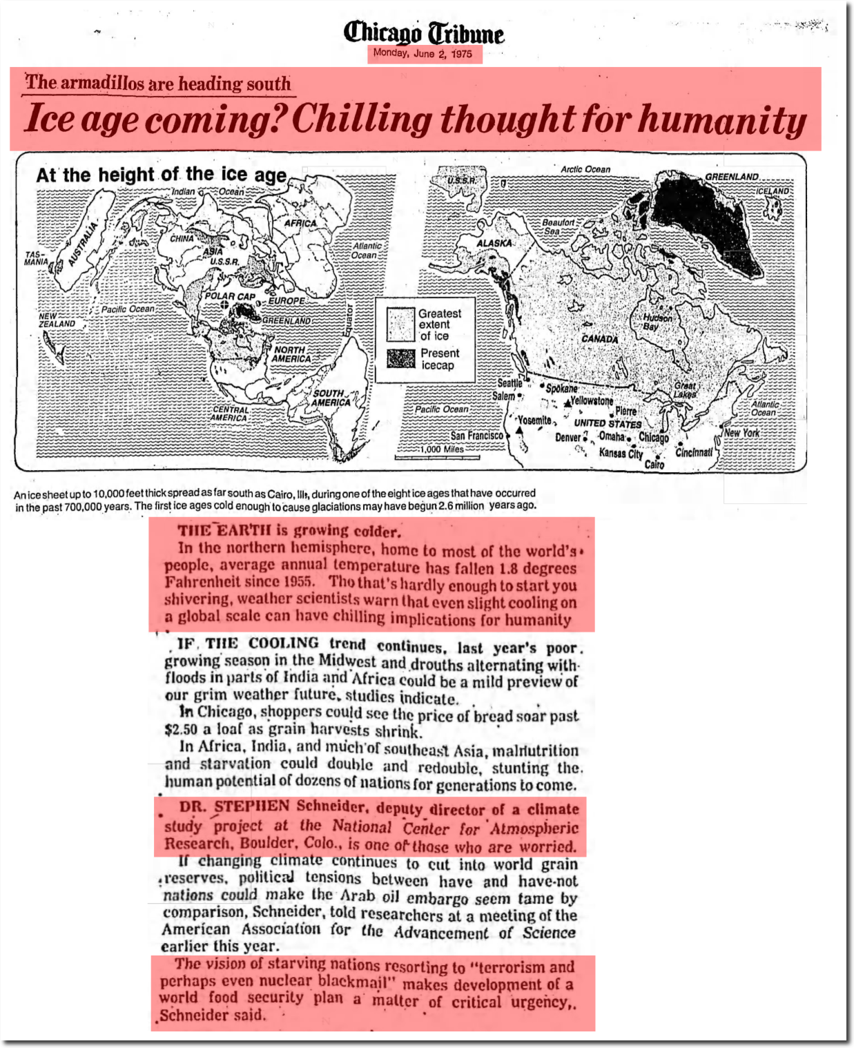
02 Jun 1975, Page 76 – Chicago Tribune at Newspapers.com
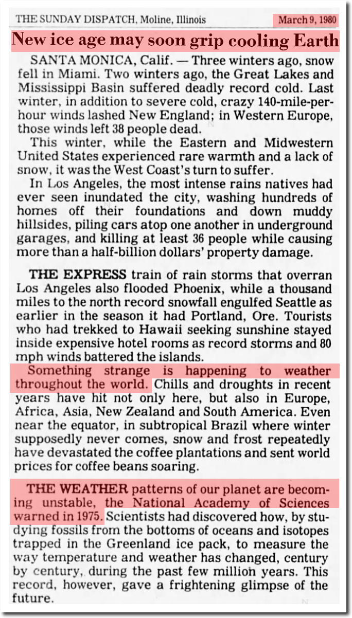
09 Mar 1980, 4 – The Dispatch at Newspapers.com
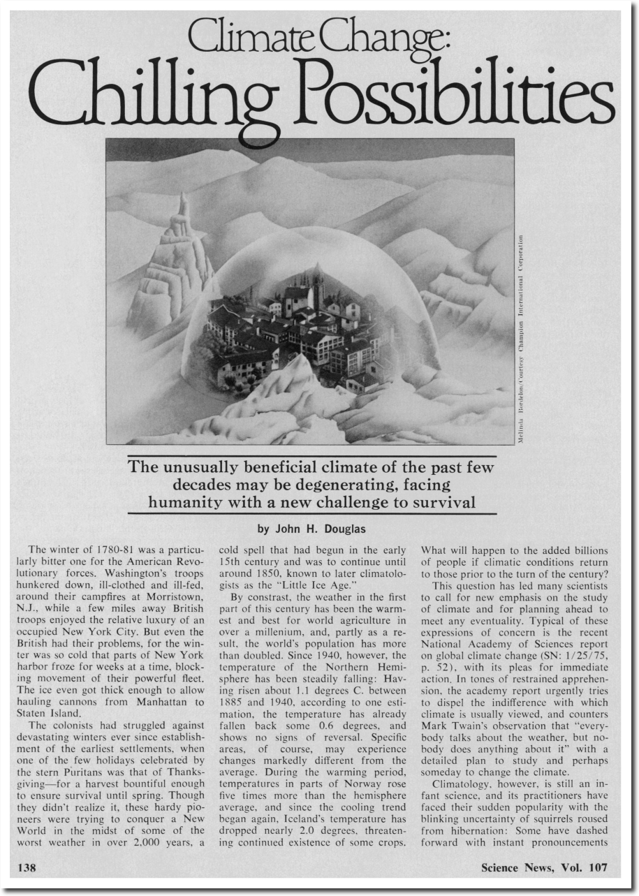
https://www.sciencenews.org/sites/default/files/8983
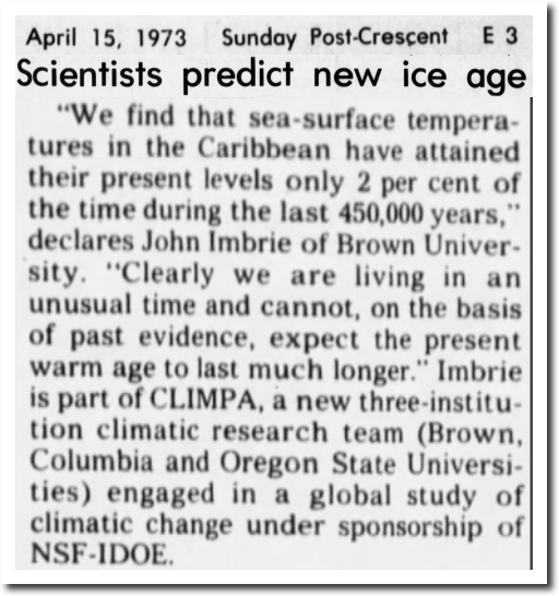
15 Apr 1973, 59 – The Post-Crescent at Newspapers.com
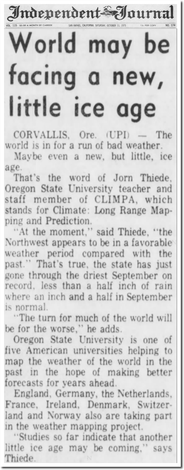
11 Oct 1975, Page 41 – Daily Independent Journal at Newspapers.com

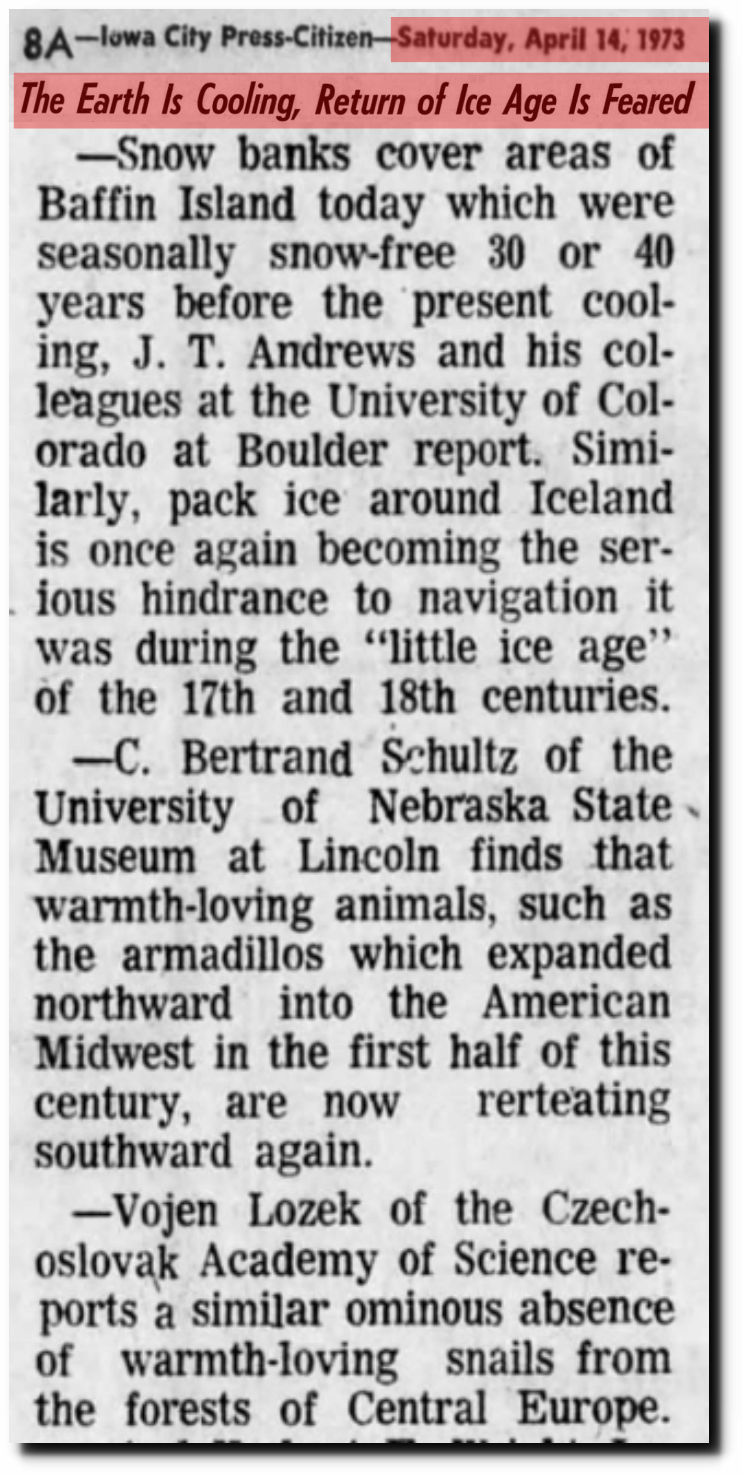
14 Apr 1973, Page 8 – Iowa City Press-Citizen
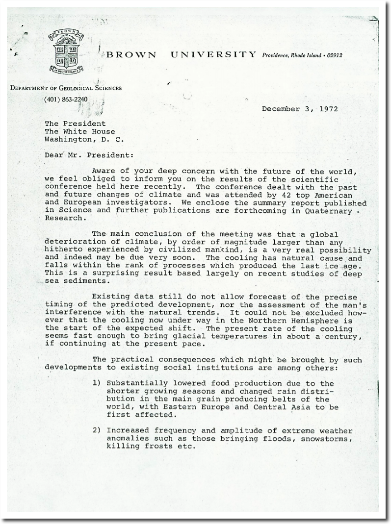
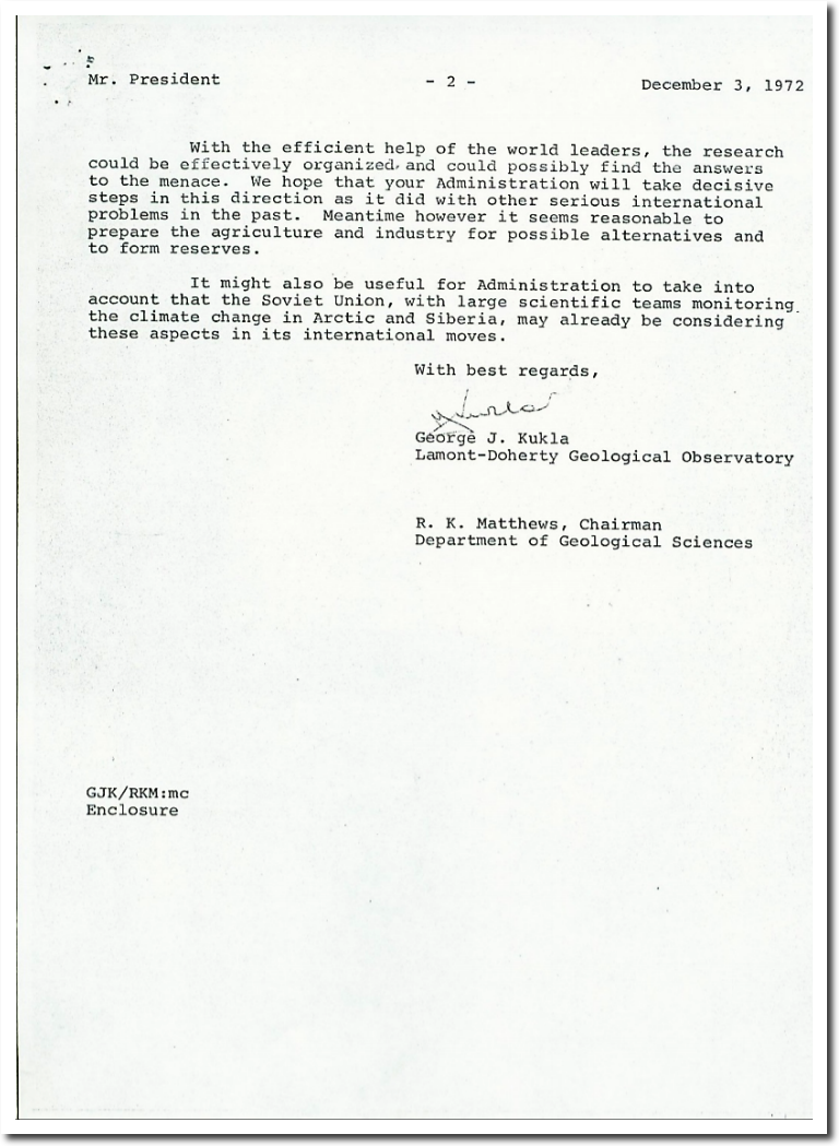
THE ROLE OF NOAA’S CLIMATE PREDICTION CENTER IN THE DEVELOPMENT OF CLIMATE SERVICES
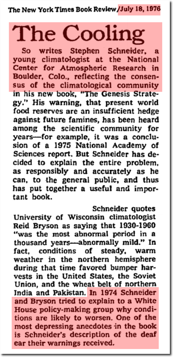
The Genesis Strategy – The New York Times
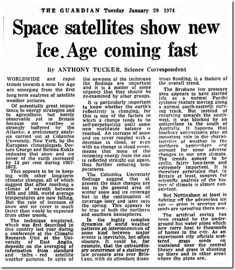
29 Jan 1974, 5 – The Guardian at Newspapers.com
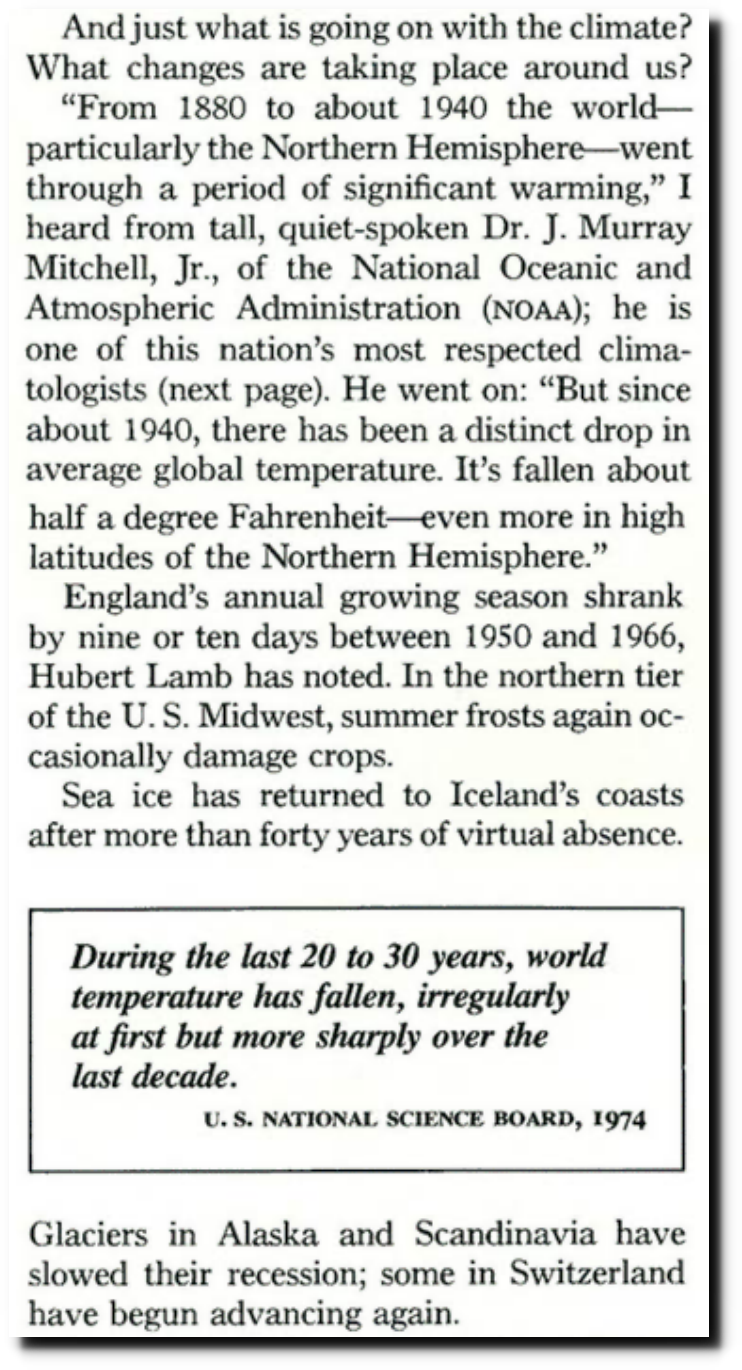
The National Geographic Archive | November 1976 | page 1
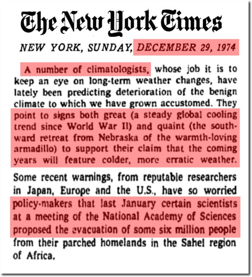
TimesMachine: December 29, 1974 – NYTimes.com
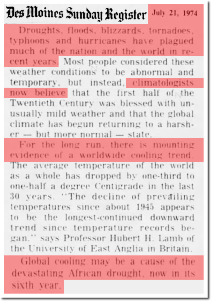
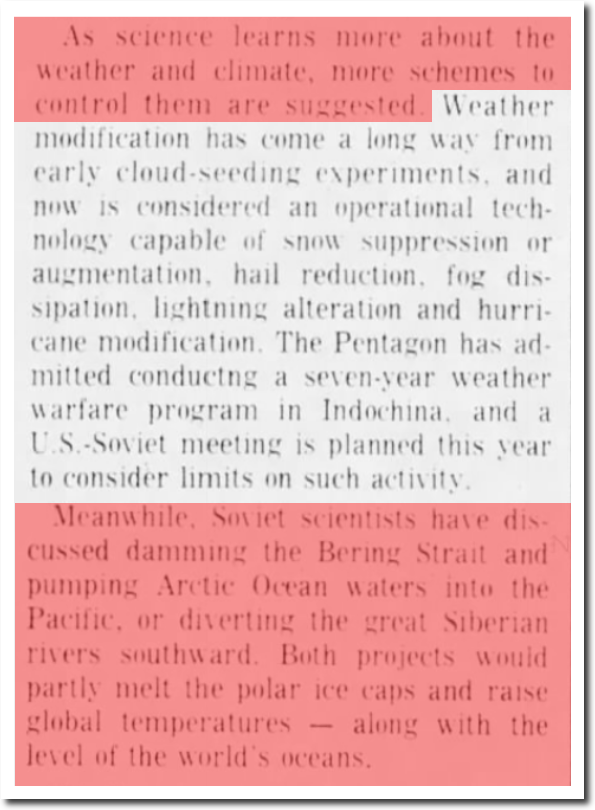
21 Jul 1974, 13 – The Des Moines Register at Newspapers.com
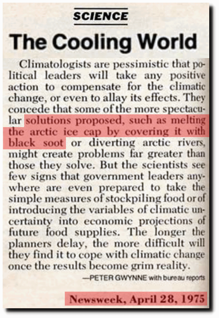
?www.denisdutton.com/newsweek_coolingworld.pdf
I’ve worked with global temperature data, and know that you can produce any shaped global temperature graph you want by picking the right set of stations. There are grossly inadequate amounts of both historical and current data to produce a meaningful long term temperature graph for the earth. Much of the data is fake – by their own admission.
The best temperature data set (by far) is the US data, which has been altered by NOAA and NASA over the past 20 years to turn 90 years of cooling in to warming. Global temperatures have also been massively altered over the past 45 years. And climate scientists colluded to remove the 1940s blip.
There is no conceivable way this graph could have been produced without lots of collusion between the four “independent” agencies.
NASA Climate says Antarctica is rapidly losing ice, but an increase in snowfall during the 20th century slowed the loss down some.
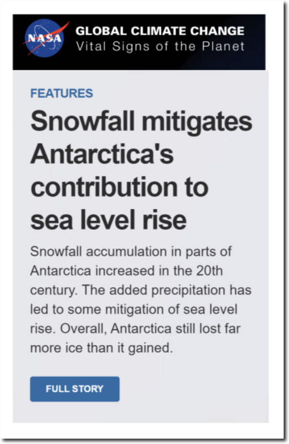
NASA: Climate Change and Global Warming
NASA also says Antarctica is rapidly gaining ice (more than 82 billion tons per year) and that it is due to an increase in snowfall which started 10,000 years ago.
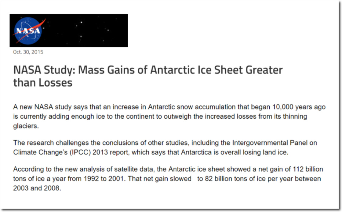
NASA Study: Mass Gains of Antarctic Ice Sheet Greater than Losses | NASA
Why would anyone believe anything NASA says about climate? Their climate group are propagandists, not scientists.
Arctic sea ice volume last spring was the highest of the past decade, and this year is well ahead of last year.

There are only about 90 days a year when ice can melt near the pole, and summer temperatures near the pole have been consistently below normal for the past 20 years.
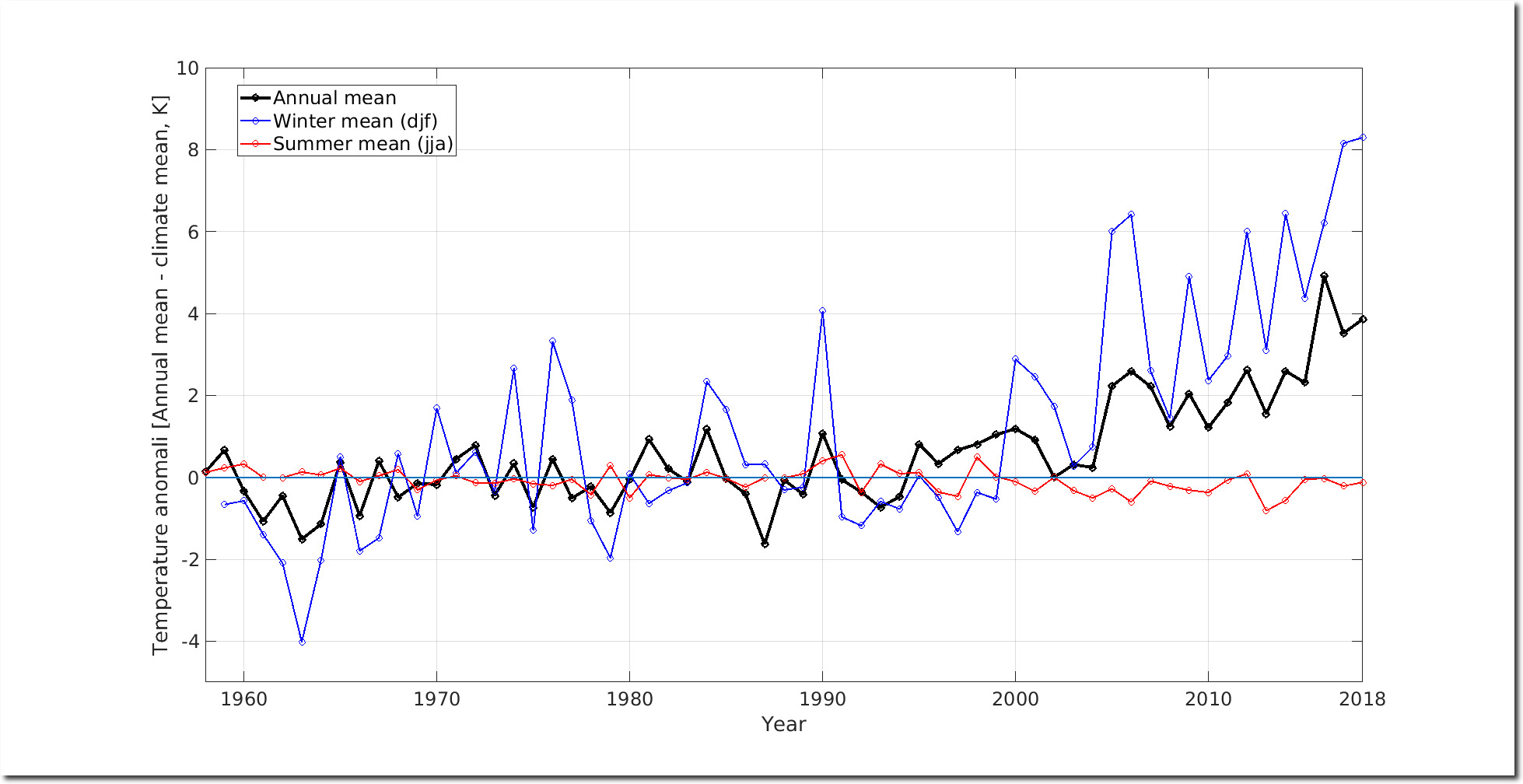
Ocean and Ice Services | Danmarks Meteorologiske Institut
The really bad news for climate alarmists is that Arctic winter temperatures have also turned cold.
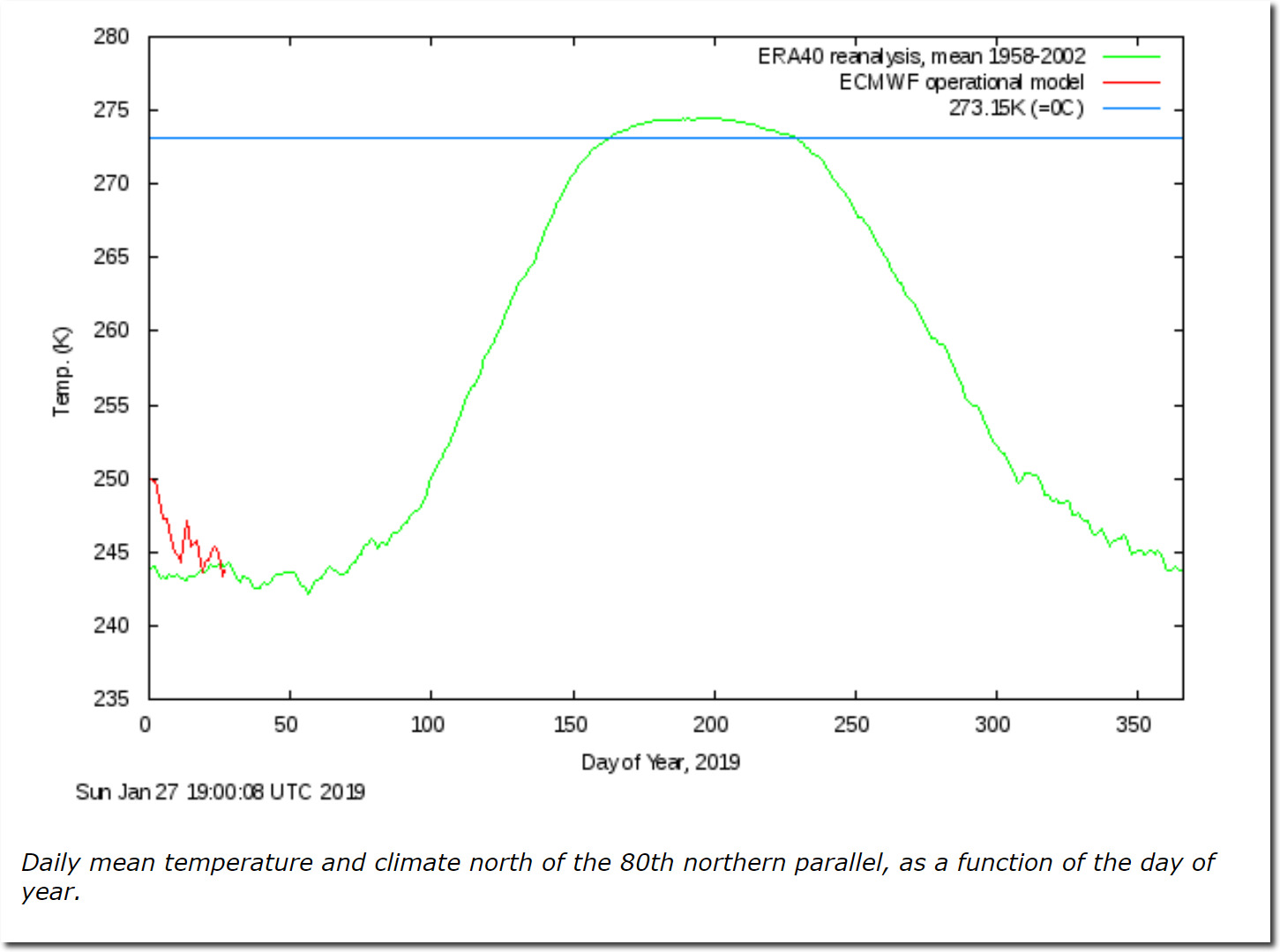
Ocean and Ice Services | Danmarks Meteorologiske Institut
Meanwhile, in Antarctica it is the hottest month of the year – and temperatures are below freezing across almost the entire continent. How is ice supposed to melt below freezing?