
Experts say that a terrifying storm melted the North Pole yesterday
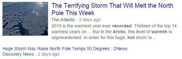
This unprecedented melting event has caused Arctic ice to reach its highest December extent in over a decade.
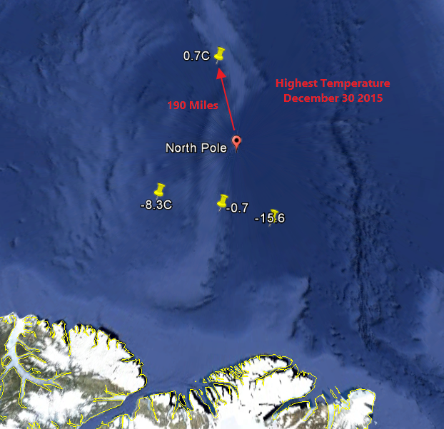
One buoy 300 km from the pole reported temperatures just above freezing for an hour yesterday. Another buoy a mile away did not report any above freezing temperatures.
Climate science is about propaganda, and never telling the truth about anything.

Steve, I don’t understand this one even though I agree that “Climate science is about propaganda, and never telling the truth about anything” — but how does this one help them?
Let us pretend they are telling the truth for a moment. (I know, I know) They say it is a storm that “is going to melt the north pole”. That is a storm and not “global warming”. Hell, it is not even the wishy-washy “climate change” they are hiding behind now. How does a natural storm help prove man made, CO2 caused global warming??
Then there is the problem that it is just a few days from January and the cold, cold winter when the ice will refreeze. What good does whining about ice cover do now when it will soon re-freeze if any ice is lost. (as it always has done in the past)
I think this one will make them look real bad as winter unfolds. They will have to send this one down the memory hole. But there is this guy some call Steve Goddard (Tony) that will reach down in that hole and remind us of what they are saying today. (about May I bet)
~ Mark the confused
Mark, I think this is a real big CYA in action.
The Atlantic had a big headline about the North Pole about to be above freezing. However the actual report was about a town by that name in Alaska. Penthouse Sidebar (@drfessel) posted the link to the Time Magazine and said
And Colorado witnessed the FUBAR before they pulled it to save face.
This of course was too good an opportunity to miss so we have “One buoy 300 km from the pole reported temperatures just above freezing for an hour yesterday. Another buoy a mile away did not report any above freezing temperatures.”
And of course we all know about how much NOAA and their buddies LOVE to adjust temperatures…..
Of course 42 F (6C) is a lot warmer than 32F (0C) but it is the headline that counts and EMOTING, not scientific accuracy.
And yes there was a bit of a warm spike yesterday. (Blue line is freezing)
http://ocean.dmi.dk/arctic/plots/meanTarchive/meanT_2015.png
But there was one in 1984
http://ocean.dmi.dk/arctic/plots/meanTarchive/meanT_1984.png
and one in 1990
http://ocean.dmi.dk/arctic/plots/meanTarchive/meanT_1990.png
and a big one in 1996
http://ocean.dmi.dk/arctic/plots/meanTarchive/meanT_1996.png
DRAT! DMI did its usual and did not post the current graph.
go here
http://ocean.dmi.dk/arctic/meant80n.uk.php
Gail – It goes to the town of North Pole Alaska. Where of course Santa’s House is.
And a very fine gift store it is. Lots of local made crafts.
Great Catch…
Unfortunately… Per usual.. The Hoaxers attacked with lies and bullshit… And have spread moved on to the next calamity.. Misleading people to think this town de Santa “North Pole” .. Is really the North Pole and not the town of North Pole in Alaska…
Anyone… HOW CAN WE head off this kind of shit BEFORE the Hoaxers fabricate it?? Why are we always caught researching and fact checking the lies after the fact…
Once the Headline is there… It’s too late…
Hey markstoval! While Tony and you (me too!) will certainly remember the details of this nice little PR blurb, the average CAGW enthusiast will only remember the bit about “the North Pole is melting!” I guarantee you (and remind me if I am wrong) that even as soon as next week, if you find a warmist who remembers this episode, they will tell you something like “only last week the North Pole was melting! It is the middle of winter and the North Pole is melting! How can you deny that the polar cap is almost gone?!”
All they will understand is “North Pole” and “melting”. Therefore (in their imagining) all the ice at the North Pole is gone. Any nuance will have disappeared.
I would simply tell them I look at the Arctic ice everyday from a satellite view and assure them it was there this very morning. If they continue spouting drivel I take them off my “speak to” list. Life is too short to deal with total stupid.
There is huge amplitude in the jet stream, with warm air surging north, all the way to the North Pole. After being zonal for so long, it is inevitable that sooner or later the jet stream would buckle. That is a weather event and has nothing to do with global warming or climate change.
Andy DC, yes I’ve noticed the same thing following the Climate Reanalyzer and GFS model output each day. This is purely weather and will only be a tiny blip over a 30 year or longer climatological period.
I have also noticed consistent large differences between two high latitude buoy stations north of Alaska with one reading about 10F or more higher than the other day after day over months, which can’t be accurate. Ideally these automated stations should have three temperature sensors for QA/QC like the USCRN stations to minimize the chance of bad readings making it out to the public.
NOAA WPC has a historical weather map web display where it is easy to track temperature changes over time, at least on for the northwest quadrant of the globe:
http://www.wpc.ncep.noaa.gov/html/sfc-zoom.php
It does show the recent warming at polar stations on the US/Canada side of the north pole.
With the jets now ‘loopy’ instead of zonal, I expect more of these weird weather patterns with 7 foot snow drifts on the Mexican border and warming in the Arctic. Unfortunately instead of figuring out WHY the change from zonal jets to meridonial (changes in ozone from changes in the sun) we will just get fed more Alarmist hype.
https://s-media-cache-ak0.pinimg.com/originals/a5/50/f8/a550f8855018f255b0e67b7d4240d634.gif
Remember, for them, all storms are now caused by global warming.
..and CO2 does it without changing the temp
It does help them when they operate in the absence of significant alternative opinions in the media. The casual viewer, i.e. most people, will see the story and it will stick in their head a bit just like the other hyped stories they saw previously. It might not get people to be as alarmed as they hope but it does foster acquiescence to the general narrative.
The faithful flock are clinging desperately to anything now. Even if it does not make sense.
The econazi mentality is the same as in 1980. Real Science is refreshingly versatile at tit for tat and other agitprop-defeating tactics. I am a happy camper here, and with luck we can keep the Petition Project and other show-stoppers growing and evolving.
http://meteomodel.pl/klimat/arcticice.png
Oh look! Natural cycles!
Paper please!
So the summer of 2007 six sigma drop was “business as usual”? You sound like a blind denialist..
Paper please!
By definition 2007 was not a six sigma drop and if you looked, you would see that 2012 was lower.
So the Alarmist is still spinning the Arctic winds that transported the sea ice out the Nares strait as melting. And DENYING Nasa’s explanation.
In 2012 it was an Arctic cyclone that “wreaked havoc on the Arctic sea ice cover” by “breaking up sea ice” so yes, it is “business as usual” that it is weather.
And yes it is weather as in the ~60 year NAO, PDO and AO.
Pick cherries much?(1980) 😉
‘Huge hot storm’ ROTFLMAO 😉
looks like 2012 was ‘hotter’ than 2015, the hottest year evah! 😉
When discussing long term trends, anything lower than around 90 years of reliable data is cherry picking. This means any discussion of satellite data before around 2070 is pointless, regardless of whether or not one supports the notion of CAGW.
cfgjd is apparently attempting to prove a point, when they’re not even making one.
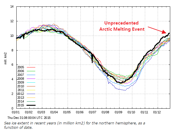
Lots of lines there…. still more ice now than in 2007… How can that be possible if this is the hottest year ever and every other year has been too. Why is there any ice left at all.
Every time you post these facts, they make the “hottest year ever” stories look ridiculous.
You have to take notice that 2007 and 2012 were both very low due to weather conditions that year. 2007 not only had a lot of sunny days but warm winds blowing from the south. This both melted and compacted the ice. 2012 had a large storm which dispersed the ice and caused it then to melt out which it would not have done otherwise.
Neither year was AGW connected at all. I’m all for forgetting them as outliers to be honest.
Andy
cfgjd— You did pick a reasonably balanced Arctic selection.
However, most of us are quite aware of the PDO, the AMDO and other oscillations which on decadal scales are a major factor in changing the amount of sea ice at the poles, significantly because of local up and down turning causing there to be more or less fresh and salt water.
With that in mind, the Antarctic has been mostly above average, with 2015 being a record since records were kept. The combined polar amount of sea ice has remained the same.
cfgjd— On a previous thread you posted a Japanese record which was unlike anything I have seen from any other source.
Do you have available the sources of the data they have for that graph? If do please state that.
Satellite, weather balloons, Hadcrut 4 do not show anything like that.
At http://meteomodel.pl/BLOG/?page_id=10640
cfgjd had a choice of two arctic maps he chose the ‘extreme’ one on the bottom.
Cryosphere Today – powierzchnia (area) pokrywy lodowej Arktyki
And not the top
http://meteomodel.pl/klimat/arcticice_nsidc.png
Shouldn’t the end point of 2014 (in your graph, which shows it at 12) be the start point of 2015, but according to your graph the starting point is well below 12.
That graph doesn’t even say what period the ‘average ” is based on..
It is meaningless nonsense.
Current levels of Arctic sea ice are almost exactly where they should be for the phase of the AMO.
So…ISIS now controls Arctic?
Trumps Fault?
Gruber Beach Beachfront parcels for sale?
If AMO has some relevance for Ice up in Artic we will see a change:
http://www.woodfortrees.org/plot/esrl-amo/from:1979/to/plot/esrl-amo/from:1900/to:1979
AMO certainly has some relevance, sure.
And starting 1979 is then a bad choice.
Anyhow 2015 is summarized and no extremes is in sight.
http://polarportal.dk/fileadmin/user_upload/PolarPortal/season_report/Polar-portal-EN-2015.pdf
Yes, The AMO has turned.
Current Arctic sea ice levels are almost exactly where they should be wrt the AMO.
And over the next few years the level will start to increase..
Will you hang around to face the music.. or crawl back into your crevasse?
Have I mentioned I think this graph
http://realclimatescience.com/wp-content/uploads/2015/12/2015-12-31-03-13-43.png
Is bullshit?
🙂
The current ice extent on that graph is similar now to 1st Feb 2015 average for last few years whereas the recommended, more modern DMI graph shows it at the Dec average.
What’s those two huge downward spikes on the older outdated graph also ? Did ice really plummet and then recover like that ? Err….
The newer, more accurate graph does not show them.
Andy
Thanks for your opinion Andy, everybody has one!
Indeed!
What’s your opinion of the graph Gator?
Andy
Opinions really don’t matter. It is a graph Andy, like any other.
That’s the whole point though isn’t it though, it’s not like all the others. The others all agree and that one doesn’t.
And you have nothing to say on the matter ? Perhaps you are more in your comfort zone saying 9000 years and papers though …. cough.
Andy
Opinions do not change data. Do you enjoy being wrong, like you were yesterday when you made the mistake of questioning my information regarding the average of Arctic ice over the past 9000 years.
You should see someone about that cough, it is killing your credibility.
I prefer cryosphere today.
It has separately both poles and interactive records on both pages, and in general more into. At the bottom it has the combined sea ice which shows a significantly continuous record.
Andy, you have confused two issues. The ‘more modern’ DMI graph solves the coastal masking problem that previously understated ice. You can use either version, but have to be consistent over the years. This is the ‘new version’ 30% extent graph. You are referring to the 15% extent graph– which like NISDC considers a gridcell ‘ice covered’ even if 85% is open water. NSIDC does not offer a pregraphed 30% version. Nor does Jaxa.
The better indication of ice is 30% extent, although even that is open to debate as a say 75% product would be computable from the raw satellite data. The more partially open ocean water is included in ice extent the more storms and ocean currents influence ice extent as opposed to ‘just’ supposed AGW polar amplification. That is why summer 2012 was anomalously low. An Arctic cyclone compacted sea ice on the leeward side of the Arctic basin, sweeping what normally would have been at least 15% or 30% ice covered Arctic ocean ice free.
“More modern” ?
Where do you people come up with this bullshit?
DMI switched to the coastal unmasked 15% extent version in 2012, but continues to offer the masked version at a subsidiary site. I double checked before posting. Andy was making doubly incorrect ‘fruit salad’ ice extent comparisons, to which I called his attention.
No bullshit.
ristvan, I have read your contributions on different blogs, and as to suggesting BS to what you have written, I simply would like to state that what you have written seems very learned, thoughtful, careful and worth considering.
Your writing suggests you have a broad background
Tony, with the ‘more modern’ verbiage in quotation marks ristvan was just paraphrasing Andy who seems to have started on multiple threads yet another “wrong graph” campaign against DMI’s “coastal-zones-masked-out” graph *).
——————–
*) For example here:
“That’s because the graph is borked …”
“As DMI replaced this graph with the one without masking they obviously do not monitor it any more as out-dated product and it has gone awol”
https://stevengoddard.wordpress.com/2015/12/29/hottest-year-ever/#comment-562288
Sadly so many miss the point including the media – weather extremes are common and threaten how we live today therefore thought has to be given about how we continue to develop. What is happening today was caused naturally or artificially years ago – so we are thinking of future generations and asking serious questions about the failure of science and politics both driven by greed and money. There will always be a colder year because there was an Ice Age and there was a hotter year because sub tropical animal remains have been found in Northern Europe in permafrost. All that is being reported is the fear and guess work of science. Sadly taxation pays for this tripe. Take each day as it comes and deal with the real issues.
There’s much less Arctic Sea Ice now than in any time since the start of the Little Ice Age – in other words since around years 1300 to 1500.
https://tamino.files.wordpress.com/2010/10/polyakfig2.jpg
I do think that is an OLD graph. Do you get some sort of perverse pleasure out of lying?
What bit of it is “lying”? Less sea ice now than in any time before the start of the LIA it seems. Natural cycles? Which ones?
cfgjd says:
December 31, 2015 at 4:10 pm
What bit of it is “lying”? Less sea ice now than…”
FYI, today is Dec.31,2015, so saying “There’s much less sea ice now than …” and showing a graph of ice extent going just to 2002 as you did in your 4:00pm comment is dishonest misrepresentation and lying because it does not show what sea ice is now.
YEAH, Natural cycles.
No only has the warming been beneficial it occurred as a Step-Change!
Ice cores from the Freemont Glacier show it went from Little Ice Age cold to Modern Warming warm in the ten years around 1850 — Naturally.
Dr. Evans Solar Notch-Delay Theory predicts a delay of about 11 years from a change in solar conditions to a change in earth climate.
So what happened around 1840? Solar Cycle 8. It began in November 1833 with a smoothed sunspot number of 7.3 and ended in July 1843. Max sunspot number ~210. The prior Solar Cycle 7,began in May 1823 with a smoothed sunspot number of 0.1 and ended in November 1833. Max sunspot number ~105. And thus began the Grand Solar Maximum, highest in 3,000 years which has just ended.
http://www.solen.info/solar/cycles1_24.png
In the journal Astronomy and Astrophysics, Usoskin et al. “present the first fully adjustment-free physical reconstruction of solar activity” covering the past 3,000 years, which record allowed them “to study different modes of solar activity at an unprecedented level of detail.” Their reconstruction of solar activity displays several “distinct features,” including several “well-defined Grand minima of solar activity, ca. 770 BC, 350 BC, 680 AD, 1050 AD, 1310 AD, 1470 AD, and 1680 AD,” as well as “the modern Grand maximum (which occurred during solar cycles 19-23, i.e., 1950-2009),” described as “a rare or even unique event, in both magnitude and duration, in the past three millennia.” http://www.co2science.org/articles/V17/N32/C1.php
http://www.co2science.org/articles/V17/N32/Usoskinetal2014b.jpg
PAPER: Usoskin, I.G., Hulot, G., Gallet, Y., Roth, R., Licht, A., Joos, F., Kovaltsov, G.A., Thebault, E. and Khokhlov, A. 2014. Evidence for distinct modes of solar activity Astronomy and Astrophysics 562: L10, doi: 10.1051/0004-6361/201423391.
Also SEE: A History of Solar Activity over Millennia
>>>>>>>>>>>>>>>>
And in further news from Royal Astronomical Society (RAS):
“Solar activity predicted to fall 60% in 2030s, to ‘mini ice age’ levels: Sun driven by double dynamo.” ScienceDaily. ScienceDaily, 9 July 2015.
http://www.sciencedaily.com/releases/2015/07/150709092955.htm.
Don’t you mean the end of not the start of the little ice age ;>)
sorry cfgjd (who ever you are )
I mean the start, since I’m postulating that during the LIA there was more sea-ice than after the recovery from the LIA. But yes, this is not visible in the graph above.
Neal it is a Tamino graph. Tamino (aka Grant Foster who likes to call himself Hansen’s Bulldog) is one of the ClimAstrologist Team™ members.
Bob Tisdale has a wee bit to say about him and the Karl ‘Hiatus Buster’ HERE.
Gail, ch doesn’t realize his graph doesn’t say what he’s trying to make it say.
It runs from the LIA to about the present, and just shows Arctic ice higher at the end of the LIA….which could say it’s returned to “normal”
Wow, satellite data going back to 1870 is more comprehensive than anyone could imagine.
Lifting a graph from Tamino that splices a single pre 1979 recontruction onto the satellite record is hardly good science. There are many other Arctic ice reconstructions that show swings equal to post 1979. And there are actual records for the Russian part going back into the 1920’s because of the significance of the northern passage.
The uncertainty must be huge on arctic ice reconstructions before satellite observations. Just because someone can draw a graph doesn’t mean it’s accurate.
So why wasn’t there a northwest passage cruise this past summer? If what you are claiming were true, then it should have been easy to sail through there. Have you any credible evidence that ANY boats managed to transit through there last summer?
I didn’t think so. You are just lying.
https://stevengoddard.wordpress.com/2015/07/23/the-northwest-passage-cruise-disaster/
So, no providence on that graph..
You know it just another fabrication for the AGW alarmist cult, don’t you.
Which satellites were they using in 1880?
No one knows what normal Arctic sea ice is…You could just as easily say that ice extent is normal right now….and has recovered from the extreme weather events of the LIA
Oh RLY? Looks lower than “normal” to me.
https://tamino.files.wordpress.com/2010/10/polyakfig2.jpg
There is no such thing as “normal” in climate or weather, something else you idiots just don’t get.
cf…you don’t know what “normal” is either
But your graph shows that arctic ice was higher at the end of the LIA…which is what would be expected….that’s all
Of course it is to be expected.
Luboš Motl and Nigel Calder and Gerald Roe explained it.
So as I showed above. There was a major change between Solar Cycle 7 and Solar Cycle 8 and that change has continued until now. Therefore you would not expect the ice built up during the LIA or the ocean heat content to change suddenly instead as the ocean got warmer and melted the sea ice from underneath, you would expect something like.
https://tamino.files.wordpress.com/2010/10/polyakfig2.jpg
Depends on how you hold the graph, how many drinks you’ve had and whether or not you took your medications today!
What is it about a “radiator” that these folk don’t understand?
If you send warm air to a “dark place where the sun don’t shine”,
=> it becomes icy cold as it radiates huge amounts of heat.
Thinking a “warm arctic” in winter is anything but scary, is really
……clueless, bullying, eco-religious fanaticism.
What is interesting is looking at
https://i2.wp.com/www.solen.info/solar/cycles1_24.png
and the bottom decadal graph of the Koppen Climate boundaries. This is the plant response to climate and there was a movement of about 200 miles in the boundaries. For the USA Great Plains 1910, 1970 and 1960 were the coolest with the other decades pretty much clustered.
https://i2.wp.com/www.solen.info/solar/cycles1_24.png
Latitude says: @ December 31, 2015 at 6:27 pm
“Gail, ch doesn’t realize his graph doesn’t say what he’s trying to make it say.”
…………………………….
It is actually worse than that look at the three graphs together and look at ~1900 and ~1960/70
Koppen Graph
http://www.sturmsoft.com/climate/suckling_mitchell_2000_fig2_3.gif
Solar Cycle Graph
https://i2.wp.com/www.solen.info/solar/cycles1_24.png
Tamino Ice Graph
https://tamino.files.wordpress.com/2010/10/polyakfig2.jpg
Sure looks like old Sol is doing something doesn’t it?
Lines up good enough for my money….
Actually I was a bit surprised at the line up with the Tamino Ice graph. I was not expecting it. Of course correlation does not imply causation but it is always a starting point for further investigation.
I know some cloistered nuns who would be interested in this info but hestitate to send the link lest they be subjected to some vulgar language that appears here in some comments. Don’t you people know any acceptable synonyms, such as balderdash, horsefeathers, utter nonsense, absurdity, insufferable foolishness, meaningless froth, or something from Shakespeare? Thanks.
copy…paste…edit…send
BTW that graph ends ~10 years ago so it’s missing the latest values that go down to about 4 million km2.
about half the size of the entire United States…
And AGAIN you ignore the fact that during the first 3/4 of the current Holocene, the Arctic sea ice was often ZERO in the summer.
Current Arctic sea ice levels are anomalously HIGH compared to most of the last 10,000 years, except the LIA that we have thankfully warmed from.
Medieval history shows fishing in the Arctic…
here’s a good one
http://s19.postimg.org/40w31ag4z/fishing_arctic1.jpg
note the last sentences.
“But after 1400, herring catches diminished due to over fishing and CLIMATE CHANGE. Arctic pack ice increased, and ocean temperatures dropped.”
Go hunting for “medieval arctic fishing”, I’m sure you will find more. 😉
Maybe you will even learn something !!!
Ok so accelerated decline starts around 1950 for min and 1960 for max. For the minimum there’s another acceleration at around 1990 and then the the minimum hits collapse-zone after 2000 (not shown on graph). 5 million km2 lost at an accelerating pace.
well about 3 anyway….and no one knows why
There is no data before 1976. The FABRICATION you are using is a myth created by one of the AGW priests.
The 1976 data shows it was much lower in 1976
as do many newspaper reports show it was much lower inn other periods such as 1920-1940.
You are using a DELIBERATE PROPAGANDA LIE.. as usual.
And of course, when you put GLOBAL sea ice on a non-vertically exaggerated graph.. you get this
http://www.climate-skeptic.com/wp-content/uploads/2009/06/globaldailyiceareawithtrend.jpg
NOTHING OUT OF THE ORDINARY IS HAPPENING.
So where are the sea ice reconstructions made by skeptics? They do not exist? Perhaps it’s time to make a poster for AGU 2018? LOL
YAWN. !
By 2018 , it will be obvious that Arctic sea ice is again climbing.
And you will be hiding under a rock somewhere.
Most skeptics don’t believe it can be done….
So where are the sea ice reconstructions made by skeptics?
Unlike the pseudo-science of climate science, skeptics prefer to have the data to be able to make a correct reconstruction.
In case anyone may be interested, below is a link to an animation of the GFS temperature forecast contoured for the northern hemisphere out to 384 hours from Sutron MeteoStar. It shows the tail end of the surge of warm air that pushed northeastward across the eastern US and Atlantic and into the Arctic and all the way into Siberia. This specific link will only be online for about 24 hours from the 12/31/15 12Z initialization time.
http://wxweb.meteostar.com/models/ipsm_looper.php?PROD=2015123112_NHC_GFS_SFC_TEMP_IMAGE
Afterwards you can get similar output from the latest GFS and NAM model runs at this link:
http://wxweb.meteostar.com/models/
The GFS has not predicted temperatures above freezing for the North Pole from what I recall, although I do remember seeing temperatures above freezing in Svalbard recently, which is at a very high latitude and received the brunt of the big push of warm air up into the Arctic from the Atlantic.
how did they go back to 1979 to get the unmasked mean value….
….when no one was recording the “unmasked” coastal zones in 1979
http://ocean.dmi.dk/arctic/plots/icecover/icecover_current_new.png
just want to see them both….side by side
http://ocean.dmi.dk/arctic/plots/icecover/icecover_current.png
so in 2012…..was the low extent 2.25 or 4?
“how did they go back to 1979 to get the unmasked mean value….”
Really good question. How did they?
Why is it so difficult to see that when we have a longer series of masked values that perhaps current masked value is a better indicator of long term variations?
Because the long term version does not support the narrative. ONLY data that supports CAGW is welcome everything else…
http://www.spiritual-board.com/uploads/images/mind-control-consciousness.jpg