

Disrupting the Borg is expensive and time consuming!

Google Search
-
Recent Posts
- Bullseye!
- It’s Getting Closer
- Greenland Meltdown Scam
- Greenland Ice Update
- Wyoming Gold
- Three Years Since The Apocalypse
- Arctic Report card Summer 2026
- Elon Pushing Pushing Geoengineering
- Earth, Wind And Fire
- On The Road Again
- Vandalism At The Reflecting Pool
- Fifty Years Ago Today
- Truth Or Consequences
- US Climate Trend Maps
- Declining Spring Snow Cover In Northern New Mexico
- You Can’t Fool Mother Nature
- Cattle And The Climate
- One Atomic Bomb Per Hour
- New Video : Analyzing Oil And Gas
- Is Antarctica Melting?
- High Speed Analysis And Visualization
- El Nino To The Rescue?
- Fake News Update
- Growth Of Antarctic Sea Ice
- 65 Years Of Progress!
Recent Comments
What do you tell people who say that the NASA charts all show rapid warming?
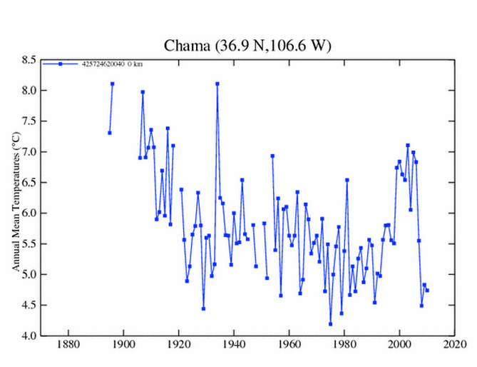
If you go to the GISS website, you will notice a strong urban heat island effect. Compare Albuquerque and Carlsbad (two places where there has been an extensive urban buildup over the last 30 years) and you will notice the standard global warming type plot, the kind they like with the up and up and up since 1980. But then check out Bell Ranch and Boys Ranch, and the standard global warming plot isn’t there, in those plots the warming trend during the 30s really stands out.