
Brian D found these archived ice charts. There is a lot more ice this year than there was in 1979, yet NCDC shows 1979 colder in the Great Lakes region. Note that Lake Ontario and half of Lake Huron were nearly ice-free on March 19, 1979.
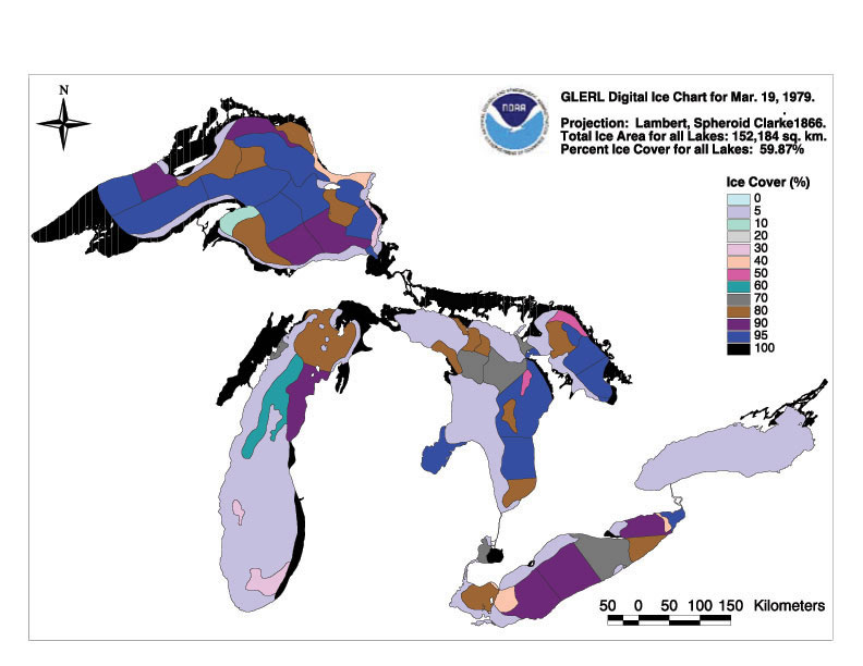
Ice Charts – Winter 1979 / c79mar19.jpg
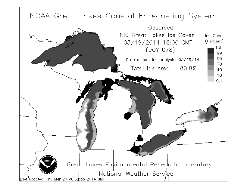
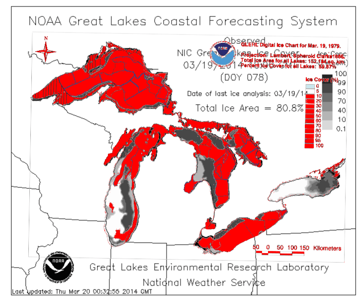
Next image overlays 1979 in red on top of 2014 in shades of gray.

Nice find!
Steve & Co. You might like to take a look at this story from our neighbors to the North in Port au Choix, Newfoundland: House buried in snow – Owners worry about collapse
“The snow is currently about 2½ meters (8 ft) over the roof,” and “packed in like concrete.”
(They are standing on the roof with shovels)
Yep. And the rest of March is forecast to be cold in this region with another strong dip in the jet. Ice will not be quickly leaving anytime soon.
http://wxmaps.org/pix/temp1.html
Obviously, the disparity is due to all of the warmer water hiding in the depths of the Great Lakes, thus allowing more ice to form at the surface. If you kept getting hit with so many polar vortices, you would run and hide, too.
No Steven, the great lakes were 94% frozen in February 19, 1979, they melted earlier that year that’s all. We peaked in March this year.
http://www.glerl.noaa.gov/data/ice/atlas/ice_charts/1979/pages/c79feb19_jpg.htm
Were they running Ice breakers through the ice to provide shipping lanes back then too?
IMAGE 1 in Arctic
IMAGE 2 Lake Huron
Shipping never stops in the Great Lakes. In Ogdensburg NY in the dead of winter you see a ship every few minutes on the St Lawrence. Hundreds of ships a day.
It is March now, and there is a lot more ice than 1979 because temperatures have been much colder.
Un-adjusted temperatures…. After adjustment, the late winter 2014 temperatures are bound to be much warmer than 1979.
Which will leave NCDC with some explaining to do.
That red and grey map makes no sense.
Yes it does. The dark gray around the edges of the red shows the extra ice that formed this year compared to March 19, 1979.
Just for fun you might like
http://webcam.clevelandcrib.org/
Apparently this is from 3.5 miles out in Lake Erie and part of an instillation to monitor wind.
http://clevelandcrib.org/
The ice has been shifting around the last week but earlier there was just ice, with no water showing. The view matches with those obtained doing a search for Cleveland skyline from the lake.
Just looked at it now.. it seems pretty bright there for 7pm.. Is CAGW causing the days to become longer? 😉
This post nicely exposes the blatant misrepresentation of NCDC. If there is more ice on the Lakes, how come the temperature is said to be higher and how come the un-tampered data says that the temperature was lower then (as one would expect). Good work finding these archived ice charts, by Brian D. There must be a lot of this sort of factual conflict lying around in the archives after years of ‘adjustment’ fraud by NCDC, etc.
“…yet NCDC shows 1979 colder in the Great Lakes region…”
I like to see source for that for March 19.
Click on the link under the map:
http://www.glerl.noaa.gov/data/ice/atlas/ice_charts/1979/pages/c79mar19_jpg.htm
Thank you. Where is lower temperature (=colder)? I see only lesser ice (59,87%). It is not nessessery warmer but can be.