
The amount of Arctic sea ice greater than one meter thick, has increased by 18% since the same date in 2012. Green shows ice gain, red shows ice loss.
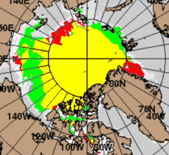
The amount of Arctic sea ice greater than one meter thick, has increased by 18% since the same date in 2012. Green shows ice gain, red shows ice loss.

Goody! Some Arctic sea ice science. geran will be pleased.
Where did you obtain the data behind that slightly fuzzy picture Tony?
The red area northeast of Greenland hints at ice that is not being lost. It is not being flushed out through Fram Strait, to melt in the North Atlantic. It is being held back. 2007 was quite the opposite, and one reason the extent was so low that year was because so much ice was flushed out.
The lack of ice in the Laptev Sea is interesting; I think it is largely due to the fact there was much thinner ice there at the end of the winter. A cross-polar-flow kept appearing all winter, from Siberia across to the Canadian Archipelago, and ice was transported across the Pole to build up amazing pressure ridges north of Canada, but leaving less in the Laptev Sea.
A side effect of this process was open water appearing in the Laptev Sea in the dead of winter. That water was cooled more than usual. You could watch the coldest air Siberia had to offer pour off shore, and be warmed thirty degrees to “only” minus-thirty by the time it reached Canada, but all that “warming” was indicative of a great deal of cooling of the Arctic Sea.
I just watched the latest Australia ABC show Catalyst story on Antarctic Sea Ice. They interview a European “ice expert” who says his models show the Antarctic sea ice is definitely shrinking since 1950.
FFS! I almost popped an aneurysm!!!
These muppets deny that Antarctic sea ice is at record highs!! I’m done. I have zero respect for complete idiots who can’t read a geographical area chart.
http://www.abc.net.au/catalyst/
The lies have become so blatant the only ‘believers’ are those who are diehards (full blown RED watermelons) and in reality believe “We’ve got to ride this global warming issue. Even if the theory of global warming is wrong, we will be doing the right thing in terms of economic and environmental policy.” (Timothy Wirth, President of the UN Foundation)
The rest are either paid to ‘Believe’ and fear for their jobs if they leave the herd or are completely brain-dead sheeple.
CAGW has ALWAYS been nothing but a political hammer meant to wipe out the prosperity of the middle class and spread universal serfdom and misery throughout the world.
That it also kills the goose that lays the golden egg, (Middle class innovation and vigor) has been the major stumbling block for the Moneyed Elite who have been trying to come up with a method to recreate serfdom with out completely wiping out innovation or provoking a return of Madame Guillotine.
The two grand experiments were the Soviet Union and The European Union. The Elite decided the EU was the better working model so now we have the world model, The World Trade Organization, set to follow the EU plan. First a ‘Trade Union’ and then a wold government.
Global Governance: Lessons from Europe – What can the world learn about global governance from the diplomatic model of the European Union?
Note the picture in the right hand corner complete with good ‘old bummer grinning widely on one end and German Chancellor Angela Merkel with a s..t eating grin on the other. Putin on the other hand looks a bit grim.
I note that Steve/Tony hasn’t responded to my 10:27 am enquiry on here yet. Perhaps this recent exchange on twitter explains why?
https://twitter.com/jim_hunt/statuses/494850475767128064
Your purpose for being here is to waste time, and you will soon be spam.
Steve please keep him, we need a hearty laugh. He brightens my day…
That doesn’t actually answer my original question though Tony. As a diligent (not to mention skeptical) scientist I’d like to try and replicate your results. Where do I start?
Your bio describes yourself as a “Surrealist programmer and cutting edge contemporary artist!”
By “surrealist” I’m guessing you mean you program while on drugs. And by “contemporary artist” I’m guessing you consider photographs of dog poo artistic, or generally whatever it is “contemporary artists” are into this week. 😉
You guessed wrong Will. My other half is a professional surrealist artist. I’m a mere amateur:
http://marketing-dreams.co.uk/2013/03/the-mirror-crackd-from-side-to-side/
So I gave you too much credit?
Are you a fine art lover then Will? If so you be the judge. At the risk of triggering the expletive deleter here, you might possibly be amused by our joint effort at simultaneously taking the piss out of both Marcel Duchamp and Charles Saatchi:
http://www.saatchiart.com/art/Installation-The-Cutting-Edge-of-Modern-Art/92256/1346733/view
That’s where the “cutting edge” reference in my “bio” comes from.
Modern art is much like modern temperature measurement. It’s truth is in the eye of the beholder.
And the eyes of the beholders on both sides of the bars are inflamed. Frequently by their own “mass media”?
I always figured ‘Modern Art’ was invented by mediocre artists so they could make a living selling trash to ignoramuses.
I have seen some really good art. The Louvre, the Sistine Chapel, the Vatican, The Museums of Florence – Michelangelo’s David is incredible. There was also this Pietà, that was rough carved except for the Maddonna’s face that was very very powerful. (Can’t find a photo of it, darn it.)
We had a couple very talented artists in my art class in high school. One guy was so good the art teacher was buying up everything he produced. Unfortunately both guys were not mentally stable.
And yes I took art in high school and also in college – I make a better chemist.
Now there are four ships of fools sitting waiting for the NW Passage to open.
http://cornellsailing.com/2014/07/change-of-scenery/
Idiots esp. those from Cornell. They should know better but Cornell is now neck deep into Agenda 21 so I should not be surprised. link
Wow! After 70 ice tourists getting stuck in Antarctic 6 months ago, now we have 4 sailboats who want to get stuck in the Arctic! I reckon the old – “you broke it, you own it” motto should be used when they ask for CG Rescue to save them.
Like last time, the Russians who are ‘evil’ will save them again.
At last report, Aug. 6, “We are still waiting for the ice situation to improve …”
http://cornellsailing.com/category/aventura-logs/
Steven thanks for the great info and the link.
Eye balling the image I get (using Gimp image manipulation software) is very similar result to yours. I am using the July 29, 2012 and 2014 images from your link. Was this the day you used? Also I can also make some very strange images by altering the hue values.
I would like to make an animated gif of the ice extent changes for the last 5 years (only July 29) but this old PC takes too long to do anything that demanding. Besides I’m no graphics specialist.
Oops make that an animation of the changes for the last 3 years as I can find earlier images on the link site. Ho hum.
Thanks for the great info Tom. You’re much more communicative than Tony!
So he isn’t starting from any sort of “raw data”, he’s starting from the ACNFS visualisations instead? As you point out, knowing which dates are being compared would be good to know.
Do you by any chance have any more handy hints?
In the absence of handy hints from Tony or Tom, here’s what I’ve come up with comparing July 29th 2012 with 2014:
https://twitter.com/jim_hunt/statuses/498588225548865538
It doesn’t look the same as yours Tony, so where did you go wrong?
Hey, Jim…
I believe “Goddard”‘s 18% increase claim was based on a pixel count. Can you give us a numerical calculation of your figure, using pixels?
I recognize, of course, that not all pixels on the image are the same area, as converting the spherical surface of the globe to a planar graphic representation creates distortion. Still, it should be a reasonable approximation for amateur science purposes.
Hi Steve,
After cleaning up my rather crude first attempt I now get:
R+Y = 17006 px
G+Y= 17895 px
which I make a 5.23% increase pixel wise. I wonder where the missing 13% might be hiding?
Hey Jim, your missing pixels are hiding with your missing heat.
(And, you probably know what that means….)
I do know what that means, hence my choice of bon mot. In this case, however, it’s Tony’s responsibility to produce a convincing explanation for the absence.