More On The NOAA Africa Fraud

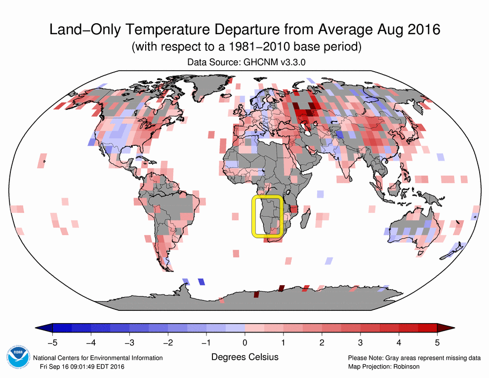
As I reported earlier, NOAA shows Angola as their hottest month ever in August.201608

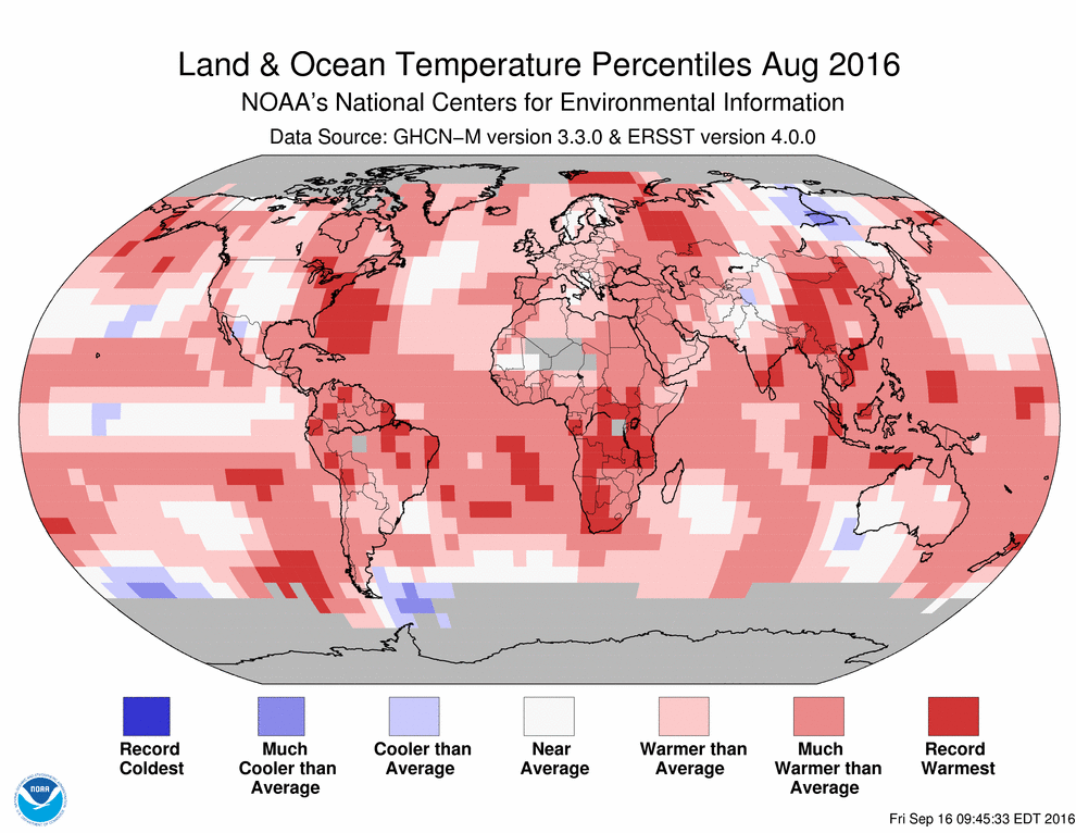
Amazing, since NOAA doesn’t actually have any thermometer readings in Angola – which is almost twice the size of Texas.

201608-1

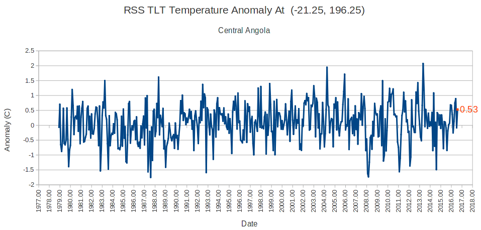
The RSS TLT August anomaly for central Angola was 0.53, slightly above average and nowhere near a record.  There has been almost no trend in Angola temperatures since the start of records in 1978.

2016-09-21120410

NOAA and NASA are defrauding the American people and the world with their junk science, which is used as the basis for policy.

This entry was posted in Uncategorized. Bookmark the permalink.

35 Responses to More On The NOAA Africa Fraud

  1. Aurora Svant says:

    Where do these data come from ? I can see my location being marked as “much hotter than average”, whereas everyone around is agreeing that it was in fact a very mild summer.

  2. Rud Istvan says:

    This is a very powerful post. A surface AGW result produced from zero observations compared to actual observations of the same region. Bookmarked.

    • Latitude says:

      Rud, look at all the places that went from below average…to above average
      Like Pakistan

      • AndyG55 says:

        Australia, all the measured blue bits just disappear once they apply their data fabrication algorithm.

      • Rud Istvan says:

        I know. But putting RSS Angola in as the clincher is an evidentiary flourish that would have made Perry Mason proud. Could do the same with more places, but one suffices.

        • Latitude says:

          First they changed South Africa from pink to red…then brushed it all the way up…
          ….and somehow ened up with a little blue dot in the middle of the Congo..just an abrupt change and no shading

          …and they call this science???

        • AndyG55 says:

          Whenever I see an article claiming “warming” caused this or that in a particular place, the first thing I do is try to find the temperature data for that area.

          Often as not, it shows basically no warming.

  3. Andy Bern says:

    Dear Tony, correct me if I’m wrong, but I think this comes simply from the fact that “missing data” are extrapolated by NOAA using temperatures “produced” by simulations rather than real data. This explains why missing data are turned into massive positive anomalies. And this, I fully agree with you, is the real reason why every year is “the hottest”. Just because all the extrapolated data are based on hyper-warming models themselves, which are based on the assumption that every year is hotter than the one before. These reddish maps are just rubbish provided for the use of the mainstream media, and nothing else.

  4. Andy DC says:

    Climate scientists love to show excessive heat in very remote places where very few people in the “civilized” part of the world would ever know the difference. By checking into their false claims, you have shown the excessive warm bias presented by climate scientists is not science at all. Rather it is propaganda for a political agenda.

  5. AndyG55 says:

    Tony, can you give a link to the RSS page that allows you to use lat, long please.

    That is a link that would be very useful

  6. AndyG55 says:

    The comparison with UAH and RSS is very revealing.

  7. Cam says:

    I like how the center of Europe from Scandinavia all the way to Italy and North Africa show half to a full degree below average in the Land-only temperature average map, but somehow that has become warmer than average in Land and Ocean temperature percentiles. In other places, the half to full degree negative are shown in white on the Land and Ocean indicating Near average, but a half to one degree positive anomaly is shown as warmer than average to make the map look more dramatic with all that red.

  8. geran says:

    “NOAA and NASA are defrauding the American people and the world with their junk science…”

    Egggsactly, Tony! With triple emphasis on “their junk science”.

    All they have is the ability to “adjust”, “correct”, and “homogenize” the temperature data. Their “junk science” fails them. The planet is NOT warming “irreversibly”! All of their predictions have failed.

    Your work unraveling their “web” is commendable.

  9. Harry M says:

    As I see it, NOAA and NASA have to continually manipulate temperatures; not just to show a continuous upswing, but also to eradicate the highs and lows from ENSO. It’s obvious to anyone on the street that ENSO has a far greater and obvious affect on global temps. than anything CO2 might or might not do, but that doesn’t fit with the political needs. The 1998 El Nino is just about gone now.

  10. Lonny Eachus says:

    I’ll add, if I may: sure, it may be infilling but the real question is how responsible or honest is the infilling?

    If you look at that huge red blob in the S. portion of Africa, then compare to the land only data, of the only stations they do have anywhere near there, none of them are deep red.

    So how could any realistic extrapolation or infill create that huge “record hot” blob?

    It’s pretty darned implausible.

    • Jason Calley says:

      Hey Lonny! How responsible or honest is the infilling? NOAA (and NASA) have been asked many times about their processes and have also responded many times with vague or partial explanations. They say things like “We are correcting for Time of Observation errors” or “We are infilling missing data with extrapolations from nearby locations” or “We have adjusted data to compensate for equipment changes.” Those all sound like they may be good things to do, but as the saying goes, “the Devil is in the details.” In this case, the Devil is in the fact that none of their explanations are complete enough to allow an objective examiner to duplicate their process. Additionally, just looking at the adjusted output, clear patterns emerge which indicate fraud.

      So, are their adjustments and infilling responsible and honest? It is theoretically possible that they are — but there is no evidence to support it. In fact, all the evidence points the other direction, and they have gone out of their way to make sure that their processes remain hidden.

    • Andy DC says:

      You would think that the most obvious adjustment should be to take the increasing urban heat island effect into account. Especially with so many records being kept at airports located in suburban or rural areas that have built up tremendously over the last 50 years.

      Both Dulles Airport and BWI in the Washington DC area are classic examples. If you were going to adjust for their rapidly increasing urbanization, you would cool the recent years relative to the years in the more distant past. But instead they are doing just the opposite, based on what appears to be for far more flimsy reasons.

  11. Lonny Eachus says:

    That was to Andy Bern.

  12. AndyG55 says:

    Note that not one of the usual AGW con-artist trolls has even tried to justify this piece of junk from NOAA.

    Maybe because even they see it as Unjustifiable.

  13. CheshireRed says:

    Well they pluck everything else about AGW from thin air, so why not Angola’s temp data?

  14. Lonny Eachus says:

    Looking at his other post on this, which gives a bit more detail, it seems pretty apparent that they used the hottest stations in the area: S. Africa and a few in the Eastern region, as sources to “extrapolate” or infill the entire area above South Africa which has few stations or none at all.

    Even though there are at least a few stations closer to that region that are cooler.

    If I were a judge in a fraud case, saw this evidence, and lacked any contrary evidence, I’d say guilty.

    So far, I lack any contrary evidence.

  15. Dave Clancy says:

    Would it be possible to take this same data, remove the extrapolated/infilled data, and see how the “global” anomaly compares to the current calculation? This would show if the extrapolation/infilling is warming the overall calculation and if so by how much.

  16. Wayne Helliar says:

    I live in NW Ontario. The map shows my temps as somewhat warmer than average. In the plus .5 to 1 degree band. I can assure you that it was much cooler than average. We had 2 days of 81F , 1 day of 82F. , and 1 day of 80F. Those were the “hot” days. These are not my numbers, I found them on the weather network’s historical temps page. The rest of the month was mid to low 70s. August is normally much warmer with mid 90s being an expected occurrence most years. This map has a huge fudge factor in my neighbourhood.

  17. Russ Wood says:

    A few months ago, there was an article on a South African newsblog by the Prof who, for years, was the person taking the offical Cape Town temperature readings at the observatory. So he has access to the old records, and wrote that he found that the South African temperature data put out by NOAA bears little relationship to the data that he personally recorded.
    Sooner or later, the whole scam is going to come out into the open!

Leave a Reply to AndyG55 Cancel reply

Your email address will not be published. Required fields are marked *