In 2004 NASA’s top climate scientist, Gavin Schmidt, said that Antarctica had cooled significantly in recent decades.
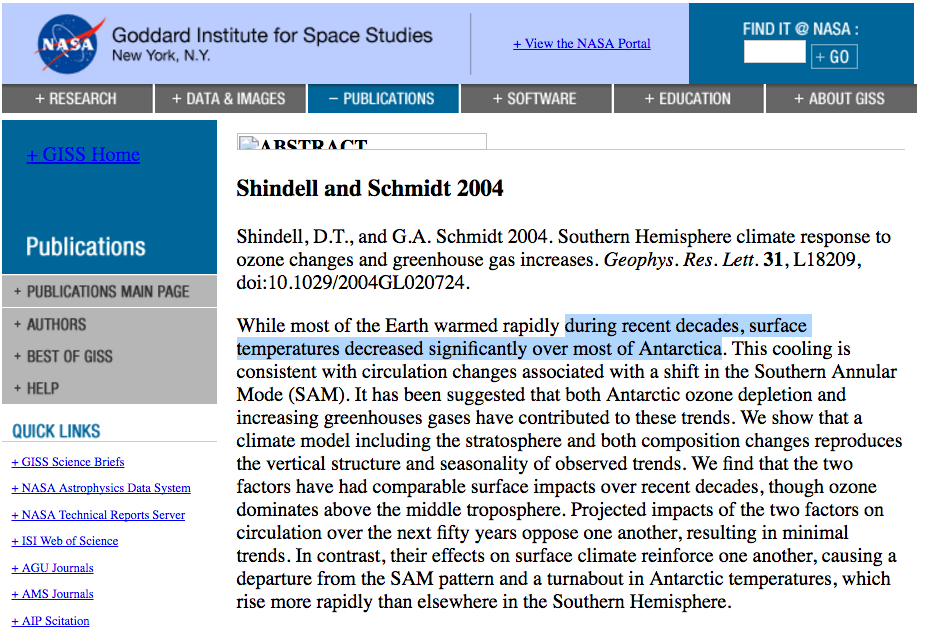
Pubs.GISS: Abstract of Shindell and Schmidt 2004
NASA showed this clearly in their 2005 map.
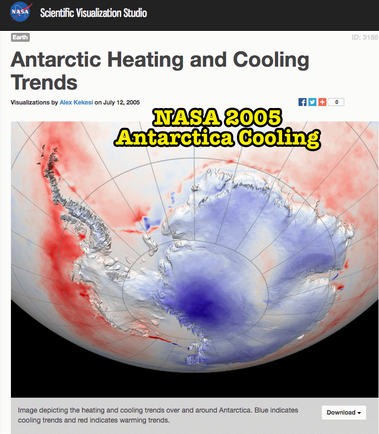
SVS: Antarctic Heating and Cooling Trends
This didn’t suit NASA’s agenda, so by 2009 they erased the decades of cooling and turned it into a half century of warming.
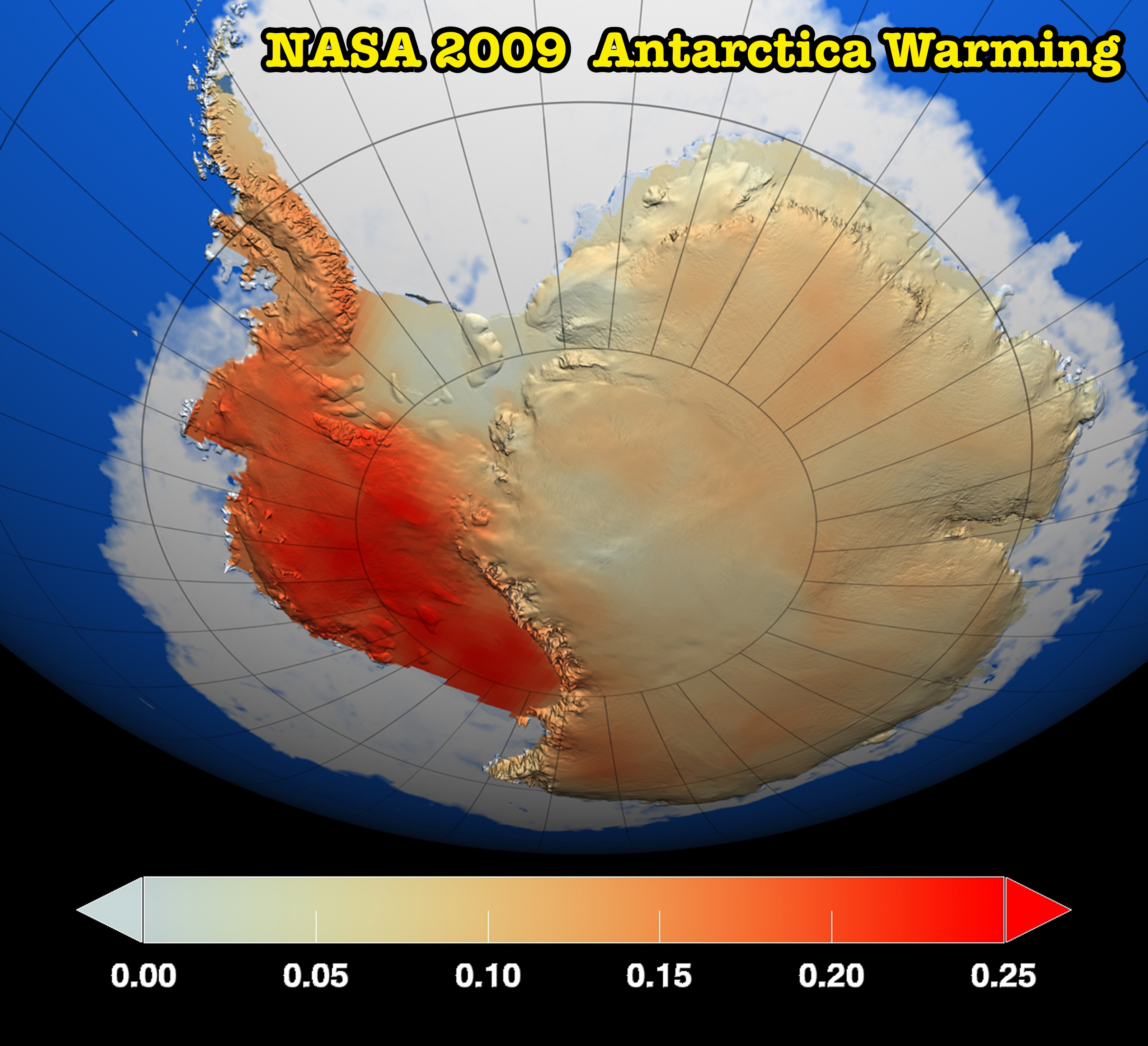
NASA – Satellites Confirm Half-Century of West Antarctic Warming
NASA says Antarctica is gaining glacial ice.
NASA Study: Mass Gains of Antarctic Ice Sheet Greater than Losses | NASA
Sea ice around Antarctica has also increased.
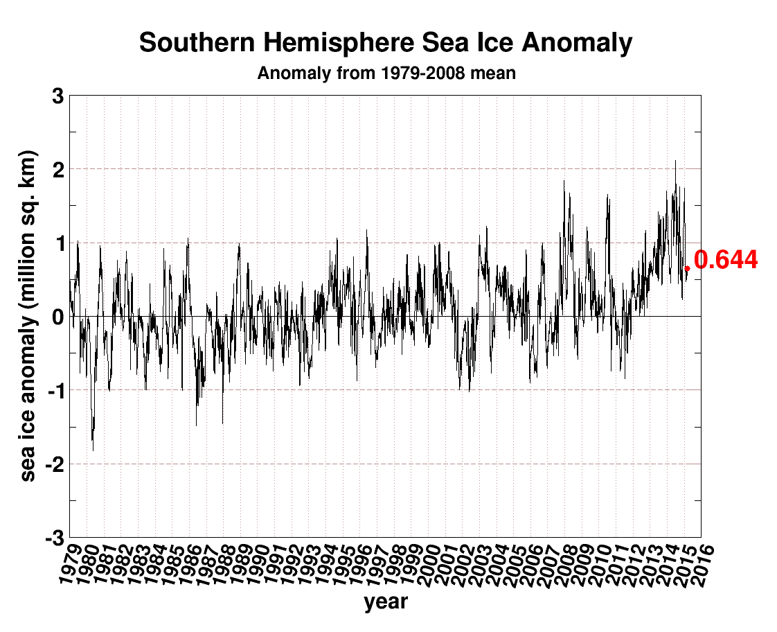
seaice.anomaly.antarctic.png (1122×912)
Thermometers show Antarctica rapidly cooling. Sea ice is increasing. Glacial ice is increasing. But facts don’t suit the NASA climate agenda, so they simply changed the data.
These seem to be measuring different time periods. Is the raw data for the same time periods the same or is it “corrected” to get the intended result?
That has nothing to do with it.
The caption to the latter image shows hilarious bias.
“Red represents areas where temperatures have increased the most during the last 50 years, particularly in West Antarctica, while dark blue represents areas with a lesser degree of warming. Temperature changes are measured in degrees Celsius. Credit: NASA/GSFC Scientific Visualization Studio.”
OT , another “weather” event.. (cold, so not “climate”)
http://joannenova.com.au/2016/10/coldest-perth-september-recorded-in-120-years-of-records/#comments
Have to love this statement down in the piece the linked NOAA’s “Antarctica 2009” site:
“Previously, researchers focused on Antarctic ozone depletion, which influences large-scale atmospheric fluctuations around the continent—most notably, the Southern Annular Mode, which speeds up wind flow to isolate and cool the continent. ”
These days, they’re focusing on mental depletion in their little heads. Oops, I thought it said Southern Analar Lobe.
That graph for Antarctic seems to stop in 2015, why don’t you use the current graph? Why that one at that time?
If you look at Bremen
https://seaice.uni-bremen.de/amsr2/extent_s_running_mean_amsr2_previous.png
Current Antarctic ice extent is lowest in last 7 years.
Andy
Antarctic always bounces around all over the place at this time of year.
Its wind and weather.
It dropped , and is now coming back up again.
Meanwhile Perth, Western Australia has had its coldest September in 120 year of records
It is a big, big conspiracy on my part Andy.
Or perhaps because the UIUC area graphs have been broken for the past six months.
True, lets see how it progresses.
Andy
About normal…. just like the Arctic.
No sign of CO2 influence in either of them.
So much for “polar amplification” ;-)
Where’s Gavin in all this? His reputation is being smashed to smithereens by an online blogger so surely Gavin will defend his professional honour, right? Erm, nope –
Gavin is nowhere to be seen.
The Scarlet Pimpernel is easier to find. Now why is that? There can’t be many climate industry pro’s who’re happy to have their pro’ reputations annihilated, yet from Mr Gavin Schmidt we hear…not a titter.
I wonder. Could it be that Gavin and his magic data have both been comprehensively busted?
‘Coo-eee! Gaaaaaavin! Come out come out wherever you are! Tony wants to play-aaaaay’.
Amazingly, Gavin has gone all quiet on us. Perhaps he’s shy? Maybe one day he’ll pluck up the courage to publicly defend his ‘data’ in court and banish the nasty Tony to eternal damnation? Until then…..Gavin and his data must be considered fake. Tough at the top, eh, Gav’?
They go wild with their tampering in places where nobody lives.
Pingback: Spectacular Antarctic Data Tampering By NASA - Principia Scientific International