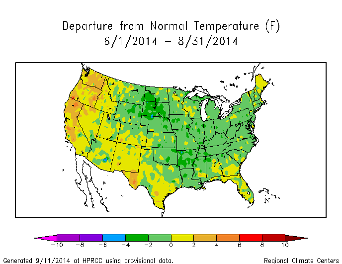
Two thirds of the US was below normal temperature last summer.
Current Climate Summary Maps – Powered by ACIS – High Plains Regional Climate Center
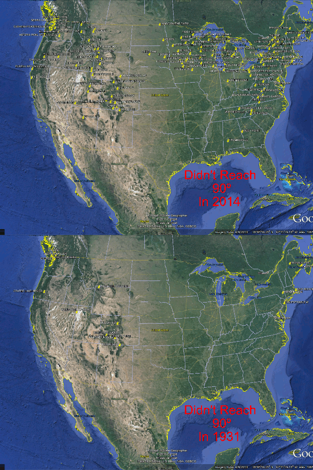
The percentage of US HCN stations which reached 90 degrees in 2014, was the smallest on record. The highest percentage occurred in 1931, when almost every single station reached 90 degrees. The area of the US which is hot has been plummeting since the 1930s.
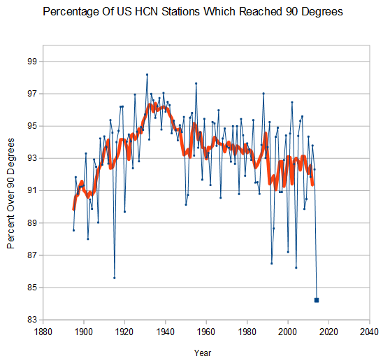
This is the exact opposite of the 100% fraudulent NCDC climate extremes index (CEI) which reports that the region of the country with unusually hot days has increased to record levels.

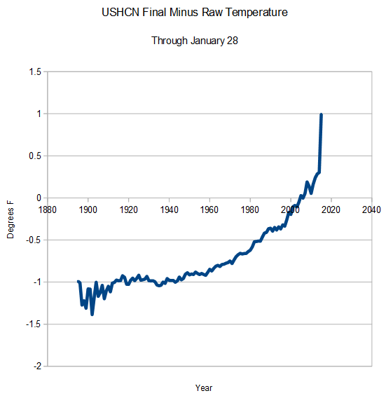
My graph was generated using the identical HCN data set used in the NCDC/EPA graph. The difference is that I use the actual thermometer data, whereas CEI uses “adjusted” data. The EPA has another graph on the same web page which directly contradicts the NCDC CEI graph above.
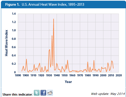
The area of the US over 100 degrees and 110 degrees also peaked in the 1930’s, and has plummeted since.
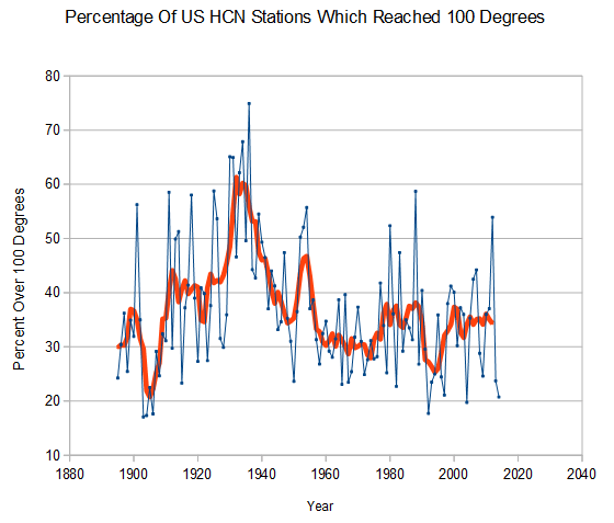

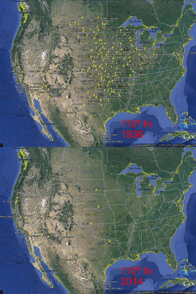
These are critical indicators, because they are not affected by time of observation bias (TOBS) and show unequivocally that NCDC data tampering is incorrect. The reason that the CEI is wrong, is because they use adjusted data.
This is a smoking gun that the adjustments are fraudulent.