Progressives hope to do the same to Americans
[youtube=http://www.youtube.com/watch?v=GHq-4a0sIAo]
h/t to Dave G
Progressives hope to do the same to Americans
[youtube=http://www.youtube.com/watch?v=GHq-4a0sIAo]
h/t to Dave G
In 1978, NOAA showed that both hemispheres cooled sharply from the 1950’s through 1970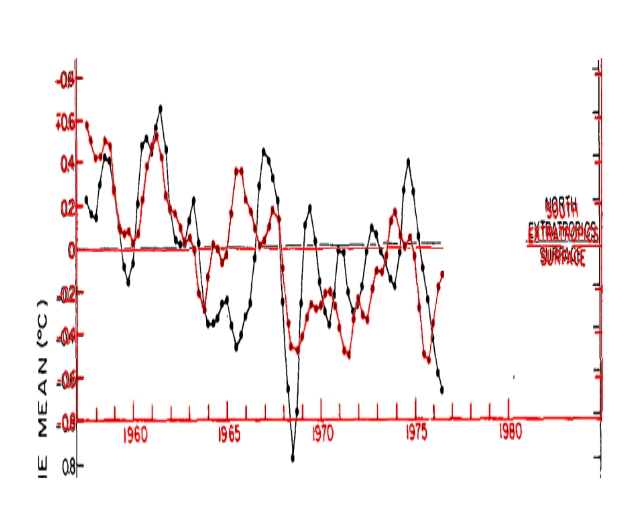
journals.ametsoc.org/doi/pdf/10.1175/1520-0493(1978)106<0755%3AGTVSMA>2.0.CO%3B2
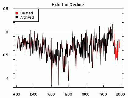
They have since erased this cooling in both hemispheres. They had to get rid of it, because it agreed with Briffa’s trees – making it impossible to hide the decline.
In 1978, NOAA published this graph showing nearly a full degree cooling in the southern latitudes between 1955 and 1970.
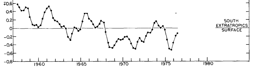
journals.ametsoc.org/doi/pdf/10.1175/1520-0493(1978)106<0755%3AGTVSMA>2.0.CO%3B2
GISS has erased 90% of this cooling.
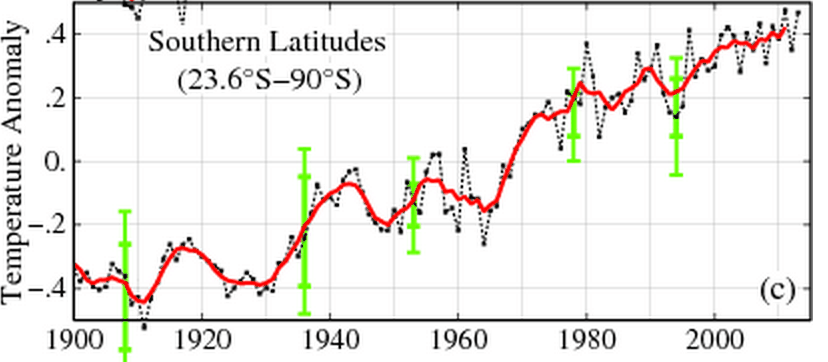
The next graph overlays the 1978 NOAA data in blue on the current GISS data. They bear no resemblance.
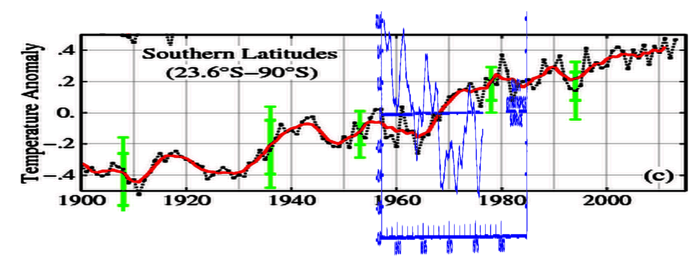
Much of the excuse for getting rid of northern hemisphere cooling was because they didn’t see it in the southern hemisphere. Apparently that was because they got rid of the southern hemisphere cooling first.
Then -after they got rid of the northern hemisphere cooling, the IPCC was able to throw out Briffa’s trees and create the hockey stick.
h/t to Alec aka Daffy Duck for the NOAA graph
Not wanting to be outdone by NASA and NOAA, the rest of the hockey team erased the MWP and the LIA, between the 1990 IPCC report (blue) and the 2001 IPCC report.
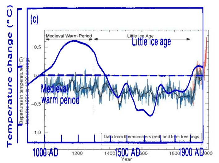
It appears that the year 2000 was a banner year for data tampering
Climate fraudsters like to claim that Earth began in 1979, the year of peak Arctic sea ice. The graph below shows why. If they started their graph in 1954, there would be almost no downwards trend to the present.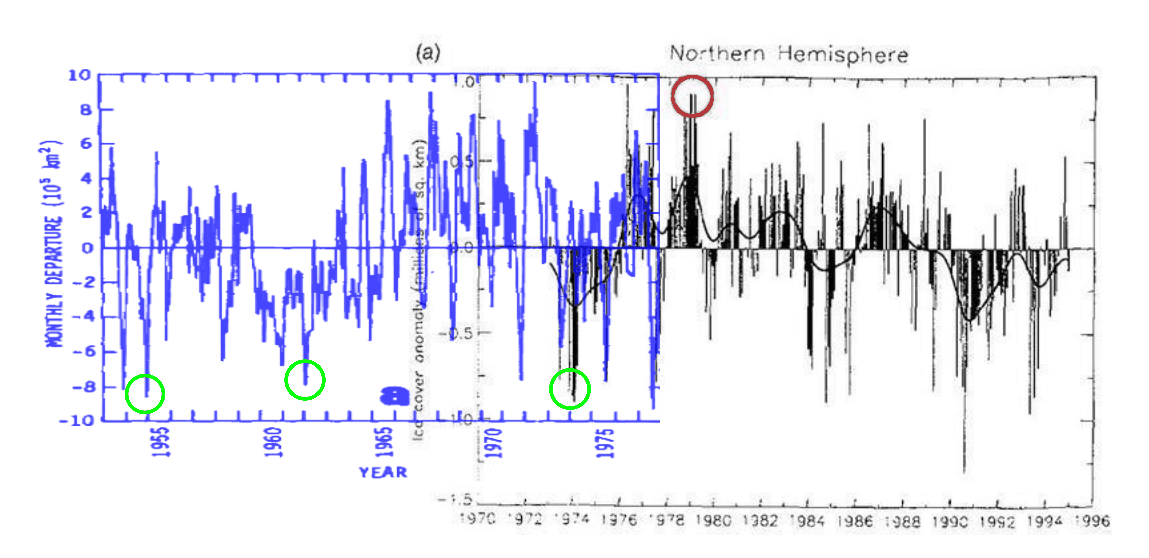
journals.ametsoc.org/doi/pdf/10.1175/1520-0485(1979)009<0580%3AAAOASI>2.0.CO%3B2
The graph below is a composite of a 1979 paper in the Journal of Physical Oceanography (red) the second IPCC report (black) and University of Illinois Arctic sea ice data. Current anomalies are a little lower than the early 1960’s and early 1970’s.
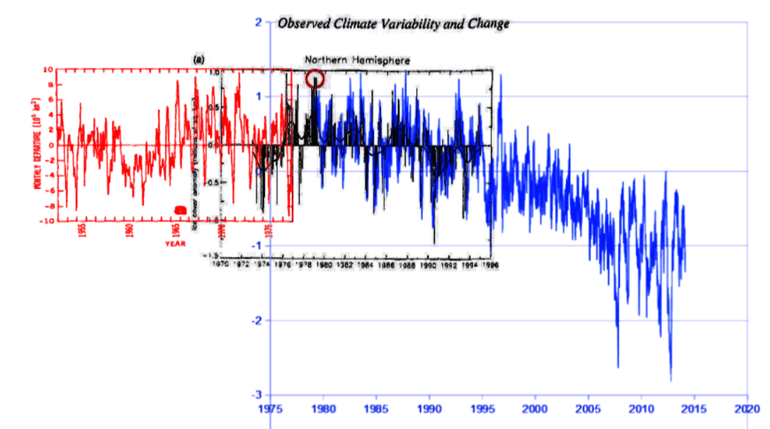
journals.ametsoc.org/doi/pdf/10.1175/1520-0485(1979)009<0580%3AAAOASI>2.0.CO%3B2
arctic.atmos.uiuc.edu/cryosphere/timeseries.anom.1979-2008
h/t to Alec aka Daffy Duck
Most people are intelligent enough to understand that the horse pulls the cart, but not climate scientists.
As ocean temperature rises, CO2 solubility decreases – pushing more CO2 into the atmosphere. Thus we see CO2 trailing temperature in ice cores.
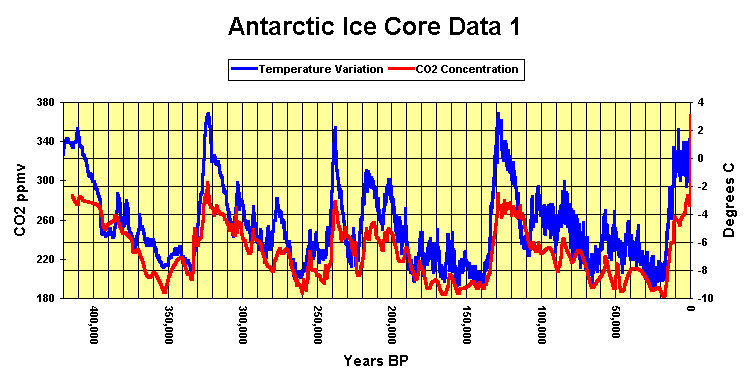
An entire religion has developed around a backwards view of this relationship. Al Gore’s buddy Laurie David went so far as to reverse the relationship, in her book intended to pollute children’s minds with cult religious BS.

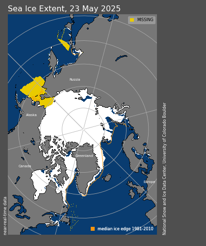
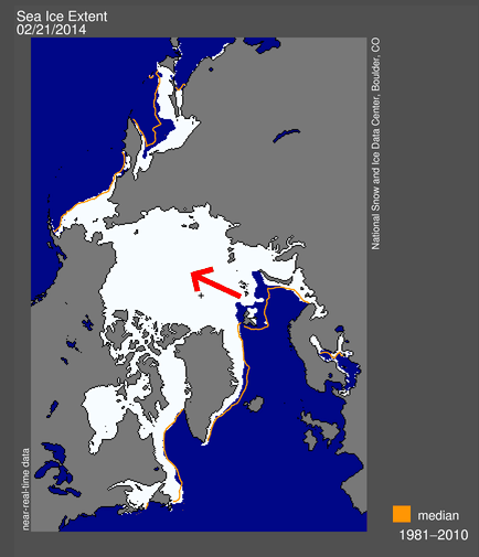
Our moron friends are excited about a small area of missing ice in the Barents Sea, which Jennifer Francis of Rutgers claims controls the global climate. You can think of her as the Hank Johnson of climate science.
The problem is that the gap is there because winds are pushing the ice towards Alaska, where it is piling up and thickening – and will be harder to melt during the summer.
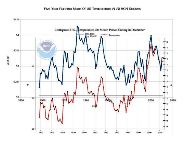
In 1999, Hansen was unhappy that the US didn’t show any warming.
Whither U.S. Climate?
By James Hansen, Reto Ruedy, Jay Glascoe and Makiko Sato — August 1999
What’s happening to our climate? Was the heat wave and drought in the Eastern United States in 1999 a sign of global warming?
Empirical evidence does not lend much support to the notion that climate is headed precipitately toward more extreme heat and drought. The drought of 1999 covered a smaller area than the 1988 drought, when the Mississippi almost dried up. And 1988 was a temporary inconvenience as compared with repeated droughts during the 1930s “Dust Bowl” that caused an exodus from the prairies, as chronicled in Steinbeck’s Grapes of Wrath.
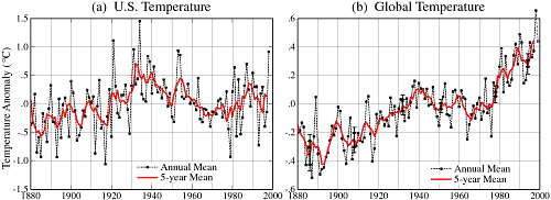
How can the absence of clear climate change in the United States be reconciled with continued reports of record global temperature? Part of the “answer” is that U.S. climate has been following a different course than global climate, at least so far. Figure 1 compares the temperature history in the U.S. and the world for the past 120 years. The U.S. has warmed during the past century, but the warming hardly exceeds year-to-year variability. Indeed, in the U.S. the warmest decade was the 1930s and the warmest year was 1934. Global temperature, in contrast, had passed 1930s values by 1980 and the world has warmed at a remarkable rate over the last 25 years.
So they fixed it during the the next year.
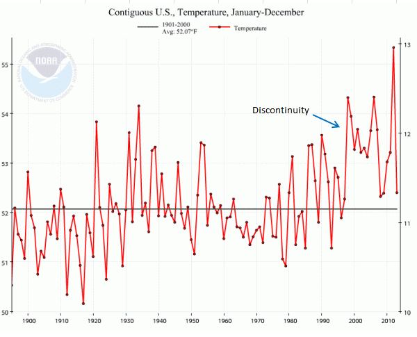
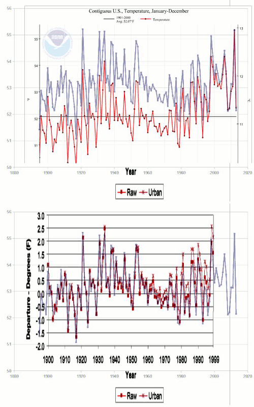
But they were quite clever how they did it. Going from USHCN V1 to V2 they shifted all of the older temperatures downwards, as seen in this animation. This created a non-existent upwards spike, and brought US temperature trends in line with Hansen’s theory.
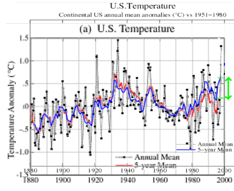
The green arrow below shows the 0.5C upwards shift in the five year mean anomaly line, made between the 1999 version (red) and the current version in blue.
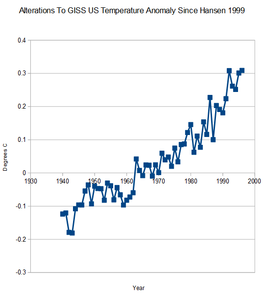
Closer analysis reveals that it is a hockey stick of exponential data tampering since 1940. Remember that they shifted the baseline temperatures downwards, so the absolute anomaly numbers don’t mean anything. What is important is the magnitude and shape of the curve.
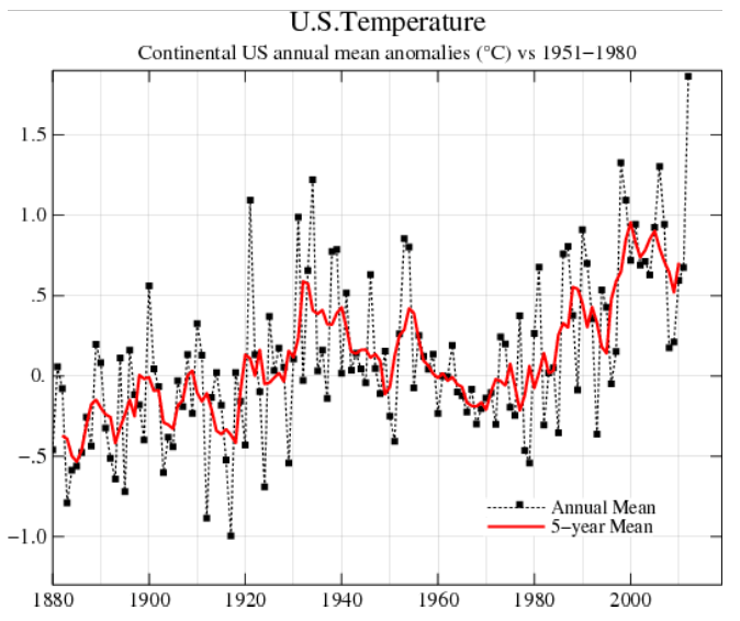
This data tampering brought the US in line with the rest of the world, and secured billions in global warming research funding. The current GISS US temperature graph has a nice hockey stick in it, courtesy of massive tampering by NOAA/NASA.
This next graph shows the raw data (blue) and the NCDC published data in red. It shows how they cool the past in their published graphs, and create the appearance of warming – which is not indicated by the thermometer data.
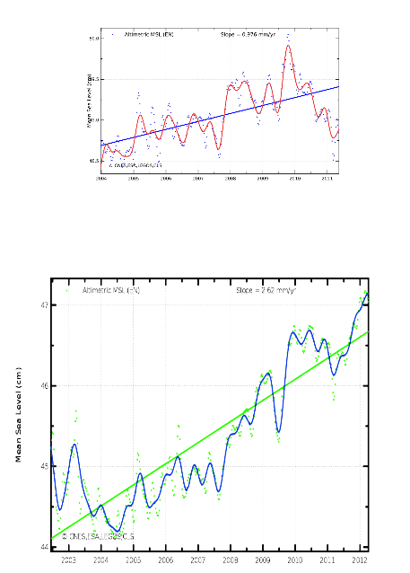
Some alarmist objected to this graph showing how Envisat has been tampered with

He complained that I didn’t have the Y-axes numerically aligned. (Alarmists love meaningless absolute numbers.)
So I obliged him, and produced another version which aligns the meaningless absolute Y-axis numbers.