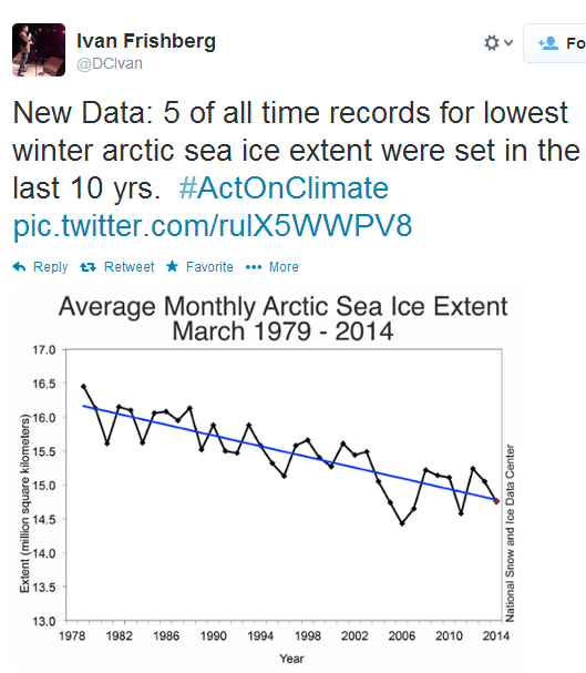
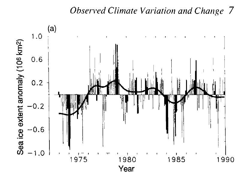
There is almost no variation over the interval, because winter sea ice extent is constrained by geography. All values in the chart are within two standard deviations. And the graph starts at the century maximum and leaves off the pre-1979 years which were much lower.
From the 1990 IPCC report.


Alarmists NOT taking junk science to new levels
That record was set in 1946, when misinformation became “Standard Models of:
1. Stars
2. Nuclei, and . . .
George Orwell started writing a futuristic novel entitled “Nineteen Eighty-Four”
Is there a way you do your overlay technique on those two charts? Not sure what the anomaly baseline is from the old chart.
It is difficult because there is no way to sort out the March data from the IPCC graph. But note that peak to peak is almost 2 million from 1974-1979, which is about the same as the 1979-2014 delta. In other words, nothing has changed in 40 years.
I knew before I even saw the Twitter graph that the start point was going to be late 70’s. Cherry picking at it’s finest.
These knuckle heads are now trying to out do each other for the biggest pile of horse shit.
Only a dipstick frothing at the mouth alarmist would turn a 35 year period into “all time”.
Bingo!
Steven,
Ivan’s chart does not show average monthly arctic sea ice extent. There aren’t enough data points. It’s got just enough data points to be average annual arctic sea ice extent
It is warmer than the coldest year in history. Does that prove catastrophic warming?