
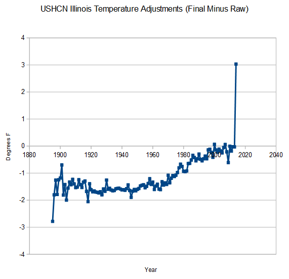
NOAA is adjusting Illinois temperatures upwards by three degrees in 2014. That makes a total of six degrees data tampering since 1895.
Index of /pub/data/ushcn/v2.5/
Disclaimer : Mosher says the temperature record is golden.
NOAA is adjusting Illinois temperatures upwards by three degrees in 2014. That makes a total of six degrees data tampering since 1895.
Index of /pub/data/ushcn/v2.5/
Disclaimer : Mosher says the temperature record is golden.

Why even bother having weather stations? They may as well just extrapolate the entire planet based upon one station in Death Valley.
Because the Death Valley station would show cooling since 134F in 1913
Touché! 😆
Transit police? They don’t hang out here on the Upper West Side at the 109th Street and Broadway Chinese Legand cafe, where I just took this picture of the making of a picture:
http://s6.postimg.org/hb99uca9d/image.jpg
I’m glad Pointman finally POINTED out the masterbatory nature of most online utterly tribal “skepticism”:
http://thepointman.wordpress.com/2014/04/24/get-real-get-organised-and-finish-it/
Are you assholes really *that* pathetically unaware that your are the cess pool of skepticism projecting your mere tribalism onto *real* skeptics? No idea how far you have fallen?
John Daly’s old 2002 take on Death Valley is here and the dishonest plaque physically attached to its temperature station that tourists are exposed to:
http://www.john-daly.com/stations/badwater.htm
[“Here is how the public plaque at Badwater misrepresents Death Valley (Fig.3). It’s red graph line traces the same data as the one above, and it is immediately clear that the ARC graph differs from GISS in that the ARC graph shows a continuous warming whereas the GISS graph only shows warming pre-1950s with little long-term change since. They can’t both be right. The plaque also said –
“During the summer of 1998 – the warmest year on record – we recorded the hottest air temperature anywhere in the world of 53.06°C ±0.1°C (128°F) on 17 July 1998 at 3:15 pm local standard time.”
Having mentioned 1998, that year was conveniently left off the chart. And with good reason, as Fig.2 shows that 1998 was a particularly cool year.
Fig.4 – The Badwater instrument.
What exactly do those skilfully crafted words on the plaque mean anyway? Note, it refers to 1998 as the `warmest year on record’, but omits to say they are referring to the world as whole, not to Death Valley itself. 1998 at Death Valley (Furnace Creek) was actually cooler than usual.
The plaque claims Death Valley recorded the hottest air temperature anywhere in the world on 17th July 1998 – implying it was an all-time world record. It was not. It was referring to 1998 only. Actually, the hottest temperature ever recorded at Death Valley was way back in 1913 on 10th July – a whopping 134°F (57°C).”]
Boy was he ahead of his time, his book The Greenhouse Trap having been published in 1989, a mere year after Hansen’s congressional testimony that set the scam in motion, whereas WattsUpWithThat.com was established in 2006. Australian psychologist John Ray was on the case at the end of 2004 with his Greenie Watch blog and Steve McIntyre arrived in 2003 with his Climate2003 blog.
We were watching July 4 fireworks in 1998 in Cupertino, CA – and it was very cold.
1998 in Cupertino was also when Calabazas Creek overflowed and Miller Ave became the creekbed for a while. Lost the engine block of my Toyota pickup when my wife ran it through high water at Miller and Stevens Creek and sucked water into the intake.
Fossil frat boy thinks everything is a sound bite pissing match, as he wins a ratings war, preaching to the kavetching-as-sport choir. And stage left, Iron Man. Look, I don’t have a whole weekend right now like I did before, to re-pirate Excel and decode Chicago as line item 427 as being it, as line item 428 kicks in, not being it, and a bunch of damned zeros infect the ends, then fighting post-Vista Microsoft menu-re-(fucking unbelievably)-moved quirks. I just want you to back up your fantastic claim with raw/final plots of Chicago monthly data.
Otherwise your seeming bluff is sucessfully called.
Two wrongs don’t make anybody cheer, dear leader of shock jock skepticism.
You are a hypocrite, so far, in negatively citing other skeptics for being co-abusively invested in continuance of a culture war, for your math posts are best defined as being cryptic insider jabs, merely.
Hopefully you’ll spell it out in real books.
At least you *fight*!
Insert my comment one floor below, on this page, just after Steve’s Chicago thrust.
What are you talking about? There is nothing wrong with the very simple mathematics.
There was a sharp drop in Illinois temps this year, and USHCN reduced the magnitude of the drop by 3 degrees.
Take your paranoid meds.
This is just like the old Saturday Night Live episode where the used car dealer up and out refused to TELL THE PRICE OF THE CAR. Due to your subterfuge I call official bullshit on your claim that a sudden plunge in Chicago or any other Illinois temperature plot actually exists, Steven Lewandowsky.
I believe you have completely lost your mind, and are off in Brandonville.
Where is the plot, Steve?
The raw/final data plots!
Hey, you, Steve.
Where *are* the SUPPORTING before/after plots of Chicago?
You, know, the plots that will actually *prove* (or disprove) your case.
Whoop! I guess I’m fucking out my fucking mind for even asking.
I need to “take my meds.”
…because I want to *see* the plots behind your claim, Gavin Goddard, whose science is settled, because you say so.
Far as I can tell, you’d a turncoat, purposefully trying to embarrass skepticism.
NCDC plots are down today. It must be a giant conspiracy by me.
You should really hang out with Mosher and Brandon.
http://www.ncdc.noaa.gov/cag/
Jesus, is PCP unpredictable
My big hat, no cattle alert FOIA request jest is:
FFFuck OOOff IIIdiot AAAsshole with the mail order bride.
You are disgraceful, and properly marginalized.
For your game is mere sensationalistic innuendo.
Not factual.
Not compassionately responsible.
You use mere glitches in data reporting to slander skeptics as being emotive instead of rational.
Welcome to planet Obscurity.
Living Straw Man.
I’m gonna have to call transit police to have you removed from the subway
Plot? You don’t approve of plots? Do tell *exactly* what I wrote that you might take to task, skeptical cultist.
Recommended to ‘clutch’ between up or downshifts, Nik; saves wear and tear on the synchronizers and prevents stripping of gears in the transmission as well. Also results in a little more pleasant ‘ride’ for the passengers. The old jokes said on the school bus driver after a missed shift would be the words “While you’re at it up there, could you grind me a pound too?” or “If you can’t find ’em, grind ’em.”
https://www.youtube.com/watch?v=yturC61EYFQ
.
ROFL – This is not a “glitch” It is USHCN monthly adjusted minus raw. Their data generated by them – both derived from the same data set.
Steve, it’s all just words on page until you offer plots. “This is this and this is that” makes you into a charlatan. I saw your claim of the site being down. But morbid curiosity drives me here to see how many insults I can collect in the very VERY everyday simple process of skeptically asking for real Willis-worthy before/after single station plots. Look at the madhouse-pointing lame counterpoint. It’s utterly pathetic, verging on evil.
I see. Because you have zero evidence that I did anything wrong, I must be doing something wrong.
Sorry if the data upsets your “real skeptic” pals.
I’m “real skeptical” that PCP improves anyone
http://www.ncdc.noaa.gov
“Several of our online systems are unavailable at this time. We are working to resolve the problem. We apologize for the inconvenience.”
Translation:
“Steve Goddard has been blogging about our massive data tampering again, so we’re denying access to everyone as a precaution”.
Maybe the swine should just model all the temperature data and save themselves some time and effort 😉
I’ve always admired f r a u d committed on an industrial, mass-production scale. It takes balls made of not just brass, but high quality stainless steel to commit this level of ‘data manipulation and malfeasance’ …
The Mann-made hockey stick lives after all!
This might be more convincing if it didn’t rely on your own parsing software that non-programmers and busy laymen can’t authenticate. A series of individual station plots that are easier to reproduce would be helpful if they too show sudden 3 degree jumps. The silence of Tamino is deafening, however, though few know who he is, a blogger with a theoretical physics degree who is obsessed with competent skeptics who do math.
If a technically inclined layperson did the expected double check by just quickly looking for such a sudden spike in Illinois on say, Wolfram Alpha, none is seen:
http://s27.postimg.org/70829jijn/Fire_Shot_Screen_Capture_748_temperature_of_i.png
Or in the Berkeley BEST series for Illinois:
http://s23.postimg.org/a6tqsgskr/Fire_Shot_Screen_Capture_749_Berkeley_Earth.png
Or in NASA GISS:
http://s7.postimg.org/tlqlnex7v/Fire_Shot_Screen_Capture_750_Data_GISS_GISS.png
There’s just no easy five minute way to confirm your claim, so far, something that can be conveniently plotted using data plotted outside of your own web site. Normally such a jump would be considered a glitch somewhere, possibly a bug, and such things periodically lead to correspondence and a correction being issued. But here, motive is attached and around in circles skeptics spin, saying the same thing over and over that few outside of the blogosphere take seriously. I can’t even make an infographic about this since I am currently not set up as a programmer and I can’t exactly have much impact referencing an anonymous blogger as my data source. How do I easily DIY before/after pairs of plots to specific stations? Or is this all really just a temporary artifact of various stations reporting late etc? As a serious skeptic I still have no idea since the presentation here is so cryptic. I mean, after all, to most of the public, “Mosher” is an unknown, as is he to most skeptical Republicans who enjoy a good update for their own blogs.
The point is that the sudden jump in adjustments have the effect of hiding a sudden drop in temperatures.
I agree. So where’s the beef? Where *are* those plots of sudden drops in raw data temperature? If they don’t show it then I must naturally suspect a simple bug in Steve’s personal software (or in the way station data is released as the year progresses) that after all has not been checked by any outspoken C++ savvy commenter here. I only know Apple II assembly, Basic, Perl, JavaScript, Regular Expressions, Postscript and Mathematica and was a failure at self-learning C++ due to its truly obscure philosophical framework, and I also lack the free time for such a project.
Oh wow, if such sudden plunge individual station plots *did* exist, the already existing “Hide The Decline” meme would tie right into it, for there would very much be a clear case of hiding declines. Call me skeptical though.
Chicago just had their coldest four months on record. Some people might consider that to be due to a drop in temperature.
I’m confused. Do we have two Nik’s or what?
No.2 Nik seems very confused.
How is that even possible? My God.
Meanwhile Gavin assures us GISS is accurate to within .1 degrees, even though temperatures in the past keep changing by more than that.
BTW how is this calculated? I’ve been assuming you do something really simple like just add up the raw temps and divide by number of stations, then compare that number to the published number.
(Sum of USHCN final minus sum of USHCN raw) / number of readings per year.
Another bit of skepticism about this post. Assuming that there really have been adjustments made, have the climate scientists given a rationale for the adjustments? Can’t be Tobs or station changes, I think.
No, these are adjustments to current 2014 data. Zero Tobs, identical stations raw vs finale
NYNik should be able to duplicate.
Climategate was the tip of a deep, dark iceberg of deceit that also brought us:
1. The standard solar model
2. The standard nuclear model
3. The standard climate model
4. The standard model of the cosmos
5. And increased human vulnerability to the forces that actually control nature!
The only way to solve this problem is the Chicago way.
http://youtu.be/xOvH-7lcjb0
Update: independent data technicians over at WUWT have now indeed confirmed my above impression that mere LATE DATA REPORTING created this hockey stick of adjustments:
http://wattsupwiththat.com/2014/05/10/spiking-temperatures-in-the-ushcn-an-artifact-of-late-data-reporting/
Ok, and I don’t want to sound like a prude, but tone down your language a bit, especially with the overuse of the F word. Because women and children read this blog. True.