The Global Temperature Record Is A Complete Fake

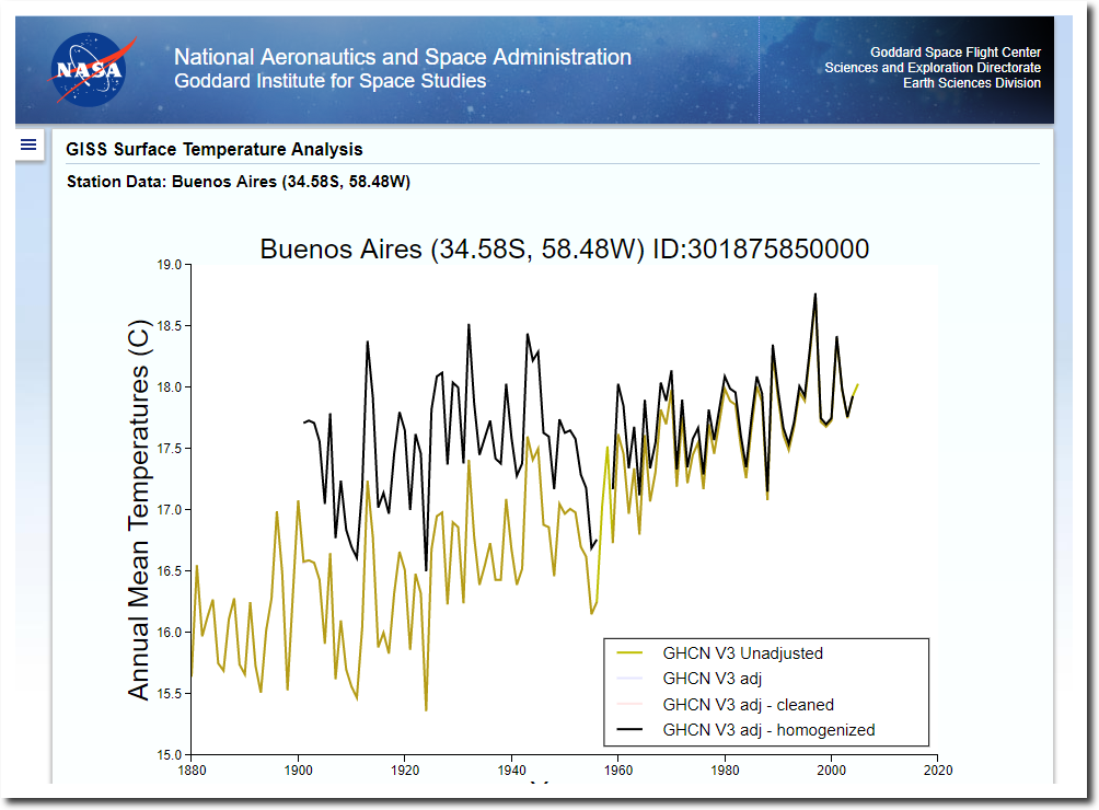
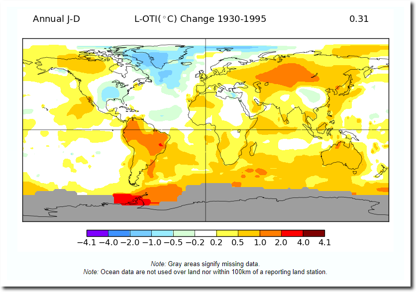
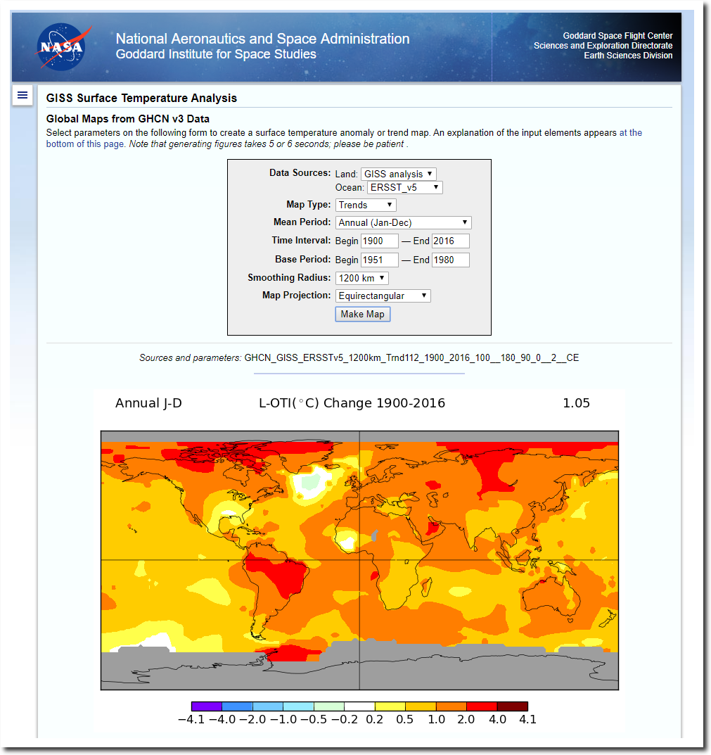
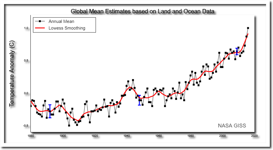
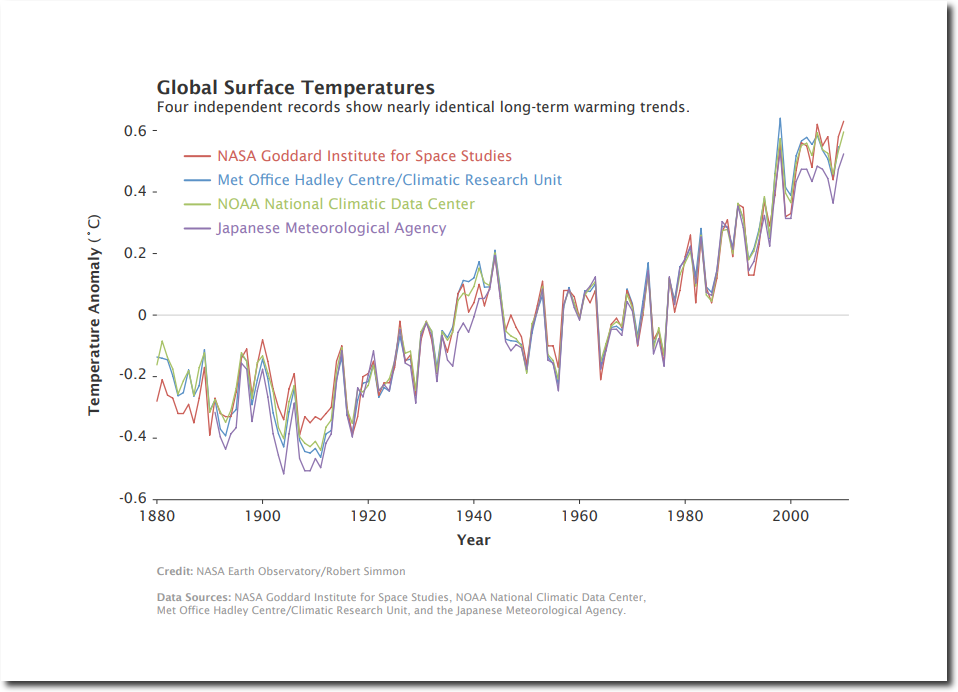
NASA publishes maps and graphs like these ones, purporting to show very detailed trends in global temperature back to 1880, with very small error bars. Their maps are based on NOAA GHCN data.

Data.GISS: GISS Surface Temperature Analysis: Global Maps from GHCN v3 Data

Then NASA claims that multiple data sets agree very closely.

annual_temperature_anomalies

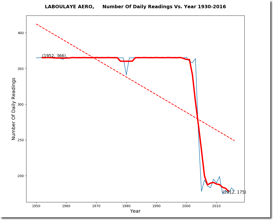
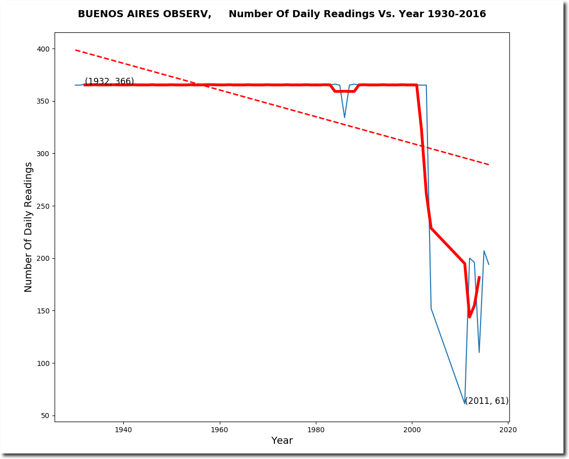
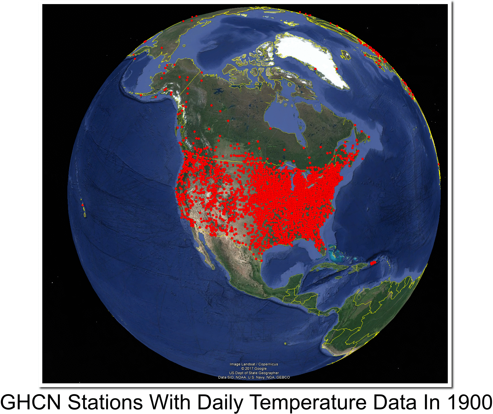
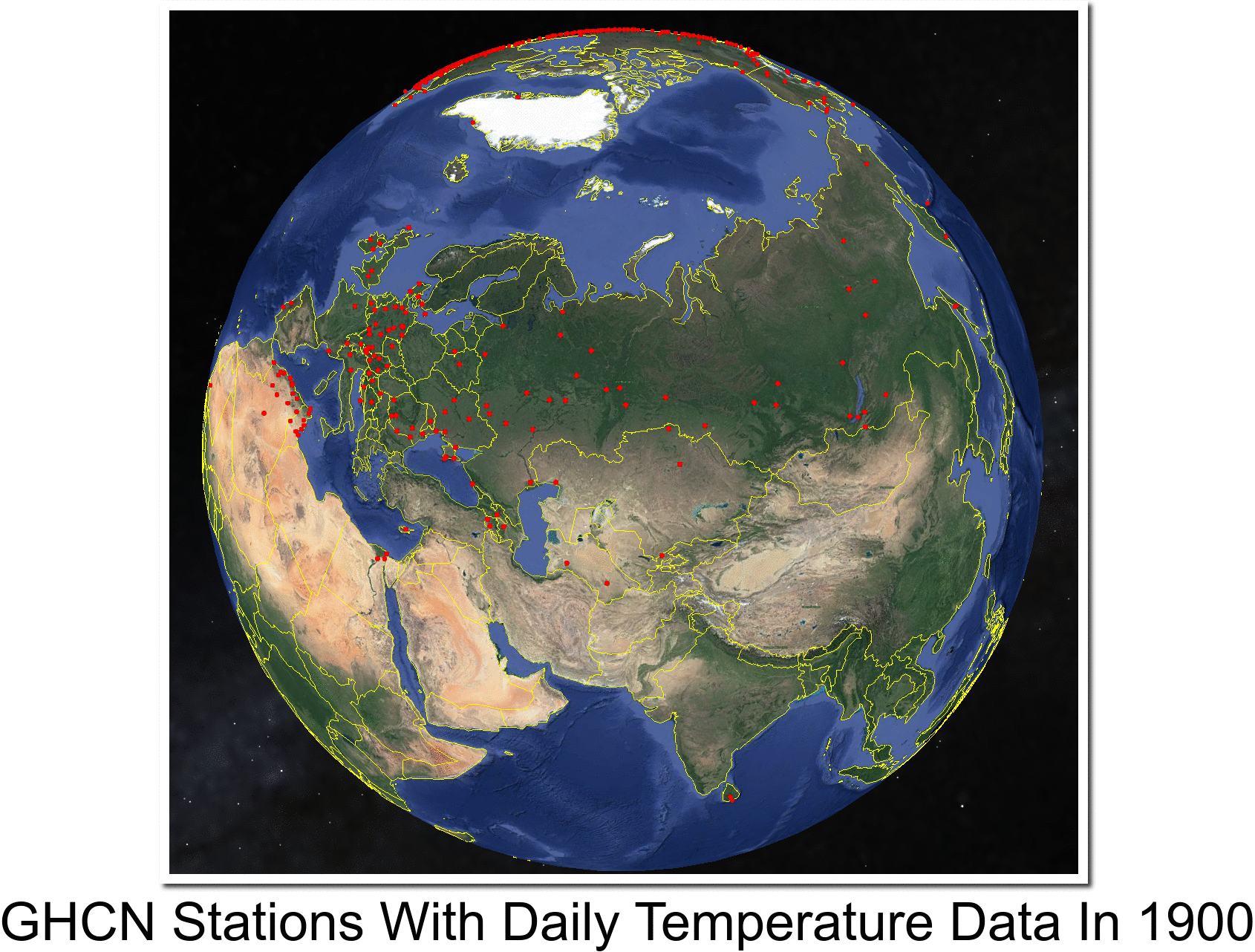
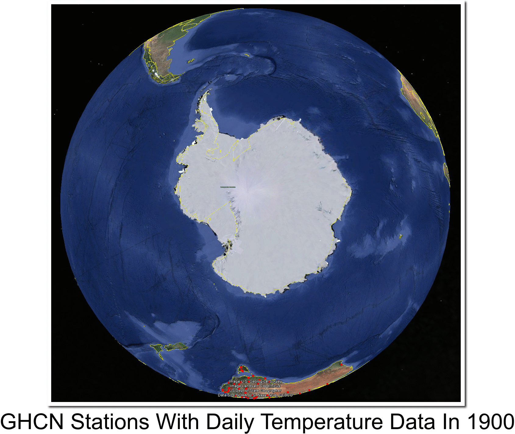
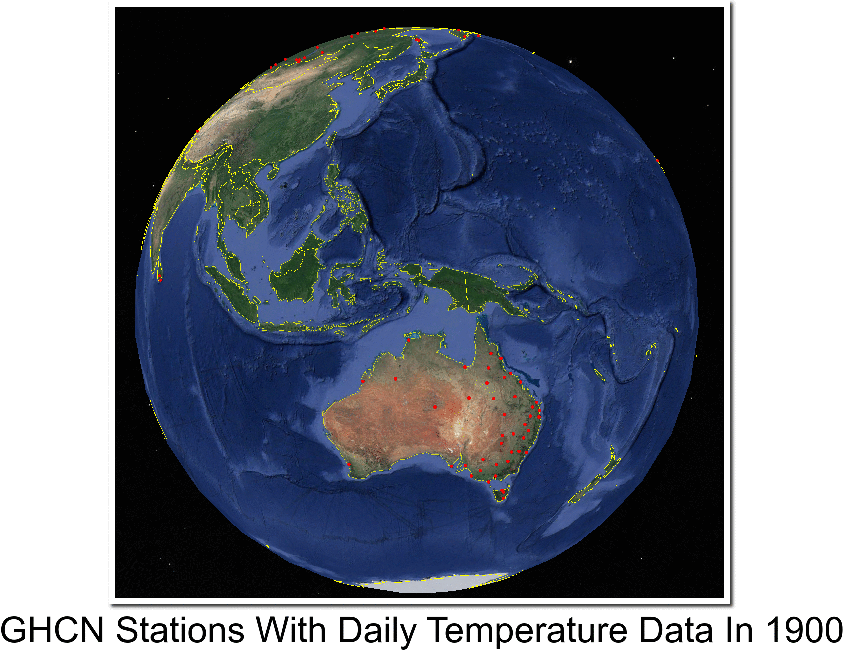
It all looks so convincing, until you look at the actual data. The maps below show the locations of all NOAA GHCN stations which had daily min/max temperature data in the year 1900. As you can see, the US had very good coverage, and the rest of the world had almost no coverage.

They have no idea what temperatures outside the US were in the year 1900. The global temperature record from NOAA/NASA/CRU/JMA is a complete fake, and the only reason that they come up with the same graph is because they are colluding to defraud the public.

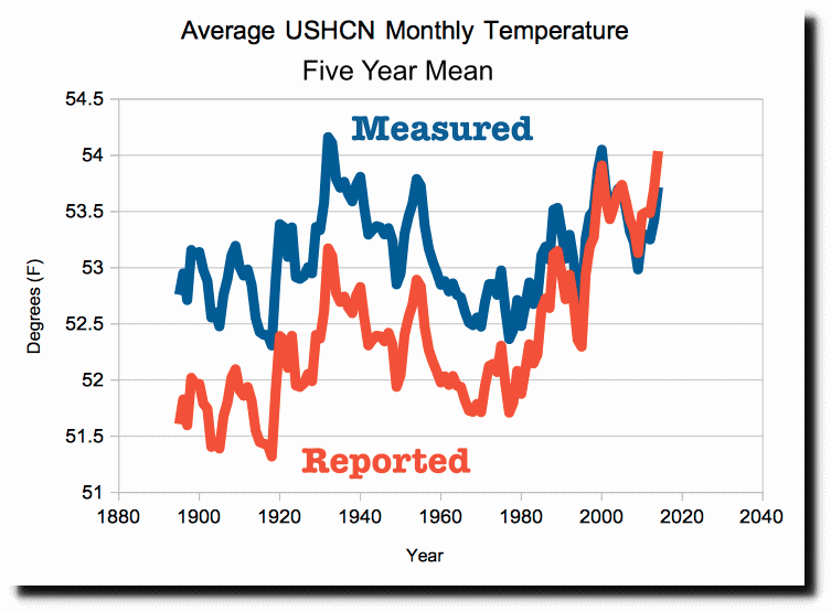
The only place which has good data back to 1900 is the US, and NOAA massively tampers with the US data to cool the past and create fake warming.

This is the biggest scam in history. Global warming is a complete fake.

Posted in Uncategorized | Leave a comment

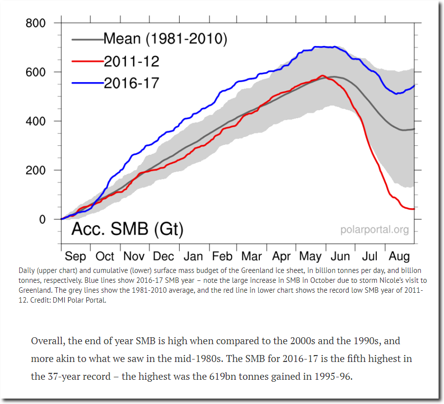
Fifth Largest Mass Gain On Greenland’s Surface Since 1981

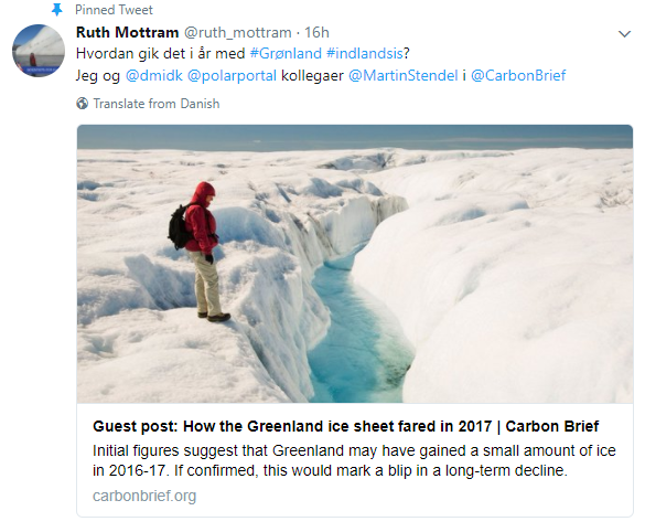
Overall, initial figures suggest that Greenland may have gained a small amount of ice over the 2016-17 year.

Guest post: How the Greenland ice sheet fared in 2017 | Carbon Brief

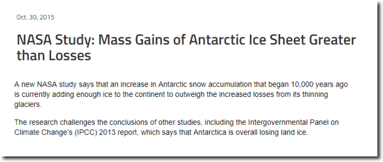
Antarctica is also gaining ice.

NASA Study: Mass Gains of Antarctic Ice Sheet Greater than Losses | NASA

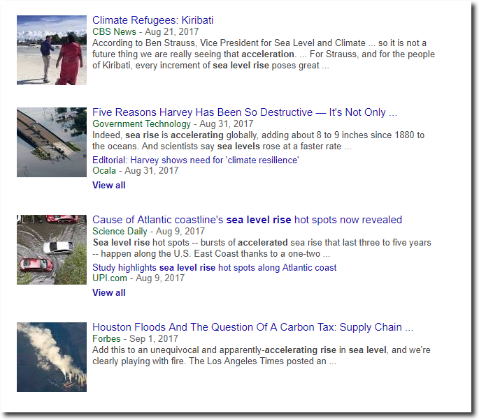
Greenland and Antarctica are both gaining ice, yet experts say sea level rise is accelerating. They must believe in an extraterrestrial source of water.

Posted in Uncategorized | Leave a comment

New Video : Latest Fake News About Sea Level

Posted in Uncategorized | Leave a comment

How Government Climate Alarmists Operate

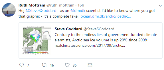
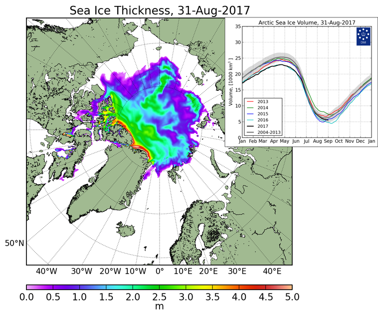
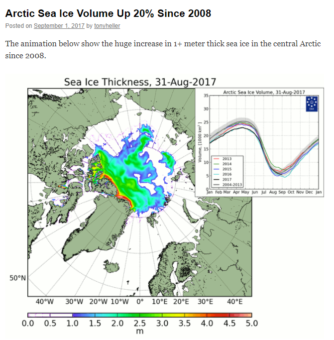
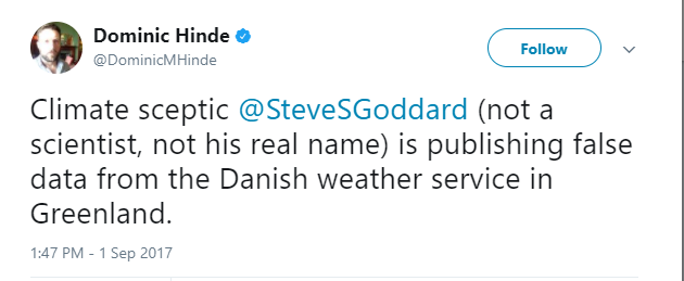
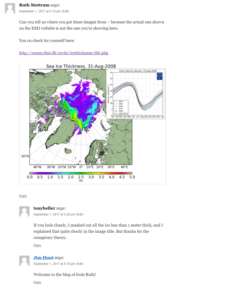
A DMI employee accused me of making up a fake DMI map yesterday after I posted a graphic showing how Arctic sea ice thickness and volume has increased since 2008.

Here was the original map

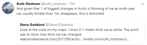
Here was my map. I masked out the thin ice because as every climate alarmist knows, thin ice isn’t important. The map I created is the one alarmists normally say they want to see.

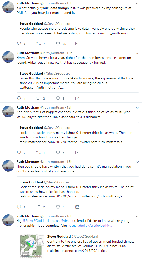
Ruth then made an incredibly stupid tweet where she agreed with me about the importance of thick ice, but thought she was disagreeing with me.

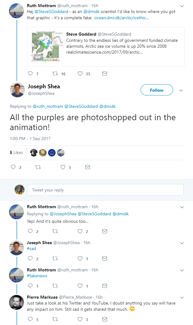
Then, every moron on the Internet jumped in, including Jim Hunt

And finally Ruth went on this tirade, where Ruth said everything – except admit she was wrong.

There was nothing wrong with my graphic. It showed exactly what I said it showed, which is also exactly what climate alarmists say they want to see. Then a DMI employee made a idiotic baseless accusation and piled on one ridiculous tweet after another.

But the funniest tweet of the day is her last one, where she begrudgingly admits that Greenland gained ice this year.

This sort of ridiculous behavior is exactly why I have zero confidence in government climate people. She made a scurrilous and incorrect accusation and then refused to retract or apologize.
Posted in Uncategorized | Leave a comment

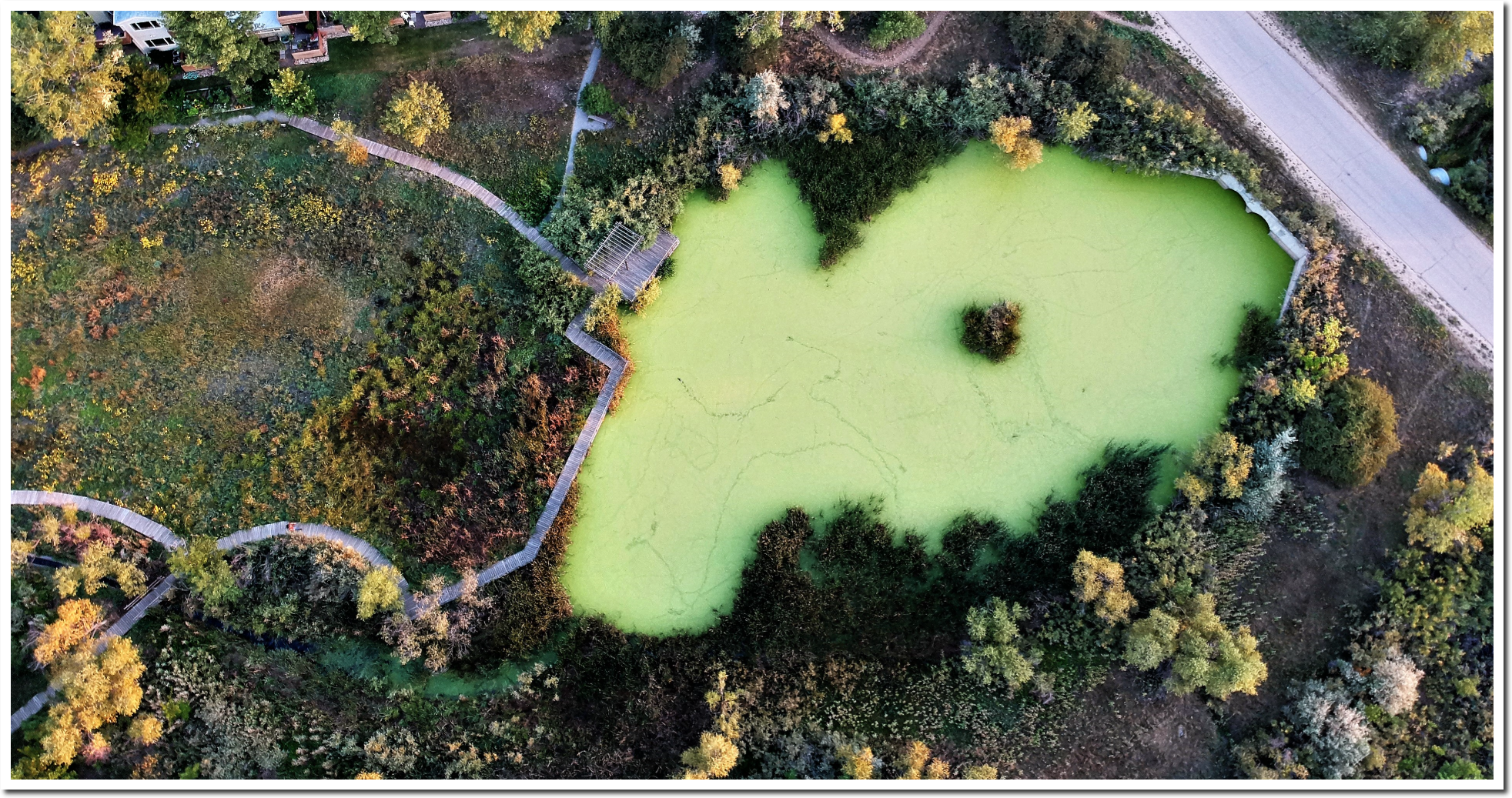
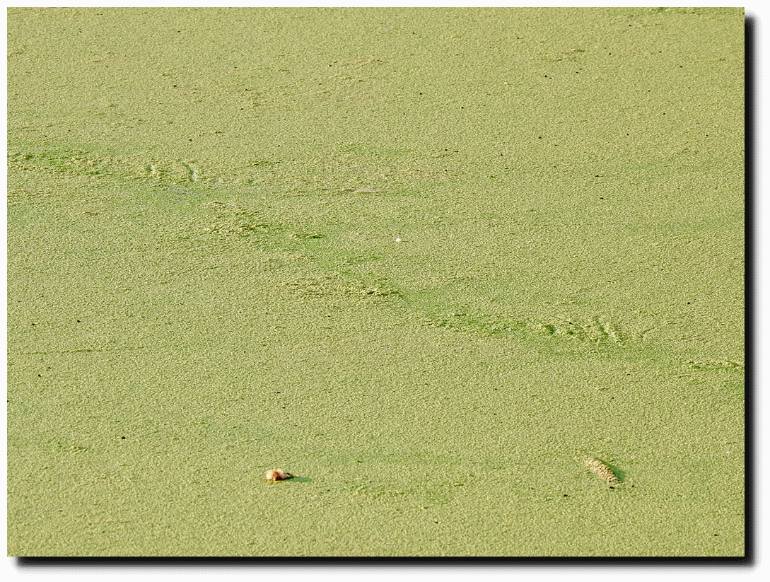
Algae So Thick A Bird Can Walk On It

You can see the bird tracks on this pond, from 350 feet above.
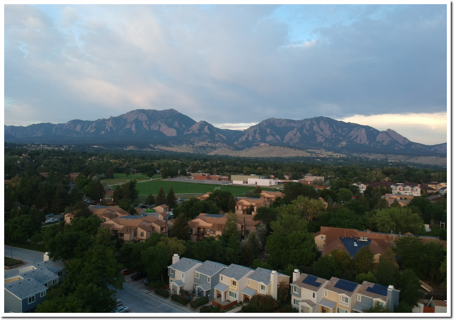
Ground level.

Chemical fertilizer running off from this neighborhood has killed the pond.

Posted in Uncategorized | Leave a comment

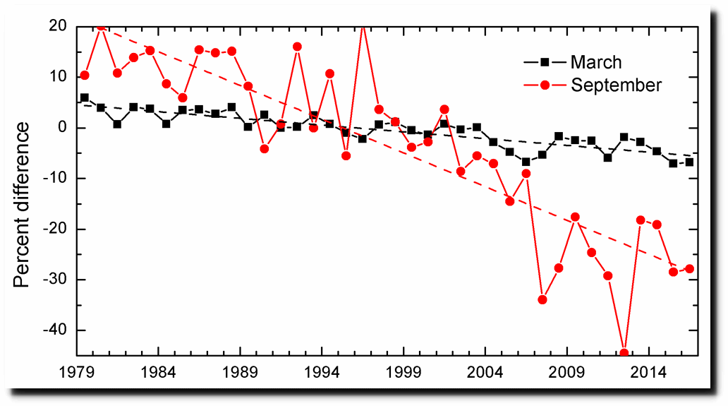
Small Reduction In Arctic Sea Ice Since 1971

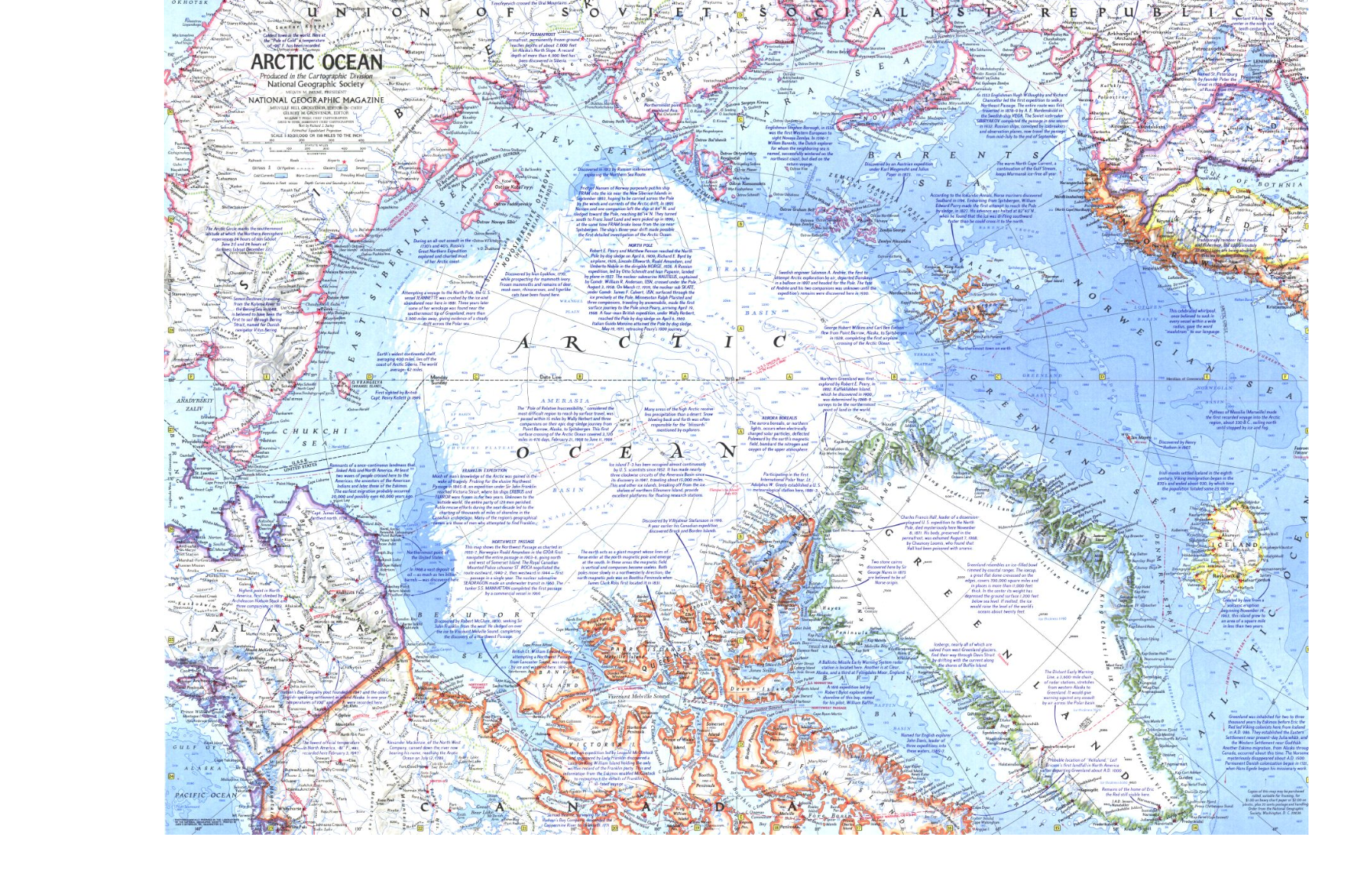
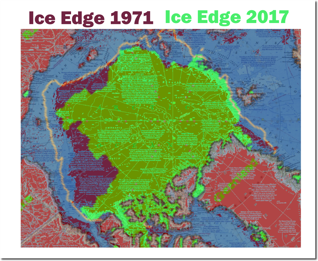
In 1971, National Geographic published this map of late summer Arctic sea ice extent.

ARCTIC OCEAN

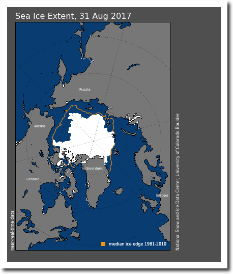
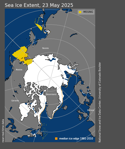
Here is their current map.

N_daily_extent.png (420×500)

The image below overlays the current NSIDC map (green) on the 1971 National Geographic Map (red.) There is less ice in the western Arctic than 1971, and more ice in the Eastern Arctic

But what is really interesting in the map above is the position of the NSIDC median ice edge line, which extends far outside the 1971 area. This is because NSIDC ignores all of the pre-1979 data, when sea ice extent was very low.

Arctic Sea Ice Fraud | The Deplorable Climate Science Blog

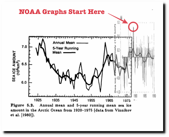
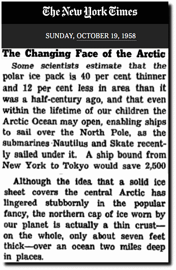
In the 1950’s experts thought the Arctic would be ice-free within a generation.

The Changing Face of the Arctic; The Changing Face of the Arctic 

In order to create their fake linear trend graphs, they start right at the peak in 1979, and ignore all the prior data. Junk science doesn’t get any worse than that.

ftp://ftp.oar.noaa.gov/arctic/documents/ArcticReportCard_full_report2016.pdf

Posted in Uncategorized | Leave a comment

The Unchanging Climate

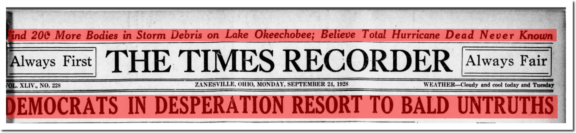
In September, 1928 an inland storm surge in Florida killed thousands of people at Lake Okeechobee, and desperate Democrats were resorting to bald faced lies.

DEMOCRATS IN DESPERATION RESORT TO BALD UNTRUTHS

24 Sep 1928, 1 – The Times Recorder 

Posted in Uncategorized | Leave a comment

Plummeting September 1 Temperatures In The US

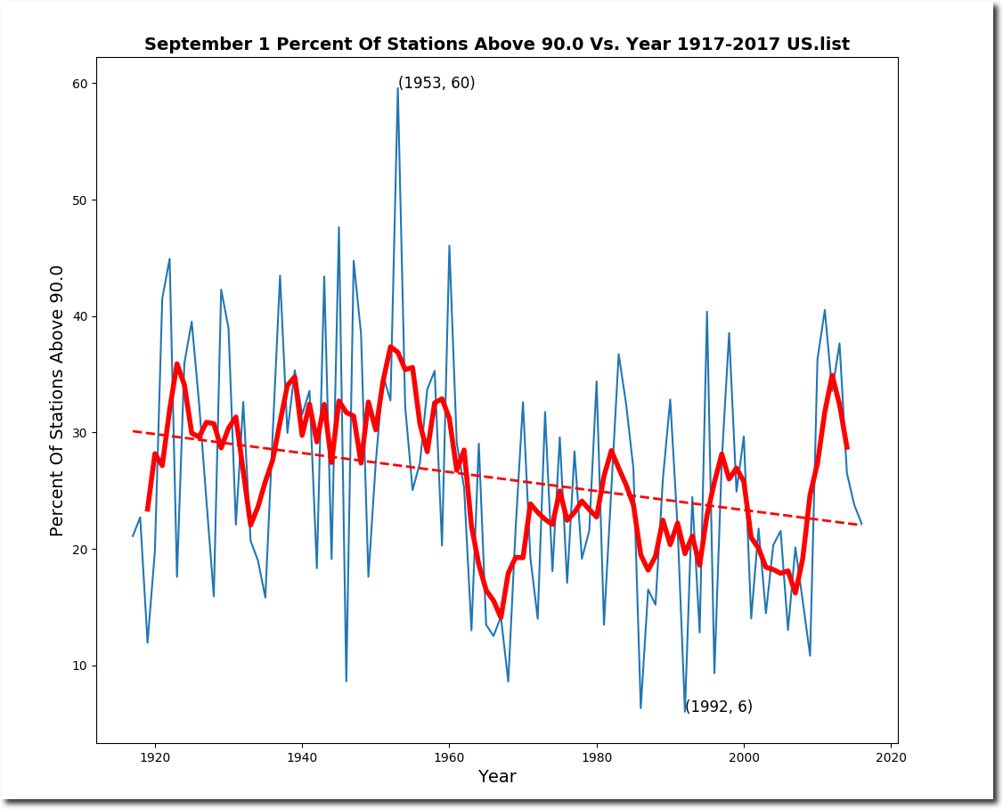
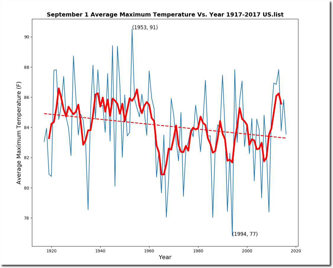
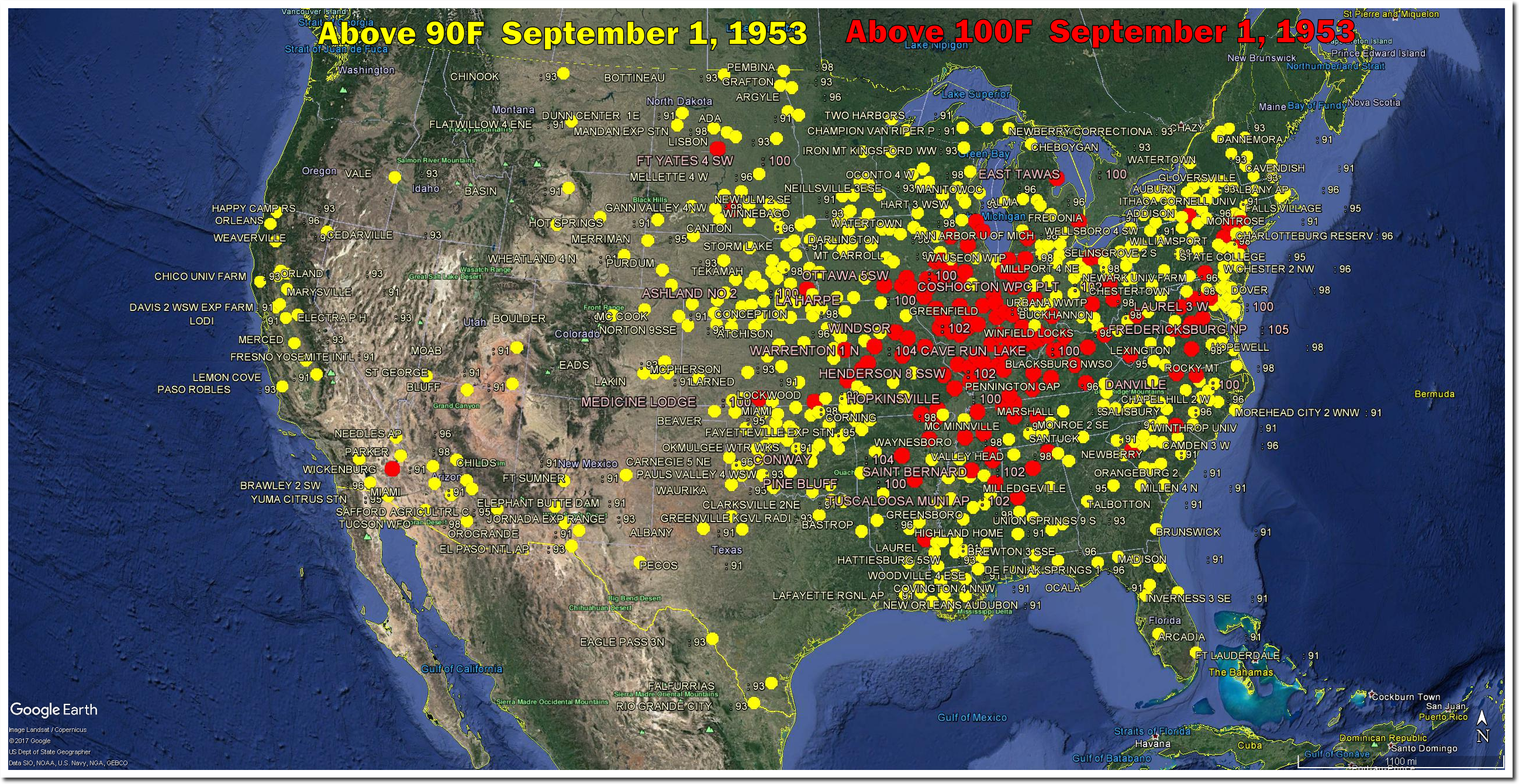
September 1 used to be a very hot day in the US, but temperatures have plummeted over the past century.

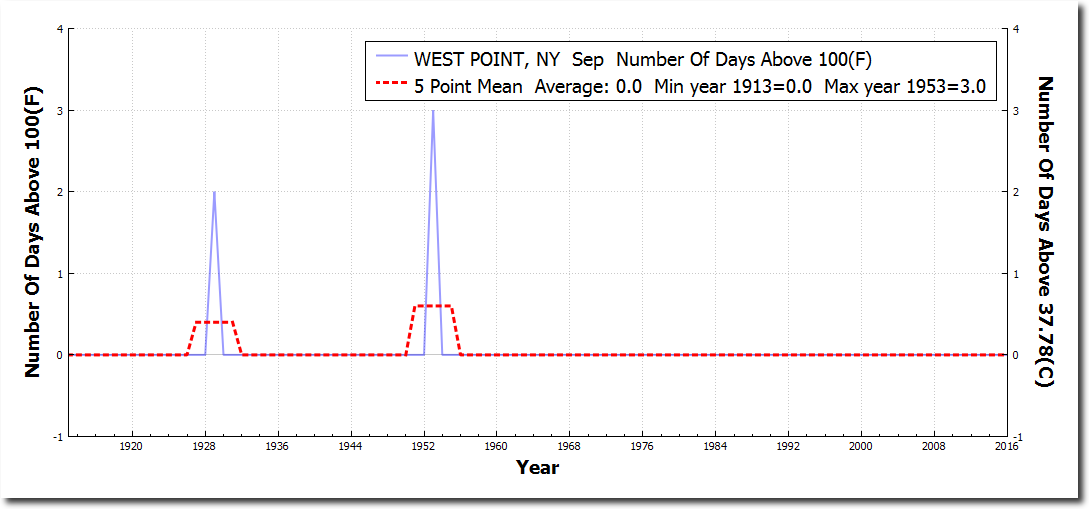
On this date in 1953, half of the Eastern US was over 100 degrees, including West Point, New York.

West Point had three September days over 100F in 1953, and none since.

Posted in Uncategorized | Leave a comment

Success Of The Paris Accords

Based on current trends, it now appears the Arctic will never be ice free. The planet is saved.

Charctic Interactive Sea Ice Graph | Arctic Sea Ice News and Analysis

Good thing we listened to the experts and #FakeNews press – who said the Arctic would be ice-free nine years ago.

Expert: Arctic polar cap may disappear this summer_English_Xinhua

North Pole May Be Ice-Free for First Time This Summer

Others were more conservative and said the ice wouldn’t be gone until 2012.

Star-News – Google News Archive Search

Some were even more conservative and said the ice wouldn’t be gone until 2013.

BBC NEWS | Science/Nature | Arctic summers ice-free ‘by 2013’

Nobel laureate Al Gore was very, very conservative and said the ice wouldn’t be gone until 2014.

Gore: Polar ice cap may disappear by summer 2014

NASA’s top climate prophet said the Arctic might not be ice-free until 2018

The Argus-Press – Google News Archive Search

Posted in Uncategorized | Leave a comment

More Spectacular Fraud From NOAA And The EPA

The NOAA/EPA graph is being touted by Democrats as proof that people who tell the truth about climate need to be jailed. It is intended to mislead people into believing that heavy rainfall events are due to your SUV.

Climate Change Indicators: Heavy Precipitation | Climate Change Indicators in the United States | US EPA

Climate change denial should be a crime | The Outline

Besides the utter insanity of Soviet mentality Democrats demanding compliance with their cult, the EPA graph itself is fraudulent. Had they extended their graph back to the start of records in 1895, the trend would have been the exact opposite.


Cherry picking starting points of graphs is standard operating procedure for criminals on the left.

Posted in Uncategorized | Leave a comment